S&P 500’s Earnings Yield Is Average
While the price-to-earnings ratio is perhaps the most common valuation metric, the reverse of the ratio is another way to gauge valuations. Called the earnings yield, this is calculated by dividing earnings by price rather than the other way around which would result in the P/E ratio. In the Valuation Section of our Annual Outlook Report released last week, we took a look at the S&P 500’s earnings yield relative to corporate bonds. An excerpt is below. To view the entire section and gain access to all of the other sections (plus the rest of our research offering), join Bespoke Premium with this 2020 special offer.
Comparing the earnings yield of the S&P 500 to the yield on the 10-Year US Treasury (a so-called risk-free asset) has the potential to be an apples to oranges comparison as stocks are considered a risk asset and treasuries are considered a ‘risk-free’ rate of return. To help take that into account, the chart below compares the earnings yield on the S&P 500 to the yield on corporate bonds using the average yield of Moody’s AAA and BAA corporate indices.
The earnings yield of the S&P 500 relative to corporate bond yields is currently right inline with its historical average. Looking back at this relationship over time, pre-1960 this ratio was much higher than average. Then, it was much lower than average for the next 50 years. In the last decade now, the ratio has stayed pretty close to its historical average. Not too hot. Not too cold.

Homebulilders Exuberant
Bullish sentiment towards the stock market has been lacking for years now, but it looks like we finally found out where all the bulls went – to the housing market! This morning’s December homebuilder sentiment report from the NAHB blew the doors off expectations. While economists were forecasting the headline index to come in at a level of 70 (unchanged from November), the actual reading rose to 76 from a seasonally adjusted November reading of 71. Not only was December’s reading the biggest beat relative to expectations since March 2017, but it was the highest overall reading since 1999!

The table below breaks down this month’s report by its components. December saw big increases in Present Sales and Traffic, but even Future Sales saw a modest bounce. On a regional basis, sentiment in the Northeast and West declined as these regions still have a lot of exposure to high tax states, but sentiment in the Midwest surged by a record 15 points. The chart below the table shows trends in sentiment by region. With this month’s data, sentiment in the Midwest is back near its cycle highs, while sentiment in the South is at its highest level of the cycle. Meanwhile, sentiment in both the Northeast and West declined, but both regions are coming off levels that were near the highest of the recovery.

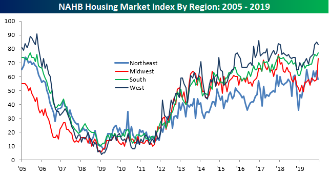
Finally, homebuilder sentiment has really taken a 180-degree turn in the last 12 months. Closing out 2018, housing was a big question mark as the impact of the tax bill and tighter monetary policy both acted as stiff headwinds. As the FOMC has pivoted, though, so too has the housing market, and this year’s 20-point jump in homebuilder sentiment will go down as the third-best year for sentiment in the history of the survey. The only stronger years were 2012 (26 points) and 1992 (21 points). Start a two-week free trial to Bespoke Institutional to access all of Bespoke’s equity market research and interactive investor tools.

Seasonality Tailwind
December has historically been a strong month for equities, although it certainly wasn’t last year. At this point in the month last December, the S&P was already down more than 5% month-to-date, and the index would fall another 9.6% over the next week and a half before making its YTD low on Christmas Eve. December 2019 looks a lot different than December 2018 so far at least, as the S&P is currently sitting on a month-to-date gain of just under 1%.
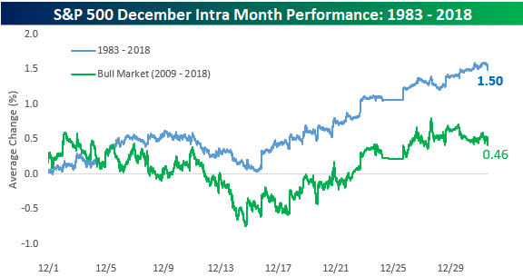
Below is a chart we published in our December Seasonality report sent to members at the end of November. It’s a composite intraday chart of the S&P throughout the month of December from 1983 through 2018 as well as from 2009 through 2018 (the current bull market). It basically shows the average path that the S&P has taken during the month of December. As you’ll notice, the first half of December has actually been the weaker half of the month for stocks, and it’s the second half of the month where the gains really kick in. We’re just past the halfway point of December 2019 now, so investors certainly have seasonality as a tailwind from here through year end.
Our Seasonality Tool shows similarly bullish prospects. When you visit our Seasonality page, you always see the gauges below which show the S&P 500’s median change over the next week, month, and three months (from the current day of the calendar year). As shown below, from today (12/16), the S&P has historically seen a median gain of 1.07% over the next week, a median gain of 2.94% over the next month, and a median gain of 5% over the next three months. All three periods rank in the 87th percentile or higher for market gains based on the calendar year. Our Seasonality Tool lets you track seasonal trends across asset classes. Try it now with a two-week free trial to Bespoke Premium.

Global Stock Breakout
Bespoke’s Interactive Tools section available to members lets you easily track the underlying health of the market. One way to monitor internals is simply looking at the number of new 52-week highs and lows made each day in our huge database of stocks and ETFs. As shown below, on Friday we saw 596 new 52-week highs and just 36 new lows. That’s a huge number.

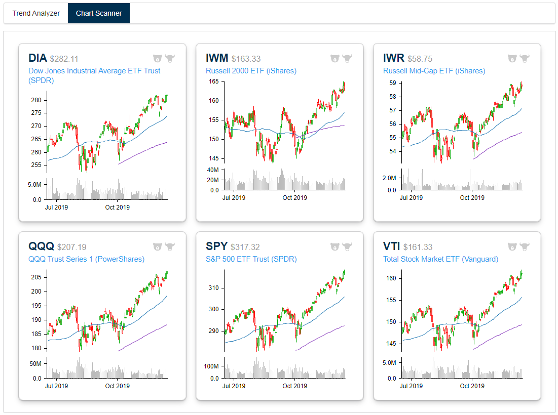
Looking at price charts across a range of US and country stock market index ETFs, we pretty much see breakouts everywhere. In the US, we saw large-caps (SPY, DIA, QQQ, VTI), mid-caps (IWR), and small-caps (IWM) all break out to new highs last week, while we saw the same for countries like Germany (EWG), Japan (EWJ), France (EWQ), and the UK (EWU). Below is a sampling of these charts pulled from our popular Chart Scanner tool. Our Chart Scanner lets users easily browse through hundreds of charts in a matter of minutes. If you like a chart or want to monitor it going forward, you can click the “bull” icon and it will go into a special folder that contains all of the charts you tag as bullish. You can do the same thing for charts you think look negative with the “bear” icon. If you use technical analysis as part of your investment strategy or simply like to look at charts to gauge overall trends for various asset classes, we can’t recommend the Chart Scanner tool enough. We use it every single day internally. Try it for yourself now by starting a two-week free trial to Bespoke Premium.

Bespoke’s Morning Lineup — 12/16/19 — Boeing No Match For the Bulls
See what’s driving market performance around the world in today’s Morning Lineup. Bespoke’s Morning Lineup is the best way to start your trading day. Read it now by starting a two-week free trial to Bespoke Premium. CLICK HERE to learn more and start your free trial.

Bespoke Brunch Reads: 12/15/19
Welcome to Bespoke Brunch Reads — a linkfest of the favorite things we read over the past week. The links are mostly market related, but there are some other interesting subjects covered as well. We hope you enjoy the food for thought as a supplement to the research we provide you during the week.
While you’re here, join Bespoke Premium for 3 months for just $95 with our 2020 Annual Outlook special offer.
Tech Wreck
The Money Men Who Enabled Adam Neumann and the WeWork Debacle by Maureen Farrell and Eliot Brown (WSJ)
A detailed look at the snowballing collapse of the shared office space company in the leadup to its buyout by previous investor SoftBank. [Link; paywall]
Unicorn, e-scooter startup from co-creator of Tile, shuts down with no money for refunds by Andrew J. Hawkins (The Verge)
A scooter start-up looking to capitalize on the popularity of short-distance e-scooter programs like Bird has gone bankrupt, taking the deposits of customers with it. [Link]
Social Media
The Age of Instagram Face by Jia Tolentino (The New Yorker)
A specific type of appearance in Instagram photos tend to get much more engagement than others, leading to a unique crowding phenomenon when it comes to looks on the site. [Link]
Market Musings
The Federal Reserve Is Primed to Launch ‘QE4’ as Year Winds Down, Strategist Says. Others Say That’s Not Likely. by Alexandra Scaggs (Barron’s)
A widely-read interest rate strategist has declared that a new round of QE is just around the corner, with some very dubious reasoning underpinning the argument. [Link; paywall]
Huge Disparity in Corporate Profits Hints at Something Amiss by James Mackintosh (WSJ)
While national accounts data shows falling profit margins, public company data reports the S&P 500’s profit margins at record highs, a massive divergence that speaks ill of the outlook for the economy. [Link; paywall]
Energy
Dominion Energy Turns to Cow Manure in Gas Pact by Ryan Dezember (WSJ)
Cow manure is set to be processed into natural gas that fuels electrical plants in a landmark deal between one of the nation’s largest utilities and dairy farmers. [Link; paywall]
Politics
Pete Buttigieg on Bernie Sanders by Pete Buttigieg (Jacobin)
In a somewhat amusing twist, left-wing magazine Jacobin has published an essay by one 2020 Presidential candidate endorsing another. [Link]
Labor Markets
FedEx Goes Deep Into Mississippi Delta to Find Workers by Paul Ziobro (WSJ)
With local labor markets unable to supply enough workers, holiday package hiring has FedEx bussing workers from deep in the Mississippi Delta to work at its Memphis, TN hub. [Link; paywall]
Nuptials
Brides And Grooms Who Got Married At A Former Slave Plantation Are Speaking Out About Criticism Of The Venues by Clarissa-Jan Lim (Buzzfeed)
Last week we linked to a story about plantation venues losing access to Pinterest and The Knot; this follow-up features comment from some brides who have had weddings at plantations as well as plantation owners. [Link]
Read Bespoke’s most actionable market research by joining Bespoke Premium today! Get started here.
Have a great weekend!
The Closer: End of Week Charts — 12/13/19
Looking for deeper insight on global markets and economics? In tonight’s Closer sent to Bespoke clients, we recap weekly price action in major asset classes, update economic surprise index data for major economies, chart the weekly Commitment of Traders report from the CFTC, and provide our normal nightly update on ETF performance, volume and price movers, and the Bespoke Market Timing Model. We also take a look at the trend in various developed market FX markets.
The Closer is one of our most popular reports, and you can sign up for a free trial below to see it!
See tonight’s Closer by starting a two-week free trial to Bespoke Institutional now!
Internals not as Overbought as Price Suggests
Earlier this morning on Twitter, we highlighted that every major index ETF, small and large-cap alike, has pushed firmly into overbought territory in our Trend Analyzer with price sitting one standard deviation or more above their 50-DMAs. While that could typically be taken as a sign of potential near term downside mean reversion to come, taking a look under the hood reveals that things may not be quite as overbought as they appear.
As shown in the trading range charts from our Daily Sector Snapshot included with the Morning Lineup and Closer, of the underlying sectors, some of the defensives, Real Estate (XLRE) and Utilities (XLU), are actually not overbought. Real Estate has not just become oversold but is nearly oversold to an extreme degree of two standard deviations below its 50-DMA. While not quite there yet, Utilities is also on the verge of moving into oversold territory. Additionally, one of the more exposed sectors to trade, Industrials (XLI), has further upside as it too is only in neutral territory amidst the swarm of positive trade news. Of the rest of the sectors, conditions are still overbought by this measure with each one’s price over one standard deviation above their 50-DMAs.

Though sectors prices have gotten elevated relative to their 50-DMAs, the same is not entirely true for the individual stocks of each sector. As shown in the charts below, only a handful of sectors like Health Care and Consumer Staples currently have an elevated number of stocks above their 50-DMAs. Other sectors like Communication Services, Consumer Discretionary, Industrials, Materials, and Technology have seen other periods this year where a higher percentage of the sector’s stocks had been above the 50-DMA. As for the Utilities and Real Estate sectors, only 35.7% and 31.25%, respectively, of stocks are above their 50-DMAs. That is notable in that for the two sectors, the readings are in the 12th and 6th percentiles of all days over the past year, respectively. This all means that while many stocks have participated in the rally, there are still plenty that could benefit from the technical catalyst of a break above the 50-DMA.

Another measure of overbought/oversold levels and participation, the 10-Day Advance/Decline line, is also not showing any drastic readings. The 10-Day A/D line shows the average number of daily advancers minus decliners over the last ten days. When this reading gets elevated, it’s usually a sign of near-term exhaustion for price. That’s simply not the case right now even with most sector’s trading in overbought territory. Start a two-week free trial to Bespoke Institutional to access all of Bespoke’s equity market research and interactive investor tools.

2020 Outlook – Valuation
Our 2020 Bespoke Report market outlook is the most important piece of research that Bespoke publishes each year. We’ve been publishing our annual outlook piece since the formation of Bespoke in 2007, and it gets better every year! In this year’s edition, we’ll be covering every important topic you can think of that will impact financial markets in 2020.
The 2020 Bespoke Report contains sections like Economic Cycles, The Fed, Sector Technicals and Weightings, Stock Market Sentiment, Stock Market Seasonality, Housing, Commodities, and more. We’ll also be publishing a list of our favorite stocks and asset classes for 2020 and beyond.
We’ll be releasing individual sections of the report to subscribers until the full publication is completed by year-end. Today we have published the “Valuation” section of the 2020 Bespoke Report, which compares current valuations for major indices and sectors to their historical levels at various points in bull and bear markets. We also analyze the earnings yield, price to book ratios, and dividend yields for the S&P 500 relative to history.
To view this section immediately and all other sections, become a member with our 2020 Annual Outlook Special!

Rich Valuation for Tech
Positive developments on the trade front over the past couple of days have been a tailwind for the Technology sector, which has exposure via trade heavy industries like the semiconductors. As the sector’s price has risen, so have valuations. Keeping track of valuations using our Daily Sector Snapshot included with the Morning Lineup and Closer, we have been repeatedly noting that the Technology sector has seen its price-to-earnings ratio consistently in the upper end of the past decade’s range recently.
In fact, with yesterday’s rally further elevating price, the P/E ratio is now in the 100th percentile of all readings of the past ten years. In other words, the 25.5 P/E yesterday was the highest of the past ten years. The last time the ratio was this high or higher was back on November 7th of 2007. Although the valuation is undoubtedly elevated now, the P/E ratio is actually still well off of its highs and only in the 68th percentile of all readings of the past 25 years. As shown below in the chart of the sector’s P/E ratio over the past quarter-century, the current level has rarely been observed since the end of the Dot-Com Bubble. But the ratio is also still well below levels seen during the bubble in the late 1990s. Additionally, the build-up to current levels has been much more gradual than around that time. Simply put, while the sector’s valuation has run hot, it’s not even close to what we saw during the 90s heyday for Tech. Click here to learn more about Bespoke and its research offering.
