Gold’s (GLD) Shiny Start
With risk assets sharply lower this morning, investors have flocked to safe havens. Treasuries are now at or near record-low yields and gold is up well over 2%. For the Gold ETF (GLD), today’s gap of 2.46% is the first gap up of 2% or more since November 9th, 2016; the day after the 2016 presidential election. Since the ETF first began trading in 2004, there have been a total of 57 days (including today and that 2016 occurrence) in which GLD has gapped up 2% or more. A little less than half (44%) of those occurrences happened during the last recession from December 2007 through June 2009. Otherwise, as shown in the chart below, these gaps have been fairly spread out without any obvious tendency to mark major tops or bottoms for the yellow metal.

Today’s gap of 2.46% is just about in line with the size of past gaps up larger than 2%. As for the rest of the day, these types of large moves at the open have not led to much further buying from open to close with an average gain of only 4 bps. GLD also only rises from open to close around half of the time. As for one week later, GLD has only been higher 48.2% of the time. Granted, the size of those pullbacks have not eaten into the gap up much with an average decline of just 11 bps (median is a 9 bps decline). Start a two-week free trial to Bespoke Institutional to access our interactive economic indicators monitor and much more.

US Down More than China
Of all the trends swirling around in the market this morning, the performance of US and Chinese equities relative to their YTD highs has to be one of the more surprising ones. Based on where equity futures are trading this morning, the S&P 500 would be down 3.91% from its YTD highs earlier this month while the Nasdaq would be down over 5%. So how much is the Chinese market down? Barely more than 3%. Just for reference, there have been a total of more than 75,000 coronavirus cases in China so far, including more than 500 today. So far in the US, there have been a total of 35 confirmed cases. Today, with the S&P 500 set to open down more than 2.5%, China’s Shanghai Composite fell just 0.28% on the day. Start a two-week free trial to Bespoke Institutional to access our full research suite including all of our interactive tools.

Bespoke’s Morning Lineup – 2/24/20 – Taking the Elevator Down
See what’s driving market performance around the world in today’s Morning Lineup. Bespoke’s Morning Lineup is the best way to start your trading day. Read it now by starting a two-week free trial to Bespoke Premium. CLICK HERE to learn more and start your free trial.
Global equities are in a bit of a free-fall this morning on rising concerns over the spread of the coronavirus. While the pace of the outbreak certainly appears to be slowing in China, flareups in South Korea and Italy over the weekend are causing increased concern of a global spread including here in the US. As of now, there have only been 35 confirmed cases in the US, but it’s hard to imagine that number not rising. Besides the coronavirus fears, the strong performance of Bernie Sanders in Nevada over the weekend isn’t helping sentiment for the market either.
Read today’s Bespoke Morning Lineup for the latest on the impact of the coronavirus, the results of the Nevada caucuses over the weekend, and the impact of the coronavirus on supply chains.

Bespoke Brunch Reads: 2/23/20
Welcome to Bespoke Brunch Reads — a linkfest of the favorite things we read over the past week. The links are mostly market related, but there are some other interesting subjects covered as well. We hope you enjoy the food for thought as a supplement to the research we provide you during the week.
While you’re here, join Bespoke Premium for 3 months for just $95 with our 2020 Annual Outlook special offer.
Climate
Here’s How the EU Could Tax Carbon Around the World by Ewa Krukowska (Bloomberg)
A new proposal would levy a tax upon import for the carbon content of goods purchased by other countries, a “border adjustment tax” for carbon emissions. [Link; soft paywall]
Are Floating Hotels, Office Buildings the Answer to Rising Sea Levels? by Konrad Putzier (WSJ)
If you can’t avoid a flood, why not ride on top of it? A new architectural trend is putting buildings on top of water instead of trying to resist the advance of seas. [Link; paywall]
Health Care
I’m Sorry to Say Skin-Cancer Screenings Are a Must by Katie Heaney (The Cut)
Regular skin cancer screenings can catch potentially lethal melanomas long before they become dangerous, a risk for virtually everybody but especially those who have used tanning beds which double the risk of skin cancer. [Link]
The effect of health insurance on crime: Evidence from the Affordable Care Act Medicaid expansion by Qiwei He and Scott Barkowski (Wiley Online)
A novel paper illustrates the benefit of improving access to health care via the Medicaid expansion of the ACA: reduced burglary, vehicle theft, homicide, robbery, and assault. [Link]
Powerful antibiotic discovered using machine learning for first time by Ian Sample (The Guardian)
Bacterial resistance to antibiotics is being tested by a new algorithm designed a special molecule from scratch in order to deal with the most harmful strains of bacteria. [Link]
Lives Lived
Meet the unknown female mathematician whose calculations helped discover Pluto by Meghan Bartels (Space)
The original calculations which led to the discovery of Pluto were undertaken by a woman who would end her life widowed and living in poverty in New Hampshire. [Link]
The Computer Scientist Responsible for Cut, Copy, and Paste, Has Passed Away by Andrew Liszewsk (Gizmodo)
While the Control+C and Control+V commands are ubiquitous today, that wasn’t always the case; they were first conceived back in the 1970s at the Xero Palo Alto Research Center. [Link]
Wealth
In America’s Richest Town, $500k a Year Is Now Below Average by Shelly Hangan, Wei Lu, and Sophie Alexander (Yahoo!/Bloomberg)
Average household income counts at $525,000 in the richest place in the United States, a Silicon Valley suburb where the cheapest listed house goes for $2.5mm and estates are more commonly priced in the 8 figure range. [Link]
Thanks, I Hate It
Corporate Buzzwords Are How Workers Pretend to Be Adults by Olga Khazan (The Atlantic)
Every culture has its own specific language, and the corporate hierarchies of US companies are no different as vocabulary and tone totally different from more prevalent language are good for some laughs. [Link; soft paywall]
Novo Mundi
Patreon Capital: An Alternative to Podcast Financing by Nicholas Quah (HotPod News)
Silicon Valley has gotten obsessed with lending based on other platform technologies, and this week Patreon entered the fray using a product that allows users fundraising on the platform to borrow based on their monthly donation revenues. [Link]
Psychedelic Fiber Offers a New Twist on the Science of Knots by Devin Powell (Wired)
The science of knots is more complex than one might think, drawing on mathematical techniques that have massive applications in other areas. [Link]
Read Bespoke’s most actionable market research by joining Bespoke Premium today! Get started here.
Have a great weekend!
The Closer: End of Week Charts — 2/21/20
Looking for deeper insight on global markets and economics? In tonight’s Closer sent to Bespoke clients, we recap weekly price action in major asset classes, update economic surprise index data for major economies, chart the weekly Commitment of Traders report from the CFTC, and provide our normal nightly update on ETF performance, volume and price movers, and the Bespoke Market Timing Model. We also take a look at the trend in various developed market FX markets.
The Closer is one of our most popular reports, and you can sign up for a free trial below to see it!
See tonight’s Closer by starting a two-week free trial to Bespoke Institutional now!
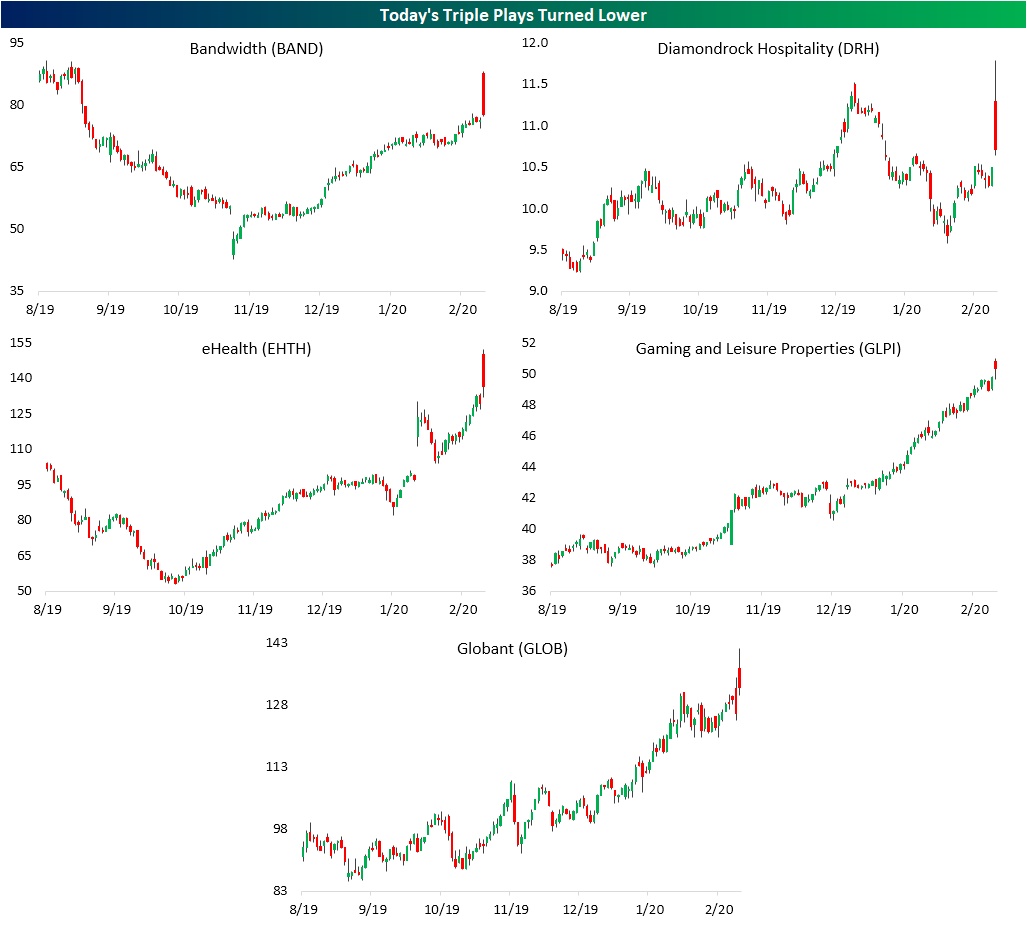
Big Week But Bad Day For Triple Plays
Even though earnings season unofficially came to a close on Tuesday with Wal-Mart’s (WMT) report and despite a shortened week due to President’s Day on Monday, this week saw the highest number of Earnings Triple Plays of any week so far in 2020. A stock reports a Triple Play when it beats EPS and revenue estimates and also raises guidance. Today alone there were five: Bandwidth (BAND), Diamondrock Hospitality (DRH), eHealth (EHTH), Gaming and Leisure Properties (GLPI), and Globant (GLOB).

Given the strong fundamental results, triple plays typically experience strong stock price reactions to earnings. On average, Triple Plays this year have gapped up 5.57% but have sold off from open to close, falling just over 1% for a full day gain of 4.43%. That compares to a full day loss of 6 bps for all stocks that have reported earnings this year. Of today’s Triple Plays, performance has been worse though only having risen 3.1% on average. But that was not the case for the entire session. The gaps up at the open were actually much stronger than normal with an average gap up of 9.9%, but broader market weakness has led these names to sell off intraday. The worst of these was Bandwidth (BAND) which is down over 11% from the open. EHTH and DRH were also notable decliners having fallen 9.13% and 5.18% since the open, respectively. Start a two-week free trial to Bespoke Institutional to access our Earnings Explorer, Triple Plays, and more.
Yet Another Corona Friday
The major indices decided it was five o’clock somewhere right off the bat today as they experience yet another “Corona Friday”. More concerns around the coronavirus have sent stocks lower with the S&P 500 down around 1.1% as of this writing and the Nasdaq down nearly 2% today. Declines on a Friday have become par for the course in 2020. Fridays have been the weakest day of the week so far in 2020; the only one to average a decline. On average, the S&P 500 has fallen 0.52% on Fridays while the next worst day has been Monday which has averaged a gain of 0.19%. Fridays have also been the day that the S&P 500 has closed higher the least. Only 28.6% of Fridays this year have seen the S&P 500 finish in the green. That compares to a positive close more than three-quarters of the time on Mondays, Wednesdays, and Thursdays. While it has averaged a gain of 0.24%, Tuesdays have also experienced a positive close less than half of the time. Try Bespoke’s premium research package for free for two weeks. Click here to start your free trial now.

Bespoke’s Morning Lineup – 2/21/20 – A Case of the Fridays
See what’s driving market performance around the world in today’s Morning Lineup. Bespoke’s Morning Lineup is the best way to start your trading day. Read it now by starting a two-week free trial to Bespoke Premium. CLICK HERE to learn more and start your free trial.
It’s looking like another negative end to a week as investors don’t want to make any major moves heading into a weekend where there’s the potential for more negative headlines related to the coronavirus. Gold is on pace for its 11th positive day in the last 12, while the 10-year yield drops below 1.5% to its lowest levels since last September.
Read today’s Bespoke Morning Lineup below for the latest on the impact of the coronavirus, the rare simultaneous rally in the dollar and gold, European economic data, and diverging performance of European equities from the perspectives of US and European investors.
US markets look set to continue their pullback from overbought levels as we close out the week. Over the last five trading days, most sectors have pulled back within their trading ranges, and in the majority of cases, we’ve seen a move from overbought to less overbought levels. Energy is the only sector below its 50-DMA (it is also the only sector that is oversold). Meanwhile, the Consumer Discretionary sector remains at extreme overbought levels, while Real Estate isn’t far behind.
Despite the lackluster market performance this week, overall US stock market performance this year yeas been strong. Energy and Materials are the only two sectors that are down YTD while five sectors are up over 5%, including Technology which is already in the double-digit percentage range, and Utilities which is up just over 9%.

The Closer – Weights Not Worrying, Five Fed, Slippery Inventories – 2/20/20
Log-in here if you’re a member with access to the Closer.
Looking for deeper insight on markets? In tonight’s Closer sent to Bespoke Institutional clients, we begin by showing why the weightings of the homebuilders and semis are not sending any worrying signals. Next, we update out Five Fed Manufacturing composite with the releases of the Philadelphia and Empire State readings. We finish tonight with a look at EIA petroleum stockpiles.

See today’s post-market Closer and everything else Bespoke publishes by starting a 14-day free trial to Bespoke Institutional today!
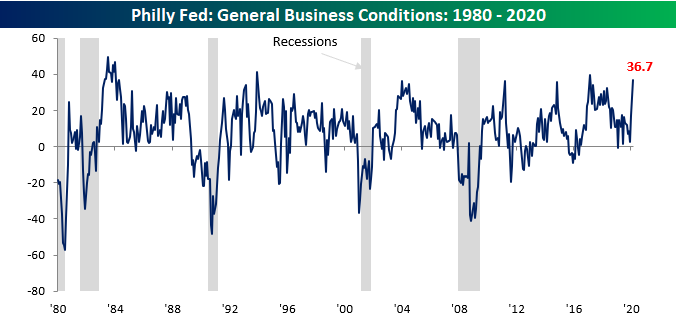
Philly Pops
After a strong report on manufacturing in the New York area earlier this week, the Philly Fed Manufacturing report one-upped its neighbor with a blowout report. While economists were expecting a modest decline in the headline reading from 17.0 to 11.0, the actual reading came in at 36.7, more than triple expectations! This was the strongest reading for the headline index since February 2017, but before that, you have to go all the way back to December 1993 to find a stronger reading. Not only that, but relative to expectations, this month’s report was the biggest beat on record (going back to 1998).
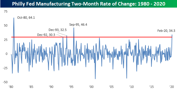
Not only was this month’s report strong, but it also followed the January report which also increased 14.6 points on a m/m basis. Combining the back to back increases together, it was the strongest two-month increase in the Philly Fed headline index since September 1995 and the third strongest two-month gain in the history of the report going back to 1980!
Breadth in this month’s report was also very positive as just two components — Prices Paid and Number of Employees — declined. Meanwhile, a number of components saw double-digit increases including New Orders, Unfilled Orders, and Inventories. When it comes to the Philly Fed Manufacturing report, they don’t get much stronger than this! Start a two-week free trial to Bespoke Institutional to access our interactive economic indicators monitor and much more.
