Claims Continue to Moderate
Just two weeks ago, initial jobless claims came in at one of the highest readings in recent years at 252K. In the two weeks since then, claims have moderated, returning to levels that are more in line with where they have been in the past year. This week, claims were expected to fall to 220K, instead, they came in slightly worse at 222K this week from 235K last week.

While seasonally adjusted claims have moved lower over the past couple of weeks, the four-week moving average has continued to grind higher for its third consecutive week. With a reading of 213K rolling off the average and replaced by this week’s 222K reading, the four-week moving average now sits at 228K. That is the highest level for the moving average since mid-February when it was 229.5K. While just 1.5K off of the 52-week highs for the moving average, it is also 26.5K off of the 52-week low of 201.5K from April. That is the furthest from the 52-week low that the moving average has been since September of 2017 when it was 37K above its 52-week low.

As is the seasonal norm, non-seasonally adjusted claims rose this week to 284.8K from 270.4K last week. This time of year typically sees claims increases until their annual peak which usually occurs in the first couple of weeks of the new year. Start a two-week free trial to Bespoke Institutional to access our interactive economic indicators monitor and much more.

Prices at the Pump Following the Seasonal Script
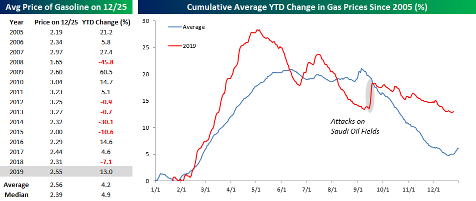
For many Americans, gas prices are a big part of the annual budget, and while this year saw an above-average increase in prices at the pump, the actual price levels are right in line with their historical average. The table below shows the average price level and YTD percent change in gas prices over each of the last 15 years. At a level of $2.55 per gallon, the national average price of gasoline is a penny less than the historical average going back to 2005 and 16 cents above the median level of $2.39. In terms of the YTD change, though, this year’s gain of 13% is triple the 4.2% average for all years.
The chart to the right of the table compares the change in gas prices this year to a composite of the historical average dating back to 2005. For the most part, this year’s path of prices followed the historical trend. The key difference, though, is that prices in the Spring this year saw a much larger than average increase. Once prices peaked in April, they started to decline at a faster than average pace and were actually up less than average by late summer. Following the attacks on the Saudi oil fields in September, though, the YTD change moved back above the historical average and has stayed there ever since.
The chart below shows the y/y change in gas prices since 2006. With a 10.4% increase compared to this time last year, the y/y change is currently the highest since late 2018, although by historical standards the current level is nowhere near an extreme. Sign up for Bespoke’s “2020” special and get our Bespoke Report 2020 Market Outlook and Investor Toolkit.

Most Wonderful Day of the Year
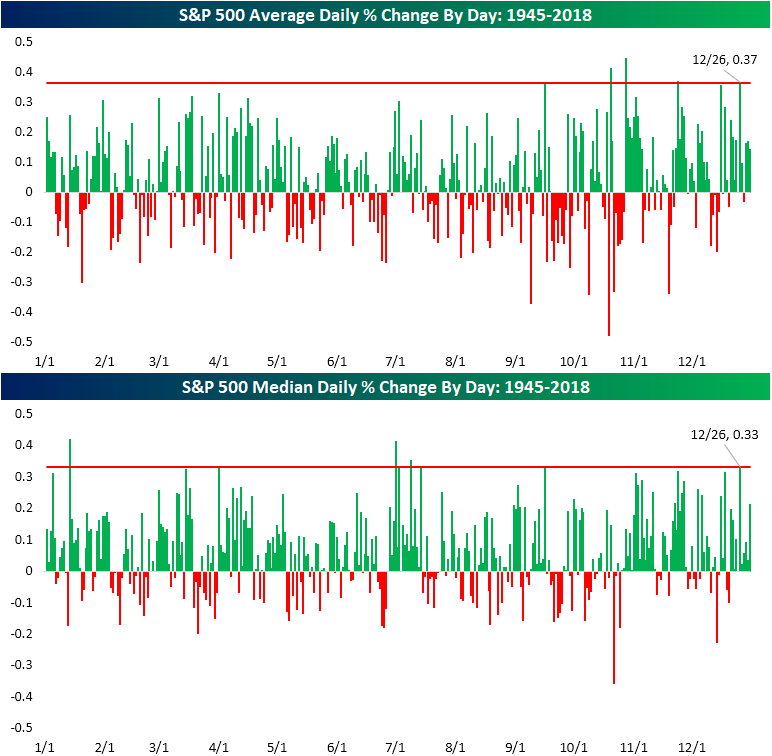
For the S&P 500, Santa comes a day late but not a buck short. As shown in the chart below and as we discussed in the seasonality section of the 2020 Outlook Report, the day after Christmas, December 26th, has been the day of the year that has most consistently seen the index finish higher. Of all December 26’s since 1945, the S&P 500 has closed higher 78% of the time. The next best days of the year have been November 24th and August 17th which have also gained more than three-quarters of the time. That is significantly better than the average for all days of the year which is just 53.07%.

In terms of the actual performance of the index, 12/26 is also one of the best days of the year on both an average and median basis. In fact, on average, the S&P 500 has closed up 0.37% on 12/26; the fourth best day of the year. As shown below, the only days of the year that have averaged better returns are 10/20, 10/28, and 11/24. October 28th is the best of these with a 0.44% gain.
In regards to the median performance, the day after Christmas is still in a top spot as the fifth best day of the year, typically rising 0.33%. The only stronger days of the year are 1/14, 4/1, 7/1, and 7/9. Of these days, 1/14 has been the strongest performer with a gain of 0.42%.
In the chart below, we created a composite intraday chart of the S&P 500 on December 26th since 1983 when data begins. As shown, pretty much through the entire day the index grinds higher with particular strength at the start of the day and in the final half-hour. Join Bespoke Premium now for our most actionable insights and market analysis. CLICK HERE to start a two-week free trial.

Bespoke’s Morning Lineup – 12/26/19 – Is Anybody Out There?
See what’s driving market performance around the world in today’s Morning Lineup. Bespoke’s Morning Lineup is the best way to start your trading day. Read it now by starting a two-week free trial to Bespoke Premium. CLICK HERE to learn more and start your free trial.

The image below is from our Trend Analyzer tool and shows where each of the S&P 500 sectors is trading relative to their trading ranges. While most sectors are overbought at the moment, Industrials (XLI) are just shy of overbought levels and the Real Estate sector (XLRE) is actually trading slightly below its 50-DMA. Despite being below its 50-DMA, though, XLRE has been the best performing sector over the last week, while Financials (XLF) is the only sector in the red.

2019 – A Most Positive Year
52.3%. That’s the percentage of all trading days throughout the S&P 500’s history since 1928 that have been up days for the market. Even though just barely more than 50% of trading days have been up days, it has translated into a price change of 18,157% for the S&P 500.
Casinos are wildly profitable using a similar format. They only have to win slightly more than 50% of all bets made to make a tremendous amount of money. The beautiful thing about investing in the stock market is that you get to be the casino for once!
2019 has been a great year for the S&P 500 with a gain of more than 28%. As shown below, the index only needed to trade higher on 59.3% of days to generate a 28% gain. But positive days occurring 59.3% of the time in a trading year is actually very rare. Only five other years since 1928 have seen up days more consistently with the most recent coming in 1995 when 61.9% of all trading days were positive. Sign up for Bespoke’s “2020” special and get our Bespoke Report 2020 Market Outlook and Investor Toolkit.

Dividend Yields Around the World
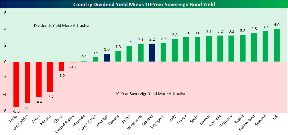
Looking at the dividend yields of 22 of the world’s largest economies, it may come as a surprise to hear that the United States currently has the second-lowest yield at just 1.83%. The only country with a lower dividend yield at 1.19% is India which is currently trading at 29.63 times earnings. In addition to India and the US, there are nine other countries with a dividend yield below the global average of 3.23%. Contrary to India’s high valuation and subsequent low yield, Russia currently boasts the highest dividend yield of 6.23% and the lowest valuation with a P/E ratio of just 6.68. That is even though the country was the second best-performing equity market in 2019 having risen over 43% year to date.

Given that interest rates remain historically low around the globe, and holding constant the varying levels of risk between a country’s stocks and bonds, equities generally continue to offer investors a higher return. The chart below shows the spread between the dividend yield and 10-year sovereign bond yield for each of the 22 countries previously discussed. As shown, there are only six countries, including the US, in which 10-year sovereign bonds are more attractive than the country’s stock market dividend yield. Given India’s low dividend yield, it is the country that most favors its 10-year sovereign bond (yielding 6.71%) while the opposite holds true for the UK given the dividend yield of 4.78% and the 0.78% yield on the 10-year Gilt. Sign up for Bespoke’s “2020” special to read the “International Markets” section of our 2020 Outlook report. We cover a number of additional fundamental, technical, and economic comparisons for countries around the world.
Country PEG Ratios Heading Into 2020
From Investopedia, a company’s PEG ratio “is used to determine a stock’s value while also factoring in the company’s expected earnings growth and is thought to provide a more complete picture than the P/E ratio.” Taking it a bit further, “While a low P/E ratio may make a stock look like a good buy, factoring in the company’s growth rate to get the stock’s PEG ratio may tell a different story. The lower the PEG ratio, the more the stock may be undervalued given its future earnings expectations. Adding a company’s expected growth into the ratio helps to adjust the result for companies that may have a high growth rate and a high P/E ratio.”
We like to calculate a PEG ratio of sorts for countries as well by taking the country’s stock market P/E ratio and its projected GDP growth. A country with a very low P/E ratio and high GDP growth (a low PEG ratio) would look very attractive using this measure, especially relative to a country with a higher P/E ratio and lower GDP growth.
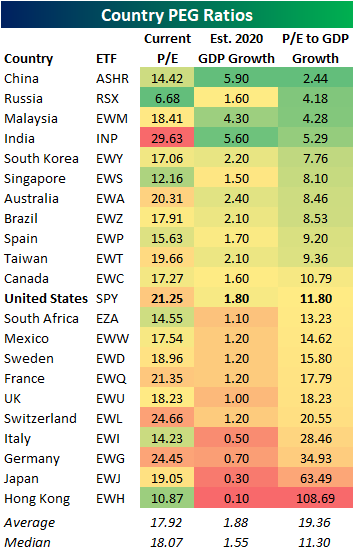
Below is a look at how country “PEG” ratios look heading into 2020. At the moment, China appears to be the most attractive country with a P/E to GDP growth ratio of just 2.44. Forecast to grow 5.9% YoY, China has the highest expectations for GDP growth in 2020 while the current P/E ratio is one of the lowest of the countries shown. Historically, China has frequently taken the number one spot on this list. For Russia, growth is expected to be much more modest at 1.6% YoY, but the extremely low P/E of 6.68x earnings gives the country the second lowest PEG ratio. Last year, Russia also had the second-lowest ratio of the countries shown, and it was one of the best performing stock markets in the world in 2019.
India has by far the highest P/E ratio of all the countries shown, but its 5.6% expected GDP growth gives it a PEG of 5.29, which ranks fourth overall. For the US, its P/E ratio of 21.25 and estimated GDP growth of 1.8% gives it a PEG of 11.8, which is in the lower half of countries shown. At the bottom of the list is Hong Kong with an attractive P/E ratio of 10.87 but woeful growth expectations of just 0.10%. The weak GDP growth gives it a PEG of over 100! That is a massive drop compared to last year when it was just 3.9. Protests are clearly taking their toll. Sign up for Bespoke’s “2020” special to read the “International Markets” section of our 2020 Outlook report. We cover a number of additional fundamental, technical, and economic comparisons for countries around the world.
Bespoke’s Morning Lineup -12/24/19- Christmas Green
See what’s driving market performance around the world in today’s Morning Lineup. Bespoke’s Morning Lineup is the best way to start your trading day. Read it now by starting a two-week free trial to Bespoke Premium. CLICK HERE to learn more and start your free trial.
The Closer – Nine in a Row; Record High? Flip a Coin
Monday’s close was the 21st record closing high for the S&P 500 in the last 40 trading days. In other words, over the last eight weeks, investors have been getting record closes more often than once every other day! Pretty incredible.
In tonight’s Closer, we take a look at how the S&P 500 performed following prior periods where the index hit record closing highs more than half of the time over an eight-week period.
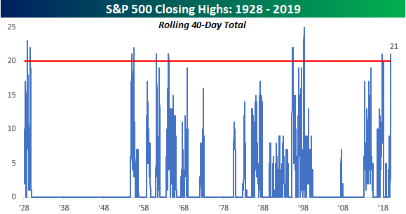
See tonight’s Closer by starting a two-week free trial to Bespoke Institutional now!
A Huge Jump in % of World Market Cap for One Country
On December 12th, the US stock market lost a full percentage point of its share of total world stock market cap. As shown below, the US’ percent of world market cap had been trending higher for most of 2019 as domestic stocks outperformed internationals. By the end of November, the US share of world market cap had gotten above 41%, but on December 12th, it fell to 39.66%. Can you think of what caused the dramatic drop?

If you immediately thought of the recent Saudi Aramco IPO, congrats. When Saudi Aramco went public earlier this month, its sheer size had a major impact on global stock market weightings. With a $1.9 trillion market cap, Saudi Aramco is easily the largest company in the world, topping the largest US company — Apple (AAPL) — by more than $650 billion. As shown below, the Saudi Aramco IPO pushed Saudi Arabia’s percentage of total world stock market cap from a mere 0.61% up to 2.8%. This means Saudi Aramco on its own makes up roughly 2.2% of total world market cap.

At 2.8%, Saudi Arabia now has the seventh largest stock market in the world behind the US, China, Japan, Hong Kong, the UK, and France.
Below we show current country stock market weightings compared to where they stood at the start of 2019, on Election Day 2016, and ten years ago at the end of 2009.
Saudi Arabia has seen the biggest increase of any country this year, while the US’ share is up the second most at +1.23 percentage points. (Prior to the Aramco IPO, the US had gained roughly 2.2 percentage points on the year.) China’s share has also gained in 2019, but its weighting has fallen 1.89 percentage points since Trump was elected, while the US has seen its share rise 3.28 percentage points over the same time frame.
Hong Kong has lost the most market share this year with a drop of 0.67 percentage points (6.95% down to 6.28%). Other countries that have seen their percent of world market cap decline in 2019 include Japan, the UK, India, and South Korea.
Over the last ten years, the US has seen by far the biggest increase in weighting at +9.89 percentage points. The only other countries to make notable gains this decade are China (+2.07 ppts) and Saudi Arabia (+2.10 ppts). Most other countries have lost share this decade, with the UK down the most at 2.52 percentage points. At the end of 2009, the UK had a solid 6.47% weighting of world market cap, but it’s down in the 3s now. Sign up for Bespoke’s “2020” special to read the “International Markets” section of our 2020 Outlook report.
