Bespoke’s S&P 500 Sector Weightings Report
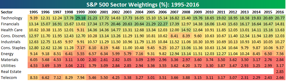
S&P 500 sector weightings are important to monitor. Over the years when weightings have gotten extremely lopsided for one or two sectors, it hasn’t ended well. Below is a table showing S&P 500 sector weightings from the mid-1990s through 2016. In the early 1990s before the Dot Com bubble, the US economy was much more evenly weighted between manufacturing sectors and service sectors. Sector weightings were bunched together between 6% and 14% across the board. In 1990, Tech was tied for the smallest sector of the market at 6.3%, while Industrials was the largest at 14.7%. The spread between the largest and smallest sectors back then was just over 8 percentage points.
The Dot Com bubble completely blew up the balanced economy, and looking back you can clearly see how lopsided things had become. Once the Tech bubble burst, it was the Financial sector that began its charge towards dominance. The Financial sector’s sole purpose is to service the economy, so in our view you never want to see the Financial sector make up the largest portion of the economy. That was the case from 2002 to 2007, though, and we all know how that ended.
Unfortunately we’ve begun to see sector weightings get extremely out of whack once again.
If you would like to see the most up-to-date numbers for S&P 500 sector weightings, simply start a two-week free trial to our Bespoke Premium or Bespoke Institutional services. Click back to this post to see the numbers once you’re signed up!
S&P 1500 Sector Weightings — Energy Now the Smallest
With oil prices continuing to plunge, the Energy sector is now officially the smallest of the eleven major sectors in the S&P 1500, which is made up of large-caps, mid-caps, and small-caps. Energy makes up just 2.63% of the S&P 1500, which is 2 basis points lower than the next smallest sector — Materials — at 2.65%. Real Estate and Utilities are the next smallest sectors with weightings of 3.41% and 3.49%, respectively.
At the top of the food chain is Technology with a weighting of 24.78%, or about 10x the size of Energy. Health Care ranks second at 15.71%. Combined, Technology and Health Care make up more than 40% of the S&P 1500 in this new post-Covid world. The seven smallest sectors have a combined weighting that is still less than the weighting of Tech and Health Care.

Even more remarkable is how big some of the largest individual companies are compared to entire sectors of the economy. Below we show the market cap of the entire S&P 1500 Energy, Materials, Real Estate, and Utilities sectors versus the market caps of the four largest stocks in the S&P 1500 — Microsoft (MSFT), Apple (AAPL), Amazon (AMZN), and Alphabet (GOOGL). Microsoft is now nearly two times as large as the entire Energy and Materials sectors, or put another way, the entire Energy and Materials sectors combined are just barely larger than Microsoft (MSFT). Apple and Amazon as well are both larger than the four smallest sectors of the market. And for Alphabet (GOOGL), its market cap puts it right in between the size of the entire Materials and Real Estate sectors. Combined, the four largest stocks make up about 17% of the S&P 1500, while the four smallest sectors in the index make up just 12.2% of the index. There are 339 individual stocks across the four smallest sectors in the S&P 1500. Start a two-week free trial to Bespoke Institutional to access our full range of research and interactive tools.

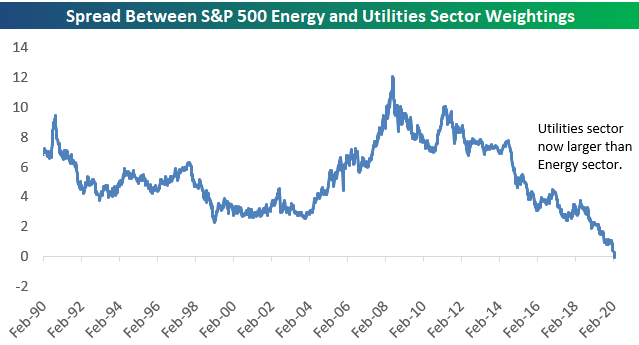
Utilities Now Larger Than Energy — S&P 500 Sector Weightings
The Energy sector continues to get smashed. The sector was already massively underperforming before coronavirus emerged, but since February 19th when the outbreak decided to start panicking markets around the world, Energy has fallen more than 17%. That’s nearly a fifth of the sector’s value in less than ten days!
Remarkably, the Energy sector’s weighting in the S&P 500 has now fallen to just 3.5%. This leaves Energy as the third smallest sector of the S&P 500, with the Utilities sector over-taking it in fourth.

Below is a chart showing the Energy sector’s S&P 500 weighting back to 1990. Talk about a disaster.

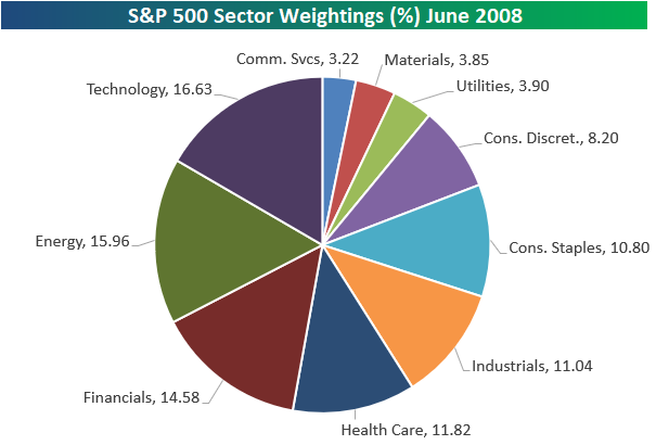
At its peak in June 2008, the Energy sector was the 2nd largest in the S&P 500 and less than 70 basis points away from Technology in first. Below is a pie chart showing sector weightings back then. Energy in mid-2008 was one of the three most impactful sectors on performance along with Tech and Financials.
Fast-forward to today, and the current pie chart of S&P 500 sector weightings shows that Energy barely moves the needle.

Below are charts comparing the weightings of the Energy and Utilities sectors back to 1990. This week is the first time in at least the past 30 years that Utilities has had a larger weighting in the S&P 500 than the Energy sector. Become a Bespoke Premium member to view Bespoke’s most actionable analysis. Start a two-week free trial now!

Bespoke’s Sector Snapshot — S&P 500 Sector Weightings
S&P 500 sector weightings are important to monitor. Over the years when weightings have gotten extremely lopsided for one or two sectors, it hasn’t ended well. Below is a table showing S&P 500 sector weightings from the mid-1990s through 2016. In the early 1990s before the Dot Com bubble, the US economy was much more evenly weighted between manufacturing sectors and service sectors. Sector weightings were bunched together between 6% and 14% across the board. In 1990, Tech was tied for the smallest sector of the market at 6.3%, while Industrials was the largest at 14.7%. The spread between the largest and smallest sectors back then was just over 8 percentage points.
The Dot Com bubble completely blew up the balanced economy, and looking back you can clearly see how lopsided things had become. Once the Tech bubble burst, it was the Financial sector that began its charge towards dominance. The Financial sector’s sole purpose is to service the economy, so in our view you never want to see the Financial sector make up the largest portion of the economy. That was the case from 2002 to 2007, though, and we all know how that ended.
Unfortunately we’ve begun to see sector weightings get extremely out of whack once again.
If you would like to see the most up-to-date numbers for S&P 500 sector weightings, simply start a two-week free trial to our Bespoke Premium or Bespoke Institutional services. Click back to this post to see the numbers once you’re signed up!