The Closer – High Commodities, Low Inflation, Picking APAC – 1/14/20
Log-in here if you’re a member with access to the Closer.
Looking for deeper insight on markets? In tonight’s Closer sent to Bespoke Institutional clients, we kick things off with a look at what copper and crude oil are suggesting for the health of the global economy. Turning to inflation data, we review today’s CPI release as well as what it means for the path of the Fed. In addition to today’s CPI release, we also look at leading inflationary indicators. We then glimpse at credit spreads before evaluating the attractiveness of APAC countries.

See today’s post-market Closer and everything else Bespoke publishes by starting a 14-day free trial to Bespoke Institutional today!
B.I.G. Tips – Percentage of Stocks Above 200-DMA Exceeds 84%
Chart of the Day: Tesla (TSLA) Parabolic; Short Covering Rally?
More New Highs Than Lows
Included with each day’s Morning Lineup and Closer is our Daily Sector Snapshot which offers a look across the internals of the S&P 500 and its eleven individual sectors. One such indicator covered is the net percentage of stocks reaching new 52-week highs. This is essentially the difference between the number of stocks that closed at a 52-week high and 52-week low for a given day.
Typically you would want to see positive readings as it would indicate more positive momentum. For multiple sectors, this reading has begun to spike up recently. Perhaps the most obvious of these is for the Communication Services sector which topped out at 30% about one week ago as many of its stocks have recently outperformed including some of the largest like Facebook (FB) and Google’s parent company Alphabet (GOOGL). For this sector, these were by far the highest new-high readings of the past year. The Technology sector likewise peaked at over 30% last week although for this sector such readings have more precedence in the past year. Similarly, Consumer Staples, HealthCare, and Financials have also begun to pick up over the past several days. While these are working their way back up to similar readings to a few weeks ago, the Utilities sector has begun to see some of the highest number of net new highs since the fall. At the current moment, the Materials sector is the only one with more 52-week lows being made than 52-week highs. Start a two-week free trial to Bespoke Institutional to get our Closer, Morning Lineup, and Daily Sector Snapshot.

Bespoke Stock Scores — 1/14/20
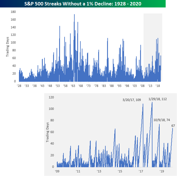
Three Months And Counting Since Last 1% Decline
It has now been over three months since the S&P 500’s last decline of 1% or more back on 10/9. While it seems like an eternity, the current streak of 67 trading days is nowhere near any sort of record on either a long or short-term basis. The chart below shows historical streaks without a decline of 1%+ for the S&P 500 dating back to 1928. The record for the longest streak was back in 1963 when the S&P 500 went 174 trading days – a full eight months – without a 1% drop. Even more impressive is the fact that in both the 1950s and 1960s there were numerous streaks of 100 or more days. For a decade that is looked back on as one with a lot of upheaval in the US, the 1960s was a period of relative calm for the equity market.
More recently, the current streak of 67 trading days doesn’t look all that impressive relative to streaks we saw back in 2017 and 2018. Right after the election in 2016 and into March of 2017, the S&P 500 had a 109-day streak without a 1% decline, and then from late 2017 through January 2018, there was another streak of 112 trading days without a 1% drop. Even in October 2018, there was another streak of 74 trading days. In other words, in just the last three years there have been three longer streaks without a 1% decline than the current one. In the S&P 500’s history, there have been 26 other streaks that have been as long or longer than the current one, and half of those went on to last at least 100 trading days. Get access to all of Bespoke’s research with a two-week free trial to Bespoke Institutional. You won’t be disappointed!
Bespoke’s Morning Lineup – 1/14/20 – And They’re Off!
See what’s driving market performance around the world in today’s Morning Lineup. Bespoke’s Morning Lineup is the best way to start your trading day. Read it now by starting a two-week free trial to Bespoke Premium. CLICK HERE to learn more and start your free trial.

The Closer – Low Vol, High Returns, IPOs, Treasury Update – 1/13/20
Log-in here if you’re a member with access to the Closer.
Looking for deeper insight on markets? In tonight’s Closer sent to Bespoke Institutional clients, we begin with various looks at how low volatility has been recently. Next, we review the S-1 of upcoming IPO Casper before checking up on the performance of 2019’s biggest IPOs. Turning to macroeconomic data, we show the December budget deficit data.
See today’s post-market Closer and everything else Bespoke publishes by starting a 14-day free trial to Bespoke Institutional today!
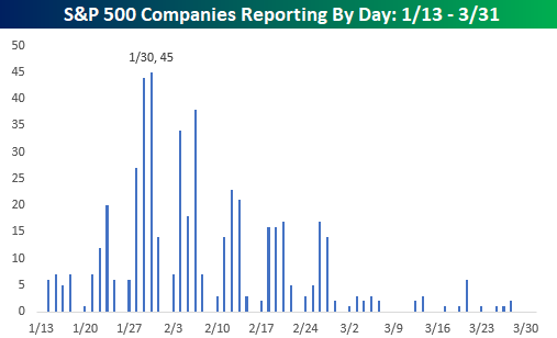
The 40 Most Volatile Stocks on Earnings
The Q4 2019 earnings reporting period starts up Tuesday with a number of key financials firms set to report, including Citigroup (C), JP Morgan (JPM), and Wells Fargo (WFC). Below is a snapshot of the number of earnings reports expected by day over the next month from our Earnings Explorer tool that’s available to Bespoke members. As shown, even though earnings season starts up this week, things don’t really pick up until the end of January.
As we do at the start of each quarterly earnings season, below is a list of the individual stocks that have historically been the most volatile on their earnings reaction days. These are stocks that experience the biggest average absolute one-day percentage change on the first trading day following the release of their quarterly earnings reports. To make the list, a stock has to have at least 10 years (40 quarters) worth of earnings reports in our Earnings Explorer database.
Infinera (INFN) is the most volatile stock on earnings with an average absolute one-day change of 14.90% on its 49 quarterly reports. YRC Worldwide (YRCW) ranks as the second-most volatile with an average one-day change of +/-13.00%, followed by Travelzoo (TZOO) at +/-12.79%.
The most notable stocks on the list are Netflix (NFLX) and Amazon (AMZN). Netflix (NFLX) ranks as the 4th most volatile earnings stock on the list of companies with at least 10 years of reports. NFLX has averaged a one-day move of +/-12.63% on the 70 quarterly earnings reports it has had in its history as a public company. While not as volatile on earnings as NFLX, Amazon (AMZN) has historically averaged an absolute change of 8.74% on its 73 earnings reaction days in our database. That ranks AMZN as the 35th most volatile stock on earnings with at least 10 years worth of data.

Below is a list of the most volatile stocks on earnings with less than 10 years of quarterly earnings data. Arlo Technologies (ARLO) ranks at the top with an average one-day change of +/-18.50% on its six prior earnings reaction days. Container Store (TCS) ranks second at +/-17.33%, followed by Snap (SNAP) at +/-17.21%. Other notables on the list include Yelp (YELP), Canada Goose (GOOS), Groupon (GRPN), Under Armour (UAA), Twitter (TWTR), GrubHub (GRUB), Twilio (TWLO), Yeti (YETI), and TripAdvisor (TRIP). Get access to all of Bespoke’s earnings tools with a two-week free trial to Bespoke Institutional. You won’t be disappointed!

B.I.G. Tips – Can Earnings Season Keep The Bulls Charging?
It was only three months ago that we were looking forward to earnings season providing a change of pace from the non stop headlines related to the trade war with China. Today, it’s the exact opposite. With the market seemingly doing nothing but trade higher, the upcoming earnings season is more of a concern over whether company reports will be good enough to keep the bulls on their feet. We’ll have our answer soon enough, though, as earnings season kicks off this week.
This week‘s batch of reports will be on the light side as just 25 companies are scheduled to report. The fact that only a small number of companies are reporting, though, doesn’t diminish their importance. On Tuesday morning alone we’ll hear from Citigroup (C ), JP Morgan (JPM), and Wells Fargo (WFC). Wednesday morning will be another busy one for the big Financials with Bank of America (BAC), Blackrock (BLK), Goldman Sachs (GS), PNC, and US Bancorp (USB) all reporting. Outside of the Financials sector, we’ll also hear from Dow component UnitedHealth (UNH).
We have just published our quarterly preview of the upcoming earnings season and what to expect in terms of the overall market and sector performance based on trends in analyst revisions. To gain access to the full report, start a two-week free trial to our Bespoke Premium package now. Here’s a breakdown of the products you’ll receive.