Bespoke’s Morning Lineup – 11/13/19 – Inflation Hotter Ahead of Powell
See what’s driving market performance around the world in today’s Morning Lineup. Bespoke’s Morning Lineup is the best way to start your trading day. Read it now by starting a two-week free trial to Bespoke Premium. CLICK HERE to learn more and start your free trial.

Chart of the Day: Tesla (TSLA) vs. The Analysts — Eat Crow or Ride It Out?
The Closer – RSI Report, Credit Cracks, VIX Term Structure, Commodity Review – 11/12/19
Log-in here if you’re a member with access to the Closer.
Looking for deeper insight on markets? In tonight’s Closer sent to Bespoke Institutional clients, following up on today’s Chart of the Day, we look at the distribution of S&P 500 returns given various relative strength index readings. Next, we address the recent concerns surrounding credit markets before reviewing volatility markets. We finish by turning to the set up for various commodities.

See today’s post-market Closer and everything else Bespoke publishes by starting a 14-day free trial to Bespoke Institutional today!
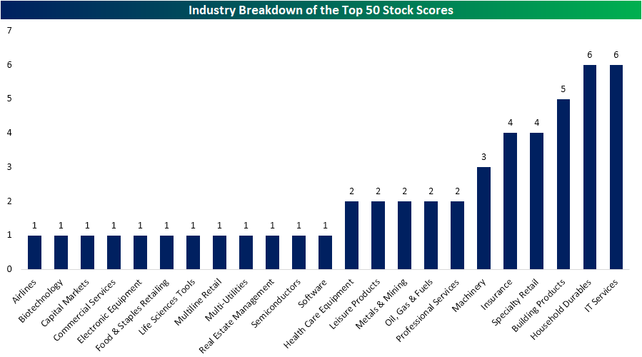
High Scores for Housing
While economic data has generally leaned towards weakness in the past month, we have repeatedly highlighted that housing data has been a bright spot for the economy. Not only has this category’s macroeconomic data come in solid, but the stocks of housing-related companies have also been showing similar strength. Just this morning, homebuilder D.R. Horton (DHI) reported a strong quarter with an EPS and revenue beat and the stock traded up 3.3% in today’s session in response. Given these trends, other housing stocks in DHI’s industry, Household Durables, as well as the housing and construction-related Building Products Industry have become fairly attractive with heavy representation in this week’s Stock Scores.
Our Stock Scores takes all 1500 stocks in the S&P 1500 and ranks them based on fundamental, technical, and sentiment factors. As shown in the chart below, of the 50 stocks with the highest total scores, Building Products and Household Durables had some of the strongest representation tied with the IT Services industry. Within the Building Products industry, 25% of its 20 members were in the top 50 stock scores this week while 6 of the 28 members of the Household Durables industry also made the top 50
We made a custom portfolio of stocks in the Household Durables and Building Products groups that ranked in the top 50 of our Stock Scores this week, so that members can track them. As shown below in the charts from our Chart Scanner, each of these stocks has been in solid uptrends over the past six months. Although some like KB Home (KBH) and Pulte Group (PHM) have more or less broken these uptrends, they have also still held up at their moving averages. Start a two-week free trial to Bespoke Institutional to access our interactive Stock Scores, Custom Portfolios, and more.

An Earnings Season to Remember
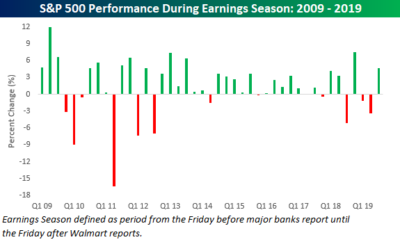
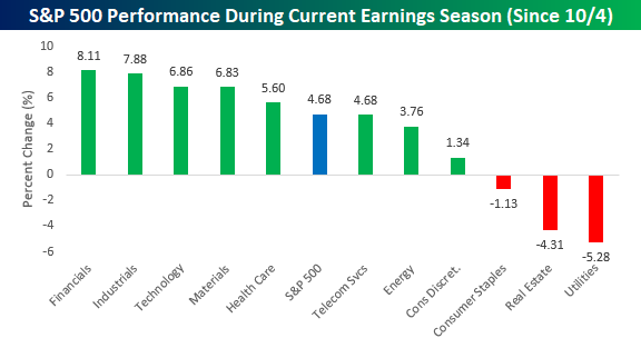
With just a few days left until the unofficial end of the reporting period, this earnings season is on pace to be one of the better ones of the last several years. The S&P 500 is currently up 4.7% since 10/4 (the Friday before the first of the major banks started to report). If we compare the current period to the prior six-week periods in other earnings seasons that encompassed the first of the major bank reports right up through Walmart’s (WMT) report, the only one with a more positive performance was the 7.6% gain in the Q4 2018 reporting period. Before that, you have to go all the way back to the 6.4% gain during the Q3 2013 period. The market has certainly come a long way from early October when it seemed to be a foregone conclusion that earnings results would be dismal while guidance would be even worse.
If you polled analysts/investors back in late September over which sectors would have the toughest earnings seasons, Financials and Industrials would have topped the list. With earnings season now winding down and these two sectors up roughly 8%, though, the list that these two sectors topped is actually the best performers! Meanwhile, the worst performers have been the high yielding defensive sectors that investors couldn’t get enough of during the summer. Sign up for Bespoke’s “2020” special and get our upcoming Bespoke Report 2020 Market Outlook and Investor Toolkit.
Small Business Optimism Bounces More Than Expected
Small business optimism increased more than expected in October, rising from 101.8 up to 102.4 compared to economist expectations for an increase to just 102.0. After a sharp drop from its high in August 2018, small business sentiment hasn’t rebounded much off its lows, but it is at least showing some sign of optimism.

We have pointed out in the past how drops in sentiment among small business owners have typically peaked well in advance of recessions, and looking at a long-term chart, every prior recession was preceded by a peak in this indicator. While that’s true, we would also note that there are also a number of periods early and mid-cycle where sentiment also declined by similar amounts but rebounded to make new highs. Therefore, we wouldn’t put too much into the recent decline as a high confidence indicator of an impending recession.

With regards to the biggest issues small business owners are facing, labor continues to be a big problem. In this month’s survey, one in four small business owners cited Quality of Labor as the most important problem, which was up from 23% last month. Behind Labor Quality, Taxes, Red Tape, Cost of Labor, and Competition were all cited by at least 10% of small business owners. Way on down the list are Inflation and Interest Rates which were cited by a total of only 3% of small business owners.

Below we show the historical percentage of small business owners who cited Labor Quality as their number one problem. Back in August, this reading hit a record high of 27%, but at 25%, it still sits at extraordinarily high levels. While labor costs have been held in check to this point, never before have employers had so much trouble finding qualified workers. Sign up for Bespoke’s “2020” special and get our upcoming Bespoke Report 2020 Market Outlook and Investor Toolkit.

Bespoke Stock Scores — 11/12/19
Chart of the Day: The Changing Tides of Weekday Patterns
Bespoke’s Morning Lineup – 11/12/19 – Not Every Market Headline Has to Be Trade Related
See what’s driving market performance around the world in today’s Morning Lineup. Bespoke’s Morning Lineup is the best way to start your trading day. Read it now by starting a two-week free trial to Bespoke Premium. CLICK HERE to learn more and start your free trial.
The Closer – Semis Surge, Credit Rally, Breakeven Blow-Out, Fedspeak – 11/11/19
Log-in here if you’re a member with access to the Closer.
Looking for deeper insight on markets? In tonight’s Closer sent to Bespoke Institutional clients, we begin with a look at just how strong semis have been this bull market as well as how credit spreads have changed over the past year. We then show just how Boeing (BA) and Walgreens (WBA) saved the Dow from a decline in today’s session. Next, we show the massive move in breakeven yields and the tone of FOMC speakers in recent weeks.
See today’s post-market Closer and everything else Bespoke publishes by starting a 14-day free trial to Bespoke Institutional today!