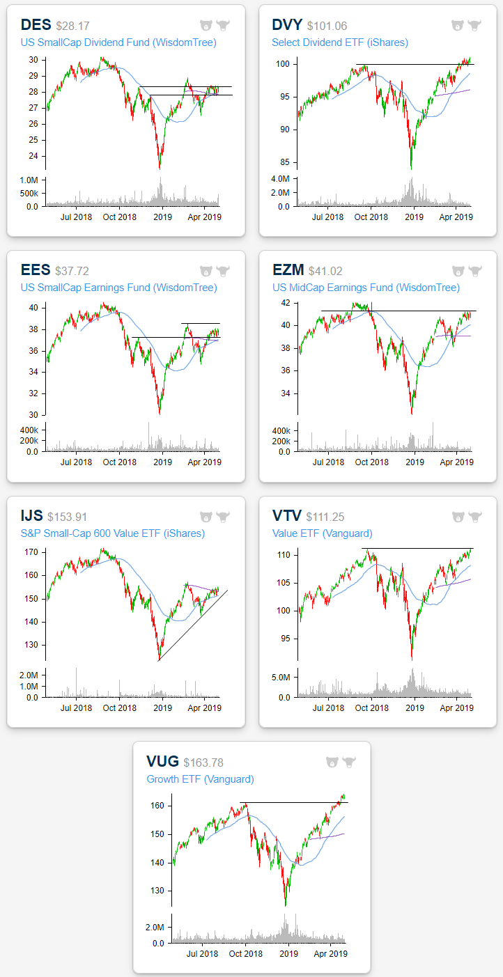
Small Caps Not In Style
Looking across various investing style ETFs in our Chart Scanner tool, small-cap focused ETFs have significantly lagged mid-cap and large-cap ETFs of similar styles this year. Whereas most of the ETFs are either above or near last year’s highs/all-time highs, small caps are still well below. Starting with a look at dividend-focused ETFs, the small-cap version (DES) surged in the first few months of the year, briefly taking out the lower highs from Q4 2018, but has failed to move considerably higher since. In the past month, DES has been trading in a tight range between the two lower highs from Q4. Conversely, the broader Select Dividend ETF (DVY)—as well as other dividend ETFs like the Vanguard Dividend Appreciation ETF (VIG), S&P Dividend ETF (SDY), and the MidCap Dividend fund (DON)—has seen a more consistent uptrend, distinctively breaking out above last year’s highs.
Earnings focused funds are seeing similar price action. The SmallCap Earnings Fund (EES) is well off of prior highs, stuck between highs from earlier this year and lower highs from late last year like DES. The MidCap Earnings Fund (EZM) has managed to get much closer to its prior highs, but it has in fact been trading sideways right under a range from late last summer. This is while the Total Earnings Fund (EXT) is just below highs from last year. So even while no earnings focused funds have taken out last year’s highs, those that are not small cap focused have performed better.
Even when it comes to growth and value it is the same story. The Small Cap version of growth (IJR) and value (IJS) have both been stuck under lower highs that were established during last year’s sell-off. In recent weeks both IJR and IJS have been trading right in between the upward trending 50-DMA and 200-DMAs that are in downtrends. In the past week each one has begun to push above these 200-DMAs but not in any distinct breakout. Meanwhile, other value and growth ETFs, the Vanguard Value ETF (VTV) and Vanguard Growth ETF (VUG), have been in strong, uninterrupted uptrends right up to new highs. All in all, when it comes to style, market cap has seemed to have played a greater role than other factors. Start a two-week free trial to Bespoke Premium to access our interactive Chart Scanner and much more.
US Strong(ish) GDP Still Beating Rest of World
As we discussed in last Friday’s Bespoke Report, US GDP data released last week was a bit of a mixed bag. The headline number solidly beat at a 3.2% QoQ clip, though, the underlying components were weaker including consumption and fixed investment weakening. Domestic Final Private Demand, which excludes government, trade, and inventories, came in 1.12% weaker than the Q4 data at 1.09% QoQ growth for Q1.
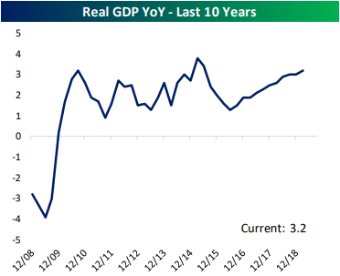
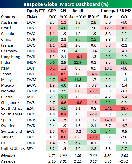
Putting any concerns from the underlying components of GDP aside, the US macroeconomic backdrop is still attractive relative to the 22 other countries tracked in our Global Macro Dashboard. In fact, at 3.2% YoY growth, US GDP growth is the fourth highest of these countries we track behind only emerging market countries China, India, and Malaysia. While China and India are seeing over 6% YoY growth, Malaysia is growing at 4.7%. The next highest GDPs behind the US are Russia and Singapore tied at 2.7% YoY. In other words, the US is blowing other developed nations out of the water in terms of GDP growth. Across the board, most US indicators we look at in the Global Macro Dashboard appear better than the average and median readings for the other countries. The US has the second highest growth rate of M2 money supply which theoretically should be further stimulative to the economy. In manufacturing, Industrial Production has held up fairly well as the US has the joint third highest growth (alongside Australia) of the 22 countries. While not explosive like India or Malaysia, retail sales growth is also better than a majority of other countries while the unemployment rate remains low. Start a two-week free trial to Bespoke Institutional to receive our Global Macro Dashboard and much more.
Interesting Industries
On top of sector ETFs, our Trend Analyzer and Chart Scanner tools have the option to take a look at the ETFs of a number of industry groups as well. Below we highlight several of these.
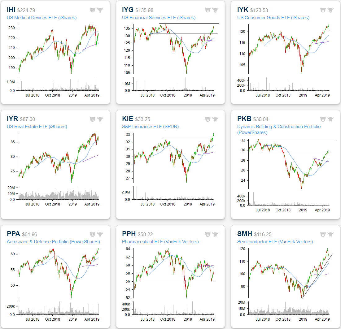
In the past few weeks, we have repeatedly highlighted that the Health Care sector had dramatically fallen out of favor, turning negative on the year and reaching extremely oversold levels. But since last week, the sector has begun to turn around. While the sector ETF’s chart (XLV) may not have bottomed at any obvious support level, two of the industries within the sector have bounced at interesting levels. The US Medical Devices industry ETF (IHI) fell pretty much vertically, right through the 50-DMA, in this most recent sell-off. Early last week, it came down to the 200-DMA which proved as much firmer support. The ETF bounced off this moving average last Monday (4/22) and has gained just over 5% since. Meanwhile, Pharmaceuticals (PPH) fell right through the 50-DMA as well as its 200-DMA, but it also put in a bottom early last week. The Pharma ETF seems to have found support near the $60 mark, at the bottom of a range from earlier this year and from the spring of 2018.
While Health Care has been rallying, so too has the Financial sector (XLF). XLF is currently the most overbought of the sector ETFs sitting just over 2 standard deviations above the 50-DMA. Of the underlying industries, Financial Services (IYG) and Insurance (KIE) have been notably strong. IYG has a similar chart pattern to the S&P 500, but while the broader index may have reached all-time highs, IYG still has a bit more progress to make. The most recent leg higher in the past month has brought IYG back into its range from late summer/early fall of last year. Currently, it needs to move another few points higher to reach its own all-time highs. S&P Insurance (KIE) on the other hand has been ripping higher, now sitting extremely overbought after a 2.56% gain over the past week (the third best of all industry group ETFs in that time). While this may not provide the best time to hop in (our Trend Analyzer gives the ETF a poor timing score), the push above last year’s highs is worth noting.
Speaking of new highs, both Consumer Goods (IYK) and Aerospace and Defence (PPA) are breaking out above last year’s highs. Both have reached extreme overbought territory at their current levels meaning momentum may carry them a little bit higher, but these highs may not hold for long. Additionally, there may be more short term momentum as these two have some strength in their underlying companies’ earnings reports. Today alone, Estee Lauder (EL) for Consumer Goods and L3 Technologies (LLL) and Harris (HRS) for Aerospace & Defense all reported earnings Triple Plays.
Construction spending data has been a bit mixed in recent months, with today’s print coming in weaker at -0.9% MoM. The Dynamic Building and Construction Portfolio ETF (PKB) has not necessarily been reflective of the weaker prints, rising over 26% year to date. After a strong run through the first four months of the year, PKB closed yesterday back into the lower end of last year’s range. The ETF now has upside towards last year’s highs around $32. Meanwhile, Real Estate (IYR) has been in a steady uptrend all year. In recent week’s, the industry has stumbled, pulling back to the 50-DMA. Whereas IYR was overbought before this, it is now only neutral and has a good timing score in our Trend Analyzer.
IYR is not alone in seeing a pullback in an uptrend. Semis (SMH) have seen the same following some weaker earnings last week from the likes of Intel (INTC). Given the industry’s impressive 33.19% run so far this year, some type of greater mean reversion is increasingly possible, so this pullback should be watched. Start a two-week free trial to Bespoke Premium to access our Chart Scanner tool and much more.
B.I.G. Tips – Years Like 2019 – May Edition
Fixed Income Weekly – 5/1/19
Searching for ways to better understand the fixed income space or looking for actionable ideals in this asset class? Bespoke’s Fixed Income Weekly provides an update on rates and credit every Wednesday. We start off with a fresh piece of analysis driven by what’s in the headlines or driving the market in a given week. We then provide charts of how US Treasury futures and rates are trading, before moving on to a summary of recent fixed income ETF performance, short-term interest rates including money market funds, and a trade idea. We summarize changes and recent developments for a variety of yield curves (UST, bund, Eurodollar, US breakeven inflation and Bespoke’s Global Yield Curve) before finishing with a review of recent UST yield curve changes, spread changes for major credit products and international bonds, and 1 year return profiles for a cross section of the fixed income world.
In this week’s report we discuss which areas of fixed income have delivered the largest absolute and risk-adjusted returns this year, and why they have posted such strong numbers.

Our Fixed Income Weekly helps investors stay on top of fixed income markets and gain new perspective on the developments in interest rates. You can sign up for a Bespoke research trial below to see this week’s report and everything else Bespoke publishes free for the next two weeks!
Click here and start a 14-day free trial to Bespoke Institutional to see our newest Fixed Income Weekly now!
Bespoke’s Closer Report — Global Macro Outlook — May 2019
Bespoke macro strategist George Pearkes recently gave a presentation on our global macro outlook at the 2019 NAAIM (National Association of Active Investment Managers) Uncommon Knowledge National Conference. If you’re a Bespoke Institutional member, you can read it by logging in here. If you’re not yet a member and would like to read the report, please start a two-week free trial to Bespoke Institutional.

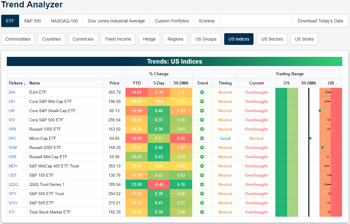
Trend Analyzer – 5/1/19 – Energy Tanking, Healthcare Coming Back
The major index ETFs are starting off May generally overbought with only the Micro-Cap ETF (IWC) sitting in neutral territory. Ahead of today’s FOMC meeting, most of the major index ETFs are up modestly over the past week with the Russell 2000 (IWM) having risen the most. On the other end of the spectrum, the Nasdaq (QQQ) has fallen 0.4% in the same span of time. Other large caps have also lagged behind with the Dow (DIA) down -0.26% and the S&P 100 (OEF) only up 0.22%. The only other ETF to see a loss in the past week is the Core S&P Mid Cap (IJR). Each of these underperforming ETFs are also coming off of extreme overbought levels, so these declines are warranted.
Start a two-week free trial to Bespoke Premium to access our interactive economic indicators monitor and much more.
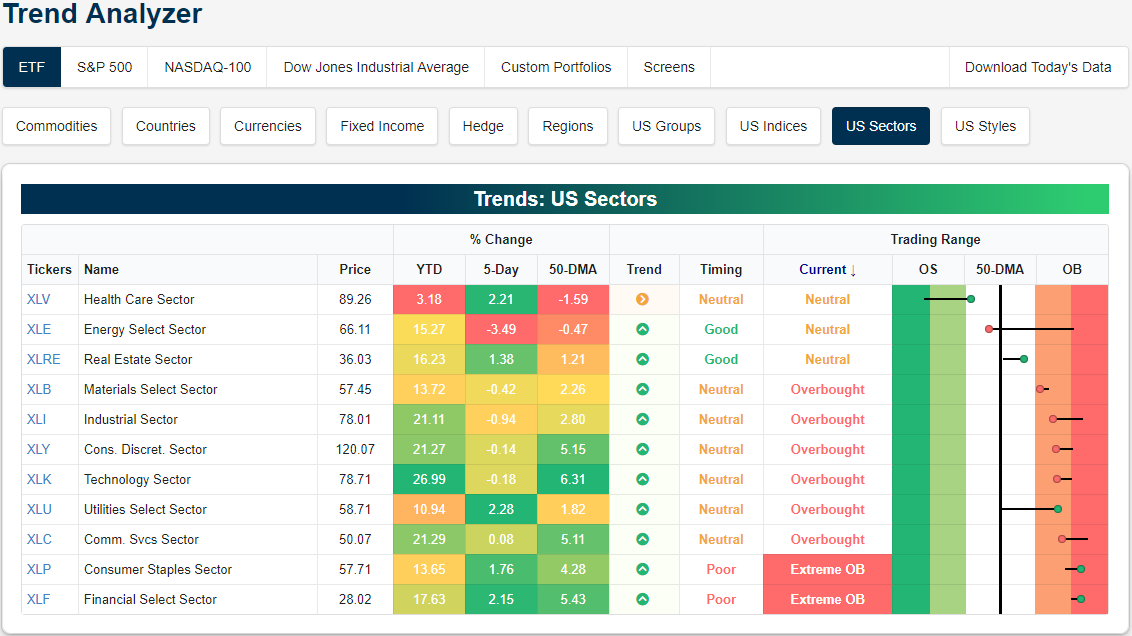
Turning to the individual sectors, Consumer Staples (XLP) and Financials (XLF) have become extremely overbought following strong gains over the past week. While both of these sectors have been strong, Utilities (XLU) have been even stronger, bouncing off the 50-DMA in the past week for a 2.28% gain. We have repeatedly highlighted Health Care’s (XLV) weakness in the past month as the sector reached extreme oversold levels. The worst for the sector seems to be over for now as it has moved back into neutral territory. It is still grossly underperforming on a YTD basis, only up 3.18% versus all other’s sectors double-digit returns. Meanwhile, Energy (XLE) has hit a bit of a rough patch having fallen 3.49% in the past five days. After sitting at extremely overbought levels, it has collapsed through the 50-DMA.
Bespoke’s Global Macro Dashboard — 5/1/19
Bespoke’s Global Macro Dashboard is a high-level summary of 22 major economies from around the world. For each country, we provide charts of local equity market prices, relative performance versus global equities, price to earnings ratios, dividend yields, economic growth, unemployment, retail sales and industrial production growth, inflation, money supply, spot FX performance versus the dollar, policy rate, and ten year local government bond yield interest rates. The report is intended as a tool for both reference and idea generation. It’s clients’ first stop for basic background info on how a given economy is performing, and what issues are driving the narrative for that economy. The dashboard helps you get up to speed on and keep track of the basics for the most important economies around the world, informing starting points for further research and risk management. It’s published weekly every Wednesday at the Bespoke Institutional membership level.
You can access our Global Macro Dashboard by starting a 14-day free trial to Bespoke Institutional now!

Morning Lineup – New Month, Same Trend
Welcome to what has historically been the start of the toughest six month period for US equity markets. While the May through October period may not be the market’s best time of year, it is starting off on a positive note as all of the major averages are pointing to higher opens. The driver of this morning’s strength isn’t any sort of positive sentiment coming out of Asia or Europe, because those markets are all closed for the day. No, the key today is earnings. In yesterday’s note, we said it’s not all about Alphabet (GOOGL), and we’re seeing that play out again today as more than 65% of the nearly 200 companies that have reported since yesterday’s close exceeded EPS forecasts and a very impressive 63% beat revenue forecasts!
Outside of earnings, the ADP Private Payroll report was just released and came in at 275K, topping expectations by 95K for the strongest report relative to expectations since February 2017 and the 6th best report relative to expectations since 2006.
We’ve just published today’s Morning Lineup featuring all the news and market indicators you need to know ahead of the trading day. To view the full Morning Lineup, start a two-week free trial to Bespoke Premium.

With another month of positive returns in the books, we wanted to provide a quick update on how the S&P 500’s current performance over the short and long-term stacks up to historical averages. Current annualized returns for the S&P 500 over the last one, two, five, and ten years are all above the historical average. The only time window where returns have been subpar is over the last twenty years where the 6.0% annualized gain is well below the long-term average of 11.0%. Keep in mind, though, that this is a period that encompasses two bear markets where the S&P 500 lost half of its value.

In terms of where the current one, two, five, ten, and twenty year returns stack up in percentile terms, for the most part, they aren’t terribly stretched. For the one, two, and five year periods, returns are all less than the 60th percentile, while 20-year returns are only in the 4th percentile. Again, the only period that is elevated is the ten-year time frame where the S&P 500’s annualized return is better than three-quarters of all other ten-year windows.

Start a two-week free trial to Bespoke Premium to see today’s full Morning Lineup report. You’ll receive it in your inbox each morning an hour before the open to get your trading day started.
The Closer — Overrated Rebalancing, EURUSD Pop, US Data Dollop — 4/30/19
Log-in here if you’re a member with access to the Closer.
Looking for deeper insight on markets? In tonight’s Closer sent to Bespoke Institutional clients, we begin by evaluating the theory that monthly rebalancing has been driving the market at month’s end. In FX, we then take a look at the dollar’s weakness versus the euro. Turning to macro data, we review this morning’s release of MNI’s Chicago PMI which is pointing to a questionably bad ISM Manufacturing reading. We also look at today’s pending home sales data and the S&P/Case-Shiller home prices before finishing with an update on the Employment Cost Index.

See today’s post-market Closer and everything else Bespoke publishes by starting a 14-day free trial to Bespoke Institutional today!