Bespoke’s Morning Lineup – 3/5/20 – 52-Week High? In China?
See what’s driving market performance around the world in today’s Morning Lineup. Bespoke’s Morning Lineup is the best way to start your trading day. Read it now by starting a two-week free trial to Bespoke Premium. CLICK HERE to learn more and start your free trial.
Futures are sharply lower this morning, but not enough to erase all of yesterday’s gains. Jobless claims were just released and came in 1K higher than expectations (216K vs 215K). Given the weakness in equities, the yield on the 10-year is not surprisingly back well below 1.0%. A lot can change between now and the close, so we’ll see how the day shakes out as the number of cases rise, events get canceled, more schools close, and companies continue to lower guidance.
Read today’s Bespoke Morning Lineup for the latest stock-specific news of note, updates on the coronavirus, and a discussion of the latest proposed OPEC cuts in oil production.

US futures are lower, and the S&P 500 is already 7.5% from its record close in February. Don’t look now, but one major economy’s equity benchmark saw a 52-week high on a closing basis overnight, and it was China! China’s CSI 300 has now fully recovered all of its losses from the coronavirus outbreak after a 2.5% gain overnight. Now, before you dismiss it all as China propping up its market by prohibiting investors from selling, we would note that the US-based ETF that tracks the index (ASHR) also closed yesterday within 2.5% of its 52-week high. In other words, investors can freely buy and sell the Chinese market.

The US is another story. Equities are still sharply off their highs. Yesterday, we noted the emerging uptrend in both the S&P 500 and Russell 2000 on an intraday basis. One thing to note about yesterday’s rally is that for both indices, the market closed right before they were able to make a higher high. With both indices now poised to open sharply lower, the first important level to watch is yesterday’s low in the S&P 500 of roughly 3,033.

The Closer – A Second Bite at the 4% Apple – 3/4/20
Log-in here if you’re a member with access to the Closer.
Looking for deeper insight on markets? In tonight’s Closer sent to Bespoke Institutional clients, we take a look at the market reaction to today’s rate cuts and where equities stand relative to short term rates. We then take a look at the record low yields in the US and abroad. Next, we show just how much bonds have outperformed equities before reviewing credit markets. We finish by looking through derivative markets.

See today’s post-market Closer and everything else Bespoke publishes by starting a 14-day free trial to Bespoke Institutional today!
Daily Sector Snapshot — 3/4/20
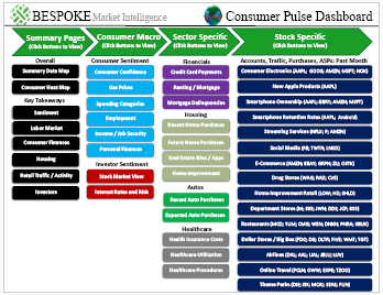
Bespoke’s Consumer Pulse Report — March 2020
Bespoke’s Consumer Pulse Report is an analysis of a huge consumer survey that we run each month. Our goal with this survey is to track trends across the economic and financial landscape in the US. Using the results from our proprietary monthly survey, we dissect and analyze all of the data and publish the Consumer Pulse Report, which we sell access to on a subscription basis. Sign up for a 30-day free trial to our Bespoke Consumer Pulse subscription service. With a trial, you’ll get coverage of consumer electronics, social media, streaming media, retail, autos, and much more. The report also has numerous proprietary US economic data points that are extremely timely and useful for investors.
We’ve just released our most recent monthly report to Pulse subscribers, and it’s definitely worth the read if you’re curious about the health of the consumer in the current market environment. Start a 30-day free trial for a full breakdown of all of our proprietary Pulse economic indicators.
Health Care Caring About Politics
Stocks experienced an impressive rebound today with the S&P 500 up around 4.25%. One of the best performing sectors today was Health Care which gained 5.76%. Performance has been even more impressive for the Health Care Providers and Services industry which was up over 12%. The major catalyst has been Joe Biden’s strong performance on Super Tuesday placing him as the front runner for the Democratic ticket. Betting markets (ElectionBettingOdds.com) now give the former Vice President an 83% chance of being Trump’s challenger come November as shown in the chart below. Over the past year, no Democratic candidate has been given this much certainty to win the nomination. Biden’s surge in the past couple of days has borrowed from not only those who have dropped out of the race like Bloomberg, but also from more progressive candidates like Bernie Sanders and Elizabeth Warren. With those more progressive candidates who threaten to shake up the Health Care space on the decline, Health Care stocks have had reason to run. Today’s response by these stocks to Sander’s decline in the polls is perhaps a more dramatic version of the same dynamic as we saw in late 2019 during Senator Warren’s rise and subsequent fall as the Democratic favorite. Start a two-week free trial to Bespoke Institutional to access our interactive tools and full range of research.

Bespoke CNBC Appearance (3/4/20)
Bespoke co-founder Paul Hickey appeared on CNBC’s Squawk Box this morning to discuss markets and where they stand after the recent declines. To view the segment, please click on the image below.

Chart of the Day: You Don’t See This Very Often
Fixed Income Weekly – 3/4/20
Searching for ways to better understand the fixed income space or looking for actionable ideas in this asset class? Bespoke’s Fixed Income Weekly provides an update on rates and credit every Wednesday. We start off with a fresh piece of analysis driven by what’s in the headlines or driving the market in a given week. We then provide charts of how US Treasury futures and rates are trading, before moving on to a summary of recent fixed income ETF performance, short-term interest rates including money market funds, and a trade idea. We summarize changes and recent developments for a variety of yield curves (UST, bund, Eurodollar, US breakeven inflation and Bespoke’s Global Yield Curve) before finishing with a review of recent UST yield curve changes, spread changes for major credit products and international bonds, and 1 year return profiles for a cross section of the fixed income world.
In this week’s report we discuss how disjointed fixed income pricing has gotten as a result of equity market declines and Fed easing.

Our Fixed Income Weekly helps investors stay on top of fixed income markets and gain new perspective on the developments in interest rates. You can sign up for a Bespoke research trial below to see this week’s report and everything else Bespoke publishes free for the next two weeks!
Click here and start a 14-day free trial to Bespoke Institutional to see our newest Fixed Income Weekly now!
No Sickness In Services
ISM’s Non-Manufacturing index has now risen for three straight months for the first time since the three months ending in August of 2014. Up to 57.3, the index is at its highest level since February of last year. Likewise, the composite reading (including both the service and manufacturing indices) has now risen in back-to-back-to-back months for the first time since April 2016. The index is now at 56.5, and is healthily above the recent multiyear low of 52.9 from September. That 56.5 reading is also the highest the composite has been since February of last year.

As with the Manufacturing Index which we discussed on Monday, due to the timing of the survey the full effects of the outbreaks of Covid-19 outside of China are not fully represented in this report as those occurred later in the month. But even more limited to China, just as the manufacturing report did, company comments highlighted the coronavirus as a growing concern nonetheless. From these comments, the impacts of the virus do not appear to be extremely widespread at the moment with only three industries referencing it. While Construction and Health Care industries have noted concrete effects in the form of “increased lead times for critical items” and “major back-orders” for items like masks and gloves, the mining industry failed to mention more specifically what consequences have already taken effect. For both the Manufacturing and Non-Manufacturing reports, expect mentions of the virus to be much more prevalent in the commentary section next month.

Breadth in this month’s report was strong with every category now sitting in expansionary territory, two of which—Backlog Orders and Inventories—were not last month. Additionally, all but three categories (Business Activity, Prices, and Import Orders) rose from one month ago. Compared to one year ago, breadth is more mixed.
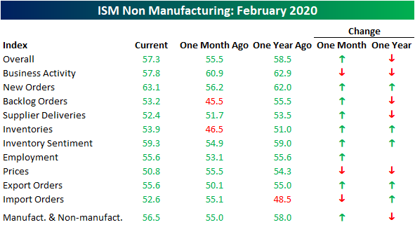
New Orders were a bright spot rising to 63.1 which is tied with June of 2018 for the strongest reading since July of 2015 when the New Orders index was just slightly higher at 63.4. Prior to that, you would need to go back to 2004 through 2005 when there were several months of higher readings. Additionally, the month-over-month increase of 6.9 points was the sixth-largest increase on record and the largest since a 7.6 point increase in January of 2018. While this could change in next month’s report, this shows that at least prior to the coronavirus outbreaks outside of China, activity in the services sector was near historically strong levels.

Backlog Orders echoed this trend. The index rose 7.7 points which was the largest month-over-month jump in Backlog Orders since May of 2018. Again, this seems to point to solid demand for the service sector.

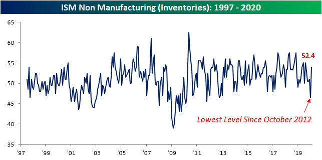
To handle this stronger demand and get ahead of future impacts from the coronavirus, businesses have also increased inventories. After falling to 46.5 last month, the lowest level since October of 2012, Inventories rose back into an expansionary level at 52.4. That was the largest increase in a single month since April of 2014.
Despite this strong demand, the index for Prices Paid has continued to slide falling to 50.8. While not indicating falling prices (readings under 50), it is the weakest reading since May of 2017. While low this month, this index is yet another category that could see a quick turnaround in the coming months assuming shortages from the coronavirus leads to higher prices as is beginning to be seen with some commodities. Start a two-week free trial to Bespoke Institutional to access our interactive economic indicators monitor and much more.

Bespoke’s Global Macro Dashboard — 3/4/20
Bespoke’s Global Macro Dashboard is a high-level summary of 22 major economies from around the world. For each country, we provide charts of local equity market prices, relative performance versus global equities, price to earnings ratios, dividend yields, economic growth, unemployment, retail sales and industrial production growth, inflation, money supply, spot FX performance versus the dollar, policy rate, and ten year local government bond yield interest rates. The report is intended as a tool for both reference and idea generation. It’s clients’ first stop for basic background info on how a given economy is performing, and what issues are driving the narrative for that economy. The dashboard helps you get up to speed on and keep track of the basics for the most important economies around the world, informing starting points for further research and risk management. It’s published weekly every Wednesday at the Bespoke Institutional membership level.
You can access our Global Macro Dashboard by starting a 14-day free trial to Bespoke Institutional now!
