April 2020 Headlines
Keeping Track of COVID-19 Across States: Improving Case Counts
Keeping track of the improvement – and in some cases, deterioration – of COVID numbers across the US is a big job. Every day in The Morning Lineup we update the table below to identify where COVID-19 case counts are rising or falling, and where they stand relative to the recent history of that state’s outbreak. We also include a second table, which shows the improvement or deterioration in testing in each state.
The best-case scenario for a state is for case counts to be dropping while the positive test rate falls. That implies that spread has slowed even as more cases in the community are detected. Some of the states with falling case counts and falling positive test rates that are the farthest from their peaks include Florida, Michigan, Wyoming, New York, Louisiana, Alaska, Vermont, Hawaii, and Montana. Georgia is another state with falling case counts and falling positive test rates even though its re-open measures began two weeks ago.
At the opposite end of the spectrum is a state like Minnesota, which is dealing with accelerating numbers of cases even as positive test counts are rising, implying more rapid spread of the virus.
To summarize, most states are reporting slower case count growth, which is a good sign, and relatively few are reporting increases in positive test rates. As more states re-open, it will be helpful to monitor these numbers along with hospitalization rates. A rise in case counts is to be expected with more activity. Start a two-week free trial to Bespoke Institutional to access our Chart Scanner, custom screens, and much more.


To assess the overall breadth of successful virus containment, in the chart below we show the number of states that have rising cases and rising positive rates. For both series, declines are “good” because they indicate increased testing penetration and lower case counts across the country. As shown, less than 15 states are seeing positive test rates rise, while only slightly more (the lowest of the outbreak) are seeing the number of cases pick up.

Bespoke’s Morning Lineup – 5/12/20 – Don’t Bank on It
See what’s driving market performance around the world in today’s Morning Lineup. Bespoke’s Morning Lineup is the best way to start your trading day. Read it now by starting a two-week free trial to Bespoke Premium. CLICK HERE to learn more and start your free trial.
Futures have been rallying off their overnight lows and are now indicated 0.30% higher. CPI for April was just released and came inline with expectations (-0.8%) at the headline level and weaker than expected on a core basis (-0.4 vs -0.2%). Inflation data will certainly be interesting to watch over the coming months, but for now, the impact of the pandemic on consumer prices (besides groceries which is the only place consumers are really spending these days) is definitely lower.
Be sure to check out today’s Morning Lineup for a rundown of the latest stock-specific news of note, the Fed’s plans for buying ETFs, the NFIB Small Business Sentiment Survey, the latest global and national trends related to the COVID-19 outbreak and much more.

It’s been a rough year for the banks. Despite coming into this crisis much better capitalized than they were during the last, the sector still hasn’t been able to avoid the pain. Year to date, the group is down about 40% which is worse than any other industry group in the S&P 500.
The Bank group had been trending nicely off ifs March lows and even closed above its 50-DMA for a day on 4/29. That didn’t last long, though. In recent days, the KBW Bank Index has not only given up its 50-DMA, but it has also broken below its uptrend line from the lows. Just yesterday, while the S&P 500 was up fractionally, the KBW Bank Index was down over 3%. While the major banks increased their loan loss provisions in their most recent earnings reports, just like a gallon of milk, the longer the economy stays ‘on the shelf’ the more likely it is that loans on their books will start to spoil.

Daily Sector Snapshot — 5/11/20
US Economic Recessions
With numbers like we saw in last Friday’s employment report, the current downturn no doubt ranks as one of, if not, the steepest downturns in US history. What started in March still hasn’t been officially designated a recession, but unlike prior downturns when investors and economists usually couldn’t even initially agree on whether the economy was in a recession or not, the only question this time around is how long and deep it will be. Because the drop-off in economic activity was so sharp and sudden, by some measures we may have already seen the depths of the contraction. If that ends up being the case, though, one could even argue that whatever it is we’ve been going through the last several weeks doesn’t even meet the criteria for a recession.
Huh? According to the NBER, which is the organization in charge of classifying recessions, they are characterized as “a significant decline in economic activity spread across the economy, lasting more than a few months, normally visible in real GDP, real income, employment, industrial production, and wholesale-retail sales.” Economic activity essentially peaked in February to early March before the lockdowns started, and from there, the economy came to an absolute standstill. With parts of the economy already starting to open up, though, if that trend continues, the trough of the contraction would have occurred in April. At that rate, the entire contraction would have spanned a period of two months at most. While the definition of a ‘few’ isn’t a specific number, if a couple is two, then a few would be three or more.
Whether the length of the economic contraction ultimately meets the criteria for an official recession is irrelevant. The fact is that never before have we seen such a large number of Americans lose their jobs in such a short period of time, and if businesses aren’t able to get back up and running soon, the dislocations it causes will take years to repair. So how long does a pandemic induced recession typically last? Unfortunately, there aren’t a lot of examples on that front. The chart below shows the length of US economic recessions going back to 1900, and while the recession brought on by the Spanish Flu back in 1918 wasn’t the shortest recession of the last 120 years, at just seven months, it was the second shortest and wasn’t even long enough to result in a bear market for the Dow. As crazy as the market’s rebound off the lows has been in the last six weeks, can you imagine if Twitter was around in 1918 when in the midst of that pandemic the DJIA never even saw a peak to trough decline of 11%? Start a two-week free trial to Bespoke Institutional to access our full library of research and interactive tools.
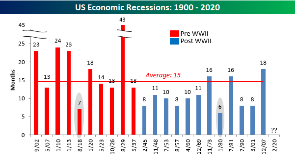
Chart of the Day: FAST Rebound and Other Pockets of Strength in Industrials
Who Needs Roller Coasters When They Can Have the Stock Market?
The US equity market’s rally off the March lows has spawned moves over a few weeks in individual stocks that would normally take years to play out. Within the Russell 3000 as a whole, approximately 4% of the stocks in the index (125) have more than doubled from their closing levels on 3/23. At face value, that’s an extremely impressive reading. However, if you dig a little, you would also find that more than half of those stocks that have doubled are still down YTD. Amusement parks may still be closed, but who needs them when you have a roller coaster ride like the stock market.
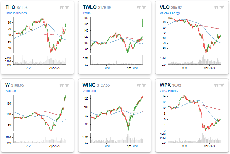
There’s not enough space to list each of the stocks that have doubled from their closing levels on 3/23, so in the interest of space, the table below lists the 25 stocks in the Russell 3000 with market caps of $2.5 billion or more that have doubled since 3/23 sorted by market cap. The largest of the ‘doublers’ listed is Valero (VLO) which just barely made the cut gaining ‘only’ 102.9%. Behind Valero (VLO), the only other doublers with market caps of more than $10 billion are Twilio (TWLO), Moderna (MRNA), Wayfair (W), and Carvana (CVNA). Wayfair is also the top-performing stock on the list with a gain of over 500%! We’re not sure which, but at some point in the last two months, the market’s valuation of W was way off the mark. To put Wayfair’s YTD move in perspective, though, even with a 500%+ rally, the stock is still up only 112% YTD.
Just as we pointed out with regards to the entire universe of stocks that have doubled since 3/23, a large number of stocks listed below are also down YTD. Even the largest of the doublers – Valero – is still down 29.3% YTD. Looking through the list, most of the other stocks listed that are still down YTD are from the Energy sector. Below the table, we have also included charts of each stock (except Bill.com which hasn’t been public for six months). As shown, many of the stocks listed are trading at extremely overbought levels after their significant rallies, and investors would probably be best served to not chase these names from here. For clients with access, we have also created a custom portfolio, so you can track these names over time to see how they digest and consolidate the recent surges. Start a two-week free trial to Bespoke Institutional to access our Custom Portfolios, interactive tools, and full library of research.


Bespoke’s Morning Lineup – 5/11/20 – Slow Start to the Week
See what’s driving market performance around the world in today’s Morning Lineup. Bespoke’s Morning Lineup is the best way to start your trading day. Read it now by starting a two-week free trial to Bespoke Premium. CLICK HERE to learn more and start your free trial.
When futures opened last night, it was looking like there would be some positive follow-through from last week’s rally, but the gains evaporated overnight as weakness in Europe dampened sentiment on our side of the Atlantic. As things stand now, the S&P 500 is looking at a gap down of 0.80%. Crude oil was also weaker but has reversed into positive territory after Saudi Arabia announced a unilateral 1 million barrel per day production reduction. On the data front, it’s a quiet start to the week, but there’s still a number of earnings reports on the calendar
Be sure to check out today’s Morning Lineup for a rundown of the latest stock-specific news of note, economic data out of Europe and China, and the latest stats and figures surrounding the COVID-19 outbreak.
From a seasonality perspective, this morning’s weakness doesn’t seem out of line. From our Seasonality Tool, the S&P 500 is currently entering what has historically been one of the weakest periods of the year. As shown below, the S&P 500’s median performance from the close on 5/11 through 5/18 has been a decline of 0.65% which ranks in just the 9th percentile for all one week periods of the year. The S&P 500’s median one-month return is positive at 0.37% but still ranks below the 30th percentile of all rolling one month periods. While one week and one month returns come in at the low end of the historical range, the S&P 500’s median three-month gain of 3.08% ranks considerably better in the 61st percentile of all rolling three-month periods.

Bespoke Brunch Reads: 5/10/20
Welcome to Bespoke Brunch Reads — a linkfest of the favorite things we read over the past week. The links are mostly market related, but there are some other interesting subjects covered as well. We hope you enjoy the food for thought as a supplement to the research we provide you during the week.
While you’re here, join Bespoke Premium for 3 months for just $95 with our 2020 Annual Outlook special offer.
Changing Patterns
Coronavirus Escape: To the Suburbs by C.J. Hughes (NYT)
New Yorkers who have spent their adult lives in apartments across the Five Burroughs are making a bid for suburban living, nudged into a new environment by changing behavior and re-evaluated risk. [Link; soft paywall]
The Small-Business Die-Off Is Here by Annie Lowery (The Atlantic)
Low cash balances and tight margins made small businesses more vulnerable to the COVID collapse in spending, and it’s going to drive massive consolidation for a long time to come. [Link]
Travel From New York City Seeded Wave of U.S. Outbreaks by Benedict Carey and James Glanz (NYT)
COVID-19 ran wild through New York City in early March, which led visitors to carry the virus from the city to the far-flung hinterlands of Louisiana, Texas, and Arizona. New York wasn’t the only major community spread event, but it was the most severe. [Link; soft paywall]
Market Mavens
Ken Griffin’s Shutdown Playbook Kept Him on Top of Markets by Liz McCormick (Bloomberg)
Some quick thinking and infrastructure building means Citadel was able to quickly shift employees into a sequestered environment with all its necessary infrastructure. [Link; soft paywall]
Buffett’s Chance for a Blockbuster Deal Faded When Fed Stepped In by Katherine Chiglinsky (Bloomberg)
When the Fed stepped in to ease the credit and markets logjam in March, it allowed companies to find financing on much more generous terms than Berkishire was willing to give. [Link; soft paywall]
Life Down The Rabbit Hole
There Are No Hours or Days in Coronatime by Arielle Pardes (Wired)
Perceptions of time are not consistent amidst a lockdown that removes both the every day routines an the bigger events we reference to keep track of time’s passing. [Link]
Can we escape from information overload? by Tom Lamont (The Economist 1843)
What happens when we eliminate all light? A London artist did so and his experience in the dark for a month is instructive about the challenges of a world constantly demanding our attention. [Link]
This Week In Tech
Health Officials Say ‘No Thanks’ to Contact-Tracing Tech by Fred Vogelstein (Wired)
Tech giants tried to step in and develop rapid contract tracing solutions, but their efforts haven’t gotten much love from governments, who prefer tried and true methods of figuring out where people have been and who they might have exposed. [Link]
How Politicians Spend Their Money on the World’s Largest Social Media Platforms by Nicoló (Medium)
Various social media platforms offer detailed sources of information on how politicians around the world spend campaign dollars to reach voters. [Link]
The U.S. Labor Market During the Beginning of the Pandemic Recession by Tomaz Cajner, Leland D. Crane, Ryan A. Decker, John Grigsby, Adrian Hamins-Puertolas, Erik Hurst, Christopher Kurz, and Ahu Yildirmaz (UChicago Working Papers)
Using ADP data, the authors find a 22% decline in private sector employment, a 4.5% decline in hours worked by those who didn’t lose their jobs, much larger impacts for lower-paid workers, and most concerningly large declines in the number of going concerns. [Link; 52 page PDF]
Is the 1918 Influenza Pandemic Over? LongTerm Effects of In Utero Influenza Exposure in the Post-1940 U.S. Population by Doughlas Almond (Journal of Political Economy)
Babies of mothers pregnant during the 1918 flu pandemic had lower educational attainment, higher disability, lower income, and lower socioeconomic status than the birth cohorts close to them. [Link; 41 page PDF]
Pandemic Sports
The Dolphins have a plan to start letting fans attend NFL games, and it’s wild by James Dator (SBNation)
One-quarter of planned capacity attendance, six foot separations in lines at doors, pre-booked arrival times, online orders for stadium food, and more details feature in proposed plans for Miami’s stadium during football season. [Link]
How the Internet Created a Sports-Card Boom—and Why the Pandemic Is Fueling It by Emma Baccellieri (SI)
While attending sports events is still generally not safe, opening a pack of cards and rooting through the contents is a very different animal. [Link]
UFC Comes Out Punching for Pandemic Embattled ESPN by Ira Boudway, Eben Novy-Williams, and Lucas Shaw (Bloomberg Quint)
Pre-fight testing and antibody screenings will be conducted before a May 9th lineup of bouts. This will be the first live sports broadcast in the US since mid-March. [Link; soft paywall]
Weird News
A Hair-Raising History of the Flowbee by Jake Rossen (Mental Floss)
With millions unable to head to the barber, the appeal of the informercial-ready Flowbee is very, very real: no muss, no fuss! [Link]
Scientists discover evidence of ancient, nitrogen-rich Martian groundwater hiding in Antarctica by Rafi Letzter (Live Science)
Advances in technology and technique have allowed scientists to confirm that ancient meteors carrying debris from Mars included nitrogen rich deposits which indicate the presence of seas conducive to life on the Red Planet. [Link]
Education
When Schools Reopen, Don’t Ditch Online Learning by Aly Kassam-Remtulla (Wired)
Entirely-remote curricula are almost certainly not going to fly, but the COVID-19 outbreak has proven that some of the venues for remote learning can help students by improving flexibility. [Link]
Stories
LeVar Burton still loves reading aloud. His storytelling might be what you need right now. by Caitlin Gibson (WaPo)
The host of the “Reading Rainbow” is still reading stories: to children, to listeners on his podcast, and to his followers on Twitter. [Link; soft paywall]
Read Bespoke’s most actionable market research by joining Bespoke Premium today! Get started here.
Have a great weekend!
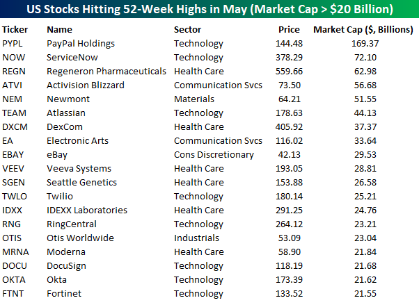
New Highs and They’re Not Mega Caps
If you’ve been paying attention over the last few weeks, all you’ve heard is how the large mega-cap tech stocks have been keeping the market afloat. The five largest stocks in the US (Microsoft, Apple, Amazon, Alphabet, and Facebook) have done extraordinarily well this year and since the March lows, but to say they’ve been doing all the lifting would be inaccurate. Take for example the fact that of the 2,052 US stocks with market caps above $500 million, 101 (4.9%) have hit 52-week highs so far in May and none of them are named Microsoft, Apple, Amazon, Alphabet, or Facebook. The table below lists the 19 US stocks with market caps above $20 billion that have hit 52-week highs so far this month. Looking at the list, only one of the names listed (PayPal) has a market cap above $100 billion and just four others have market caps above $50 billion. Not only are these names not mega-caps, but many of them are also stocks that most people have probably never heard of.
While mega-cap stocks may not be the ones hitting 52-week highs this month, one part of the argument behind which factors are driving the market that is partially accurate is that tech stocks are leading. Breaking out the table below by sectors 8 of the 19 names listed are from the Technology sector. Behind Technology, the next most heavily represented sector is Health Care with 6. However, when we expand the universe to all stocks hitting 52-week highs with market caps above $500 million, Technology doesn’t even top the list. With 49 stocks from the Health Care sector hitting 52-week highs this month, it tops the list followed by Technology with 26. Behind these two, no other sector accounts for even 10 names. These days, if you’re a company that’s not involved in Health Care or Technology, you’re dead to investors. Start a two-week free trial to Bespoke Institutional for full access to our research and interactive tools.