Daily Sector Snapshot — 6/17/20
Chart of the Day: Smart Money Indicator
Global Valuations Stretching
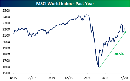
Generally speaking, stock markets around the globe have recovered a solid portion of their losses from earlier in the year. The MSCI World index is now just 8.86% below its February 12th all-time closing high after rallying 38.5% off of its March 23rd low.
With equities running higher around the globe, valuations have risen as well. The median price to earnings ratio of the 23 countries in our Global Macro Dashboard is now 19.89. That is actually down from some of the higher readings of the past couple of weeks when the P/E ratio was north of 20. As shown in the chart below, only about 10% of days over the past decade have seen the median P/E ratio at 20 or more. Most of those days came in January and February of this year and in parts of 2015 and 2016.

As shown in the table below, the median stock market’s P/E ratio is now in the 88th percentile of the past decade’s range. As for the 23 Global Macro Dashboard countries comprising that median reading, several including the US, Germany, Japan, and Norway are in the 90th percentile or better of the past decade’s range. Of all 23 countries, Norway has the highest overall P/E ratio of 41.22. Many of the other countries with the highest valuations like Brazil, Spain, and Japan all are also in the upper end of the past few years’ range. Meanwhile, China actually has one of the lowest valuations when compared to other countries, albeit that is at the highest level of the past couple of years. Other countries like South Africa, Mexico, and Canada are similarly at the lower end of the range of current country P/E ratios while also being at the upper end of their own range of the past few years. Click here to view Bespoke’s premium membership options for our best research available.

Job Losses Around the Globe
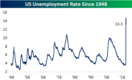
Every Wednesday we release our Global Macro Dashboard which covers major macroeconomic and stock market indicators across 23 of the world’s largest economies. One of the stats tracked is each country’s unemployment rate. Labor market data has been a major focus in the US as jobless claims have printed in the millions for multiple months now and the U-3 unemployment rate sits at 13.3%, off its April high of 14.7% but still at some of the highest levels since the Great Depression. High unemployment is not just a US phenomenon though. While it isn’t as extreme as the US, the world average across the 23 countries in our Global Macro Dashboard has soared and currently sits at 7.6%; the highest level in a decade.

In the charts below, we show eight countries that are experiencing some of the most dramatic upswings in unemployment. Our neighbor to the North, Canada, has a similar unemployment rate to the US both in terms of the rate itself and the sharp upswing over the past few months. Of the other countries in our Global Macro Dashboard, Brazil, South Africa, and Spain are the only other countries with double-digit unemployment rates at the moment. Like Canada and the US, the unemployment rates of Hong Kong, Malaysia, and South Korea have also all spiked to the highest levels of the past decade. Sweden, Australia, Germany, and Switzerland also all have seen large moves higher. Of these, only Germany has seen any respite as the US has in the most recent readings. Click here to view Bespoke’s premium membership options for our best research available.

Bespoke’s S&P 500 Sector Weightings Report
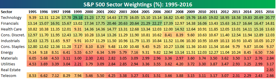
S&P 500 sector weightings are important to monitor. Over the years when weightings have gotten extremely lopsided for one or two sectors, it hasn’t ended well. Below is a table showing S&P 500 sector weightings from the mid-1990s through 2016. In the early 1990s before the Dot Com bubble, the US economy was much more evenly weighted between manufacturing sectors and service sectors. Sector weightings were bunched together between 6% and 14% across the board. In 1990, Tech was tied for the smallest sector of the market at 6.3%, while Industrials was the largest at 14.7%. The spread between the largest and smallest sectors back then was just over 8 percentage points.
The Dot Com bubble completely blew up the balanced economy, and looking back you can clearly see how lopsided things had become. Once the Tech bubble burst, it was the Financial sector that began its charge towards dominance. The Financial sector’s sole purpose is to service the economy, so in our view you never want to see the Financial sector make up the largest portion of the economy. That was the case from 2002 to 2007, though, and we all know how that ended.
Unfortunately we’ve begun to see sector weightings get extremely out of whack once again.
If you would like to see the most up-to-date numbers for S&P 500 sector weightings, simply start a two-week free trial to our Bespoke Premium or Bespoke Institutional services. Click back to this post to see the numbers once you’re signed up!
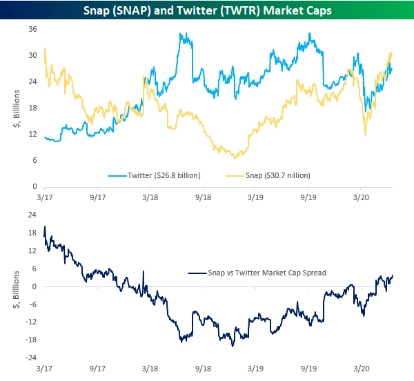
Battle of the Social Media Misfits
While both companies were touted by some as the next Facebook (FB) at the time of their IPOs, Twitter (TWTR) and Snap (SNAP) have clearly not lived up to their hype. Years after their respective IPOs, both companies trade well below levels they traded at immediately after they started trading. While neither company has been able to hold a candle to FB, for the last several years TWTR has mostly been considered the least bad of the two companies given its utility for a source of breaking news.
So far in 2020, both stocks have held up relatively well, but the tide has turned in SNAP’s favor. Looking at TWTR first, after a sharp drop during the COVID Crash, the stock has regained the bulk of its losses trading in a steady uptrend channel off the lows. While the stock has been unable to retake its February highs, it is up in the high single-digit percentage range on a YTD basis.

Turning to SNAP, if you look quickly, the chart looks very similar to TWTR. Looking a little closer, though, the stock has seen a steeper ascent off the March lows, and as a result, it has also managed to make new YTD highs in the last couple of weeks. SNAP first overtook its high from January on June 2nd, and while it pulled back with the overall market last week, it has rebounded to new highs in the last two days. Following this move, SNAP is 9% above its January high and up more than 32% YTD.

With SNAP’s recent outperformance, it also recently overtook TWTR in terms of market cap, and the gap has been widening ever since. In fact, with a current spread of $3.8 billion between the two stocks, the gap hasn’t been wider (in SNAP’s favor) since February 2018. Only time will tell whether or not this trend will continue, but analysts are currently expecting a lot stronger growth from SNAP than they are for TWTR. For this year and the next two, SNAP’s revenues are expected to rise by 23%, 38%, and 30%, respectively. Conversely, expected sales growth for TWTR in the same three years is expected to be much weaker at -5%, +22%, and +14%, respectively. For anyone with kids or teenagers, that kind of forecast makes sense as the first app they want when they get a phone is Snap, while the phrase, “Can I get a Twitter account?” is about as common as “Can I go to bed early tonight?” Click here to view Bespoke’s premium membership options for our best research available.
Surge in Mortgage Applications Continues
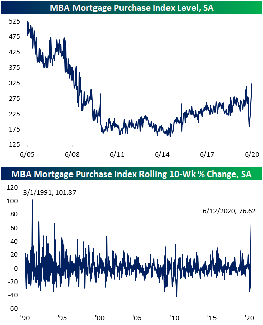
Housing market data is the main focus in today’s macroeconomic slate, and although Housing Starts and Building Permits both came in below estimates, weekly mortgage applications from the Mortgage Bankers Association (MBA) were much stronger. MBA’s seasonally adjusted purchase index rose another 3.46% week over week. That marked the ninth consecutive sequential increase (the longest such streak on record) and the highest level for the index of the post housing crisis period. In fact, this morning’s reading was the highest since the first week of 2009.
That is a massive rebound after purchase apps had fallen to their lowest levels since early October of 2015 back on April 10th. In the ten weeks since that low, purchases have rise 76.62%. As shown in the second chart below, that is the largest 10-week increase since the early days of the index: March of 1991.
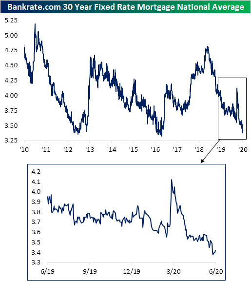
As for what has driven that surge in purchase applications, interest rates have played a major role. Although they are off the lows after rising a few basis points over the past few days, last Thursday the national average for a 30 year fixed rate mortgage fell to 3.38% which was the lowest level since October 3rd of 2016.
Low mortgage rates have also led to strong levels of refinancing applications. Earlier this year refinances spiked to their highest level since 2009. In the wake of that March peak, refinance application strength subsided a bit, but has remained at very strong levels. This week’s 10% WoW increase marked the first back to back weeks with higher refinance applications since the last week of February and the first week of March. That also comes after seven consecutive weeks of declines from mid-April through the end of May. Even though refinances are nearly 65% off that early March peak, they remain at some of the highest levels since 2013.

In addition to low rates, due to the COVID-19 shutdowns occurring during what is a seasonally strong time of year, seasonal catch up is also providing a boost this year. As shown below, the past few weeks have seen some of the strongest readings for the specific week of the year of the past decade. That comes shortly after shutdowns resulted in the weakest readings of the past decade for the weeks around March and early April. Additionally, purchases have continued to rise despite the annual peak typically having already occurred by this point in the year. In the past decade, the annual peak for purchases is usually put in place by mid-April or mid-May. The only year with an annual peak later than that was 2015 on account of a change in mortgage disclosure rules leading to a one time surge in purchase applications. While 2020 is far from over, the continued strong readings are sure to make a later seasonal peak than normal.
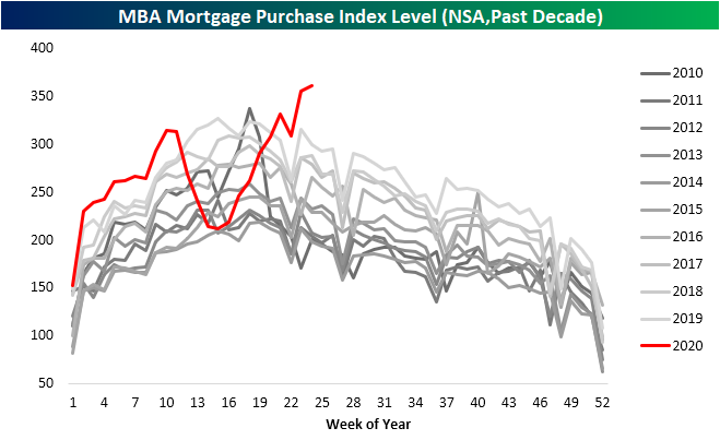
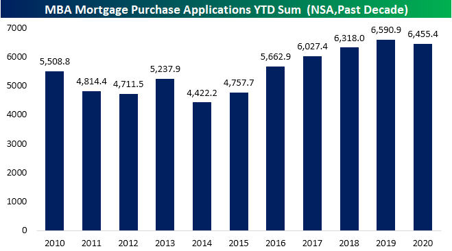
Despite the recent strength, the damage from weakness earlier in the year still hasn’ been undone. Looking at the YTD sum of purchase applications through the current week of the year (24th week) applications are down roughly 2% in 2020 vs 2019. Given that the US is in the midst of a global pandemic, however, it could be a whole lot worse. Click here to view Bespoke’s premium membership options for our best research available.
Bespoke’s Morning Lineup – 6/17/20 – Chips and Dips
See what’s driving market performance around the world in today’s Morning Lineup. Bespoke’s Morning Lineup is the best way to start your trading day. Read it now by starting a two-week free trial to Bespoke Premium. CLICK HERE to learn more and start your free trial.
Markets are poised for another positive start to the day today, although not nearly to the degree of yesterday’s surge. On the economic calendar, today’s big reports are Housing Starts and Building Permits. While the continued surge in mortgage applications suggested a positive backdrop for housing, the actual numbers came in weaker than expected. Housing Starts were expected to come in at a level of 1.1 million but were well short at 974K. For Building Permits, the 1.220 million print was also weaker than the 1.245 million consensus estimate.
Be sure to check out today’s Morning Lineup for a rundown of the latest stock-specific news of note, European auto sales, mortgage applications, global and national trends related to the COVID-19 outbreak, and much more.

In yesterday’s report, we discussed the rally in chips and how semiconductors trading at new highs relative to the S&P 500 was a positive trend for the broader market. From yesterday’s discussion of chips, today we wanted to highlight ‘dips’ and how investors have been buying them recently. In the last three trading days, the S&P 500 ETF (SPY) has finished the day more than 1.5% above its intraday low. That may not sound all that noteworthy, but before two occurrences in March, the last time we saw a similar pattern was back in 2011.
The idea of consistent buying on the dips sounds like a positive trend, but the reality is that it isn’t much of a consistent signal in either direction. The most recent occurrences in March, late 2011, and late 2008 all occurred in the later stages of market declines, but there was also an occurrence right near the 2007 peak as well as multiple occurrences from 2000 right through 2002. It sounds great in theory, but this is one trend we wouldn’t put much stock into.

Daily Sector Snapshot — 6/16/20
Citi’s US Economic Surprise Index at an All-Time High
Over the past few months, we’ve seen record drops and now record bounces for many of the most widely followed economic indicators. The Citi Economic Surprise indices, which track how economic data is coming in relative to forecasts, have been a prime example of the moves in economic data. Back at the end of April, the index for the US had fallen to a record low of -144.6, but that has since turned around. Even before the addition of today’s blockbuster US retail sales report, the Citi Economic Surprise index had reached a new all-time high yesterday. With a further boost from today’s releases, the all-time high is now even higher. That means that economic data in the United States has been coming in far stronger than economists have had penciled in.

While the US has seen big beats for the country’s economic data, the same cannot be said for the broader world. The global index (which would include the US) is at a much more modest level in just the 42nd percentile of all readings. Although it was briefly positive one week ago, the global index is not even positive. Negative readings indicate that more indicators from around the globe are still releasing at levels worse than forecast. Granted, that is still improved from April and May when the index was at some of its lowest levels since the Financial Crisis.

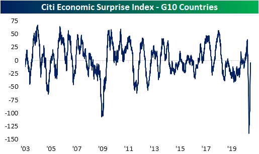
The same can also be said for the G10 countries. Even though the US has likely provided a boost, the index for G10 countries remains negative and more or less in the middle of its historic range. Unlike the global index, though, the index for the G10 has not been in positive territory since April 1st.
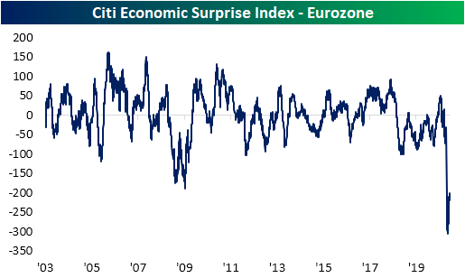
Taking another look at the developed world, more specifically the Eurozone, there has not been much of a rebound at all. The Citi Eurozone surprise index is currently around -200 compared to a low of -304.6 on May 11th. Despite the nearly 100-point increase over the past month, it is still in the bottom 1% of all readings since 2003.
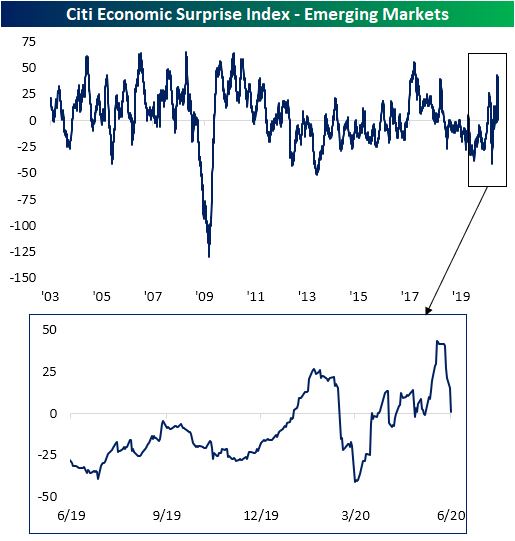
Switching over to Emerging Markets, there was never an outright collapse in the surprise index as was seen in other areas of the world. In fact, the index had been sitting in negative territory for much of the past couple of years, but the past several weeks have actually seen fairly consistent positive readings. But the emerging markets index has been falling back towards negative territory so far in June. Click here to view Bespoke’s premium membership options for our best research available.