China’s Shanghai Composite Approaching 52-Week Highs
Chinese equities surged to close out the trading week today with the Shanghai Composite gaining 2.1%. At current levels, the Shanghai Composite is just 0.80% from taking out its pre-COVID peak made in early January.
Below is a 20-year chart of the Shanghai with a 5-year and 1-year chart included as well. While the index is still well off its highs made during bubble runs in 2007 and 2015, its recent run higher over the last few weeks has pushed it above the top of its 5-year downtrend channel (see second chart below). Click here to view Bespoke’s premium membership options for our best research available.

More of the Same From Jobless Claims
The Nonfarm Payrolls report for the month of June cast a shadow on other labor data, but we did also get weekly jobless claims this morning. While the NFP numbers saw a massive improvement from last month and beat relative to expectations, today’s weekly jobless claims were not as strong. This morning’s release saw more of the same with claims in fact lower, but by a lesser degree than prior weeks since the peak. Seasonally adjusted claims came in at 1.427 million which was lower than last week’s upwardly revised (by 2k) 1.482 million claims but above expectations of 1.3 million. That marked a thirteenth consecutive week in which claims have fallen, the longest streak on record, and the third week in a row higher than expectations. Additionally, as we have been highlighting the past several weeks, although claims have been declining for a record amount of time, the rate of improvement has slowed considerably. Over the past three weeks claims have fallen 46.3K/week on average. That compares to a much larger average decline of 530K/week over the first ten weeks of the current streak. Granted, the level of claims has also dropped sharply, but even as a percentage the pace of decline has slowed.

As for the nonseasonally adjusted data, the same can also be said. By this measure claims have dropped for twelve straight weeks now, coming in at 1.445 million this week. Just like the seasonally adjusted data, there has been a slowed rate of improvement as non-adjusted claims have only seen single to double-digit declines (in ‘000s) in recent weeks compared to much stronger triple-digit declines in the first weeks of the declines off of the peak in claims in April.

Taking a look at the four-week moving average is another way of showing this. Currently sitting at 1.5 million, the four-week moving average fell 117.5K this week which was the smallest improvement week over week since the pandemic began. Additionally, although claims by this measure have fallen for 10 straight weeks, each of those weeks has seen smaller and smaller improvements even as jobless claims continue to come in in the millions.

There was one other con to this week’s data: continuing claims ticked higher to 19.29 million. That was only the second time that continuing claims have risen week over week since the peak on May 8th. The other week that claims rose was May 22nd. This week’s increase is not a glaring negative as the increase was very small at just 59K but is worth highlighting nonetheless. That is actually the smallest weekly move in continuing claims (either positive or negative) since a 3K increase in the first week of March. Click here to view Bespoke’s premium membership options for our best research available.

Bespoke’s Morning Lineup – 7/2/20 – Fireworks Starting Early
See what’s driving market performance around the world in today’s Morning Lineup. Bespoke’s Morning Lineup is the best way to start your trading day. Read it now by starting a two-week free trial to Bespoke Premium. CLICK HERE to learn more and start your free trial.
There may not be as many fireworks as usual this weekend due to restrictions on social gatherings during the COVID pandemic, but on Wall Street, the fireworks are coming early. Futures are firmly in the green on what has historically been a strong period for equities, and things are likely to only get more explosive later this morning with the release of the June Non-Farm Payrolls report and Initial Jobless Claims. What color the fireworks end up will likely be determined by how these reports come in relative to expectations.
Given the observance of the July 4th Holiday tomorrow, US markets will be closed, so there will be no Morning Lineup tomorrow. Happy 4th!
Be sure to check out today’s Morning Lineup for a rundown of the latest stock-specific news of note, global and national trends related to the COVID-19 outbreak, and much more.

Across the universe of S&P 500 sectors, we’re seeing quite a wide disparity between performance coming into the third quarter. Leading the way to the upside, Technology still reigns supreme as the sector is more than 8% above its 50-day moving average (DMA), followed by Consumer Discretionary (6.0%) and Real Estate (5.4%). At the other end of the spectrum, Energy (-3.35%) is the only sector that is below its 50-DMA.
In addition to the three leading sectors highlighted above, the only other sector that is currently overbought is Communication Services, while every other sector is in neutral territory.

Daily Sector Snapshot — 7/1/20
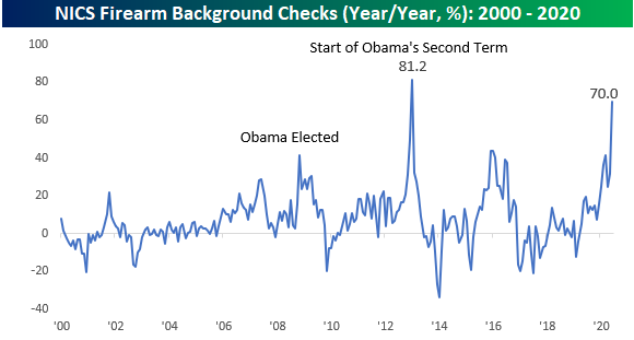
Gun Stocks Blazing
At first glance, the chart below looks a bit like a tally of COVID case counts, but what it really shows is the number of NICS background checks taking place for the purchase of firearms. In the month of June alone, there were 3.93 million background checks which represents slightly more than 1% of the entire US population. Historically, the pattern of background checks follows a saw-tooth pattern hitting their annual highs towards the end of the year, but after hitting a new record high back in March, background checks hit another record high in June. It’s not often that you see that. They say that gun sales increase during periods of uncertainty, and whatever your views are towards the shutdowns or the protests that have erupted all over the country, we can all agree that they have generated enormous amounts of uncertainty.

Besides the instability that has blanketed the country, the decline in President Trump’s poll numbers may also be fueling a rush to buy guns. If Biden were to win in November and the Democrats take control of the Senate, the odds of legislation curbing at least some types of gun sales would only increase. Historically, there is a precedent for this. Back in 2008, when President Obama was elected, the y/y pace of background checks surged at what was a record y/y pace to record highs. When Obama was re-elected, the pace of background checks surged again, increasing at a y/y pace of over 80% at the start of his second term.

With Americans in a rush to buy guns, the two publicly traded gun manufacturers have been on fire. The charts below show the performance of Sturm Ruger (RGR) and Smith and Wesson (SWBI) over the last year. In the case of both stocks, they have doubled off the lows. While financial markets hate uncertainty, these two stocks can’t get enough of it. Click here to view Bespoke’s premium membership options for our best research available.


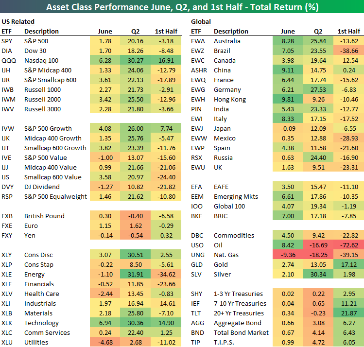
First Half and Q2 2020 Asset Class Performance
Global pandemics, bear markets, bull markets, countless records in economic data, and widespread protests made for an eventful first half of 2020, to say the least. In the table below we show the total return of various asset classes using key ETFs in June, Q2, and the first half of 2020. As shown, overall the best performing assets in June could be found outside the US as international stocks surged. Hong Kong (EWH) in particular was the best performing asset in June. Oil (USO) similarly saw solid returns of 8.42% during the month but remained the second-worst performing asset in Q2 behind Natural Gas (UNG) which was also the worst-performing asset in June. Additionally, oil was the worst-performing asset in the first half of the year. Meanwhile, although their returns were more muted in Q2 and June, Treasuries (namely at the long end of the curve) were some of the top performers in the first half. Precious metals similarly were strong performers in the first half with particular strength from silver (SLV) in Q2. Silver actually saw returns in line with cyclical equities in Q2.
In terms of the US equities space, the Tech heavy Nasdaq 100 (QQQ) drastically outperformed closing out June with a 16.91% gain in the first half. In Q2 and June, it was also the best performing major index by a wide margin. On a sector basis, Technology (XLK), Energy (XLE), and Consumer Discretionary (XLY) all rose over 30% in Q2 just like the Nasdaq did, though their first half and June returns were more modest with the exception of the Tech sector whose returns were more in line with that of the Nasdaq.
Investing based on market cap saw some interesting dynamics as well. Even though small caps are some of the major US indices down the most on the year—S&P 600 Small Caps (IJR) are down 17.89% and the Russell 2000 (IWM) is down 12.96% YTD—there was some catch up in June as these indices were some of the best performers. That applies to both growth and value names though small cap value (IJS) is still one of the most beaten-down groups in the US equities space. On the other hand, large-cap growth (IVW) offered the strongest returns in June, Q2, and the first half when compared to the various other style ETFs.
Outside of the US, even with big gains in June, countries like Brazil (EWZ), France (EWQ), Italy (EWI), and Spain (EWP) remain down big on the year. Click here to view Bespoke’s premium membership options for our best research available.
ISM Manufacturing Returns to Expansion
Last month, ISM’s headline manufacturing number saw a slight rebound rising from the April low of 41.5 to 43.1. That indicated that activity was still worsening in May albeit at a slower pace than April. Fast forward to June’s reading released this morning and ISM’s manufacturing report showed a huge rebound in activity with the headline index rising 9.5 percentage points to 52.6. That is the headline index’s highest reading since March of last year and was also the first back to back increases since June 2018. A reading above 50 also indicates the first expansionary reading in the manufacturing sector since February. Lastly, perhaps most notable about today’s report was that the 9.5 point m/m increase was also the third-largest on record behind a 10.5 point increase in August of 1980 and a 12.1 point jump all the way back in August of 1952.

Respondent commentary reinforced the rebound with most making some mention of demand or production improving in June. Important to note, while they point to improved conditions from the past few months, that is not to say activity has necessarily returned to pre-COVID levels. In fact, one comment out of the Chemical Products industry reported that it ha been a “slow recovery” and the Petroleum & Coal Products industry mentioned that things are still “below normal volumes”. Regardless, as the commentary from a Plastics & Rubber Products respondent put it, things are still “trending toward normal”. In other words, things are back on the right track, but activity has not fully recovered.

Taking a look across the various sub-indices of the report, the headline number was not alone in terms of historic monthly rebounds. Outside of the inventories index, every indices’ MoM rise was in the upper 90th percentiles of all readings. Now 6 of the 11 indices are showing expansionary readings compared to just two last month.
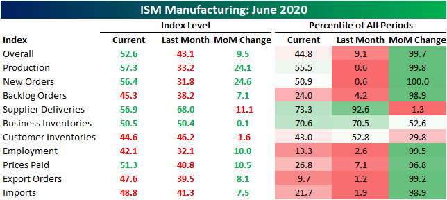
As previously mentioned, production has been ramping back up with the index rising to 57.3, its highest level since November of 2018. The only larger one month jump in production was in August of 1952 when the index rose 46.8 percentage points. Meanwhile, New Orders saw its largest one month increase on record. Granted that only leaves it in the dead middle of its historic range while backlog of orders are still in contraction for a fourth consecutive month. One interesting point of the data recently has been the index for Supplier Deliveries. Recent months have seen very elevated readings indicating longer delivery times meaning supply chains have appeared to have been disrupted. While this month’s reading of 56.9 still indicates longer delivery times, it is a much healthier reading pointing to at least some stabilization. The MoM decline of 11.1 percentage points was also the largest decline since May of 1979.

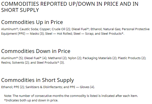
One final note on this month’s report concerns the commodities survey where businesses report price increases and decreases. As could be expected in a pandemic environment, protective equipment remains in short supply and up in price. Meanwhile, many cyclical products are also seeing higher prices indicating strengthened demand. For example, cyclical metals like copper and steel are up in price in addition to various fuels. That further reinforces the overall uptick in economic activity. Click here to view Bespoke’s premium membership options for our best research available.
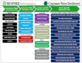
Bespoke’s Consumer Pulse Report — July 2020
Bespoke’s Consumer Pulse Report is an analysis of a huge consumer survey that we run each month. Our goal with this survey is to track trends across the economic and financial landscape in the US. Using the results from our proprietary monthly survey, we dissect and analyze all of the data and publish the Consumer Pulse Report, which we sell access to on a subscription basis. Sign up for a 30-day free trial to our Bespoke Consumer Pulse subscription service. With a trial, you’ll get coverage of consumer electronics, social media, streaming media, retail, autos, and much more. The report also has numerous proprietary US economic data points that are extremely timely and useful for investors.
We’ve just released our most recent monthly report to Pulse subscribers, and it’s definitely worth the read if you’re curious about the health of the consumer in the current market environment. Start a 30-day free trial for a full breakdown of all of our proprietary Pulse economic indicators.
July Market Seasonality
At the start of each month, we send members our seasonality report that highlights the historical performance of the US stock market by month. In our July report published yesterday, we highlighted the chart below which shows the Dow’s average change by month over the last 100, 50, and 20 years. One notable trend is that over the last 20 years, the Dow has actually averaged declines in half of all months. The summer months have been particularly negative, but July is the one month that stands out on the bullish side. As shown in the table, July is the only month from May through September that has averaged gains over the last 20 years, and the average gain has been quite strong at 1.32%. Click here to view Bespoke’s premium membership options for our best research available.
