Bespoke’s Morning Lineup – 7/31/20 – Three Out of Four Ain’t Bad
See what’s driving market performance around the world in today’s Morning Lineup. Bespoke’s Morning Lineup is the best way to start your trading day. Read it now by starting a two-week free trial to Bespoke Premium. CLICK HERE to learn more and start your free trial.
Quote of the Day: “The person who is the star of previous era is often the last one to adapt to change, the last one to yield to logic of a strategic inflection point and tends to fall harder than most.” – Andrew Grove
The big four of Apple (AAPL), Amazon (AMZN), Alphabet (GOOGL), and Facebook (FB) all reported last night, and with the exception of Alphabet, they all came through with very strong reports. The big event is now behind us, and next week the economy will get added attention with both the ISM Manufacturing and Non Manufacturing reports as well as the July Non-Farm Payrolls report. Earnings and economic data. We can’t wait!
Be sure to check out today’s Morning Lineup for a rundown of the latest stock-specific news of note, key earnings and economic news in Europe and the US, trends related to the COVID-19 outbreak, and much more.

We doubt Andy Grove ever had Intel, the company that in the 1990s he transformed into the world’s largest semiconductor company, in mind when he wrote the above words. However, with the company announcing last week that it would delay the rollout of its 7nm manufacturing process and missing the boat on yet another industry shift in the semiconductor sector, the words couldn’t be more applicable today. While Intel was basically “the semiconductor industry” in the 1990s, today its dominance is a shell of its former self. The stock is down nearly 20% YTD and trading closer to 52-week lows than 52-week highs.
While Intel flounders, the rest of the semiconductor sector has been going in the opposite direction. Intel is the worst-performing stock in the Philadelphia Semiconductor Index (SOX) this year, but the average YTD performance of the 30 stocks in the index has been a gain of over 15%. Similarly, since the March lows, the average stock in the SOX is up over 65%. INTC? It’s down over 3% and the only stock in the index down during that time. Talk about falling harder than most.

Bespoke’s Weekly Sector Snapshot — 7/30/20
Please click the thumbnail image below to view our weekly Sector Snapshot report.

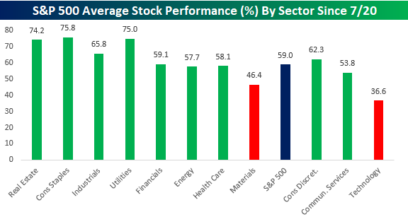
S&P 500 Stronger Underneath the Surface
Earlier today we posted a chart showing S&P 500 sector performance since the Nasdaq’s recent peak on 7/20 when Technology stocks began what has now been a 10-day period of consolidation. Below we have updated these performance numbers to include today’s moves. While not as many sectors remain in positive territory, the majority of sectors continue to outperform the S&P 500, while Technology drags the market lower. Along with Technology, Communication Services, and Consumer Discretionary are the only other sectors that have lagged the S&P 500, and their performance has been dragged down by the mega-cap tech-like stocks of Alphabet (GOOGL), Facebook (FB), and Amazon (AMZN).

Expanding on this theme of underlying strength in the index, the chart below shows the average performance of stocks in the S&P 500 grouped by sector. On an equal-weighted basis, the S&P 500 is actually up 1.3% since 7/20, and only two sectors (Technology and Materials) have seen negative average returns. On the upside, Real Estate (4.1%) has been the big winner followed by Consumer Discretionary (3.3%), and Consumer Staples (2.2%). The fact that Consumer Discretionary at the cap-weighted sector level is down over 1.4% while the average performance of stocks in the sector has been a gain of 3.3% illustrates what a mammoth impact AMZN has on that sector.

Breadth among S&P 500 stocks has also been overwhelmingly positive. For the S&P 500 as a whole, 59% of stocks in the index have had positive returns since the close on 7/20. Only two sectors (Technology and Materials) have seen fewer than half of their components post positive returns over that time, while Real Estate, Consumer Staples, and Utilities have seen roughly three-quarters of their components rally since 7/20. Like what you see? ]Click here to view Bespoke’s premium membership options for our best research available.
Bears Double Bulls Again
The S&P is flat over the past week and is roughly 1.3% away from last Wednesday’s high. Even though there has not been any significant push lower, sentiment has taken a hit as AAII’s reading on bullish sentiment has fallen down to 20.23%. That is a 5.83% drop from last week (the largest since a 9.91 percentage point decline on June 18th) and marginally surpasses the recent low last October of 20.31% to mark the lowest reading for bullish sentiment since May of 2016. Think about that. Investors in this survey are less bullish now than they were at any point throughout the COVID crisis

Meanwhile, bearish sentiment rose to 48.47%. Unlike bullish sentiment, that does not surpass any earlier readings for a multiyear high as it is the highest level since only the end of June. But it is also now only 3.6 percentage points away from the March 26th high when more than half of investors were reporting as bearish.

As we discussed in greater detail in today’s Chart of the Day, bears more than double bulls as the bull-bear spread is now at its widest level in favor of bears since the first week of May. Back then it was only slightly wider at 28.99. While not at a new low, the bull-bear spread has been negative for a record 23 week-long streak.

Not all the losses to bulls this week went to bears as neutral sentiment rose to 31.3%. That is the highest since the start of the month. Click here to view Bespoke’s premium membership options for our best research available.

Chart of the Day: Bulls Outnumbered
Bullish Earnings Season So Far
At our Earnings Explorer tool available to clients on our website, we provide a real-time look at beat rates for both EPS and sales. Below is a snapshot from the website showing both the EPS and sales beat rates for US companies reporting earnings on a rolling 3-month basis. Currently, 64.61% of companies have exceeded consensus analyst EPS estimates over the last three months, while 63.75% of companies have beaten consensus sales estimates over the same time frame.
In looking at the chart, you can see a big spike in the EPS beat rate over the last few weeks. Since earnings season began on July 13th, nearly 80% of companies have posted stronger than expected EPS numbers. That’s a huge beat rate and suggests that analysts were too bearish on Q2 numbers heading into July. The revenue beat rate held up much better than EPS beats throughout the first half of 2020, but it too is on the upswing this season.

We also monitor how share prices are reacting to earnings reports. So far this earnings season, the average stock that has reported Q2 numbers has gained 1.31% on its earnings reaction day. That compares to a historical average one-day change of just 0.06% on earnings reaction days. As shown below, stocks that have beaten EPS estimates this season have gained 2.2% on earnings reaction days, while companies that have missed EPS estimates have fallen 1.89%. It’s rare to see beats gaining more than misses decline, but that’s what is happening this season. Click here to view Bespoke’s premium membership options for our best research available.

Claims Higher in Back to Back Weeks
Initial jobless claims (seasonally adjusted) rose from 1.422 million to 1.434 million this week. That marks the first time since the second half of March that seasonally adjusted jobless claims have risen week over week in back to back weeks. While 16 weeks without back to back increases in jobless claims may sound like a very long streak, it is only the longest such streak since April of last year, and there were two other long streaks of 15 weeks and 12 weeks in between. On the bright side, this week’s reading of 1.434 million was better than forecasts for an increase to 1.445 million. Additionally, while claims continue to rise and print deep into the millions, this week’s increase of 12K was much more modest than the 114K increase last week.

Given that large uptick in initial claims last week, seasonally adjusted continuing claims also picked up. Continuing claims for the week of July 17th (continuing claims are lagged one week to initial claims) rose back above 17 million this week. That was above expectations for claims coming in at 16.2 million.
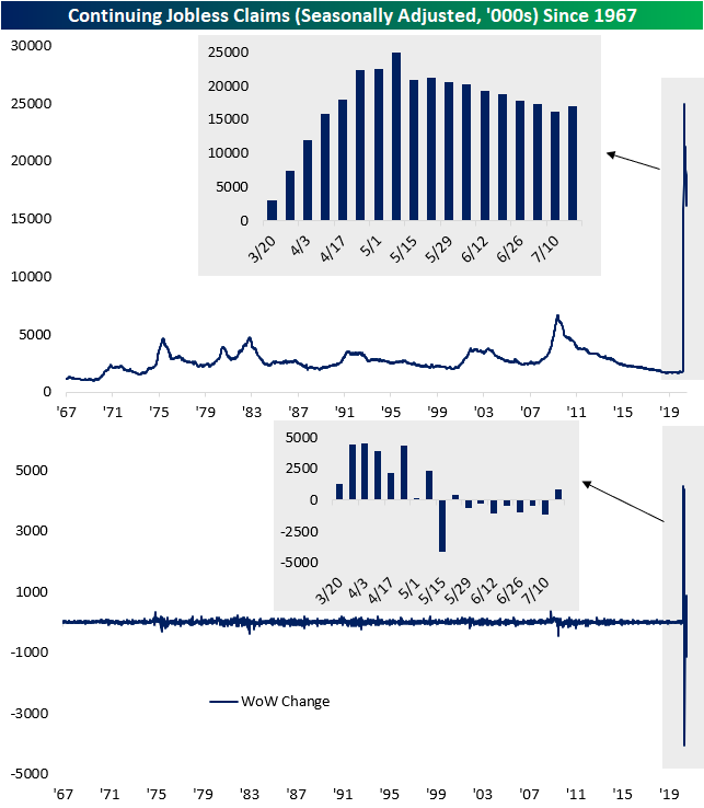
As we noted last week and was again the case this week, there is a divergence between the seasonally adjusted number which is rising, and the non-seasonally adjusted (NSA) number which is falling. As shown below, the massive upswing in claims in the spring that has persisted through the summer makes it somewhat hard to compare for seasonal patterns, but in the past few weeks, the data has risen and is now falling consistent with typical seasonal patterns for this time of year. In other words, as the seasonally adjusted data has deteriorated a bit in recent weeks, it is hard to distinguish if recent improvements in the unadjusted data are material improvements in the labor market or more a factor of seasonality.

As such, NSA initial claims fell from 1.377 million down to 1.205 million this week. That is the lowest level of jobless claims since the first reading above one million earlier in the pandemic in March. That was also the largest decline since the last week of May.

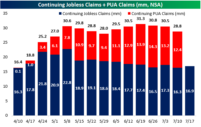
Factoring in Pandemic Unemployment Assistance (PUA) claims shows the same story. Like the standard NSA number, PUA claims have fallen for a third straight week totaling 0.83 million and bringing the grand total to 2.04 million. For PUA claims, this was the lowest initial claims print since the second week of June when PUA claims came in at 0.77 million. Again, it is hard to distinguish how much of this improvement may be seasonality versus more concrete improvements in the data, but this is the lowest reading since PUA claims began to be tracked in April.

It is a similar story for continuing jobless claims (NSA) which are also down for a third straight week when including PUA claims (lagged an additional week to the already lagged continuing claims). PUA claims were at their lowest level since the first week of June, and total continuing claims are at their lowest since the last week of May. Click here to view Bespoke’s premium membership options for our best research available.
The Bespoke 50 Top Growth Stocks — 7/30/20
Every Thursday, Bespoke publishes its “Bespoke 50” list of top growth stocks in the Russell 3,000. Our “Bespoke 50” portfolio is made up of the 50 stocks that fit a proprietary growth screen that we created a number of years ago. Since inception in early 2012, the “Bespoke 50” has beaten the S&P 500 by 150.9 percentage points. Through today, the “Bespoke 50” is up 287.0% since inception versus the S&P 500’s gain of 136.1%. Always remember, though, that past performance is no guarantee of future returns. To view our “Bespoke 50” list of top growth stocks, please start a two-week free trial to either Bespoke Premium or Bespoke Institutional.

Bespoke’s Morning Lineup – 7/30/20 – GD-PU
See what’s driving market performance around the world in today’s Morning Lineup. Bespoke’s Morning Lineup is the best way to start your trading day. Read it now by starting a two-week free trial to Bespoke Premium. CLICK HERE to learn more and start your free trial.
Quote of the Day: “The secret to investing is to figure out the value of something – and then pay a lot less.” – Joel Greenblatt
Did traders who bought Eastman Kodak (KODK) in the $2s last week figure out Greenblatt’s “secret” to investing?
Well, we got that over with. We have all just experienced what will likely be the worst quarter of economic growth in our lifetimes. At least it better be! Q2 Advance GDP was just released, and while economists were forecasting an annualized decline of 34.5%, the actual reported number was a bit better at -32.9%. In any other environment, a GDP report that was 1.6 percentage points better than expected would be extraordinary, but when you’re dealing with numbers in the 30s, it’s no big deal. In other economic news, Initial Jobless Claims were better than expected, but Continuing Claims came in considerably higher.
Be sure to check out today’s Morning Lineup for a rundown of the latest stock-specific news of note, key earnings and economic news in Europe and the US, trends related to the COVID-19 outbreak, and much more.
Since the Nasdaq’s most recent peak on 7/20, it should come as no surprise that Technology has been a laggard. As shown in the chart below, the sector has been the worst performer falling over 2%. Interestingly enough, the only two other sectors that are down during this period are Telecom Services and Consumer Discretionary, and these declines are also due primarily to weakness in large-cap names like Amazon (AMZN), Alphabet (GOOGL), and Facebook (FB). Outside of these three sectors, every other sector has rallied since the close on 7/20, and all but one of them (Health Care) are up over 1%. So, while the S&P 500 has been bogged down by Tech and other mega-cap “tech-like” stocks, other areas of the market have been holding up just fine. Sectors like Real Estate, Energy, Consumer Staples, and Financials are all up 2.5% or more.

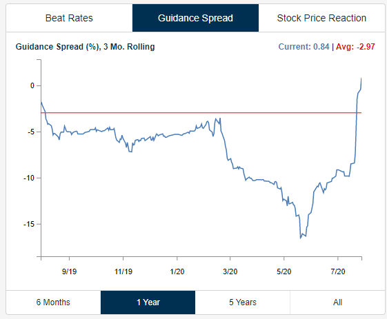
Raising Guidance
We saw another 13 earnings triple plays (beat EPS, beat sales, raised guidance) after hours today. Companies are raising guidance like crazy this earnings season, causing our Guidance Spread tracker (see chart below) to spike up into positive territory in the span of two weeks. It seems that worst fears either failed to materialize or the “Covid Economy” is actually benefiting a lot of public companies. Or maybe it’s a little bit of both. You can track the 100 most recent earnings triple plays at our Tools page. Learn more about Bespoke Premium.