Chart of the Day: Gold (GLD) Gaps Down
Bespoke’s Morning Lineup – 8/11/20 – New Highs Back in View
See what’s driving market performance around the world in today’s Morning Lineup. Bespoke’s Morning Lineup is the best way to start your trading day. Read it now by starting a two-week free trial to Bespoke Premium. CLICK HERE to learn more and start your free trial.
Can we make it eight in a row? Based on this morning’s move in the futures, the DJIA and S&P 500 are both on pace to extend their current seven-day winning streaks to eight. The Nasdaq, meanwhile, is working on its own streak as it is on pace to underperform the S&P 500 for the third straight day.
In economic news, the NFIB Small Business Optimism report missed expectations, and PPI came in much higher than expected. That hotter than expected inflation data hasn’t had any impact on futures as of yet, though.
Be sure to check out today’s Morning Lineup for a rundown of the latest stock-specific news of note, market performance in the US and Europe, trends related to the COVID-19 outbreak, and much more.

As the S&P 500 sets its sights on new record highs, its cumulative A/D line has already set the path. With a number of positive readings in the last few days, the cumulative A/D line has broken out of its short consolidation range from the last couple of weeks. That’s an encouraging sign for the direction of the market going forward, even as tech starts to take a back seat.

Daily Sector Snapshot — 8/10/20
Chart of the Day: Record Guidance and Strong Beat Rates
A Rare Case of the Mondays for the Nasdaq
For most of us, Monday is the worst day of the week, but for the Nasdaq lately, it doesn’t get any better than Monday. The chart below shows the Nasdaq’s performance on Mondays since the closing low for the S&P 500 on 3/23. On that day, the Nasdaq fell a pedestrian 0.3%. Since then, Mondays have been a blockbuster. In the 19 weeks between 3/23 and today, the Nasdaq’s average gain on Mondays (or Tuesday if Monday was a holiday) has been +1.4% with only two declines. Not only that, but on 13 of those Mondays, the Nasdaq has been up over 1%, including eight of the last nine heading into this week. On a cumulative basis, half of the Nasdaq’s entire gain off of the March 23rd lows was from Mondays alone. With the Nasdaq down half of a percent so far today, the magnitude of the decline isn’t all that notable but relative to other Mondays recently, it stands out like a sore thumb. Click here to view Bespoke’s premium membership options for our best research available.

Rocket Reversals
Over the last few days, we’ve been seeing a moderate rotation in the market as red-hot growth stocks sell-off and investors shift into other areas of the market that have been lagging. To highlight this, the table below highlights 24 companies in the Russell 3,000 with market caps of more than $1 billion that traded at a 52-week high within the last month but are currently down more than 20% from that high. The vast majority of these stocks are names that investors haven’t been able to get enough of in 2020 but now appear to have had their fill.
Topping the list of these reversals is Eastman Kodak (KODK). On 7/29, the stock surged to a 52-week high of $60.00 after being awarded a questionable government contract to domestically produce components for prescription drugs. With the SEC and government agency that originally awarded the contract now looking into stock option awards at the company just before it was announced, the stock has pulled back sharply and is now down over 80% from its high less than two weeks ago.
While KODK is more of a unique example, other names on the list are primarily growth or health care stocks that have benefited from the COVID outbreak. However, now that signs suggest the summer wave in the south has crested, investors appear to be taking some profits. Shares of Vaxart (VXRT) hit a high of $17.49 on July 14th but have since lost nearly half of their value and trade back in the single-digits. Additionally, Bloom Energy (BE), 1Life Healthcare (ONEM), and Bioxcel Therapeutics (BTAI) have all lost more than a third of their value.
In terms of market cap, most of the names listed are on the small side, but Tesla (TSLA) is a notable exception as it is now just over 20% below its 52-week high on 7/13. Other relatively large companies on the list include Moderna (MRNA), Citrix Systems (CTXS), Teladoc (TDOC), and Livongo (LVGO). TDOC and LVGO both hit all-time highs last week but after announcing a mostly stock merger last Wednesday, both have lost nearly a quarter of their value.
While all of the stocks listed below have seen sharp pullbacks in the last several days, a little perspective is in order. Of the 24 names listed, the average YTD change even after the declines has been a gain of 219.7% (median: +94.6%). Only two of the stocks shown (New Relic- NEWR and Sonos- SONO) are down YTD, and half of them have at least doubled and in many cases much more. Click here to view Bespoke’s premium membership options for our best research available.

Bespoke’s Morning Lineup – 8/10/20 – Apple vs Russell
See what’s driving market performance around the world in today’s Morning Lineup. Bespoke’s Morning Lineup is the best way to start your trading day. Read it now by starting a two-week free trial to Bespoke Premium. CLICK HERE to learn more and start your free trial.
“There is a huge difference between a good trade and good trading.” – Steve Burns
The week looks to be kicking off on a quiet note, but what else would you expect? It’s August. S&P 500 futures are modestly higher, and Nasdaq futures are modestly lower. That may not sound like anything particularly significant, but keep in mind that the Nasdaq has been up 1%+ on eight of the last nine Mondays and positive on 13 of the last 14, so down Mondays have been pretty uncommon lately.
Be sure to check out today’s Morning Lineup for a rundown of the latest stock-specific news of note, economic news in Europe and the US, trends related to the COVID-19 outbreak, and much more.
Apple’s (AAPL) extraordinary run in this year has the stock closer to achieving what would surely be a monumental feat. The chart below shows the historical market cap of AAPL against the Russell 2000. For most of 2019, the market cap spread between the two was over a trillion dollars. But then COVID hit. As AAPL’s stock was much less impacted than the companies in the Russell 2000, the market cap spread between the two has narrowed substantially this year, and on Thursday reached a record low of just under $250 billion. On Friday, the spread narrowed out again to just under $340 billion. Even at that level, though, it’s pretty amazing that there’s such a narrow spread between the market cap of one company and an entire index- even if that index is comprised of small-cap companies.

Bespoke Brunch Reads: 8/9/20
Welcome to Bespoke Brunch Reads — a linkfest of the favorite things we read over the past week. The links are mostly market related, but there are some other interesting subjects covered as well. We hope you enjoy the food for thought as a supplement to the research we provide you during the week.
While you’re here, join Bespoke Premium with a 30-day free trial!
Policy Research
California Unemployment Insurance Claims During the COVID-19 Pandemic by Thomas J. Hedin, Geoffrey Schnorr and Till von Wachter (California Policy Lab)
Some startling findings on the nature of jobless claims filers in California: half are re-opened claims, driven by new rounds of firings or hours reduction. One-third of California’s workforce has filed for UI benefits since the start of mid-March. [Link]
Do Unemployment Insurance Benefits Improve Match Quality? Evidence from Recent U.S. Recessions by Ammar Farooq, Adriana D. Kugler, and Umberto Muratori (NBER)
New research argues that more generous UI benefits allow workers to find jobs better-suited to their skills, supporting long-term income and productivity with extra benefits for women, non-white, and lower-education workers. [Link]
The Gulf Between Republicans and Democrats on Coronavirus Aid, in 9 Charts by Alicia Parlapiano (NYT)
A helpful rundown of the priorities each party has in their proposed new round of relief from the COVID shock. [Link; soft paywall]
Investing
With Biotech Stocks, Investors Love the Thrill of the Chase by Gregory Zuckerman and Michael Wursthorn (WSJ)
Risk-seeking individual investors have turned to vaccine plays as a way to scratch their itch for big payoffs and high uncertainty. [Link; paywall]
A Blank-Check ETF May Be Coming After the Surge in SPACs by Katherine Greifeld (Bloomberg)
With the popularity of so-called “blank-check” special purpose acquisition companies (which raise capital then use it to buy out a private company), there is of course an ETF set to track the broad space. [Link; soft paywall]
Political Donations
Schwarzman’s Wallet Props Up Wall Street Elite’s Giving to Trump by Shahien Nasiripour and Hema Parmar (Bloomberg)
The CEO of PE shop Blackstone is accounting for three-quarters of every dollar that Wall Street donates to the President’s re-election campaign. Excluding Schwarzman, donations are down almost 70% versus 2016. [Link; soft paywall]
COVID
Some scientists are taking a DIY coronavirus vaccine, and nobody knows if it’s legal or if it works by Antonio Regalado (MIT Technology Review)
In an effort to develop immunity ahead of the commercially viable alternative, some are taking a basically homemade vaccine that sits on at best legally dubious grounds. [Link; soft paywall]
Agriculture
Wheat yield potential in controlled-environment vertical farms by Senthold Asseng et al (PNAS)
A new study of vertical farming, whereby crops are grown indoors in layers, can produce radically higher crop yields than any current farming technique, creating more calories with fewer resoruces. [Link]
Read Bespoke’s most actionable market research by joining Bespoke Premium today! Get started here.
Have a great weekend!
The Bespoke Report – Curtains Open?
This week’s Bespoke Report newsletter is now available for members.
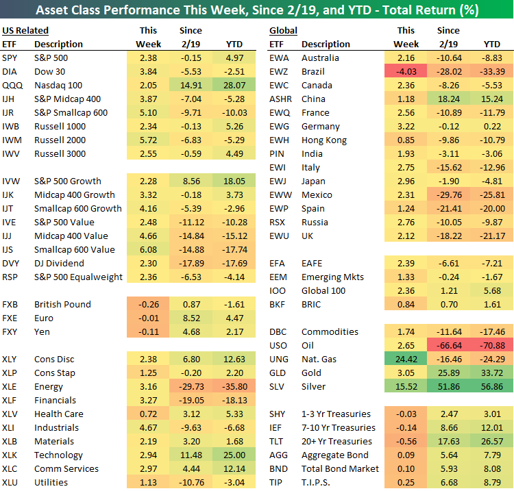
As shown below in our ETF Asset Class Performance Matrix, August has by all accounts come in like a bull for equities.
Every single equity ETF with the exception of Brazil (EWZ) was up this week. Top-performing ETFs overall this week were Natural Gas (UNG) and Silver (SLV) which saw gains of over 15%.
In the US, every major index ETF was up over 2% this week as small caps led the way higher as IJR and IWM both rallied more than 5%. Despite this week’s outperformance, those two ETFs are still the worst performers YTD and since the February high for the S&P 500. The Nasdaq 100 was uncharacteristically a laggard this week gaining ‘only’ 2.05%. Converse to the small caps, though, this week’s underperformance didn’t put much of a dent in the Nasdaq 100’s lead in terms of performance YTD and since 2/19.
Investors who have been waiting for value to take the lead over growth saw things move ever so slightly in their favor this week as the value-oriented ETFs in each market cap range outperformed their global peers. It was only modest outperformance, but you have to start somewhere!
Cyclical sectors led the way this week as Industrials, Financials, and Energy were the top performers as defensive-oriented sectors like Health Care, Utilities, and Consumer Staples lagged.
We discuss this week’s action across markets in our weekly Bespoke Report newsletter, including a detailed look at election trends and the moves in commodities this week. To read the report and access everything else Bespoke’s research platform has to offer, start a two-week free trial to one of our three membership levels. You won’t be disappointed!