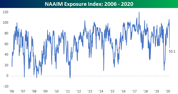
Active Managers Do an About Face
The National Association of Active Investment Managers (NAAIM) has an index which tracks the exposure of its members to US equity markets. Each week, members are asked to provide a number that represents their exposure to markets. A reading of -200 means they are leveraged short, -100 indicates fully short, 0 is neutral, 100% is fully invested, and 200% indicates leveraged long. Two weeks ago, in our Bespoke Report, we highlighted the fact that the exposure index had moved to one of the highest levels in its 15-year history. Now, just two weeks later, these same active managers have reigned in their exposure considerably as this week’s reading dropped from just under 100 to 53.1.
This week’s drop was the second-largest one week decline in the index’s history and just the 10th time that the index lost more than a third (33 points) in a single week. The most recent occurrence was back in early March in the middle of the Covid crash, and every other prior period where the index saw a similar drop, the S&P 500 was also down every time by an average of 2.3%. Therefore, it’s not much of a surprise to see the big drop this week given the big declines in the market. But what about going forward? Do big drops in the NAAIM Index mean a bounce back for markets or further declines? Find out in this weekend’s Bespoke Report newsletter where we cover this much more in depth. If you aren’t currently a client of any of Bespoke’s research services, make sure to sign up for a free trial today in order to unlock access to this week’s report.
Mean Reversion Shows up in Trend Analyzer
Our popular Trend Analyzer tool is a very helpful way for Bespoke members to monitor overbought and oversold levels for large baskets of stocks or ETFs across asset classes. Below is a snapshot of major US index ETFs from our Trend Analyzer tool as of this morning.
When looking at the Trend Analyzer’s “Trading Range” section (far right of snapshot), the dot for each stock or ETF represents where its share price is currently trading relative to its 50-day moving average (DMA). In the snapshot below, the 50-DMA for each ticker is represented by the vertical black line in the middle of the trading range. Price is below the 50-DMA when it is to the left of the 50-DMA line and above the 50-DMA when it is to the right of the black line. Additionally, the tail for each ticker in the Trading Range section shows where the stock or ETF was relative to its range one week ago. So when the dot is to the left of the tail, it means price moved lower within its trading range over the last week. When the dot is to the right of the tail, it means price moved higher within its trading range over the last week.
Long tails mean price moved a lot over the last week on a relative basis, while short tails indicate little price movement. In today’s snapshot of US index ETFs, you can see that all of them have long tails with price moving lower over the last week. This highlights the significant downside mean reversion that US equities have experienced recently. In early September, pretty much everywhere you looked, prices were very overbought (extended well above their 50-day moving average). Over the last week or so, however, as equities have sold off they’re now trading at more neutral levels within their trading ranges.
When looking for an entry point or exit point on a position, it’s useful to take overbought or oversold levels into account. We use our “Timing” score within the Trend Analyzer to help members identify attractive (or unattractive) set ups. Members looking to add a new position or add to an existing position like to do so when price is trading at neutral or oversold levels as opposed to placing a bid when price is extremely overbought.

Looking at US sector ETFs, our Trend Analyzer shows that all of them have moved lower within their trading ranges over the past week, which gives them “Good” timing scores as opposed to the “Poor” timing scores these same ETFs had when they were trading at extreme overbought levels a few weeks ago.
The Energy sector (XLE) is the main outlier here with an extreme oversold reading. While every other sector is either neutral or overbought (Materials), Energy just can’t seem to get out of its own way this year. The sector entered today down 7.5% over the last week, 10.84% below its 50-day moving average, and down 43.7% year-to-date.

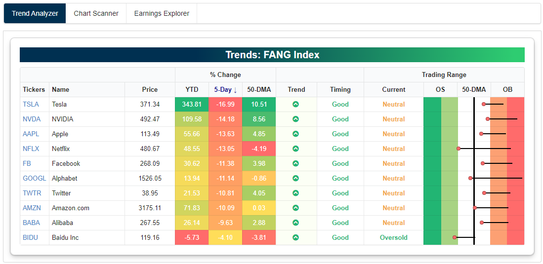
Finally, below is a snapshot of the stocks that make of the NYSE FANG+ index run through our Trend Analyzer. Similar to what we’ve seen around the rest of the US equity space recently, all of the FANG+ stocks are down significantly over the last week (8 of 10 down 10%+), and this has caused most of them to move out of overbought territory and back into neutral territory. For those that have been waiting for a pullback in these names to add exposure, now you’ve gotten it. Click here to start a free trial to Bespoke Premium and immediately gain access to our Trend Analyzer tool.
Bespoke’s Morning Lineup – 9/11/01 – Looking to Go Out on a Good Note
See what’s driving market performance around the world in today’s Morning Lineup. Bespoke’s Morning Lineup is the best way to start your trading day. Read it now by starting a two-week free trial to Bespoke Premium. CLICK HERE to learn more and start your free trial.
“The report continues to be that a plane hit the World Trade Center.” – Mark Haines, CNBC 9/11/01
While there’s now an increasing number of people who have no recollection of the 9/11 attacks, there’s still an even larger percentage of us who can’t believe it has already been 19 years. We can all still remember exactly where we were and what we were doing at the time.
It was a crisp and sunny fall day, and futures were trading higher after what had been an inexplicably weak number of days where the market did nothing by trade lower with little in the way of any bounces. On the morning of 9/11, stocks were looking up for a change. Then, someone in the office turned the volume up on the TV as Mark Haines broke away from an interview to show the billowing smoke coming out of the North Tower. In the minutes that followed, the details became clear, and the last thing that anyone cared about was what they were just doing or the plunging futures.
Futures are higher this morning too as the market attempts to recover from a much more explicable decline in the markets over the last week as growth stocks attempt to work off extremely overbought conditions. The economic calendar is relatively quiet with CPI the only release on the calendar
Be sure to check out today’s Morning Lineup for a rundown of the latest stock-specific news of note, market performance in the US and Europe, trends related to the COVID-19 outbreak, and much more.

Yesterday, we showed the intraday chart of the S&P 500 since the high on 9/2. Today, we are updating it to show yesterday’s action as well. After opening higher, the S&P 500 once again ran into resistance at last Friday’s closing level (as it also did on Wednesday afternoon) and then traded lower all day. By the closing bell, Friday’s highs were a distant memory, and traders were breathing a sigh of relief that Tuesday’s lows held.
As things stand this morning, the S&P 500 will open right in the middle of yesterday’s range. Given the moves we’ve seen of late, it’s highly likely that at some point in the day we will encounter yesterday’s high or low and maybe even both. How the market reacts to either of these levels will then likely dictate the tone going into next week.

The Bespoke 50 Top Growth Stocks — 9/10/20
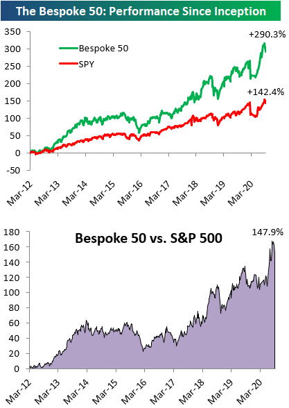
Every Thursday, Bespoke publishes its “Bespoke 50” list of top growth stocks in the Russell 3,000. Our “Bespoke 50” portfolio is made up of the 50 stocks that fit a proprietary growth screen that we created a number of years ago. Since inception in early 2012, the “Bespoke 50” has beaten the S&P 500 by 147.9 percentage points, which hit a new high this week. Through today, the “Bespoke 50” is up 290.3% since inception versus the S&P 500’s gain of 142.4%. Always remember, though, that past performance is no guarantee of future returns. To view our “Bespoke 50” list of top growth stocks, please start a two-week free trial to either Bespoke Premium or Bespoke Institutional.
Bespoke’s Weekly Sector Snapshot — 9/10/20
Gap Between Market Cap and Equalweight Shrinks a Bit
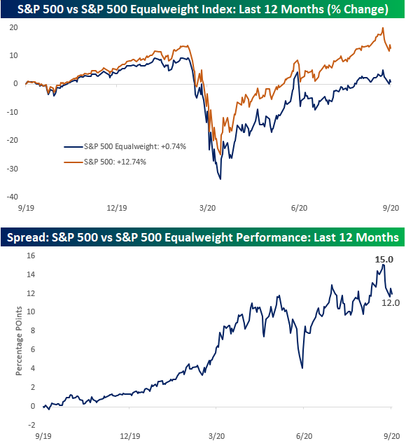
From the lows in March right up to now, one of the number one preoccupations of investors has been the widening gap between the market-cap-weighted S&P 500 and the equal-weighted index. When the market-cap-weighted index outperforms the equal-weight index, it indicates that stocks with the largest market caps are outperforming their relatively smaller peers and vice versa when the equal-weight index outperforms. As shown in the top chart below, through this afternoon, the S&P 500 has rallied more than 12.74% over the last year compared to a gain of just 0.74% for the equal-weight index for a gap of 12 percentage points.
The second chart below shows the performance spread between the S&P 500 and the equal-weighted index over the last 12 months. While the spread is wide now, just over a week ago it was even wider at 15 percentage points. The sell-off of the last few days has certainly narrowed the gap a bit, but there is still a lot of space between the two indices where they sit now. If the recovery from the pandemic recession continues, we would expect to see some broadening out of performance across market caps, but if the recovery derails or hits a roadblock, then the largest of the largest stocks could see their lead start to widen again. Click here to view Bespoke’s premium membership options for the best market analysis available.
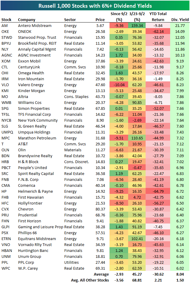
A Look at the Highest Dividend Yields in the Russell 1,000
There are currently 42 stocks in the Russell 1,000 that have dividend yields of more than 6%. These 42 stocks are listed in the table below. Given that every single one of these stocks is down on a year-to-date basis, and many are down 30-50%, the stability of these dividends is certainly in question. Many names on the list are from the beaten-down Energy sector. Antero Midstream (AM) has an indicated yield of 21.77% at the moment, followed by ONEOK (OKE) at 14%. Other Energy names on the list include Exxon Mobil (XOM) with its yield of 9.19%, Valero Energy (VLO) at 8.23%, and Marathon Petroleum (MPC) at 7.32%.
One of the only stocks on the list that’s not from the Energy, Financials, or Real Estate sectors is AT&T (T). AT&T is still down more than 20% year-to-date, and it has an indicated yield of 7.12%. Click here to view Bespoke’s premium membership options for our best research available.
The Most and Least Heavily Shorted Stocks in the Russell 1,000
Below is an updated look at the most heavily shorted stocks in the Russell 1,000. Each of these 30 stocks has at least 15% of its equity float sold short.
At the top of the list is Nordstrom (JWN) with 38.66% of its float sold short. With a YTD decline of 61.86%, the shorts have crushed it with JWN this year.
With its huge portfolio of office and retail real estate, Brookfield Property REIT(BPYU) has the second highest short interest in the Russell 1,000 at 33.7%. BPYU is down 35.7% YTD.
There are plenty of other well-known companies on the list of the most heavily shorted stocks. Examples include American Airlines (AAL), Virgin Galactic (SPCE), LendingTree (TREE), Wayfair (W), Dick’s Sporting Goods (DKS), ADT, TripAdvisor (TRIP), Beyond Meat (BYND), and Kohl’s (KSS).
One name that is no longer on the list of most shorted stocks is Tesla (TSLA). When we provided an update on short interest back in February (a pre-COVID world), Tesla (TSLA) had more than 17% of its float sold short, but that number is all the way down to 8.3% as of the most recent filing.
These 30 stocks with the highest short interest are down an average of 3.01% since last Wednesday (9/2) when the S&P 500 made its last closing high. That’s actually a little bit better than the 3.55% average decline for the rest of the stocks in the Russell 1,000. And year-to-date, these 30 stocks are up an average of 0.60% versus an average gain of 0.81% for the rest of the index. That’s not much of a difference!

Below is a list of the 30 least shorted stocks in the Russell 1,000 as a percentage of equity float. None of these stocks have more than 0.71% of their float sold short, and they’re mostly made up of more conservative names in the Health Care and Consumer Staples sectors.
Johnson & Johnson (JNJ) has the lowest short interest as a percentage of float in the Russell 1,000 at just 0.36%. Microsoft (MSFT) — one of the key mega-cap Tech names — has the second lowest short interest, followed by Merck (MRK), Eli Lilly (LLY), and Medtronic (MDT).
Somewhat surprisingly, Amazon (AMZN) is the sixth least shorted stock in the entire Russell 1,000. While AMZN is still thought of as a high-flying momentum name by many investors, its short interest levels tell a much different story, painting it as more of a non-cyclical stock like Pepsi (PEP), Procter & Gamble (PG), or Coca- Cola (KO).
While the 30 most heavily shorted stocks in the Russell 1,000 are up 0.60% YTD, the 30 least shorted stocks in the index are up much more at +8%. This group has MSFT, AMZN, HD, and AAPL to thank for that strong performance! Click here to view Bespoke’s premium membership options for our best research available.

Rates Around The World
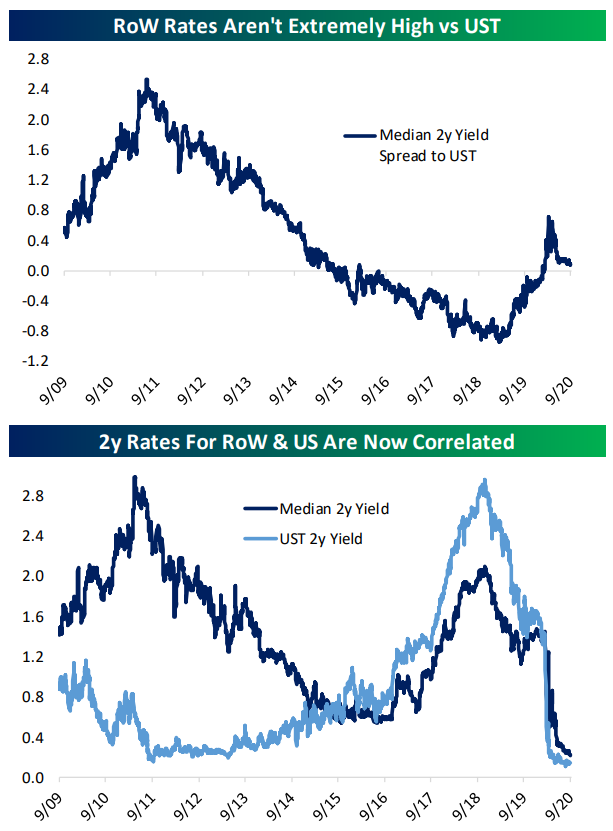
Each Wednesday, Bespoke Institutional subscribers receive an update on fixed income markets in the US and around the world in our Fixed Income Weekly. This week, we took a look at short-term rates in the US relative to the rest of the world, with some surprising results.
With the sudden reversal of US monetary policy to the zero lower bound in response to COVID, the widening gap between US short-term rates and the rest of the world has narrowed and is now stable just a bit above zero. It’s interesting to note that unlike the 2009-2016 period when the level of US rates and the level of rest of world rates tended to move in opposite directions, since the last tightening cycle began in earnest, US rates and rest of world rates have moved almost in lock step. In other words, monetary policy expectations have essentially been globalized.
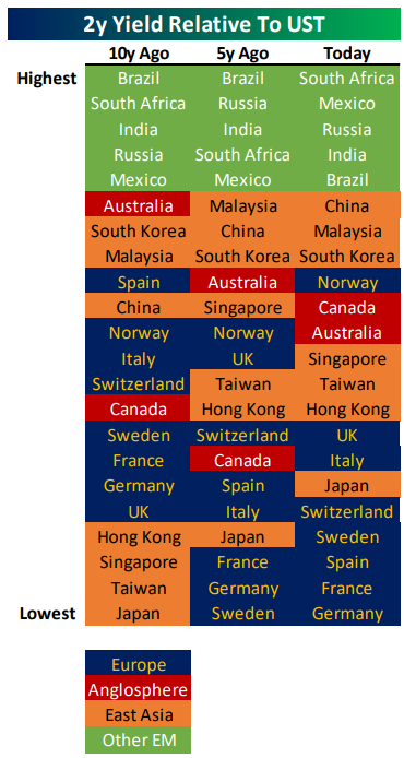
At the same time, an interesting pattern is visible within the rankings of spreads to US Treasuries among 2 year local currency government bonds for the countries that we include in our Global Macro Dashboard. In the table below, we show rankings of spreads to UST by country 10 years ago, 5 years ago, and now. We’ve added four basic geographic regions: Europe (developed), the Anglosphere (developed), East Asia (emerging), and other EM (emerging).
As shown, these economies have started to cluster more on a geographic basis. European rates are uniformly among the lowest spreads to US (other than Norway), East Asian rates are more clustered, and other EM rates are clustered at the high end. Click here to start a free trial and receive our Fixed Income Weekly for the next two weeks.
Best and Worst Performing Stocks Since the 9/2 High
Since the S&P 500 and Nasdaq peaked on September 2nd, we’ve seen rotation out of the post-COVID winners and rotation into laggards in the value space. Below we take a look at the best and worst performing stocks in the Russell 1,000 since the 9/2 high for the S&P. For each stock, we also include its YTD total return and its percentage change from the 3/23 COVID Crash low through 9/2.
Capri Holdings (CPRI) is up more than any other stock in the Russell 1,000 since 9/2 with a gain of 17.43%. Even after the recent gains, however, Capri — the holding company for brands like Michael Kors, Jimmy Choo, and Versace — is still down 52.9% year-to-date.
Only four other stocks are up more than 10% since 9/2 — Beyond Meat (BYND), PVH, Virtu Financial (VIRT), and Reinsurance Group (RGA). Interestingly, BYND and VIRT are also up big (~80%) year-to-date, while PVH and RGA are both down more than 35% year-to-date.
What stands out the most about the list of winners is that only one Technology stock made the cut — Sabre (SABR). Most names come from the two consumer sectors including cruise-liners like Carnival (CCL), Royal Caribbean (RCL) and Norwegian Cruise (NCLH), Kohl’s (KSS), Williams-Sonoma (WSM), Six Flags (SIX), Foot Locker (FL), and Ralph Lauren (RL). Both UBER and LYFT also made the cut with gains of 6% since 9/2. The 30 biggest winners since 9/2 are still down an average of 20% year-to-date, while the rest of the stocks in the Russell 1,000 are up an average of 1.46% YTD.

While only one Technology stock made the list of biggest winners since 9/2, the sector accounts for two-thirds of the 30 biggest losers over the same time frame. As shown below, since 9/2, the six worst performing stocks in the Russell 1,000 and ten of the worst twelve all come from Tech. Notably, though, these 30 stocks that have all fallen more than 12% since 9/2 are still up an average of 5.6% YTD. Were it not for the horrid YTD performance of the Energy stocks that made the list, the average YTD gain would be even higher. Receive Bespoke’s most actionable research and access our Trend Analyzer and Chart Scanner tools with a two-week free trial to Bespoke Premium.
