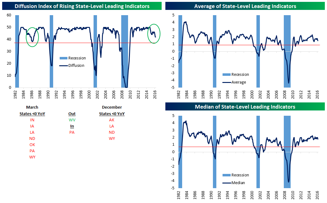
Leading Indicators Slow, But Only For A Few States
The Philadelphia Fed regularly publishes monthly indices of leading economic indicators for all 50 states. Aggregating this data is one way to look at the breadth of the economic expansion, and is also a good way to see what the outlook is for the broad economy. As recently as November 2014, all 50 states had leading indicator readings higher than the year previous. Since then, however, there’s been a marked deterioration as 6 states currently have negative leading indicator readings YoY.
Below at top left we chart a diffusion index which measures the number of states with leading indicators above 0. Only 44 states are positive YoY, with Indiana, Iowa, Louisiana, North Dakota, Oklahoma, Pennsylvania and Wyoming down YoY. West Virginia was down as-of February but ticked up, while Pennsylvania is a new addition to the negative category. That’s compared with four states (Alaska, Louisiana, North Dakota, and Wyoming) down or flat YoY as-of December. We note that most of states showing weakness (Louisiana, North Dakota, Oklahoma, and Wyoming) are highly dependent on petroleum extraction, a sign of the impact that the crash in oil has had on the US economy. While the current deterioration looks concerning, it’s not without precedent. In the mid-1980s, a similar mid-cycle pause took place. The red line indicates the level that has historically indicated a recession (i.e. “no going back”) in the past. We also include the average YoY change in leading indicators and the median YoY change. As shown, both are right in the middle of expansion territory, not showing a fantastic economy but not showing a huge recession risk either.
Apple’s (AAPL) Worst Week in Three Years
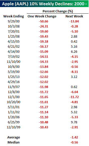 To say that it has been a bad week for Apple (AAPL) would be an understatement. After a lackluster earnings report, investor Carl Icahn piled on Thursday by saying he no longer owned shares in the company. Through midday today, the stock is trading down over 12% on the week, making it the worst week for the stock since January 2013. Additionally, if AAPL closes below $92.98 it will be the worst week for the stock since October 2008!
In the table to the right, we have listed every week since 2000 that AAPL declined more than 10%. For each of the prior 21 occurrences, we have also included the stock’s performance in the following week. In that period, AAPL has averaged a decline of 1.42% (median: -0.52%) with positive returns just 43% of the time. For the sake of comparison, in all weeks since 2000, its average change has been a gain of 0.55%.
Bespoke’s Earnings Triple Plays Report — 4/29/16
US Weekly Economic Data Review and Next Week’s Schedule
Below we show a summary of US economic data released this week. Despite beats on some big components, GDP disappointed, as did Durable Goods earlier this week. Housing data was mixed after a new home sales miss on Monday but a pending home sales (typically lead existing home sales) beat Wednesday. US initial jobless claims reached the lowest 4-week moving average since 1973 Thursday, while wage growth remains low as measured by the Employment Cost Index. As a result, PCE inflation is muted, coming in on-expectations at 1.6% YoY today.
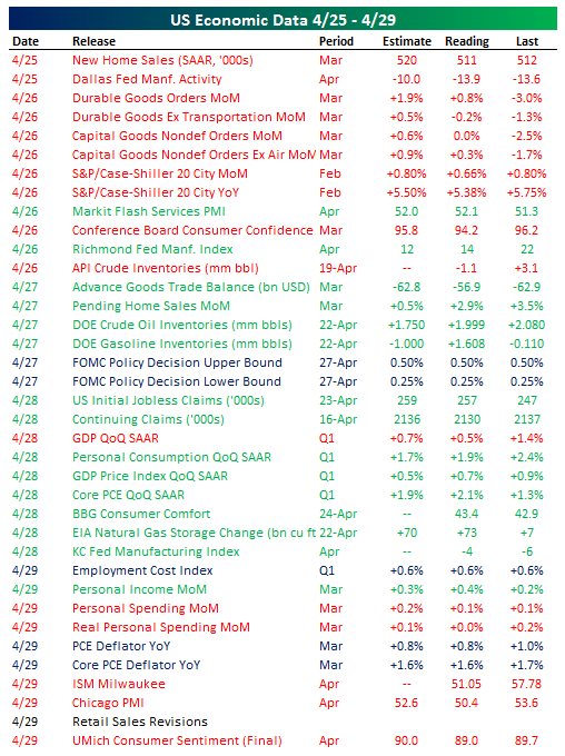
Coming up next week, there’s a wide range of data on tap! ISM will be watched closely early in the week amidst mixed trends in Manufacturing activity surveys from regional Fed surveys. Durable Goods will get updated in the form of the full Factory Orders report later in the week, giving a more complete view of the industrial economy. Non-farm productivity is likely to be abysmal next week after weak growth but strong payrolls in Q1. The biggest release is likely to be the Employment Situation Report for April on Friday, though with inflation modest and growth sub-par the Fed’s June meeting decision will probably be less impacted by the report than many recent releases of non-farm payrolls. We also note an interesting and rare event next Thursday: four different regional Fed Presidents on stage at one time.
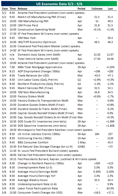
Chart of the Day – 4/29/16: Four Months Down…
After today, 2016 will already be one-third completed, and boy what a four months it has been. In today’s Chart of the Day, we wanted to summarize the historical performance of the S&P 500 in the month of May, from May through October, and from May through year end based on how the index performed in the first third of the year (through 4/30).
You can access today’s Chart of the Day by starting a 14-day no-obligation free trial to our paid research platform.
ETF Trends: US Indices & Styles – 4/28/16
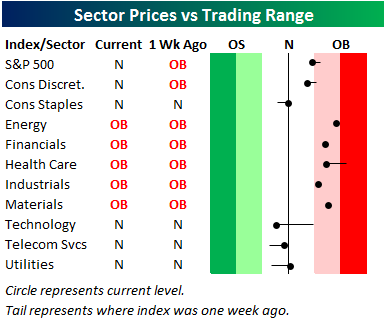
Bespoke’s Sector Snapshot — 4/28/16
We’ve just released our weekly Sector Snapshot report (see a sample here) for Bespoke Premium and Bespoke Institutional members. Please log-in here to view the report if you’re already a member. If you’re not yet a subscriber and would like to see the report, please start a 14-day trial to Bespoke Premium now.
Below is our trading range screen for the ten S&P 500 sectors, which is always included in the weekly Sector Snapshot. The screen allows you to quickly see which sectors have upside or downside momentum, and which sectors may be too extended to the upside or downside. For each sector, the dot shows where it is currently trading within its range, while the tail end shows where it was trading one week ago. The black vertical “N” line represents each sector’s 50-day moving average, and moves into the red or green zone are considered overbought or oversold. The darker the shading, the more extreme the reading.
As shown, the S&P 500 has just moved below overbought territory, while five of ten sectors remain overbought. These include Energy, Financials, Health Care, Industrials, and Materials. No sectors are currently oversold, and five are in neutral territory. Notably, the Technology sector has seen pretty significant weakness within its range over the last week.
To see our full Sector Snapshot with additional commentary plus six pages of charts that include analysis of valuations, breadth, technicals, and relative strength, start a 14-day free trial to our Bespoke Premium package now. Here’s a breakdown of the products you’ll receive.
B.I.G. Tips – May Seasonality; Sell in May and Go Away?
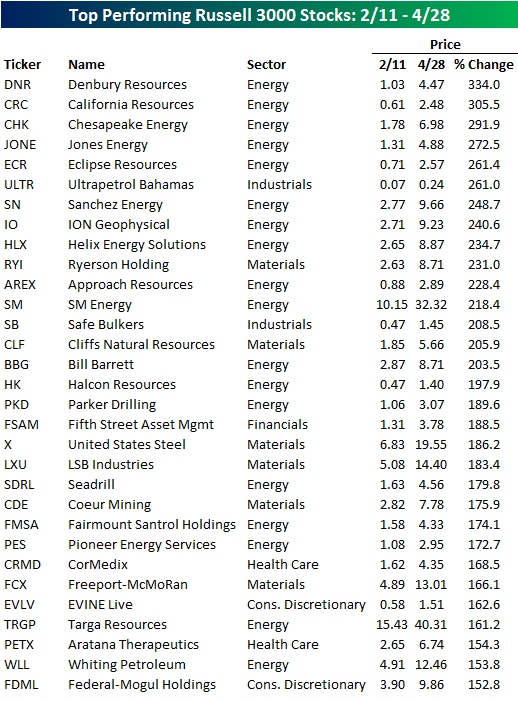
Top Performing Russell 3000 Stocks Since 2/11
In an earlier post, we highlighted the fact that small-cap stocks have been leading the market higher in the rally off the 2/11 lows. Looking at the stocks that have done the best since 2/11, it would also appear as though not only have stocks with low market caps done well, but so have ones with low prices too. The table below lists the 31 stocks in the Russell 3000 that have risen more than 150% since the market’s closing low 11 weeks ago today. As shown, the average closing share price of these stocks on 2/11 was a measly $2.85. Additionally, only two stocks were trading above $10 per share while only another two had share prices with a five-handle. What really stands out about the table, though, is the preponderance of stocks from the Energy sector. Over half of the stocks listed are from the sector including each of the top five spots.