Short Interest Report – 7/26/17
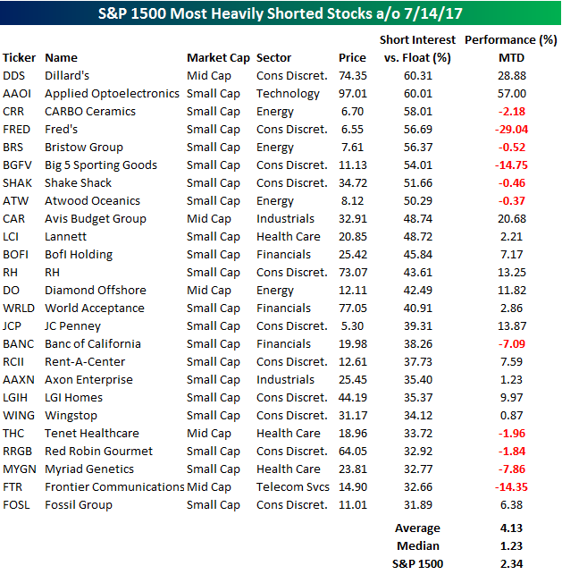
Short interest figures for the middle of July were released after the close on Tuesday, so we have just updated our regular report on short interest trends for the market, sectors, and individual stocks for clients. Below we wanted to quickly highlight the stocks with the highest levels of short interest as a percentage of float. The list below shows the 25 stocks in the S&P 1500 that have the highest short interest as a percentage of float (SIPF). Through early Wednesday, the 25 stocks listed below were up an average of 4.13% (median: 1.23%) compared to a gain of 2.34% for the S&P 1500.
One thing that stands out on the list is that the two stocks in the S&P 1500 with the highest short interest as a percent of float have also been the two best-performing stocks on the list. As shown, Dillard’s (DDS) has 60.3% of its float sold short and has seen its stock rally 28.9% since the start of July. Likewise, shares of Applied Optoelectronics (AAOI) also have more than 60% of their float sold short and its shares have rallied 57% this month! To the downside, the two worst performing stocks on the list are retailers Fred’s (FRED) and Big 5 Sporting Goods (BGFV) which have declined 29% and 15%, respectively. One characteristic of the list that should surprise nobody is that a large percentage of the stocks listed are involved in the retail space. With Amazon.com (AMZN) continuing to steal share from traditional brick and mortar retailers, these stocks are among the most hated stocks in the world and their short interest figures reflect that
For a more detailed look at short interest data on a regular basis, sign up for a monthly Bespoke Premium membership now!
ETF Trends: International – 7/26/17
Base Metals leads the way in this week’s edition of our ETF Trends report, up over 3.5% on a rolling 5 day basis. Biotech and US Oil have also been trending upward as of late, along with other notable outperformers Telecoms and Financials. Meanwhile, Natural Gas and Oil are both down over 5% this week. Also continuing their recent poor performance are Agriculture, Transports, and Turkey.

Bespoke provides Bespoke Premium and Bespoke Institutional members with a daily ETF Trends report that highlights proprietary trend and timing scores for more than 200 widely followed ETFs across all asset classes. If you’re an ETF investor, this daily report is perfect. Sign up below to access today’s ETF Trends report.
See Bespoke’s full daily ETF Trends report by starting a no-obligation free trial to our premium research. Click here to sign up with just your name and email address.
Bespoke’s Global Macro Dashboard — 7/26/17
Bespoke’s Global Macro Dashboard is a high-level summary of 22 major economies from around the world. For each country, we provide charts of local equity market prices, relative performance versus global equities, price to earnings ratios, dividend yields, economic growth, unemployment, retail sales and industrial production growth, inflation, money supply, spot FX performance versus the dollar, policy rate, and ten year local government bond yield interest rates. The report is intended as a tool for both reference and idea generation. It’s clients’ first stop for basic background info on how a given economy is performing, and what issues are driving the narrative for that economy. The dashboard helps you get up to speed on and keep track of the basics for the most important economies around the world, informing starting points for further research and risk management. It’s published weekly every Wednesday at the Bespoke Institutional membership level.
Click here to start a no-obligation two-week free trial to Bespoke Institutional!

Fixed Income Weekly – 7/26/17
Searching for ways to better understand the fixed income space or looking for actionable ideals in this asset class? Bespoke’s Fixed Income Weekly provides an update on rates and credit every Wednesday. We start off with a fresh piece of analysis driven by what’s in the headlines or driving the market in a given week. We then provide charts of how US Treasury futures and rates are trading, before moving on to a summary of recent fixed income ETF performance, short-term interest rates including money market funds, and a trade idea. We summarize changes and recent developments for a variety of yield curves (UST, bund, Eurodollar, US breakeven inflation and Bespoke’s Global Yield Curve) before finishing with a review of recent UST yield curve changes, spread changes for major credit products and international bonds, and 1 year return profiles for a cross section of the fixed income world.
In this week’s note, we review what the bill market is pricing for the upcoming debt ceiling debate this fall.

Our Fixed Income Weekly helps investors stay on top of fixed income markets and gain new perspective on the developments in interest rates. You can sign up for a Bespoke research trial below to see this week’s report and everything else Bespoke publishes free for the next two weeks!
Click here to start your no-obligation free Bespoke research trial now!
The Closer — Global Data, Selling Calls, And A Busy Tuesday In The US — 7/25/17
Log-in here if you’re a member with access to the Closer.
Looking for deeper insight on global markets and economics? In tonight’s Closer sent to Bespoke Institutional clients, we review global producer price inflation, global trade volumes, present a trade idea for a tactical pullback in EM, and review US data released today including Case-Shiller home price indices, Conference Board consumer confidence, and Richmond Fed activity indices.
The Closer is one of our most popular reports, and you can sign up for a free trial below to see it!
The Closer is one of our most popular reports, and you can see it and everything else Bespoke publishes by starting a no-obligation 14-day free trial to our research!
Bespoke Stock Scores: 7/25/17
B.I.G. Tips – Fed Days July 2017
“Hope and Change” For Older Americans
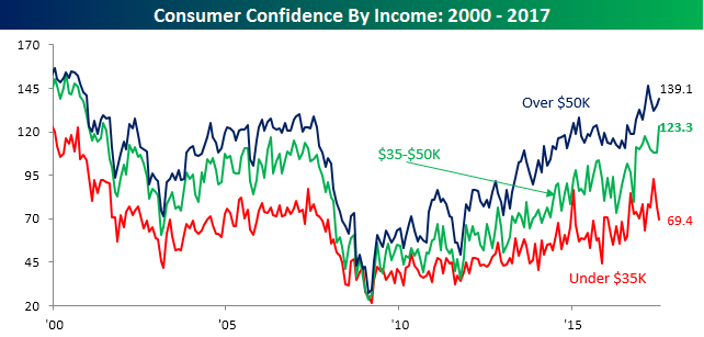
As noted earlier, Consumer Confidence handily exceeded expectations in July. Digging a little deeper into the details, however, we found some interesting trends in confidence levels based on income levels and age. Starting with income, every income level has seen a boost in confidence since the election last November, but while sentiment is off its peak for consumers with higher and lower incomes, those with incomes in the middle ($35-$50K) saw their level of confidence rise to a new cycle high of 123.3 in July. That was the best reading since June 2001. Trump campaigned in support of the forgotten man, or those Americans right in the middle who seemingly receive little in the way of benefits but are still scrambling to get by, and based on July’s data, they don’t feel as forgotten.
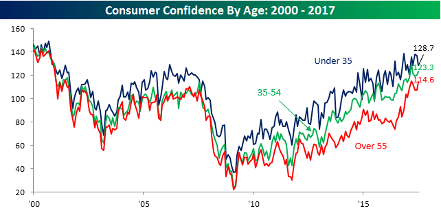
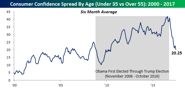
In terms of how age has impacted confidence levels, we have also seen some notable shifts. While consumers with incomes right in the middle of the income spectrum have seen the biggest boost to sentiment since Trump was elected, it has been the oldest Americans that it has had the most positive impact on. As shown in the red line below, confidence among Americans over 55 surged after the election and is currently closer to its cycle-high than any other age cohort. Meanwhile, consumers under the age of 35 actually saw their confidence level decline in July. So what’s behind the different shade of glasses that different age groups are viewing the economy by?
In a word, Trump. The chart below shows the spread in Consumer Confidence among consumers under the age of 35 and those over 55 on a six-month moving average basis in order to smooth things out. Because younger consumers have their whole life ahead of them, they are naturally more optimistic than older consumers who have likely reached and surpassed their peak earnings years. But the chart below shows how in the last eight years the spread really widened to levels not seen in decades.
While a lot had to do with the fact that the economy was doing well, a big contributing factor was also the administration of Barack Obama, who for most younger Americans attained rock star like status. The shaded region in the chart shows the period from when Obama was first elected in November 2008 through the election of Trump in November 2016. Almost to the month when Trump was elected, confidence among younger Americans stalled out, while older Americans viewed the election as a new period of – to borrow a phrase from the Obama campaign – hope and change. In fact, at the current level of 20.25, the six-month average spread has dropped to its lowest level since June 2010!
Consumer Confidence Back on the Upswing
After three straight months of declines, Consumer Confidence saw a solid rebound this month, rising from 117.3 up to 121.1. July’s reading also handily exceeded the consensus forecast of 116.5. While the headline reading in Consumer Confidence is still off its cycle-high of 124.9 from March, it still sits at levels that have rarely been seen in the last seventeen years.

Overall confidence was driven this month by consumer attitudes towards their present situation. As shown in the chart below, that index rose to 147.8 in July, which is the highest level in sixteen years. Meanwhile, consumer attitudes towards the future aren’t nearly as positive as that reading barely increased in July.
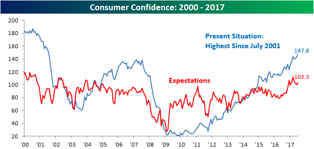
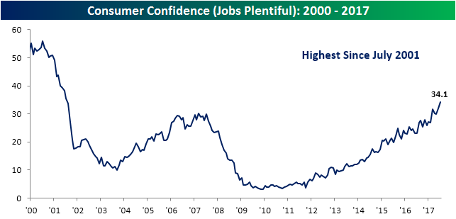
The reason consumers appear to be so confident about their current situation is that it is easy to find work. As shown in the “Jobs Plentiful” tracker, consumers feel that it is easier to find a job now than at any other point since July 2001.