The Bespoke Report Newsletter — 5/11/18
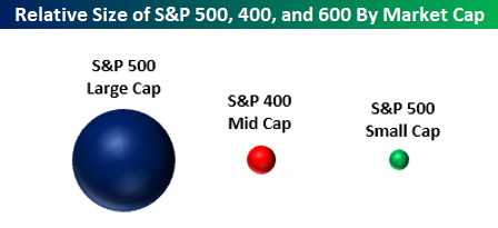
In this week’s Bespoke Report, one of the many topics covered was market weightings and market caps. The bubble chart below shows representations of the size of the large-cap S&P 500, the mid-cap S&P 400, and the small-cap S&P 600. When we speak with a lot of investors, we often hear these asset classes discussed like they are interchangeable. The reality is that they are very different. The S&P 500 is 29 times the size of the S&P 600 small cap index. Therefore, while it has little impact for an individual investor, collectively speaking, any new money in (or out) of the market will have a much more significant impact on small caps than it will on large caps. Think of it like dropping an ice cube in a full glass of water versus a bathtub.
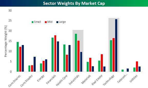
A second chart we wanted to highlight was sector weightings by market cap. While the Technology sector’s weighting is abnormally large in the S&P 500 large-cap index at over 25%, within the small and mid-cap indices, it is at a much more reasonable level of around 15%. In the small and mid-cap indices, the sector that has an abnormally large weighting is actually Industrials. Whereas the sector’s weight is under 10% in the S&P 500, it has a weighting of over 15% in the S&P 400 mid-cap index and a weight of over 18% in the S&P 600 small cap index.
With these weighting abnormalities in mind, when the Technology sector rallies, it has an exaggerated impact on large caps relative to small and mid caps, while an Industrials led rally has a more positive impact on mid and small caps.
As mentioned above, these charts are from our just-published weekly Bespoke Report newsletter, which provides an in-depth review of recent market action and events. To read this week’s Bespoke Report in its entirety, start a two-week free trial to any Bespoke membership level by clicking the button below.
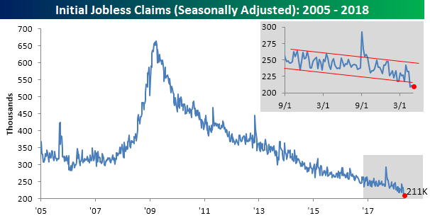
The Closer: End of Week Charts — 5/11/18
Looking for deeper insight on global markets and economics? In tonight’s Closer sent to Bespoke clients, we recap weekly price action in major asset classes, update economic surprise index data for major economies, chart the weekly Commitment of Traders report from the CFTC, and provide our normal nightly update on ETF performance, volume and price movers, and the Bespoke Market Timing Model. We’ve recently added a section that helps break down momentum in developed market foreign exchange crosses as well.
Below is a snapshot from today’s Closer highlighting weekly intraday price charts for major equity indices and other asset classes. If you’d like to see more, start a free trial below.

The Closer is one of our most popular reports, and you can sign up for a free trial below to see it!
See tonight’s Closer by starting a two-week free trial to Bespoke Institutional now!
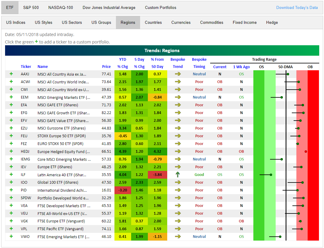
Global Stock Markets Back to Overbought
It took a few months, but global stock markets are mostly back to overbought levels. Below is a snapshot of regional ETFs from around the world using our Trend Analyzer Tool. You can see that every single one is up over the last 5 trading days, and only 4 of them remain below their 50-day moving averages.
Looking at the trading range section on the right side of the snapshot, all but 5 regional ETFs are trading in overbought territory, and just 1 is oversold (Latin America ILF).
Our Trend Analyzer Tool is one of many interactive features we’ve recently introduced to our premium research service. Other features include our Chart Scanner, Stock Seasonality Tool, Earnings Screener, Earnings Calendar, International Revenues Database, Economic Indicator Database, Earnings Triple Plays, and our Economic/Fed Monitor. As traders/investors ourselves, we’ve built all of these original tools to better serve our investment needs after years of learning and refining our approach. We use ALL of them every single trading day, and now our clients can use them as well! You can start using them now by joining Bespoke Premium or Bespoke Institutional!
Rest-of-Month Stock Market Seasonality
Bespoke’s Stock Seasonality Tool allows users to easily look up seasonal performance for US and international stock markets, individual stocks, and every asset class (through widely traded ETFs). When you visit the tool, it immediately shows you the S&P 500’s median change over the next week, month, and three months based on the last ten years worth of trading.
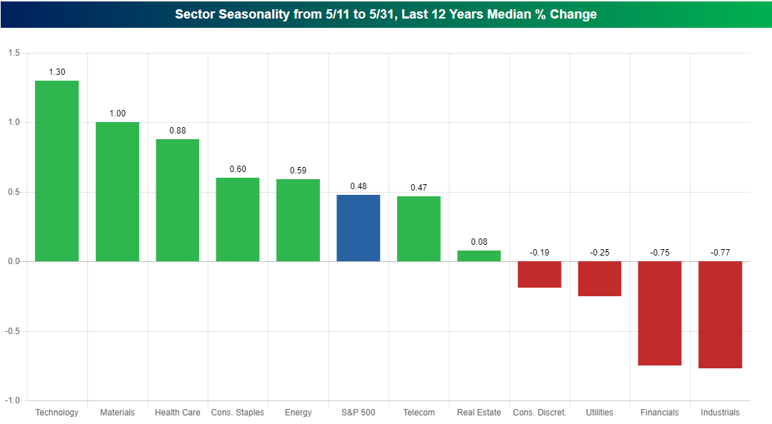
Below is a snapshot of a chart we pulled from the tool today showing historical sector performance for the remainder of May. The chart shows the median change that each S&P 500 sector has experienced from the close on May 11th through the close on May 31st over the last 12 years.
As shown, the S&P 500 as a whole has historically posted a median gain of 0.48% from May 11th through May 31st. That’s pretty good. But there has been quite a bit of disparity when it comes to the performance of various sectors during this time of the year.
The last 20 days of May have been a great time for the Technology and Materials sectors, which have both posted median gains of more than 1%, but it has been a rough time of the year for Financials and Industrials, which have both posted median declines of more than 0.75% over the same time frame.
The Stock Seasonality Tool is one of many interactive features we’ve recently introduced to our premium research service. Other features include our Chart Scanner, Trend Analyzer, Earnings Screener, Earnings Calendar, International Revenues Database, Economic Indicator Database, Earnings Triple Plays, and our Economic/Fed Monitor. As traders/investors ourselves, we’ve built all of these original tools to better serve our investment needs after years of learning and refining our approach. We use ALL of them every single trading day, and our clients can use them as well! You can start using them now by joining Bespoke Premium or Bespoke Institutional!
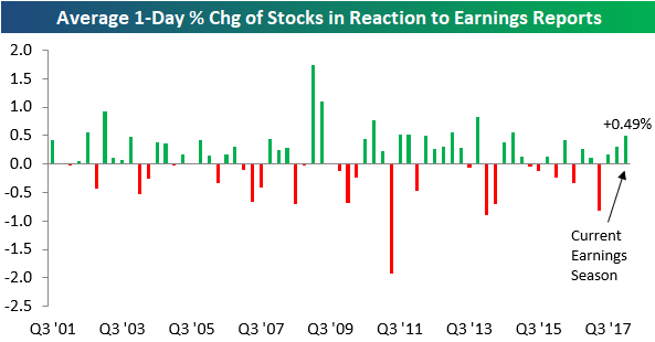
Stocks Reacting Positively to Earnings
So far this earnings season, the more than 2,000 stocks that have reported have averaged a gain of 0.49% on their earnings reaction days. (For a stock that reports in the morning, its earnings reaction day is that trading day. For a stock that reports after the close, its earnings reaction day is the next trading day.)
Below is a chart showing the average 1-day price change in reaction to earnings by quarter since 2001. As shown, this quarter’s reading of +0.49% is actually set to be the strongest since the Q4 2014 reporting period when the average stock gained 0.55% on its earnings reaction day.
Even though expectations for earnings have gotten dramatically more optimistic over the last year, stocks have still managed to react positively to their earnings reports for three consecutive quarters.
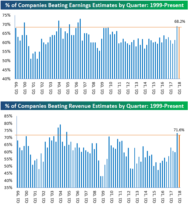
Earnings and Revenue Beat Rates Hold Strong
Another 500+ companies reported earnings this week, bringing the total number of companies that have reported this earnings season up to 2,000+. The “unofficial” end to earnings season comes next week when Wal Mart (WMT) reports on Thursday. With less than a week to go, the summary results for this earnings season aren’t likely to change much.
As shown below, the percentage of companies that have beaten consensus analyst EPS estimates this season now stands at 68.2%. This is down slightly from where it stood a couple of weeks ago, but it’s still a very strong reading nonetheless. There have only been a handful of other quarters (including last quarter) over the last 20 years that have seen higher bottom-line beat rates.
In terms of top-line numbers, 71.6% of companies have beaten consensus analyst revenue estimates this earnings season. Like we’ve seen with the earnings beat rate, the revenue beat rate is extremely strong this season even though it’s down just a hair from last season. There have been just four prior quarters over the last 20 years that have seen stronger top-line beat rates.
The Closer — Taking A Breather: Inflation, Deficit, EM — 5/10/18
Log-in here if you’re a member with access to the Closer.
Looking for deeper insight on markets? In tonight’s Closer sent to Bespoke Institutional clients, we discuss slower inflation readings after a miss today in the BLS report for April. We also take a look at the US monthly budget statement and the explosive rebound in EM assets today.

See today’s post-market Closer and everything else Bespoke publishes by starting a 14-day free trial to Bespoke Institutional today!
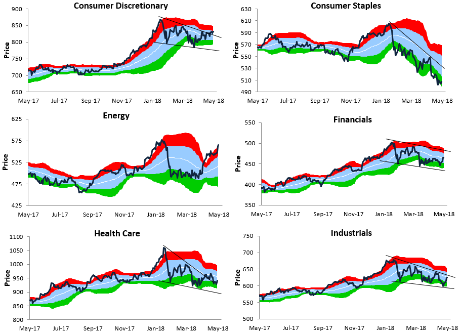
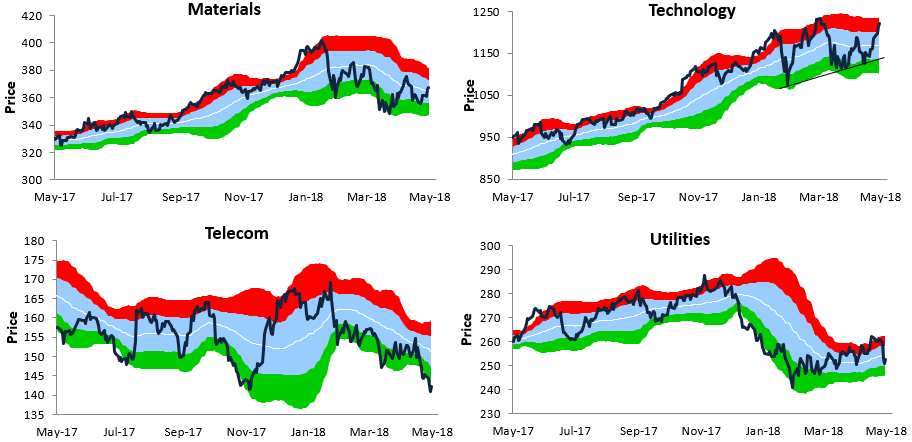
Bespoke’s Sector Trading Range Charts
Below is a look at our one-year trading range charts for ten S&P 500 sectors (the Real Estate sector is excluded). In each chart, the white line represents the 50-day moving average, while the light blue shading represents each sector’s “normal” trading range. This range is calculated as one standard deviation above and below the 50-DMA.
Moves into or above the red zone are considered overbought, while moves into or below the green zone are considered oversold.
For some of the charts, we’ve drawn trend lines where applicable. Note that Consumer Discretionary has now broken above the top of its downtrend channel. Consumer Staples, on the other hand, remains in a steep downtrend.
The Energy sector has moved up into extreme overbought territory, while Financials is just breaking back above its 50-DMA. The Health Care sector hasn’t bounced nearly as much as some other cyclical sectors, and Industrials is still flirting with its 50-DMA and the top of its downtrend channel.
Technology is the one sector that has managed to make a series of higher lows since its first correction low back in February. At this point Tech is approaching new all-time highs again!
Bespoke’s Sector Snapshot — 5/10/18
We’ve just released our weekly Sector Snapshot report (see a sample here) for Bespoke Premium and Bespoke Institutional members. Please log-in here to view the report if you’re already a member. If you’re not yet a subscriber and would like to see the report, please start a two-week free trial to Bespoke Premium now.
Below is one of the many charts included in this week’s Sector Snapshot, which highlights the percentage of stocks by sector trading above their 50-day moving averages. As shown, in the Energy sector, 97% of stocks are now above their 50-DMAs, which is an extremely high reading.
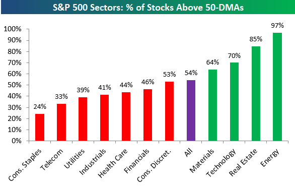
To find out what this means and to see our full Sector Snapshot with additional commentary plus six pages of charts that include analysis of valuations, breadth, technicals, and relative strength, start a two-week free trial to our Bespoke Premium package now. Here’s a breakdown of the products you’ll receive.
Introducing Bespoke’s Beige Book Sentiment Index
Twice per quarter, the Federal Reserve publishes a qualitative assessment of the economy called the Beige Book. The Beige Book makes for very interesting reading, filled with anecdotal discussion about the state of output, prices, consumer spending, confidence, and other indicators nationally and in each of the Fed’s individual districts. While useful, the Beige Book is very long, with the most recent edition running in excess of 14,000 words! In an effort to more quickly digest that huge body of text, we have developed an algorithm to quickly summarize the main thrust of the Beige Book. By analyzing the balance of positive words relative to negative words, we summarize what the Beige Book is saying about the economy. As currently constructed, Bespoke’s Beige Book Sentiment index reports the share of positive descriptors less negative descriptors divided by all descriptors. Over time, this diffusion index tends to lead GDP and is more timely, as shown in the chart below.
Readings above zero indicate more positive descriptors than negative ones, and vice-versa. The most recent reading hit a new multi-year high, but it’s still below readings seen during the early part of the current expansion. Only twice has the reading dipped below zero, and they both occurred near the depths of the last two recessions.
Our new Beige Book Sentiment economic indicator will be released in the moments after the Beige Book release twice per quarter (or eight times per year). Access to this new economic indicator and its sub-indices is only available at the Bespoke Institutional subscription level, which you can start a free trial to here. If you have any questions about the Bespoke Beige Book Sentiment index, please submit a contact form at our About page.