Bespoke’s Consumer Pulse Report — February 2019
Bespoke’s Consumer Pulse Report is an analysis of a huge consumer survey that we run each month. Our goal with this survey is to track trends across the economic and financial landscape in the US. Using the results from our proprietary monthly survey, we dissect and analyze all of the data and publish the Consumer Pulse Report, which we sell access to on a subscription basis. Sign up for a 30-day free trial to our Bespoke Consumer Pulse subscription service. With a trial, you’ll get coverage of consumer electronics, social media, streaming media, retail, autos, and much more. The report also has numerous proprietary US economic data points that are extremely timely and useful for investors.
We’ve just released our most recent monthly report to Pulse subscribers, and it’s definitely worth the read if you’re curious about the health of the consumer in the current market environment. Start a 30-day free trial for a full breakdown of all of our proprietary Pulse economic indicators.
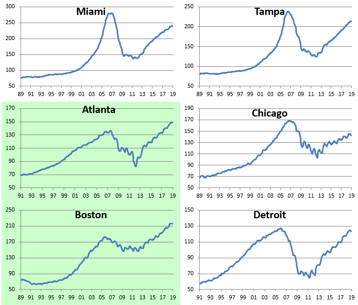
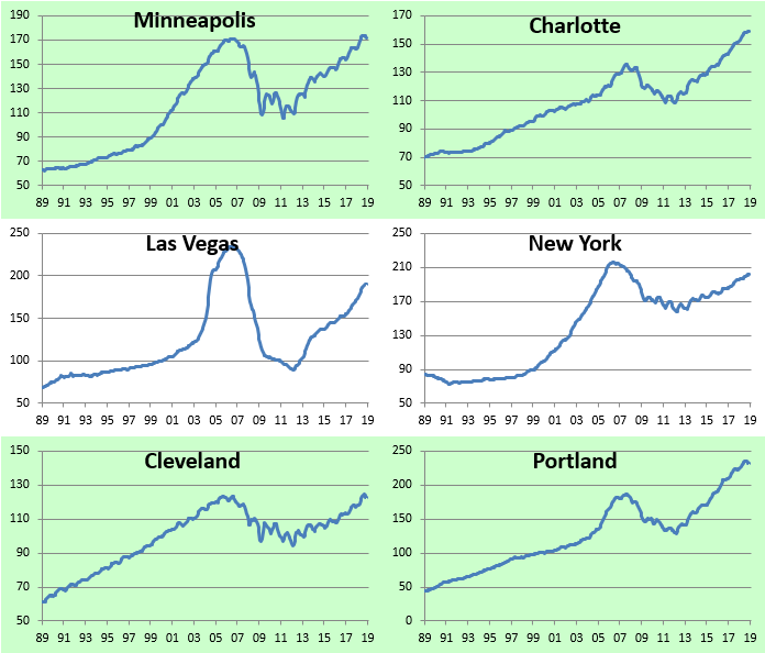
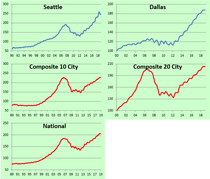
2018 Home Price Trends for Major US Cities/Regions
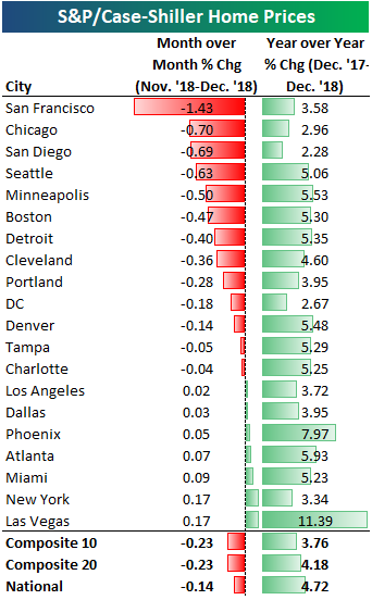
The most recent Case Shiller home price data for the 20 cities tracked was released last week, and below we have updated a number of charts and tables that we’ve published on a regular basis over the years. The first table shows the month-over-month and year-over-year change in home price values across the country. After years of seeing all green in this table, we’ve seen a string of month-over-month declines recently. The composite 10-city and 20-city indices both fell 23 basis points in December, while the “National” index saw home prices dip 14 basis points.
San Francisco saw the biggest month-over-month decline at -1.43%, followed by Chicago (-0.70%), San Diego (-0.69%), and Seattle (-0.63%). Seven of twenty cities saw small month-over-month gains, led by New York and Las Vegas at +0.17%.
On a year-over-year basis, every city still posted home price gains, but those gains are getting smaller and smaller as the months progress.
The chart below shows how much each city has seen home prices gain off of their housing crash lows that were put in sometime between 2010 and 2012 for most cities. San Francisco is up 128% off of its lows, while Las Vegas and Detroit are both up more than 100% as well. The National index is up 53% off of its low, while New York home prices have bounced the least at just 25%.

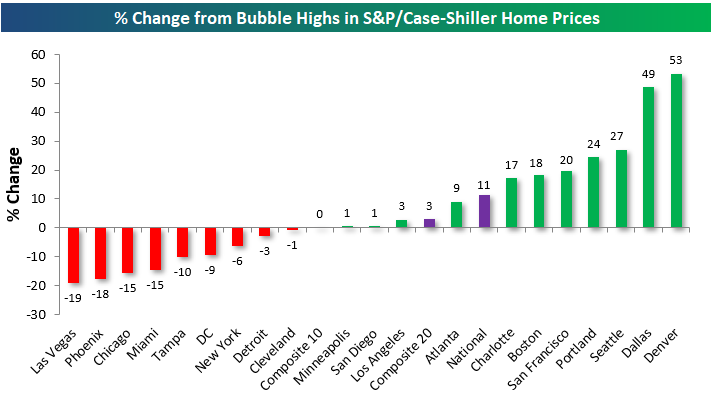
The next chart shows where home prices stand for each city relative to their peak during the housing bubble of the mid-2000s. The National index is up 11% from its prior all-time high that was made in July 2006. Denver prices have soared the most above their prior highs at +53%, followed by Dallas at +43%. On the flip side, Las Vegas is still the furthest below its housing bubble highs from the mid-2000s at -19%. Phoenix, Chicago, Miami, and Tampa are all still 10%+ below their prior highs as well.
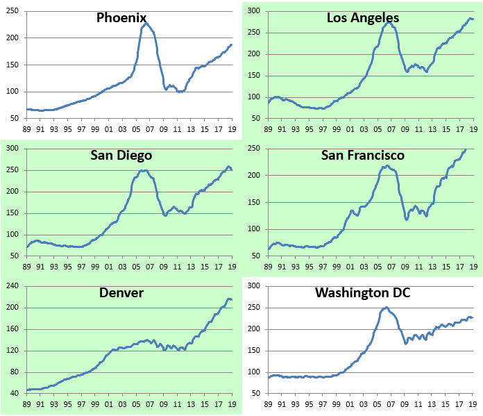
Below we provide charts showing home price levels over the last 30 years for the cities tracked by Case Shiller. Cities highlighted in green have taken out their prior housing bubble highs, while cities not highlighted are still below their prior all-time highs.
The next set of charts shows the rolling year-over-year change for home prices in each of the 20 cities tracked. You’ll notice that home price appreciation for the National and Composite indices has begun to turn lower, although it’s still important to remember that it’s positive. Cities like Portland, Denver, Seattle, and Dallas have seen some of the steepest drops in home price growth, but again, every city is still in the green on a year-over-year basis for the time being.
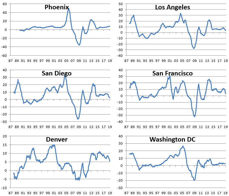
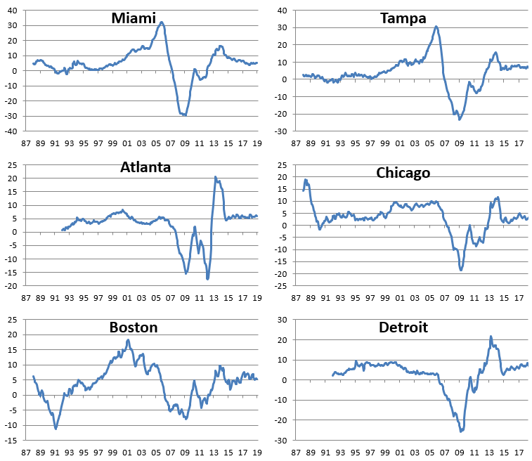
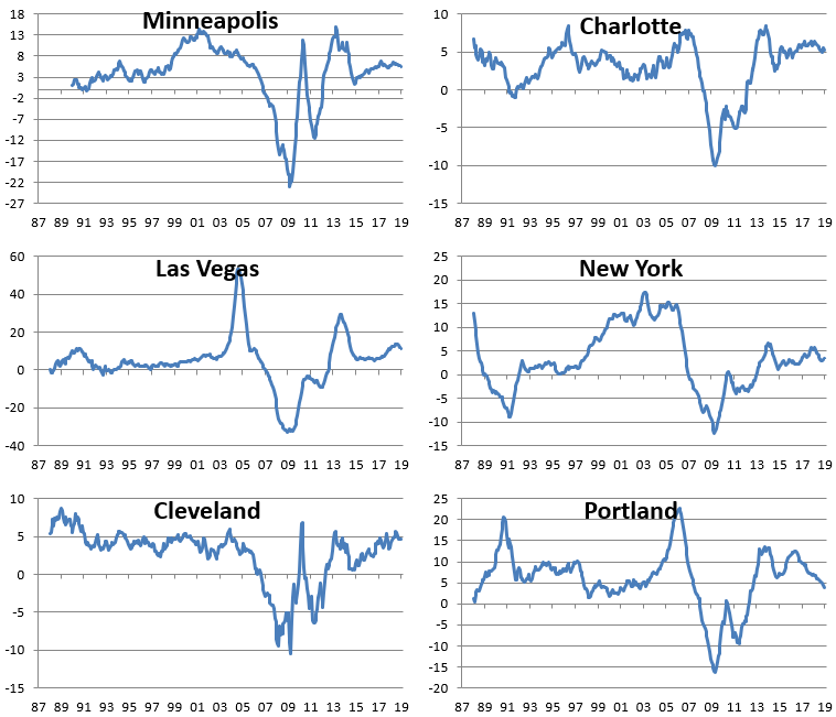
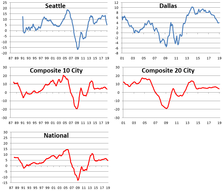
Chart of the Day: Breadth Stays Strong
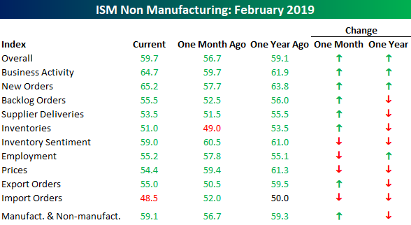
No Slowdown in Services Sector
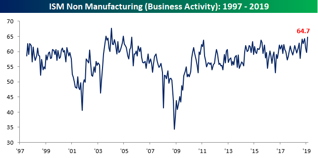
If this is a slowdown, we’ll take it. While economic data clearly slowed in December and January due to a combination of equity market weakness, the government shutdown, and other factors, activity really appears to have bounced back in February. In the case of the ISM Non-Manufacturing report, February not only increased versus January’s reading of 56.7, but it also came in higher than the consensus expectation of 57.4. At 59.7, February’s report was just slightly more than one point below the cycle high of 60.8 from back in September.
On a combined basis and accounting for each sector’s share of the total economy (second chart), the February ISM came in at 59.1 which was nearly two points below the cycle high of 60.7 from back in September. Following the strength of this report, the market is now once again pricing in a higher chance that the FOMC hikes rates between now and next January (8.9%) versus cutting rates (5.6%). Meanwhile, the odds that the FOMC sits on its hands between now and then are at just under 86%. Normally, we would say the odds of the FOMC doing nothing are extremely low, but now that they have the balance sheet to tinker with, a long pause on the Fed Funds rate is certainly a possibility.

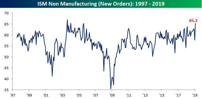
The table below breaks down February’s report by each of its sub-components. On a m/m basis, this month’s report saw solid breadth, although versus where things stood a year ago the pace of growth has been less robust. The real stars of this month’s report, however, were Business Activity and New Orders (two charts below table). Business Activity rose to 64.7, which is the highest reading that component has seen since August 2005! New Orders saw an even more impressive move. While it also reached its highest level since August 2005, the m/m increase of 7.5 points was the third largest on record behind only the 9.6 point jump in April 2009 and the 8 point rise in February 2002. Pretty impressive!
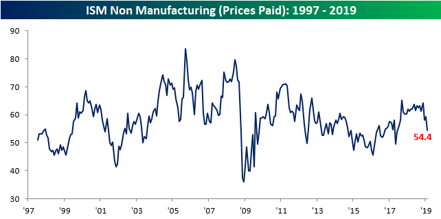
On the downside, Prices Paid saw the largest m/m decline of any component, falling from 59.4 down to 54.4 to its lowest level since June 2017. Behind Prices Paid (lowest chart), the only other components to decline on a m/m basis were Import Orders, Employment (which doesn’t necessarily bode well for Friday’s Payrolls report), and Inventory Sentiment.
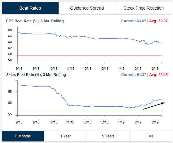
Earnings Slow to a Crawl as Top-Line Beat Rate Continues to Increase
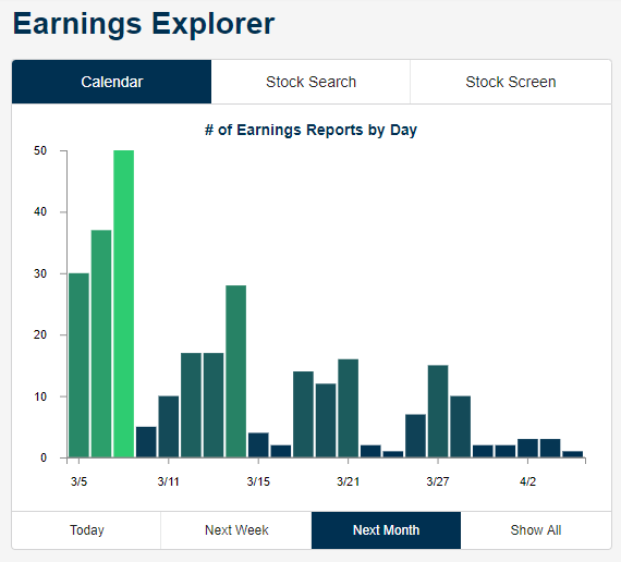
As shown in the chart below from our Earnings Explorer tool, the number of earnings reports slows to a crawl in the weeks ahead. While there are still a lot of companies set to report this week, including a number of big retailers like Kroger (KR), Costco (COST), Dollar Tree (DLTR), Ross Store (ROST), by next week we’ll get only about 20 reports per day. At the end of March and early April, we’ll only see 5-10 reports per day before things pick back up again in mid-April when Q1 reports start to roll in.
One positive we continue to monitor is the pick-up that we’ve seen in top-line revenue beat rates. Below are two charts from our Earnings Explorer tool — the first shows the 3-month rolling earnings per share beat rate, while the second shows the 3-month rolling revenue beat rate. While bottom-line beat rates continue to trend slightly lower, we have seen a steady increase lately in top-line beats. This means that either the analysts providing revenue estimates got too bearish, or companies have managed to surprise the market with stronger revenues (or a combination of both).
Trend Analyzer – 3/5/19 – Last Three
As we have seen over the past few days, in the midst of some choppy price action, the major index ETFs continue to shed their downtrends. In spite of declines yesterday, there are once again fewer ETFs in downtrends than the prior day. Currently, there are only three that remain in downtrends. Each of these three are small-cap focused ETFs (IJR, IWC, IWM). Ironically, these are also some of the best performing members of the major index ETFs year to date. The Russell 2000 (IWM) and Micro-Cap (IWC) are the top two performers up 17.11% and 16.34% YTD, respectively.
Turning to performance over the past week, things are unfortunately not as positive. There are only two ETFs that have managed to edge out gains: the S&P 100 (OEF) and the Nasdaq (QQQ). All others have seen declines ranging from only a few basis points to 1.65%. These declines have also shifted the overbought/oversold conditions that we have been observing over the past few weeks. Whereas everything has been solidly overbought, and each ETF still has an overbought rating, it is currently much less firmly so.

Morning Lineup – Better Than Expected Data in Europe; Breadth Still Positive
We’ve seen some better than expected economic data out of Europe for a change this morning as PMIs for the Services sector mostly came in better than expected. US equity futures are pointing to a slightly higher open after yesterday’s weakness. In Asia, China lowered 2019 GDP growth forecasts and President Trump is threatening to end preferential trade treatment for India and Turkey. Read all about everything driving the markets in today’s Morning Lineup.
Bespoke Morning Lineup – 3/5/19
We’ve been discussing the market’s strong breadth so far in 2019 for several weeks now, but today we wanted to provide another illustration of it. The S&P 500’s 10-Day A/D line typically oscillates between positive and negative territory on what is usually a week to week basis or at least every couple of weeks to weeks. Lately, though, it has been all positive. Through yesterday’s close, the 10-Day A/D had been positive for 39 straight trading days. That’s over eight weeks in calendar days!
These kinds of periods of consistent positive breadth don’t typically happen very often. Going back to 1990, there have only been four other periods where the 10-day A/D line was positive for longer than it has been now.

Start a two-week free trial to Bespoke Premium to see today’s full Morning Lineup report. You’ll receive it in your inbox each morning an hour before the open to get your trading day started.

The Closer — Lyft Hits The Market, Construction Collapse — 3/4/19
Log-in here if you’re a member with access to the Closer.
Looking for deeper insight on markets? In tonight’s Closer sent to Bespoke Institutional clients, on a quiet day in macro data, we turn to the upcoming IPO of ride-sharing giant Lyft. We take a look at the company’s annuals and offer some forecasts as to the growth prospects. We finish with a note on today’s Construction Spending data which showed the weakest YoY growth in the post-recession period.

See today’s post-market Closer and everything else Bespoke publishes by starting a 14-day free trial to Bespoke Institutional today!
Boeing Soars
To say that Boeing shares have had a good start to 2019 would be like calling the 747 a puddle jumper. With a gain of over 50% from its late 2018 low and a YTD gain of over 36% through last Friday’s close, it has been one of the strongest starts to a year (through 3/1) for a current DJIA component in decades.
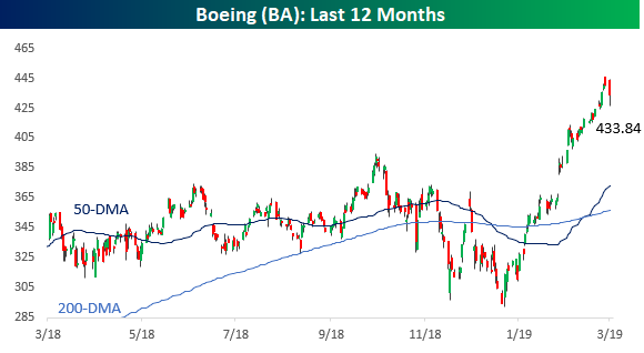
Making its move even more noteworthy is that with a share price of more than $400 and the fact that the Dow is a price-weighted index where each component’s weighting in the index is based on its share price, BA’s rally has had a ‘jumbo’ impact on the overall index. BA’s weight in the DJIA currently stands at 11.5%, while its weighting in the S&P 500, which is a market cap weighted index, is less than 1%. As a result, through Friday’s close the DJIA had gained 2,807 points so far in 2019 and BA accounted for 812 of them. That works out to 29% of the DJIA’s entire gain this year! Without BA’s rally, the DJIA would only be up about 8% this year versus its 11.5% gain through Friday. Behind BA, the next closest stock in terms of its impact on the DJIA this year has been Goldman Sachs (GS) which has accounted for 216 points of the DJIA’s YTD gain (7.7%).
As mentioned above, BA’s strong start to the year is one of the best for current DJIA components going back to 1995. Of the 30 current members, there have been just four prior occurrences where a stock rallied more than 30% YTD through the close on 3/1, and two of those were in the stock of Apple (1998 & 2005) well before it was even added to the DJIA. The only two other occurrences were Intel’s (INTC) 41% gain in 2000 just after it was added in late 1999 and then Microsoft (MSFT) the next year in 2001 when it rallied 37%. The key difference between those two occurrences and Boeing, though, is that because of their share prices at the time, they didn’t have nearly the positive impact on the overall index when they rallied.
While bulls have nothing to complain about regarding BA’s big rally this year, the impact of high price stocks on the DJIA cuts both ways. Barring any future stock splits, even just a 10% correction in shares of BA would clip the DJIA by more than 250 points.
