B.I.G. Tips – Death by Amazon – 4/23/19
Our “Death By Amazon” index was created many years ago to provide investors with a list of retailers we view as vulnerable to competition from e-commerce. In 2016, we also created our “Amazon Survivors” index which is made up of companies that look more capable of dealing with the threat from online shopping. To see how the two indices have been performing lately and view the full list of stocks that make up the indices, please read our newest report on the subject available to Bespoke Premium and Bespoke Institutional members.
To unlock our “Death By Amazon” and “Amazon Survivors” indices, login or start a two-week free trial to either Bespoke Premium or Bespoke Institutional.

Best and Worst Performing IPOs
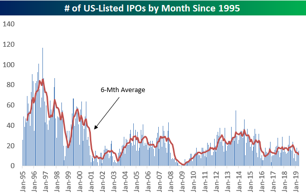
Recent initial public offerings like Lyft (LYFT), Zoom (ZM), and Pinterest (PINS) have sparked a lot of interest lately, so below is a chart showing the number of US-listed IPOs by month since 1995. As you can see, the monthly numbers have actually been trending lower since peaking for the current bull market in mid-2014. And the late 1990s, when we were seeing 100+ IPOs in some months, is an environment we might never again see in our lifetimes again.
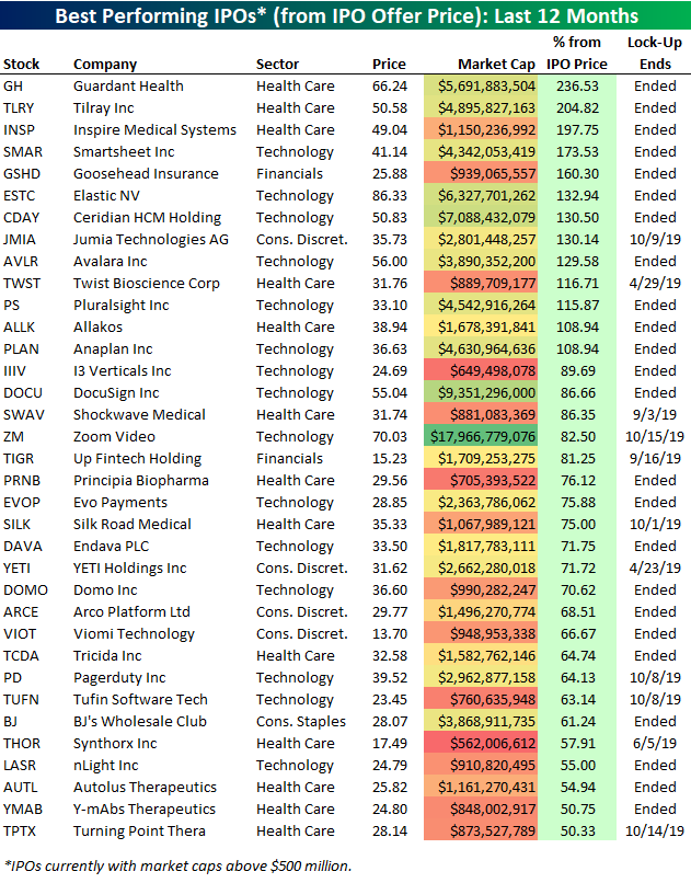
We ran a screen of companies that went public within the last 12 months to find the ones that are up the most from their IPO price. Below is a list of the 35 best performers.
Two recent Health Care IPOs are up more than 200% from their IPO price — Guardant Health (GH) and Tilray (TLRY). Inspire Medical (INSP) — another Health Care stock — ranks 3rd best with a gain of 197.75%. Zoom Video (ZM) is the largest stock on the list with a market cap of $17.97 billion. ZM just went public last Thursday and is already up 82.5% from its IPO price! Note that Zoom’s lock-up expiry (the date that shareholders within the company can sell shares) isn’t until October 15th.
Other notables on the list of biggest IPO winners include digital signature company DocuSign (DOCU), sales tax software company Avalara (AVLR), and the popular cooler and mug company Yeti Holdings (YETI). Yeti’s lock-up actually ends today, so it will be interesting to see how the stock trades near term.
Below are companies that went public within the last 12 months that are down from their IPO price. (Note that only companies with market caps above $500 million are included on this list and the one above.)
Ride-sharing app Lyft Inc. (LYFT) is by far the biggest standout on the list of IPO losers. Since the company went public at the end of March, its shares are down 15.36%. With a lock-up date of September 25th, corporate insiders have a long time to watch these shares rise and fall without being able to exit.
Start a two-week free trial to Bespoke Premium to unlock all that Bespoke’s research has to offer!

Knocking on New High’s Door
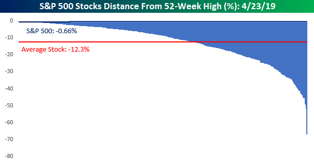
With a late-morning surge in equity prices pushing the S&P 500 above its all-time closing high from 9/20, we wanted to see where individual stocks in the index stand relative to their own 52-week highs. The chart below shows the distance (in percentage terms) that every stock in the S&P 500 is trading from its 52-week high. Overall, the S&P 500 is now within 1% of its 52-week high. For individual stocks, though, the average distance from their respective 52-week highs is actually just over 12%. Also, in case you were wondering, the blue bar all the way to the right represents Nektar Therapeutics (NKTR) which is down 67% from its 52-week high! There may always be a bull market somewhere, but as NKTR proves, there always a bear market somewhere too.
With the S&P 500 knocking on the door to new all-time highs, we’re going to also want to see an expansion in the number of stocks hitting new highs. So in order to see which sectors pose the best chance of expanding the new high list, the table below breaks down each sector within the S&P 500 and shows how far stocks in each one are, on average, trading down from their respective 52-week highs as well as what percentage of stocks in the sector are trading within 5% of a 52-week high.
The Utilities sector tops the list with the average stock in the sector down just 4.2% from its 52-week high and 79% of stocks in the sector trading within 5% of a new high. After Utilities, just two other sectors have more than half of their components trading within 5% of a new high (Technology and Industrials). Given the sector’s relatively low volatility, it’s not too surprising that Utilities top the list. The fact that more than half of stocks in the Technology and Industrials sectors are within 5% of their 52-week highs, though, is impressive. These are two sectors to watch as the S&P 500 attempts to take out its highs.
At the other end of the table, Energy is still trying to recover from its weakness last year as the average stock in the sector is still down over 20% from its 52-week high and barely 10% of stocks in the sector are within 5% of a new high. Because of its relatively low weight in the S&P 500, Energy hasn’t acted as much of a drag. Health Care, though, is a different story. After the recent carnage in the sector, the average Health Care stock is down nearly 18% from its 52-week high, and less than 10% of stocks in the sector are within 5% of a new high. With a weighting of over 13% in the S&P 500 and 61 stocks in the sector, it is going to be difficult to get any meaningful expansion in new highs with Health Care stuck in the infirmary. Start a two-week free trial to Bespoke Premium to unlock all that Bespoke’s research has to offer!
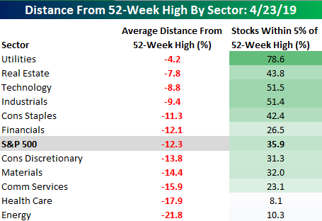
Chart of the Day: Anything But Defensive
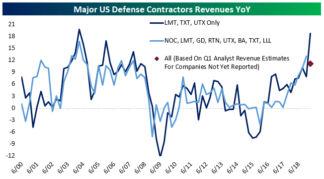
This morning, Lockheed-Martin (LMT) smashed earnings expectations, reporting $5.99 EPS for Q1 versus $4.34 expected. The beat was driven by sales of $14.3bn, exceeding analyst estimates of $12.6bn, and also came with a dramatic upgrade to guidance for all financial metrics this fiscal year. The triple play from LMT joined strong reports from Textron (TXT) and United Technologies (UTX). Together, these three companies are seeing combined revenues grow at a staggering 18.7% YoY, the fastest since defense spending’s huge ramp up following the 9/11 attacks and the invasions of Afghanistan and Iraq. Among other defense contractors, analysts are projecting revenue numbers for Q1 that would indicate a significantly lower revenue growth number, but if the results from LMT, TXT, and UTX are any indication, those forecasts are going to be handily beaten.
So which of the other defense contractors currently look the most attractive?
Continue reading this Chart of the Day by starting a two-week free trial to any of our research membership levels.
Morning Lineup – Earnings Season Wakes, Gold Goes to Sleep
With markets around the world all open following a holiday on Monday for many, the mood is mixed although US futures are right near their highs of the morning. The catalyst in the US is solid earnings reports. Of the nearly 50 names that have reported so far this morning, two-thirds have exceeded EPS forecasts. More impressive, however, is the fact that two-thirds of those companies reporting have also exceeded top-line revenue estimates. It’s only one morning’s worth of data, but it is also the busiest day of earnings so far this reporting period.
We’ve just published today’s Morning Lineup featuring all the news and market indicators you need to know ahead of the trading day. To view the full Morning Lineup, start a two-week free trial to Bespoke Premium.

Here’s an interesting chart to start your day:
As earnings season has come to life, gold has completely flat-lined in the last few trading days. Take a look at the chart below which shows the YTD performance of the SPDR Gold Trust ETF (GLD). Over the last four trading days, the spread between the intraday high and low over that period has been just 0.40%. While that narrow a spread is notable enough, its the third time this year that GLD has gone into one of these four-day nap periods where the spread between the intraday high and low was less than 1%! Like the last two, will this one be another pause that refreshes?

What’s even more notable about the recent narrow range for GLD is that since the ETF started trading in 2005, there has never been a four-day period where the spread between the intraday high and low over those four days has been narrower. Volatility isn’t just lower in the equity market as gold has become increasingly less volatile in recent years.

Start a two-week free trial to Bespoke Premium to see today’s full Morning Lineup report. You’ll receive it in your inbox each morning an hour before the open to get your trading day started.
The Closer — Earnings Flood, HYG Drop, 2s10s Breakout, VIX Curve, Growth Uptick — 4/22/19
Log-in here if you’re a member with access to the Closer.
Looking for deeper insight on markets? In tonight’s Closer sent to Bespoke Institutional clients, while it may have been a quiet day in equities before a massive amount of earnings in the days to come, credit was a different story. High Yield credit fell from open to close for its fifth straight day and the yield curve has steepened, we explain what this could mean going forward. Next, we cover risk sentiment as seen through the VIX. Turning to macroeconomic data, we look at today’s Chicago Fed National Activity Index release which came in weaker than forecast with a revision lower. We finish with a look at our Beige Book Index, updated with last Thursday’s release.

See today’s post-market Closer and everything else Bespoke publishes by starting a 14-day free trial to Bespoke Institutional today!
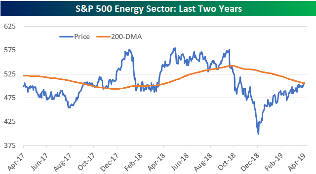
Energy Sector Back Above 200-DMA as Oil Rallies; Energy Stocks and Oil Correlation
The S&P 500 Energy sector moved above its long-term 200-day moving average today on the back of another sharp move higher for crude oil prices. It was the Energy sector’s first close above its 200-DMA since October 10th, 2018. As shown below, while the sector has rallied significantly off of its December 2018 low, it’s still right in the middle of the range it has been in over the last two years.
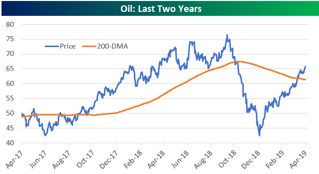
Oil has rallied nearly 60% off of its December low, and as shown below, the commodity eclipsed its 200-DMA a few weeks ago well ahead of the Energy sector.
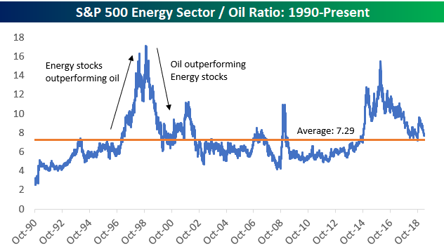
Below is a long-term look at the ratio of Energy stocks to oil. When the line is rising, Energy stocks are outperforming oil. When the line is falling, oil is outperforming Energy stocks.
You can see in the chart that there have been two big periods of strength for Energy stocks (versus oil) over the last 30 years. One period was during the late 1990s when equities in general were on fire, and the other was from 2014 through early 2016 when both oil and Energy stocks were in free-fall (oil fell a lot more). Since oil bottomed in the mid-$20s three years ago, we’ve seen the commodity far outpace Energy stocks. Oil is up 148% off of its lows while Energy stocks are up just 30%.
At any rate, while the ratio is certainly volatile, the current level of 7.7 is just a notch above the long-term average ratio of 7.29.
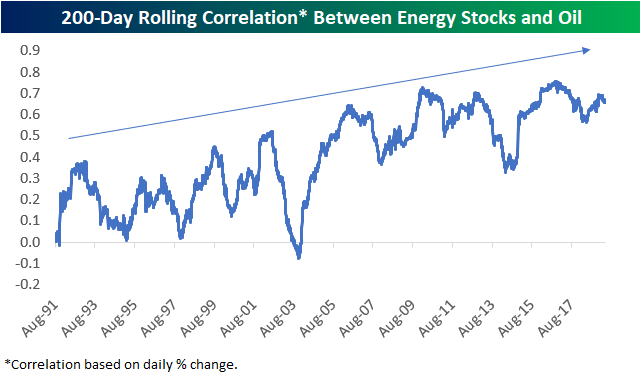
In terms of the day-to-day fluctuations for oil prices and Energy stocks, over the last 30 years we’ve seen the two become more and more correlated. Below is a chart showing the rolling 200-trading day correlation between their daily price movements (%). During the 1990s, the correlation between the two ranged from 0 to 0.5 with even a couple dips into negative territory. Since 2003, though, we’ve seen the correlation increase more and more over time, and it actually hasn’t dipped below 0.50 in a few years now.
Start a two-week free trial to Bespoke Institutional to unlock all that Bespoke’s research has to offer!
Megacap Market Caps
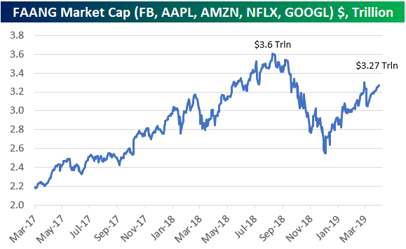
The five FAANG stocks of Facebook (FB), Apple (AAPL), Amazon (AMZN), Netflix (NFLX), and Alphabet (GOOGL) saw their combined market cap fall 30% during the late 2018 sell-off. As shown in the chart below, their combined market cap has climbed back quite a bit since the lows, but it’s still about $330 billion from prior highs. Start a two-week free trial to Bespoke Institutional to access our premium research!
If we just look at the four largest companies in the S&P 500 instead of FAANG, they’re a lot closer to eclipsing the prior combined high of $3.8 trillion. As shown below, Apple (AAPL), Amazon (AMZN), Microsoft (MSFT), and Alphabet (GOOGL) together account for $3.7 trillion in market cap at the moment.
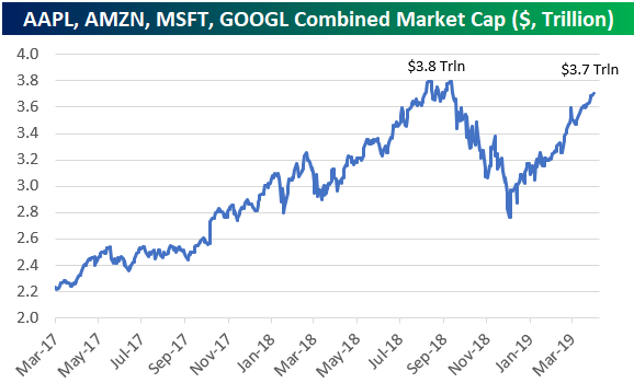
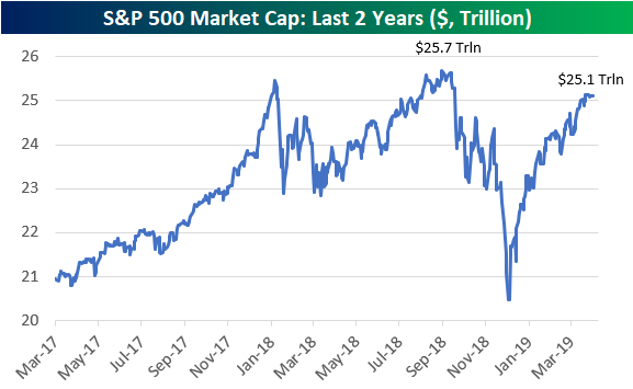
The $3.7 trillion in market cap that the four largest stocks make up accounts for about 14.7% of the S&P 500’s total market cap of $25.1 trillion. The S&P 500 as a whole needs to add another $600 billion in market cap to eclipse its late 2018 high of $25.7 trillion, more than half of which is from the five FAANG stocks.
Sector Charts – 4/22/19 – Financials
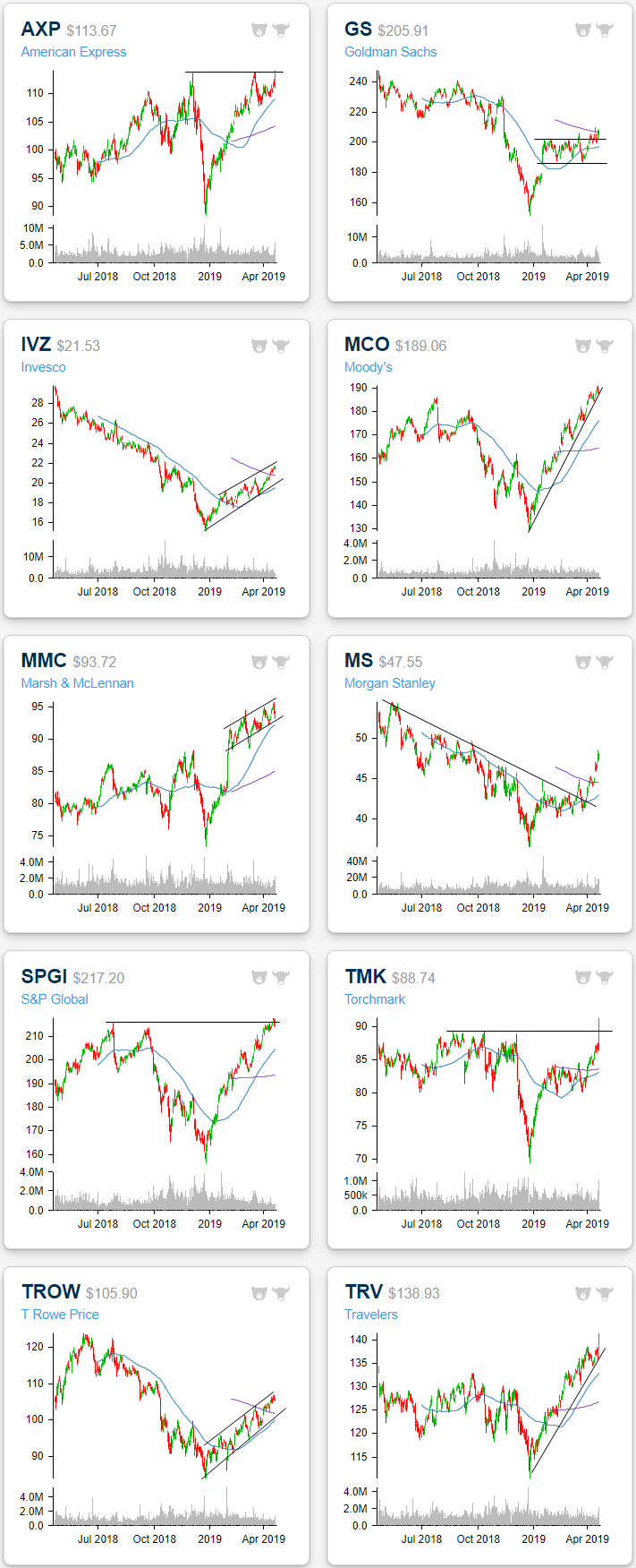
Following a long list of the major companies in the sector reporting earnings over the past week, Financials have been the second strongest sector. With a 2.5% gain since the start of last week, the Financial Sector (XLF) has become extremely overbought. Even at these levels, there are a number of attractive charts, some of which thanks to their response to earnings.
Of the companies shown below, American Express (AXP), Goldman Sachs (GS), Morgan Stanley (MS), Torchmark (TMK), and Travelers (TRV) all reported earnings within the past week. The reactions have ranged from explosive, like TMK and TRV, to more subdued, like GS. Running down the list, popular credit card company American Express reported on Thursday beating EPS estimates but also falling short in terms of revenues. The stock still rallied 1.71% in response, bringing it just above highs from late last year and earlier this year. Today, the stock has pulled back slightly but is up from the open.
GS reported one week ago last Monday. Similarly seeing a top line miss and bottom line beat, GS fell 3.82% on the day. While earnings may not have acted as a catalyst, the stock saw some buying in the days since its report, bringing it above its recent range before failing at the 200-DMA.
Reporting mid-week (4/17), Morgan Stanley (MS) beat both EPS and sales estimates leading it to rally 2.64% into extreme overbought territory. The stock has fallen off of these levels but this strong run has been a nice sign following a long term downtrend through most of last year and a flat start to 2019. This recent run higher has brought it out of this year’s range as well as above the 200-day.
Similar to MS hitting extremely overbought levels, Torchmark (TMK) and Travelers (TRV) both rallied 2.88% and 2.25%, respectively, in response to their earnings last week. For TMK, like American Express, the earnings report was just the push the stock needed to retouch 52-week highs after what was looking like a flat year. Meanwhile, TRV has been in a solid uptrend all year. The stock couldn’t hold onto highs from Thursday’s response to earnings, but it has set a precedent for a move higher.
After a somewhat rough 2018, uptrends are common among Financials this year. After a brutal downtrend all last year, Invesco (IVZ) finally found a bottom alongside the broader market and has been making a series of higher lows and higher highs ever since. At its current levels, it has gotten a bit extended so a pullback like we saw multiple times earlier this year is increasingly possible. Regardless it has had a clean chart and in the past couple of weeks has closed above the 200-DMA for the first time since last March.
While their 2018 downtrends may not have been as long or clean as IVZ, Moody’s (MCO), T Rowe Price (TROW), and S&P Global (SPGI) each have a similar chart to IVZ with a steep downtrend last year and a solid uptrend so far this year. TROW and IVZ both have a lot of progress to still make until they retake last year’s highs, while MCO and SPGI have made considerable pushes and are now solidly above prior highs. Both of these are also a bit more attractive at current levels as they are sitting at the bottom of their uptrend line. TROW and MCO both report later this week while SPGI is out on May 2nd.
Staying on the topic of uptrends, Marsh & McLennan (MMC) did not see the same type of downtrend in 2018, rather it saw a fairly choppy sideways trend with increasing volatility into the end of the year. But following a surge after its February earnings report, the stock has been in a steady uptrend. It is now coming off of overbought levels to the bottom of its uptrend channel and just barely overbought, meaning it could begin to reverse higher, continuing its uptrend soon. Start a two-week free trial to Bespoke Premium to access our interactive Chart Scanner and much more.