Gas Prices Flatline
The summer driving season is typically defined as the period between Memorial Day and Labor Day. This year, the summer season has been a bit different due to COVID, and while many Americans who would have traveled outside the United States have opted to stay domestic, overall driving is down. With fewer people driving to work and driving around in general, gas prices have been pushed down to extremely low levels relative to recent history.
The table below shows the historical price of the national average price for a gallon of gas based on AAA data. At the current national average of $2.19, a gallon of gas hasn’t been this cheap at this time of year since at least 2005. While prices were up on a YTD basis every year from 2005 through 2019 by an average of 18.3%, this year the national average price is down over 15%.
The chart to the right of the table below compares gasoline prices this year (red line) to a composite of gas prices during the ‘average’ year (blue line). So far this year, the pattern of prices is nearly the exact opposite of the average year. While prices tend to rise through the first five months of the year, this year they trended lower, bottoming right in late April. After a decent increase in prices from May through early June, prices have completely flat-lined in the last two months.

While it’s not uncommon for prices to remain steady throughout the summer months, the current flat-lining of prices has been nearly without precedent. The chart below shows the rolling two-month (60 calendar days) high low range of the national average price of gasoline since early 2004. With the current two-month range spanning $2.174 to $2.201, or 1.24%, the only other time the range was narrower was in late June/early July 2014. Throughout the last fifteen years, there has never been a time where gas prices have been this low at this time of year or this stable. Click here to view Bespoke’s premium membership options for full access to our research and interactive tools.

Chart of the Day: Overbought Apple (AAPL)
Worlds Apart: YTD Sector Performance
If you want to see an example of where the term winners and losers couldn’t be more applicable, take a look at the performance of S&P 500 sector ETFs on a YTD basis. The chart below is derived using performance numbers from our Daily Sector Snapshot report, which provides investors with an easy-to-read matrix of technical analysis, breadth and internal readings, and fundamental data points. It’s the perfect way to get an aerial snapshot of both current readings and the way they’ve been trending for each of the major sectors. This perspective also allows investors to see how sectors stack up versus each other as well as relative to themselves on a historical basis.
2020 has clearly been a case of the have and have nots. On the haves side, Technology (XLK) and Consumer Discretionary (XLY), which is basically Amazon (AMZN) and a few other retailers, top the list. Rounding out the top three, Communication Services (XLC) is the only other sector up over 10% and outperforming the S&P 500. On the have-nots (or in this case, the ‘nearly halves’) side, we have Energy leading the way lower with a decline of 41%, followed by Financials (XLF) which is down 21.2%.
There was a time not long ago when Energy and Financials were considered the life-blood of a capital intensive economy, but these two sectors have been deemed irrelevant by the market in the current work-from-home world where interest rates are zero and money is practically free. Instead, Communications, Technology, and Retailers with a strong online infrastructure are the ever-important cogs in the digital economy. Today, it may seem that this is a secular shift in the shape of our economy, which in many respects is true. But don’t count out the old leaders just yet. Someday, ‘going to work’ will once again mean more than just rolling out of bed and over to your desk chair. In that environment, people and goods will increasingly move, capital intensive infrastructure projects will be undertaken and interest rates just might move higher. Click here to view Bespoke’s premium membership options, including the must-have Daily Sector Snapshot report.

Bespoke Brunch Reads: 8/23/20
Welcome to Bespoke Brunch Reads — a linkfest of the favorite things we read over the past week. The links are mostly market related, but there are some other interesting subjects covered as well. We hope you enjoy the food for thought as a supplement to the research we provide you during the week.
While you’re here, join Bespoke Premium with a 30-day free trial!
Biome Stories
‘Murder Hornets’ in the U.S.: The Rush to Stop the Asian Giant Hornet by Mike Baker (NYT)
So-called ‘murder hornets’ get a lot of hype as a threat to humans, but they are a very real threat to already-struggling pollinators like bees, which have suffered massive population loss in recent years and don’t need another competitor. [Link; soft paywall]
How the World’s Largest Garbage Dump Evolved Into a Green Oasis by Robert Sullivan (NYT)
Arthur Kill was the world’s largest garbage dump, but returning the site to nature wasn’t actually that complicated: it was covered up and left for nature to work its magic. The result is a near-paradise after just 20 years of lying fallow. [Link; soft paywall]
Economic Research
Germany is beginning a universal-basic-income trial with people getting $1,400 a month for 3 years by Adam Payne (Business Insider)
120 German volunteers will get a €1,200 monthly payment for three years, with their outcomes studied by social scientists in an effort to assess how the larger population might respond to a more universal policy of the same kind. [Link]
Market Function Purchases by the Federal Reserve by Kenneth D. Garbade and Frank M. Keane (NY Fed Liberty Street Economics)
A history of historical interventions in the US Treasury market by the Federal Reserve, showing that recent purchases to stabilize markets during the COVID shock was unprecedented in size and scope. [Link]
CRE Innovation
WWE Turning Orlando’s Amway Center Into ‘WWE ThunderDome’ for TV Production Going Forward by Just Barrasso (SI)
WWE events are now being held on a semi-permanent basis in Orlando’s Amway Center, which has been upgraded in numerous ways to adapt to the conditions of the COVID pandemic. [Link]
REI looks to sell brand new Seattle-area HQ as pandemic forces retailer to rethink remote work by Taylor Soper (GeekWire)
A brand new Bellevue, WA headquarters for REI is being abandoned thanks to a near-100% work from home policy driven by COVID; specifically, the company says that having a distributed workforce “will have immediate, positive impacts on our ability to attract and retain a divers and highly skilled workforce”. [Link]
New York Stories
Movers in N.Y.C. Are So Busy They’re Turning People Away by Julie Satow (NYT)
Moving companies report “double the volume of customers – maybe more” this summer thanks to departures from the city for local suburbs, turnover in apartments within the city, and people moving out of the Tristate area entirely. [Link; soft paywall]
What Happened When Homeless Men Moved Into a Liberal Neighborhood by Daniel E. Slotnik (NYT)
COVID’s arrival meant homeless shelters had to reduce capacity, and as a result New York City bid up empty hotel rooms to house people formerly in crowded shelters. But in a deep Democratic stronghold, this modest form of redistribution was met with aggressive and painfully harsh resistance. [Link; soft paywall]
Lost and Found
30-year-old stash of beer and gum found in library’s mystery section by Ben Hooper (UPI)
Stashed in the mystery section of the Walla Walla, WA public library 30 years ago: five cans of beer and a packet of Godzilla Heads gum, untouched for at least three decades. [Link]
‘The mystery is over’: Researchers say they know what happened to ‘Lost Colony’ by Jeff Hampton (The Virginian-Pilot)
The so-called Lost Colony of Roanoke Island likely moved with friendly Croatoan indigenous people, with evidence suggesting that colonists intermarried with their hosts and thrived despite their status as “lost”. [Link]
Voting
The 2018 Voting Experience: Polling Place Lines by Matthew Weil, Charles Stewart III, Tim Harper, and Christopher Thomas (Bipartisan Policy Center)
In 2018 voters faced huge increases in vote times, with lower-income and non-white voters facing substantially longer waits in the first election following the removal of Voting Rights Act protections by the Supreme Court. Voters in precincts that were >90% non-white average wait times of 32.4 minutes, more than six times the 5.1 minute average wait time for voters at precincts that are >90% white. [Link]
Kids These Days
Where Has Your Tween Been During the Pandemic? On This Gaming Site by Kellen Browning (NYT)
Roblox is the most popular online world for children stuck at home during the pandemic with a massive windfall to developers that built games as part of the platform. [Link; soft paywall]
Convenience Business
With Seasonal Products Making an Early Return This Year, Consumers Weigh In on Sweet Spot for Promotions by Alyssa Meyers (Morning Consult)
An amusing poll that shows consumers generally prefer companies hold off on seasonal product promotions until the actual season they’re associated with. [Link]
Jimmy Butler’s $20 coffee hustle is the best business in the NBA bubble by James Dator (SBNation)
The NBA bubble created a unique kind of scarcity, and ballhandling entrepreneurs are stepping into the gap. Jimmy Butler is probably the most successful, running an amusingly simple coffee stand out of his room at Disney World. [Link]
Read Bespoke’s most actionable market research by joining Bespoke Premium today! Get started here.
Have a great weekend!
The Bespoke Report — Bucking Trends, ZIRP With No End
This week’s Bespoke Report newsletter is now available for members.
US large cap stocks continue to trend higher, even as small caps have retreated to support and other global equities have broken post-COVID uptrends to the downside. All is not lost, though, after an incredibly strong earnings season and with COVID retreating in the US…for now. This week we’re also watching the possibility of a double hurricane in the Gulf of Mexico, booming housing markets and the lumber they’re desperately bidding for, upticks in COVID case counts for a number of other countries, and booming e-commerce sales from major retailers. We discuss all these items in detail along with economic data in the US and around the world, new all-time highs for US stocks, and the outlook for Federal Reserve policy in this week’s Bespoke Report.
To read the report and access everything else Bespoke’s research platform has to offer, start a two-week free trial to one of our three membership levels. You won’t be disappointed!

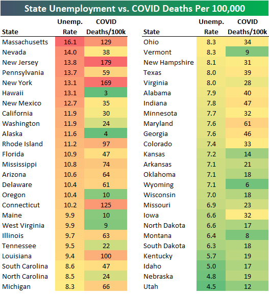
State COVID vs. Unemployment
There have been plenty of jabs thrown between state governors since COVID began back in late February. While COVID is still ongoing, we can compare state performance numbers at this point by looking at COVID deaths per 100,000 along with state unemployment rates.
In the table below we show state unemployment rates as of July 2020 along with COVID deaths per 100,000 people (as of 8/21/20). As shown, Massachusetts currently has the highest unemployment rate at 16.1%, followed by Nevada at 14%, New Jersey at 13.8%, Pennsylvania at 13.7%, and New York and Hawaii at 13.1%.
Massachusetts, New Jersey, and New York have some of the highest unemployment rates and by far the highest COVID deaths per 100,000, but Nevada, Pennsylvania, and Hawaii have high unemployment rates yet much lower COVID deaths per 100,000. While New York and Hawaii have the exact same unemployment rates, New York has 169 COVID deaths per 100,000 while Hawaii is at just 3 deaths per 100,000.
States with the lowest unemployment rates have some of the lowest COVID deaths per 100,000.
If we provide a scatter plot of the data in the table above, you can see a pretty clear trend line between state unemployment rates and COVID deaths per 100,000:

Because of the nature of the virus, it’s obvious that states with higher population densities are more at risk. New Jersey has the highest population density in the country, and it’s also the state with the highest number of COVID deaths per 100,000. Rhode Island, Massachusetts, and Connecticut are the next most populated states in terms of people per square mile, and these states all have high COVID deaths per 100,000 as well. States like Florida, Ohio, and California have managed to keep their COVID deaths per 100,000 under much better control so far even with pretty high population density. Click here to view Bespoke’s premium membership options for our best research available.

Largest S&P 500 Stocks + Tesla (TSLA)
Tesla (TSLA) is now up 50% over the last 10 calendar days dating back to August 11th. This has propelled the company way up the list of the largest US companies.
Below is a table of the largest stocks in the S&P 500 with Tesla (TSLA) included. As shown, Tesla’s $382.7 billion market cap would rank it as the 9th largest stock in the S&P 500 were it in the index.
On August 11th, Tesla’s market cap was just $256 billion, so over the last ten days it has leapfrogged companies like Walmart (WMT), Home Depot (HD), JP Morgan (JPM), Procter & Gamble (PG), Mastercard (MA), and NVIDIA (NVDA). Next up would be Visa (V) and Johnson & Johnson (JNJ), which have market caps just under $400 billion. Click here to view Bespoke’s premium membership options for our best research available.

Philly Fed in a Funk
On the back on Monday’s weaker Empire Fed survey, today’s release of the Philadelphia Fed’s Business Outlook Survey similarly showed a slowdown in activity during August. The headline index fell 7 points to 17.2. While that is a third consecutive expansionary reading, it also marked back to back declines. That means that the region’s manufacturing sector has continued to grow, but at a decelerating pace in the past two months.

Like the headline number, many of the individual categories also remain in expansion territory but were lower than last month. The only readings to rise month over month were the indices for Delivery Times, Inventories, and Prices Received. Inventories as well as the index for Unfilled Orders were the only ones to be in contraction in August.
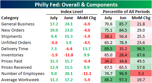
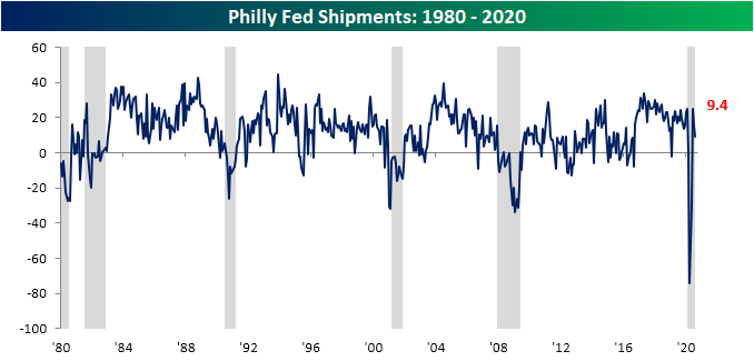
Demand continues to improve with both the indices for New Orders and Shipments showing another expansionary reading in August, but both were also lower indicating demand did slow somewhat. While the index for New Orders remains at a healthy level historically, in the upper quartile of all readings since 1980, Shipments are at a more muted level in just the 38th percentile.

As for employment metrics, there was a slowing in the Number of Employees hired in the region with that index falling from 20.1 to 9. That 11.1 drop was the biggest change of any sub-index this month and with respect to that index, this month’s decline was in the bottom 5% of all monthly changes. Not only did the index for Number of Employees fall, but so did the index for Average Workweek, although it still remains in the upper end of its historical range. Start a two-week free trial to Bespoke Institutional to access our interactive economic indicators monitor and much more.

Leading Indicators Up Again
The Conference Board’s Index of Leading Indicators for July came in stronger than expected, rising 1.4% compared to expectations for a gain of 1.1%. From its high of 112.0 in January to its low in April, leading indicators saw the largest three-month decline in the history of the index. Since then, we’ve now seen the largest three-month increase on record. Unfortunately, the magnitude of the increase hasn’t been nearly as strong as the decline, but it’s an improvement nonetheless.
This month’s stronger than expected increase in leading indicators was also notable for what it suggests about the business cycle. As shown in the chart, the bounce of the last three months has now erased nearly half of the decline from January through April, but more importantly, the only other times the index has risen three times in a row during a recession was in the last three months of the 1981/1982 contraction from September through November and the last three months of the Financial Crisis from April to June 2009. If past history is any guide, that would suggest that the COVID-recession ended in July or earlier.

Looking at the ratio of leading to coincident indicators shows an even stronger picture. As we have mentioned numerous times in the past, this ratio always starts to roll over in advance of a recession. Interestingly enough, leading up to the most recent recession, this ratio started drifting lower beginning in late 2018, although not anywhere close to the typical weakness you would see heading into prior recessions. In other words, the economy was already on a relatively shaky footing in advance of COVID.
In the last three months, though, the ratio has seen a large rebound nearly erasing all of its declines from the last peak. At 22 months now since the last peak, the current streak has been a lengthy one, but looking just at the period since the end of the Financial Crisis, the current streak isn’t even the longest. That title belongs to the 27-month drought from mid-2011 through late 2013. Like what you see? Start a two-week free trial to Bespoke Institutional for full access to all of our research and interactive tools.
