Sector Charts – 4/17/19 – Consumer Staples
The Consumer Staples sector, while far from the best, has been on a solid run this year gaining 11.34% YTD. On a 1.42% gain over the past week, the sector, as seen through the XLP ETF, is now sitting in extremely overbought territory. Below we show several notable charts of stocks in the sector taken from our Chart Scanner tool.
Consumer product conglomerate Colgate-Palmolive (CL) was hit hard in the last quarter of 2018. After falling over 16% off of its highs all the way down to around $56 in the final days of October, the stock briefly rebounded back to summer lows before falling down again around $56-57 when the broader market bottomed. The stock rallied off of this double bottom and in January, it came back into this range and has broken out to the upside in late March. CL is now at its highest levels since this time last year. Estee Lauder (EL) similarly made a double bottom in late 2018 and has been in a decent uptrend, especially following a large gap up in response to its Q4 earnings. This uptrend has brought the stock up near 52-week highs.
There are a few other stocks within Consumer Staples that are also in solid uptrends: General Mills (GIS), Hershey (HSY), and Procter & Gamble (PG). While GIS has only really been rallying since the start of the year (after a range-bound 2018), HSY and PG have had their uptrends relatively uninterrupted for just about an entire year now. All three have been making 52-week highs recently, and while they are overbought at current levels, the general trend is still on their side.
On the other hand, Kellogg (K) has not been as fortunate to see these kinds of uptrends. The stock has been in a downtrend since the fall with a big dent coming in response to its November earnings report. Unlike most other companies, the start of 2019 was not a turning point. Fortunately, late last month the stock managed to break out above the downtrend line as well as the 50-DMA. It has made a higher low recently by bouncing off of the 50-DMA and has been working its way higher since.
Some other food-related stocks in the sector have seen some interesting movements in relation to resistance. Sysco (SYY) and Tyson Foods (TSN) have both broken out above resistance to new highs. SYY fell hard on its earnings report from last November, below prior support. In February, the stock failed to break out higher around these levels but on its next test of this resistance in the past couple of weeks the stock has surged; currently, it is pretty overextended as the most overbought stock in the sector. On the other hand, TSN was in a downtrend from December 2017 to December of 2018. This year it finally broke out of this downtrend and the stock has now come up to prior highs from late summer 2018. In the past few days, TSN has smashed through these levels and is at new 52-week highs.
Spice giant McCormick (MKC) is almost the opposite of TSN. After a solid rally through 2018, MKC held up in Q4 but eventually fell in December through late January. The stock rallied off of a bottom near $120 and has now run upon its prior highs at $155. On this test the stock is failing to break out, currently trading around $152 today. This is not necessarily a detrimental sign as the uptrend is still holding as of now. Like SYY, it could take another test of these levels for a breakout. Start a two-week free trial to Bespoke Premium to access our interactive economic indicators monitor and much more.

Chart of the Day: Fourth Best Start on Record in Junk Bond Market
After a rough Q4 for the junk bond market, 2019 has turned into a banner year for the sector. As measured by the Merrill Lynch High Yield Master Index, the total return for the high yield market through Tuesday’s close has been a gain of 8.67%, making it the fourth-best start to a year for the sector on record and the best start since 2009. This year’s gain also marks the eighth time since 1987 that the high yield market had gained more than 6% through 4/16.
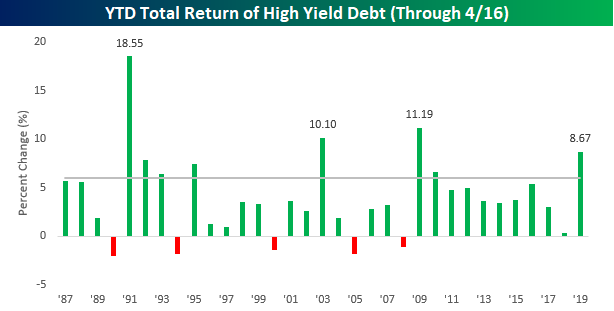
So how does the junk market perform for the remainder of the year after such strong starts like 2019? And how about the equity market as well? Below is a chart showing rest-of-year returns for junk bonds and the S&P 500 in all years since 1987. Years where junk bonds rallied 6%+ through 4/16 are shaded in grey.
Continue reading this Chart of the Day by starting a two-week free trial to any of our research membership levels.
Fixed Income Weekly – 4/17/19
Searching for ways to better understand the fixed income space or looking for actionable ideals in this asset class? Bespoke’s Fixed Income Weekly provides an update on rates and credit every Wednesday. We start off with a fresh piece of analysis driven by what’s in the headlines or driving the market in a given week. We then provide charts of how US Treasury futures and rates are trading, before moving on to a summary of recent fixed income ETF performance, short-term interest rates including money market funds, and a trade idea. We summarize changes and recent developments for a variety of yield curves (UST, bund, Eurodollar, US breakeven inflation and Bespoke’s Global Yield Curve) before finishing with a review of recent UST yield curve changes, spread changes for major credit products and international bonds, and 1 year return profiles for a cross section of the fixed income world.
In this week’s report we review strong performance and momentum of credit.

Our Fixed Income Weekly helps investors stay on top of fixed income markets and gain new perspective on the developments in interest rates. You can sign up for a Bespoke research trial below to see this week’s report and everything else Bespoke publishes free for the next two weeks!
Click here and start a 14-day free trial to Bespoke Institutional to see our newest Fixed Income Weekly now!
Mortgage Applications Hit Nine-Year High
This morning the Mortgage Bankers’ Association (MBA) reported mortgage application volumes for the week ending April 12th this morning. Refinancing volumes dropped over 8% after an 11.4% WoW drop last week. Refinancing is still running at a strong pace (roughly twice the pace where they finished last year), but the more economically relevant result was the strong purchase application data. Applications for purchase are a leading indicator of home sales, so the new cycle high in purchase application volumes posted this week is a good sign that the housing market remains in a much better position than where it stood last year.
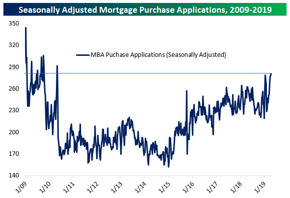
Weekly data can be tricky to seasonally adjust, so it’s also worth taking a peek at weekly data without seasonal adjustments. As shown, we’re right near the typical seasonal peak for application volumes, and as-of this week, only two weeks since 2009 have recorded stronger purchase application volumes. That confirms the basic message of the seasonally adjusted index, which is that mortgage applications are running at a very strong pace.
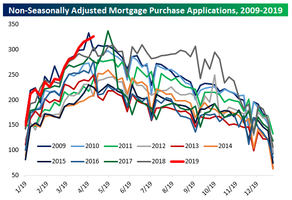
On a YoY basis, purchase application volumes are not extremely strong, but it’s pretty clear there’s a healthier trend than the period in the second half of last year. Since week-to-week applications can be pretty volatile, it helps to smooth things out with a rolling 4-week average. Using this approach, the 4-week average of purchase applications is up 8.2% YoY, the best pace since the week ended February 9th of last year. Start a two-week free trial to Bespoke Institutional to unlock the full Bespoke interactive research portal.
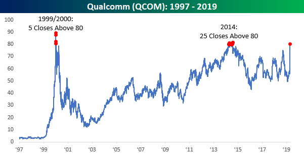
Qualcomm (QCOM) and $80 Meet Again
It’s happening again. After a 40%+ gain in less than 90 minutes of total trading (last hour on Tuesday and first half hour on Wednesday), shares of Qualcomm (QCOM) are once again back above $80, which is a level that it hasn’t had a whole lot of success holding in the past. In the 25+ years that QCOM has been public, it has only closed above $80 (on a split-adjusted basis) 30 prior times. The first date with $80 came back in late 1999/early 2000 at the height of the tech bubble as the stock closed above $80 on just five days. From there, 14 years passed before the stock ever got back to that level again when there were 25 days in 2014 where the stock managed to close above $80. Fast forwarding another five years and here we are again as QCOM traded back above $80 earlier this morning but has since traded back down below that level. Will the third time be the charm, and can QCOM finally trade and hold above $80? It’s certainly been quite a trip! Start a two-week free trial to Bespoke Institutional to unlock the full Bespoke interactive research portal.
Strong Real Incomes, Declining Minimum Wage Coverage
Yesterday the BLS released its quarterly estimate of median weekly income for Q1. After accounting for inflation, in Q1 the median worker with a full-time job took home the same income (seasonally adjusted) as in Q3 and Q4. That’s the first time we’ve seen real weekly pay unchanged for three straight quarters in the history of the data set. While real income growth hasn’t been dramatic recently, there’s definitely been a trend of improvement since the end of 2014.
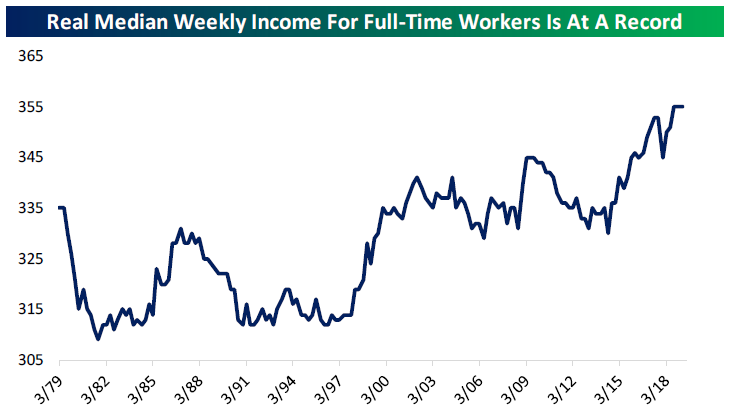
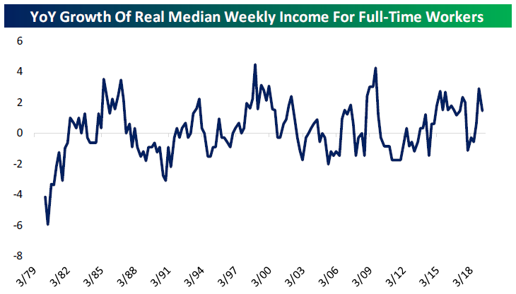
As far as YoY growth goes, this series had its best year in a decade in the year ending Q4, but slowed YoY in Q1. At 1.4%, that growth is stronger than three-quarters of readings since 1979. In short, real incomes are growing at a healthy pace.
One other interesting data point released in the report is the share of workers nationally who earn the federal minimum wage. As shown in our last chart below, 2018 had only 2.1% of hourly paid workers receiving the minimum wage, the lowest percentage on record since 1979. The combination of state/local minimum wage hikes above the federal rate and a national legislative failure to keep the minimum wage rising with the pace of inflation are the key reasons for the decline to record lows. Start a two-week free trial to Bespoke Institutional to unlock the full Bespoke interactive research portal.
Morning Lineup – Still Settling Up
After a big surge yesterday, shares of Qualcomm (QCOM) are still finding an equilibrium in the wake of yesterday’s settlement with Apple (AAPL). After a bunch of upgrades this morning, the stock is up another 11%. Yesterday’s news between the two companies also gave Intel (INTC) an opportunity to exit the smartphone modem business (AAPL was its primary customer), which was considered an inferior offering to QCOM’s. With that news, INTC’s stock is rallying close to 5% as the knock-on effects of this major deal (details of which are scant) continue to shake out.
In earnings news this morning, the picture isn’t quite as pretty as it was yesterday. Of the thirteen companies that have reported so far today, just 62% have exceeded EPS forecasts while slightly more than half (7) have managed to exceed top line results.
We’ve just published today’s Morning Lineup featuring all the news and market indicators you need to know ahead of the trading day. To view the full Morning Lineup, start a two-week free trial to Bespoke Premium.

Here’s a snippet from today’s report:
We have a lot to get to in this morning’s report, but below we wanted to highlight one interesting aspect in terms of where global equity markets stand now compared to three months ago. If you haven’t looked at equity index charts from around the world recently, it may surprise you to know that as of yesterday’s close no less than seven major national indices are within 1.5% of new 52 week highs on a closing basis with India and China marking their best closes of the past year. Another 7 major country indices are within 6% of that level, and only one (Malaysia’s Bursa Malaysia Index) is more than 11% below 52-week closing highs.
In the left chart below, we show distance from 52-week closing and intraday highs for the global markets covered in our Global Macro Dashboard. What a change it’s been over the last three months. In the second chart at right below, we show the same metrics as-of three months ago. Only 2 indices were within 6% of 52-week highs at that point, and seven were at least 15% below their best levels of the year prior. The risk asset rally since the end of December has lifted a lot of ships. With this kind of backdrop, one would think central banks around the world would be more biased towards tightening than cutting! For an updated set of charts and other metrics covering each of the countries below, make sure to check out our weekly Global Macro Dashboard.

Start a two-week free trial to Bespoke Premium to see today’s full Morning Lineup report. You’ll receive it in your inbox each morning an hour before the open to get your trading day started.
Bespoke’s Global Macro Dashboard — 4/17/19
Bespoke’s Global Macro Dashboard is a high-level summary of 22 major economies from around the world. For each country, we provide charts of local equity market prices, relative performance versus global equities, price to earnings ratios, dividend yields, economic growth, unemployment, retail sales and industrial production growth, inflation, money supply, spot FX performance versus the dollar, policy rate, and ten year local government bond yield interest rates. The report is intended as a tool for both reference and idea generation. It’s clients’ first stop for basic background info on how a given economy is performing, and what issues are driving the narrative for that economy. The dashboard helps you get up to speed on and keep track of the basics for the most important economies around the world, informing starting points for further research and risk management. It’s published weekly every Wednesday at the Bespoke Institutional membership level.
You can access our Global Macro Dashboard by starting a 14-day free trial to Bespoke Institutional now!

Health Care Continues to Slide in 2019
As shown in the chart below, the Health Care sector ETF (XLV) took a nosedive yesterday to break below its March lows after UnitedHealth (UNH) — which has a pretty big weighting in the sector — fell 4% in reaction to its Q1 earnings report. This weakness has been a trend for Health Care all year now. The sector has been lagging the S&P 500 badly this year, and after yesterday’s declines, Health Care is underperforming the S&P 500 by 14 percentage points YTD.
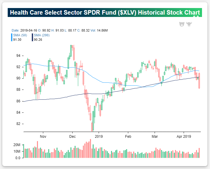
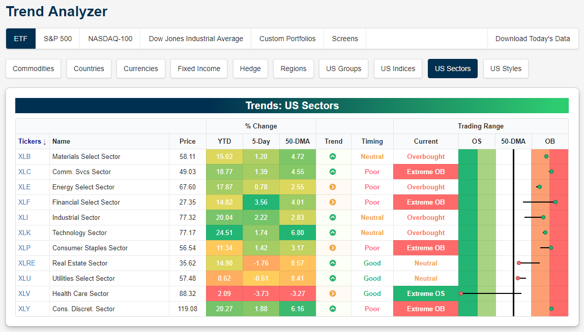
As shown in our Trend Analyzer snapshot below, every sector is above its 50-day moving average right now except Health Care, which is now trading at extreme oversold levels at more than two standard deviations below its 50-day. Not only is Health Care underperforming this year, but now it’s up just 2% YTD and another day like yesterday will put it in the red for the year.
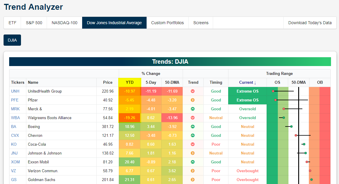
In the Dow Jones Industrial Average, just four stocks are in the red on the year, and they’re all Health Care names. Both UnitedHealth (UNH) and Pfizer (PFE) are in “extreme” oversold territory, while Merck (MRK) and Walgreens (WBA) are merely oversold. Is Health Care going to eventually outperform given how weak it has been relative to every other sector this year? We analyzed the likelihood in a Chart of the Day yesterday that you can access with a two week free trial to any of our premium research subscriptions. You’ll also gain access to a number of interactive tools whose snapshots were featured in this post.
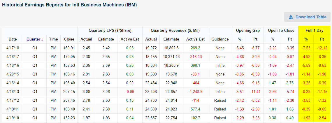
IBM Can’t Shake the Q1 Blues
Heading into last night’s Q1 2019 earnings report, IBM was the 2nd best performing stock in the Dow Jones Industrial Average on the year. That looks to change this morning with the stock trading down 3.5% ahead of the open on a Q1 revenue miss. The first quarter has been a challenging one for IBM’s stock for a decade now!
Using our Earnings Explorer, below is a snapshot of IBM’s prior 9 first quarter earnings reports dating back to 2010. In our earnings database, we include how the stock price reacted to the report because that essentially tells investors how good or bad an earnings report really was. As shown in the far right column of the table, IBM has traded lower on its last nine Q1 earnings reaction days (the first trading day following its report). With the stock set to open down 3.5% this morning, there’s a strong possibility this Q1 losing streak for IBM will extend to ten years in a row! Start a two-week free trial to Bespoke Institutional to unlock the full Bespoke interactive research portal.