Beige Book Bounce
We like to keep tabs on what the Federal Reserve’s Beige Book has to say about the economy, but it can be hard to take a bottom line from a wordy document running 15 thousand words! To help with this problem, we created an index of positive and negative words the Beige Book has featured over time, creating an index of sentiment from the aggregated language of the document. The results tend to do a pretty good job tracking GDP growth, as shown in the chart below.
Beige Book sentiment rolled over hard over the past 9 months, but April’s release (published last Thursday) saw sentiment bounce considerably. That’s consistent with a number of economic indicators we’ve seen over the last few months, as well as the rocket ship uptick in GDP Nowcasts like the Atlanta Fed GDPNow index, which has bounced over two percentage points from March lows to the near-3% growth tracked for Q1 at present. While only one Beige Book release does not an economic upturn make, this data definitely supports the thesis that growth is making a comeback despite weak global activity. Want to track our Beige Book Index on a regular basis? Become a Bespoke Institutional member now! CLICK HERE to start a two-week free trial.

Fixed Income Weekly – 4/24/19
Searching for ways to better understand the fixed income space or looking for actionable ideals in this asset class? Bespoke’s Fixed Income Weekly provides an update on rates and credit every Wednesday. We start off with a fresh piece of analysis driven by what’s in the headlines or driving the market in a given week. We then provide charts of how US Treasury futures and rates are trading, before moving on to a summary of recent fixed income ETF performance, short-term interest rates including money market funds, and a trade idea. We summarize changes and recent developments for a variety of yield curves (UST, bund, Eurodollar, US breakeven inflation and Bespoke’s Global Yield Curve) before finishing with a review of recent UST yield curve changes, spread changes for major credit products and international bonds, and 1 year return profiles for a cross section of the fixed income world.
In this week’s report we compare returns for equally-weighted versus market cap-weighted EM sovereign bond exposure.

Our Fixed Income Weekly helps investors stay on top of fixed income markets and gain new perspective on the developments in interest rates. You can sign up for a Bespoke research trial below to see this week’s report and everything else Bespoke publishes free for the next two weeks!
Click here and start a 14-day free trial to Bespoke Institutional to see our newest Fixed Income Weekly now!
B.I.G. Tips – CAT Sales Trying to Stabilize
Bespoke’s Global Macro Dashboard — 4/24/19
Bespoke’s Global Macro Dashboard is a high-level summary of 22 major economies from around the world. For each country, we provide charts of local equity market prices, relative performance versus global equities, price to earnings ratios, dividend yields, economic growth, unemployment, retail sales and industrial production growth, inflation, money supply, spot FX performance versus the dollar, policy rate, and ten year local government bond yield interest rates. The report is intended as a tool for both reference and idea generation. It’s clients’ first stop for basic background info on how a given economy is performing, and what issues are driving the narrative for that economy. The dashboard helps you get up to speed on and keep track of the basics for the most important economies around the world, informing starting points for further research and risk management. It’s published weekly every Wednesday at the Bespoke Institutional membership level.
You can access our Global Macro Dashboard by starting a 14-day free trial to Bespoke Institutional now!

Morning Lineup – Flat Morning After Record Highs
In another busy morning for earnings, we have already seen more than 50 companies report, and like yesterday, the EPS beat rate among these companies has been very strong at 67%. Unlike yesterday, though, the revenue beat rate hasn’t been nearly as strong as just under half of the companies reporting so far have managed to post better than expected revenues.
We’ve just published today’s Morning Lineup featuring all the news and market indicators you need to know ahead of the trading day. To view the full Morning Lineup, start a two-week free trial to Bespoke Premium.

With the S&P 500 closing just above its former record high yesterday, one would think the last seven months have been nothing more than running on a treadmill for the stock market. A look deeper, though, shows that there has been no shortage of big winners (and losers) in terms of industries.
The table below shows the ten best and worst performing S&P 500 industries since the S&P 500’s 2018 closing high on 9/20. Eight of the biggest winners are all up over 10%, including one – Power & Renewable Electricity- which is up over 20%. Who would have thought that an industry from the Utilities sector would have led the market? Outside of Utilities, Technology has been a big contributor to the market’s strength with three industries in the top ten (Communications Equipment, Software, and Semis). Another surprising sector with representation on the list is Consumer Staples. Both the Personal Products and Household Products industries are up 14.8% since the S&P 500’s 2018 high.
On the downside, Energy has been a drag as Energy Equipment and Services has dropped over 23% since 9/20 while Oil, Gas & Fuels is down 6%. One would think that with oil prices so high, that this group would have done better, but no such luck. Two groups that have felt the pinch from higher energy prices (and other issues like the 737) are Airlines and Air Freight. Both of these industries from the Industrials sector are down close to 10%.

Start a two-week free trial to Bespoke Premium to see today’s full Morning Lineup report. You’ll receive it in your inbox each morning an hour before the open to get your trading day started.
The Closer — Stocks Soar, New Home Sales Fly — 4/23/19
Log-in here if you’re a member with access to the Closer.
Looking for deeper insight on markets? In tonight’s Closer sent to Bespoke Institutional clients, as the S&P 500 reached an all-time high rising over 80 bps today, we begin tonight’s Closer by evaluating the forward returns for the past ten times the index rose to all-time highs in a similar fashion. We also make note of improved correlation while the dollar has also improved. Pivoting to economic data, we look at Multifactor Productivity for 2017 which was released today. We also update out Five Fed Manufacturing Composite with the addition of the Richmond Fed’s input. We finish with a recap of New Home Sales.

See today’s post-market Closer and everything else Bespoke publishes by starting a 14-day free trial to Bespoke Institutional today!
B.I.G. Tips — Welcome Back Bull!
B.I.G. Tips – New Highs. Now What?
That was fast! When it comes to market recoveries from a correction, they don’t get much more v-shaped than the last seven months. After falling just short of a 20% decline (on a closing basis) in the span of 95 calendar days from 9/20/18 to 12/24/18, the S&P 500 has charged back and is on the cusp of closing above its record closing high from 9/20. If it closes above that level today, it will have rallied 24.7% in the span of just 120 days.
Present company included, there aren’t that many people who back in December would have anticipated a record closing high in the S&P 500 before April 30th! In our just-released B.I.G. Tips report, we took a look at prior corrections from all-time highs in the post-WWII period based on their magnitude and duration as well as how long it took them to reclaim their prior highs. We then compared those periods to the current one to find which ones had the most in common.
To gain access to the full report, please start a two-week free trial to our Bespoke Premium package now. Here’s a breakdown of the products you’ll receive.

B.I.G. Tips – Death by Amazon – 4/23/19
Our “Death By Amazon” index was created many years ago to provide investors with a list of retailers we view as vulnerable to competition from e-commerce. In 2016, we also created our “Amazon Survivors” index which is made up of companies that look more capable of dealing with the threat from online shopping. To see how the two indices have been performing lately and view the full list of stocks that make up the indices, please read our newest report on the subject available to Bespoke Premium and Bespoke Institutional members.
To unlock our “Death By Amazon” and “Amazon Survivors” indices, login or start a two-week free trial to either Bespoke Premium or Bespoke Institutional.

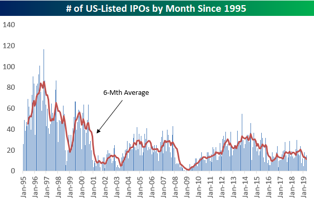
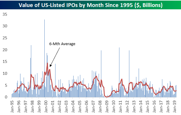
Best and Worst Performing IPOs
Recent initial public offerings like Lyft (LYFT), Zoom (ZM), and Pinterest (PINS) have sparked a lot of interest lately, so below is a chart showing the number of US-listed IPOs by month since 1995. As you can see, the monthly numbers have actually been trending lower since peaking for the current bull market in mid-2014. And the late 1990s, when we were seeing 100+ IPOs in some months, is an environment we might never again see in our lifetimes again.
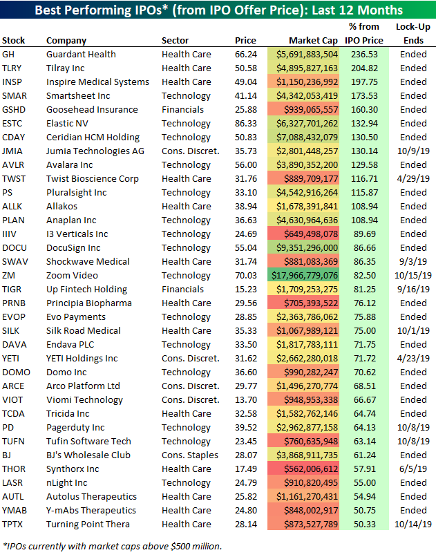
We ran a screen of companies that went public within the last 12 months to find the ones that are up the most from their IPO price. Below is a list of the 35 best performers.
Two recent Health Care IPOs are up more than 200% from their IPO price — Guardant Health (GH) and Tilray (TLRY). Inspire Medical (INSP) — another Health Care stock — ranks 3rd best with a gain of 197.75%. Zoom Video (ZM) is the largest stock on the list with a market cap of $17.97 billion. ZM just went public last Thursday and is already up 82.5% from its IPO price! Note that Zoom’s lock-up expiry (the date that shareholders within the company can sell shares) isn’t until October 15th.
Other notables on the list of biggest IPO winners include digital signature company DocuSign (DOCU), sales tax software company Avalara (AVLR), and the popular cooler and mug company Yeti Holdings (YETI). Yeti’s lock-up actually ends today, so it will be interesting to see how the stock trades near term.
Below are companies that went public within the last 12 months that are down from their IPO price. (Note that only companies with market caps above $500 million are included on this list and the one above.)
Ride-sharing app Lyft Inc. (LYFT) is by far the biggest standout on the list of IPO losers. Since the company went public at the end of March, its shares are down 15.36%. With a lock-up date of September 25th, corporate insiders have a long time to watch these shares rise and fall without being able to exit.
Start a two-week free trial to Bespoke Premium to unlock all that Bespoke’s research has to offer!