US Equity Markets Enter Q4 in Neutral Territory
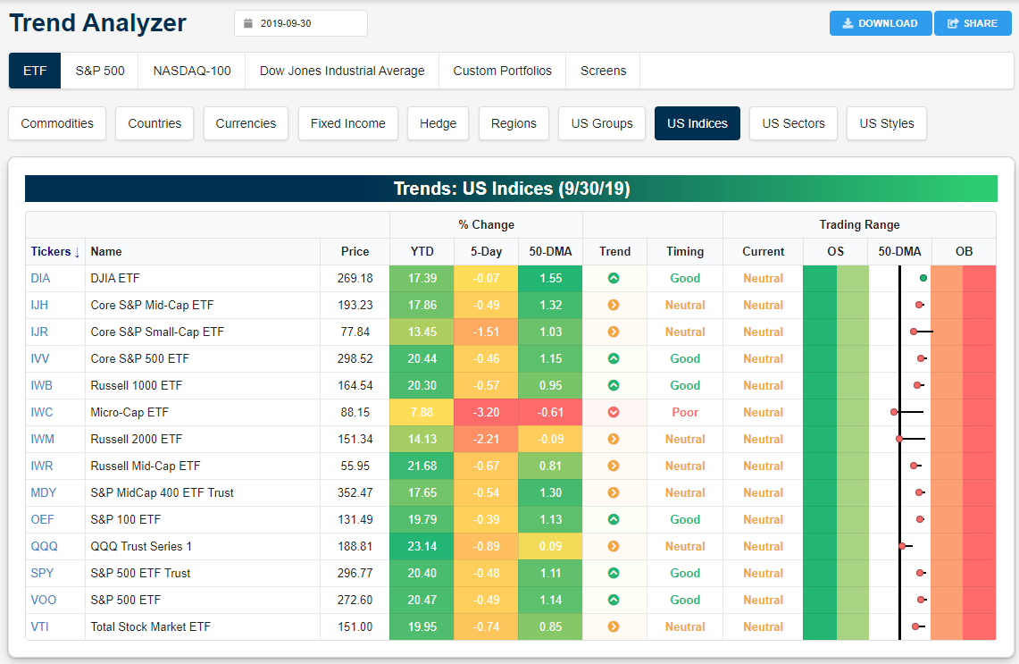
Below is a snapshot of US equity index ETFs from our Trend Analyzer tool. The Trend Analyzer helps investors easily see where a large number of stocks or ETFs are trading relative to their normal ranges. When looking at the “Trading Range” section, the black, vertical line represents each ETF’s 50-day moving average, and the dot represents where the ETF’s price is currently trading. The tail end of the dot shows where the ETF was trading one week ago, so if the dot is to the left of the tail, the ETF’s price moved lower within its trading range over the last week.
Over the last week, every major US equity index ETF moved lower within its range with the exception of the Dow 30 (DIA). The small-cap Russell 2,000 (IWM) and the Micro-Cap ETF (IWC) both moved back below their 50-day moving averages, while the Nasdaq 100 (QQQ) is the next closest to testing its 50-DMA. Start a two-week free trial to Bespoke Institutional for full access to our research and market analysis.
Looking at US sector ETFs, we saw Communication Services (XLC), Energy (XLE), and Health Care (XLV) break below their 50-day moving averages over the last week, while Consumer Staples (XLP) moved from neutral to overbought. Along with Utilities (XLU) and Real Estate (XLRE), the only sectors that are overbought right now are defensive in nature.

The Most Volatile Time of the Year
Welcome to October. The most volatile month of the year. While most investors and traders are well aware of the increased tendency for volatility in the month of October, the chart below provides an excellent illustration of that trend. In it, we show the average percentage spread between each month’s closing high and closing low going back to 1928. For all months since 1928, the S&P 500 has averaged an intra-month spread of 6.41%, but for the month of October, the average has been nearly two full percentage points wider at 8.25%! The next closest month in terms of intra-month volatility has been November with an average range of just 6.96%. While October is a big outlier in the data, volatility in the market is pretty seasonal. From July right through November, average intra-month volatility is above the historical average for all months, but from December through June, the average intra-month range has been below average. Start a two-week free trial to Bespoke Institutional for full access to our research and market analysis.

Bespoke’s Morning Lineup – 10/1/19
See what’s driving market performance around the world in today’s Morning Lineup. Bespoke’s Morning Lineup is the best way to start your trading day. Read it now by starting a two-week free trial to Bespoke Premium. CLICK HERE to learn more and start your free trial.
In case you didn’t see it last Friday, we just published our quarterly update of the “Pros and Cons” facing the equity market as we head into Q4. In it, we break down what we see as the biggest positive and negative issues facing the equity market. Make sure to check it out. For a brief summary, make sure to check out Monday’s CNBC segment on our outlook.

One interesting chart in today’s Morning Lineup is the chart of gold. Talk about losing its luster quickly! It wasn’t too long ago that gold was in massive rally mode on the way to new highs. After a lower high in September and now a bearish break of the 50-DMA, though, there looks to be quite a bit of space between now and the 200-DMA below.

The Closer – Edging Towards Breakouts, Ag Surge, Precious Metals Collapse – 9/30/19
Log-in here if you’re a member with access to the Closer.
Looking for deeper insight on markets? In tonight’s Closer sent to Bespoke Institutional clients, we begin with a look at stocks’ technical setup, with particular focus on industrials and banks. Next we review today’s agricultural data and the boost they provided to the corresponding commodities. Also on the topic of commodities, we review the move in precious metals, before covering today’s regional Fed indices.

See today’s post-market Closer and everything else Bespoke publishes by starting a 14-day free trial to Bespoke Institutional today!
Q3 Performance Recap
Markets officially closed the books on the third quarter today and based on where things stood at the end of August, equities finished the quarter in considerably better shape than most people would have expected. Think about it. At the end of August, we had just seen a month of major volatility heading into what has historically been the worst month of the year for equities, but thirty days later, the S&P 500 finished the month in positive territory enough so to scratch out a positive return for the quarter. The primary benchmark for US large-cap stocks (SPY) is up 20% YTD through the first nine months of the year for the first time since 1997. Besides the S&P 500, every major index ETF we track in our Asset Class Performance matrix had a gain in September. For the quarter, only three ETFs (mid and small-cap focused) were down, while two other ETFs (Nasdaq 100 and the Russell 1000) have logged YTD gains of 20%+.
Value was the big winner in September as those ETFs were all up around 5% this month. YTD, though, there’s a bit of a disparity; while large and mid-cap growth ETFs are outperforming their value peers, small-cap growth is actually underperforming small-cap value by a wide margin.
In terms of sector returns, Health Care was the only one to finish September in the red, and it is now the worst-performing sector YTD. In addition to Health Care, the only other sector that is up less than 10% on a YTD basis is Energy. Heading into the quarter Energy was up over 10%, but a 6% decline in Q3 erased more than half of its YTD gains. On the upside, the biggest Q3 gainers were Utilities and Financials. Technology slightly underperformed the broader market in September, but it still outperformed the S&P 500 for the quarter padding to its gaudy 30%+ YTD performance numbers. The fact that Technology (+31%) and Utilities (+25%) are the two leading sectors YTD shows just how unique the year 2019 has been.
Moving outside of the US, Hong Kong was the only country ETF that was down in September, and it was far and away the worst-performing sector in Q3 with a decline of over 12%. While US equities were broadly positive in Q3, international markets were much more mixed on a dollar adjusted basis with eleven of the fourteen country ETFs listed down on the quarter. Year to date, though, international returns have also been up across the board, although again, most have underperformed the S&P 500.
In the commodities space, even after dropping more than 7% in September, Silver was up over 11% in Q3. Gold saw similar directional moves, although not nearly to the same degree. In Energy, the wide disparity in performance between Oil and Natural Gas remains in place as their directional returns are in the opposite direction YTD, QTD, and MTD.
Outside of an extraordinary August, treasuries gave back some of those gains in September with the biggest declines at the long end of the curve. Year to date, though, long-term treasuries are still looking at returns of just under 20%, or a percentage point less than the S&P 500. Start a two-week free trial to Bespoke Institutional for full access to our research and market analysis.

Bespoke CNBC Appearance (9/30)
Bespoke co-founder Paul Hickey appeared on CNBC’s The Exchange today (9/30) to talk about how markets are positioned heading into Q4. To view the segment, click on the image below. Start a two-week free trial to Bespoke Institutional for full access to our research and market analysis.

Dividend Stock Spotlight: Pfizer (PFE)
Health Care has had a lack-luster year with the worst YTD performance of the 11 sectors. Pfizer (PFE) has been a prime example of this. The stock had been in a long term uptrend over the past several years, and after a big move higher in early 2018, 2019 has been another story. After a few lower lows over the past year, the stock fell dramatically in August in response to disappointing earnings. Although the damage has been done in regards to the near term technical picture, the longer-term uptrend is still in place.
Additionally, from a dividend-focused point of view, it is one of the best in the Health Care sector. This recent drop sent the yield much higher. At just a hair under 4%, PFE currently has the third-highest dividend yield of all S&P 500 Health Care stocks. Additionally, the company has raised that dividend consistently over the past decade. Even with that high yield, the dividend payout ratio is only at 39% meaning the company has the earnings to cover or even raise its payout.
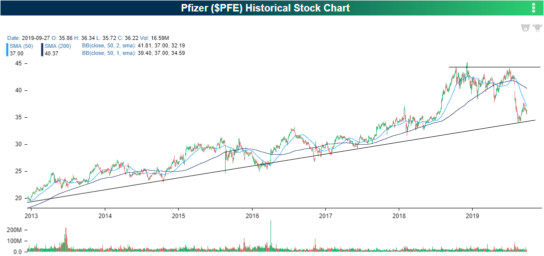
In a post in late August, we highlighted PFE’s massive decline in response to its last earnings report which led the dividend yield to spike higher. In turn, the yield drastically distanced itself from the yield on another major Dow Health Care stock, Merck (MRK). Since then, given the price has yet to move back to where it previously was, PFE’s yield continues to be much higher than that of MRK. Though it is off its recent high, the difference between the two stocks’ yields is right near the highest levels of the current cycle. Start a two-week free trial to Bespoke Premium to access our most actionable equity market research.

Chart of the Day – Raise a Glass to the End of a 21 Year Streak
Bespoke Market Calendar — October 2019
Please click the image below to view our October 2019 market calendar. This calendar includes the S&P 500’s average percentage change and average intraday chart pattern for each trading day during the upcoming month. It also includes market holidays and options expiration dates plus the dates of key economic indicator releases. Start a two-week free trial to one of Bespoke’s three premium research levels.
