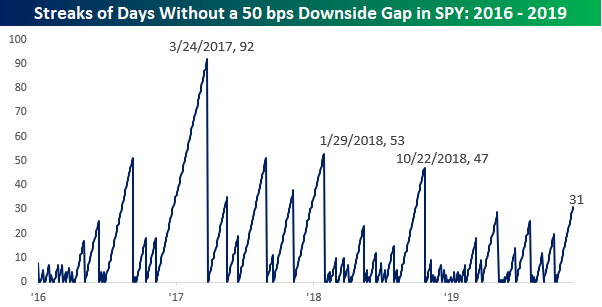
S&P 500 Streaks Without a 50 Basis Point Downside Gap
The S&P 500 opened lower this morning, so since we don’t seem to get these opportunities much anymore, we wanted to highlight just how benign the US equity market has been in recent weeks. While downside gaps aren’t uncommon, using SPY as a proxy, the S&P 500 has now gone 31 trading days without a downside gap of 0.50% or more at the open. For perspective, it has now been over a year since the S&P 500 had a longer stretch of time without at least one downside gap of 0.50%. To find a longer streak, you would have to go back to October 2018 when the S&P 500 went 47 trading days without a 0.50% decline and before that January 2018 when there was a streak of 53 trading days without a 0.50% decline.
If you’ve been paying attention, the dates 10/22/18 and 1/29/18 likely stir up bad memories if you are a bull. From the close on 10/22/18, the S&P 500 went on to decline 15%, while in the weeks that followed the end of the 1/29/18 streak, the S&P 500 dropped 10%. Before you start heading for the hills, though, we would also note that there were a number of similarly long streaks following the election in 2016 and throughout 2017 that were just as long or longer and when those streaks came to an end, there was little negative impact on the equity market’s performance going forward. Sign up for Bespoke’s “2020” special and get our upcoming Bespoke Report 2020 Market Outlook and Investor Toolkit.
Trump vs. the Average Presidential Election Cycle
With year three of the current four-year Presidential Election Cycle coming to an end in six weeks, below is an updated look at the average performance of the S&P 500 in each year of the cycle going back to 1928. As shown, years one and two have historically been weaker than years three and four of the cycle. The S&P has been up 56.5% of the time in both year one and year two, but the index has been up 81.8% of the time in year three and 72.7% of the time in year four. Year three has been by far the best year of the cycle with an average gain of 12.81%, and the playbook has stuck to the script in year three of the current cycle with the S&P up 24.5% year-to-date. While year four has historically been consistently positive with gains 72.7% of the time, the average change for the S&P in year four (+5.71%) is just barely better than the average change in years one and two.

Below we show the S&P 500 under Trump so far versus a composite of the S&P four-year Presidential cycle. The S&P gained 19.4% in year one of the current cycle versus an average year-one gain of 5.7%. Year two is historically the worst year of the cycle with an average gain of just 4.54%, and in Trump’s second year, the S&P actually fell 6.2%. So far this year, the S&P is up 24.5% versus the average gain of 12.8% during year three of the cycle. As shown in the chart, year four generally trends positively but experiences pullbacks shortly after Q1 and again in October leading up the Election Day before closing out the year strong. Sign up for Bespoke’s “2020” special and get our upcoming Bespoke Report 2020 Market Outlook and Investor Toolkit.

Bespoke’s Morning Lineup – 11/20/19 – Retail Makes a Stand
See what’s driving market performance around the world in today’s Morning Lineup. Bespoke’s Morning Lineup is the best way to start your trading day. Read it now by starting a two-week free trial to Bespoke Premium. CLICK HERE to learn more and start your free trial.

Bespoke’s Global Macro Dashboard — 11/20/19
Bespoke’s Global Macro Dashboard is a high-level summary of 22 major economies from around the world. For each country, we provide charts of local equity market prices, relative performance versus global equities, price to earnings ratios, dividend yields, economic growth, unemployment, retail sales and industrial production growth, inflation, money supply, spot FX performance versus the dollar, policy rate, and ten year local government bond yield interest rates. The report is intended as a tool for both reference and idea generation. It’s clients’ first stop for basic background info on how a given economy is performing, and what issues are driving the narrative for that economy. The dashboard helps you get up to speed on and keep track of the basics for the most important economies around the world, informing starting points for further research and risk management. It’s published weekly every Wednesday at the Bespoke Institutional membership level.
You can access our Global Macro Dashboard by starting a 14-day free trial to Bespoke Institutional now!

The Closer – Commodity Stocks Crushed, RSI Divergence, Home Data Dicing – 11/19/19
Log-in here if you’re a member with access to the Closer.
Looking for deeper insight on markets? In tonight’s Closer sent to Bespoke Institutional clients, after WTI futures have plunged over 4.6% in the course of the past two days, we show why the dive below the 50 and 200 day moving averages is not as alarming as it would have been for equities. Expanding on this, we show the dramatic underperformance of commodity related stocks. Next, we show the underperformance of the Russell 2000 including the divergence from the other major indices’ 14-day RSI. Switching over to economic data, we review the rebound in single family housing data.

See today’s post-market Closer and everything else Bespoke publishes by starting a 14-day free trial to Bespoke Institutional today!
S&P 1500 Stocks Furthest From Their 52-Week Highs
Earlier today, we posted an analysis showing how S&P 1500 sectors were trading relative to their 52-week highs. One trend that stood out was in Energy where stocks in the sector were down an average of more than 42% from their respective 52-week highs. The table below lists the thirty stocks in the S&P 1500 that are currently the furthest below their 52-week highs, and as you might expect, there are a lot of Energy names listed. Who knows when and if the Energy sector will rebound, but there haven’t been many times since the late 1990s where the sector was this far out of favor.
Even though stocks in the Energy sector account for less than 90 of the 1,500 stocks in the S&P 1500, 18 of them are on the list of stocks down the most from their 52-week highs. That’s right, about 20% of Energy stocks are down by more than two-thirds from their 52-week highs! The two biggest losers in the sector (and the S&P 1500 overall) are Unit (UNT) and McDermott International (MDR), which are both down by over 90%. Besides the 18 stocks from the Energy sector, the next closest is Consumer Discretionary with just four members on the list. While you probably haven’t heard of most of the stocks from the Energy sector, the four Consumer Discretionary stocks – Tupperware (TUP), Tailored Brands (TLRD), Signet Jewelers (SIG), and Fossil (FOSL) – are all pretty well known. Sign up for Bespoke’s “2020” special and get our upcoming Bespoke Report 2020 Market Outlook and Investor Toolkit.

US Dollar Coiling
The US Dollar index has moved higher since early 2018, but really for the past year now it has traded in a very tight sideways range. Below is a chart showing the rolling spread between the Dollar index’s highest and lowest close over the last 12 months (rolling high/low spread) going back to 1972. As shown, the current 12-month high/low spread is only the fifth time it has dropped down to 5% or lower over the last 45+ years. While the spread could certainly go lower, in the past it has usually not stayed at this low of a level for long. We’d expect the Dollar to break out of its sideways range in one direction or the other sometime soon.

Below is a price chart of the US Dollar index over the last ten years. The only other time that the rolling 12-month high/low spread dipped below 5% over this 10-year time frame was back in July 2014, and following that tight sideways trading period, the Dollar eventually broke out to the upside in a big way. Sign up for Bespoke’s “2020” special and get our upcoming Bespoke Report 2020 Market Outlook and Investor Toolkit.

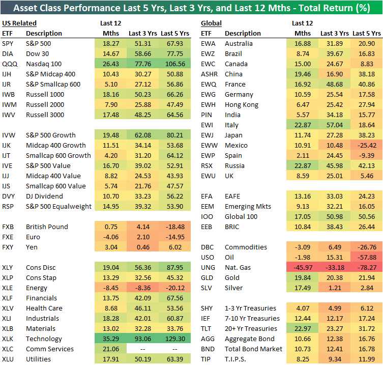
12 Month, 3 Year, and 5 Year Asset Class Total Returns
The table below shows the total returns of various asset classes over the last twelve months, three years, and five years using key ETFs traded on US exchanges.
The US Technology sector (XLK) has posted the strongest returns over all three time periods, with a 35.29% gain over the last year, a 93.06% gain over the last three years, and a 129.3% gain over the last five years. Looking at other sectors, Consumer Discretionary (XLY) has been the second best performer behind Tech over the three and five year time frames, while the new Communication Services sector (XLC) has been the second best over the last twelve months.
On the negative side, the US Energy sector (XLE) is down on a total return basis over all three time frames. Energy is down 8.45% over the last year, 8.36% over the last three years, and 20.12% over the last five years. That’s how a sector goes from having an S&P 500 weighting of 9% five years ago to a weighting of just over 4% now!
Large-cap growth has been the best factor ETF over all three time frames by a large margin. The S&P 500 Growth ETF (IVW) is up 80.21% over the last five years. The next best of the size/strategy ETFs in our matrix has been Smallcap Growth (IJT) with a five-year total return of 64.12%. On the other hand, Midcap Value (IJJ) has been the weakest factor ETF with a five-year gain of 43.93%.
Internationally, no country ETF in our matrix comes close to the 67.93% gain that the S&P 500 (SPY) has seen over the last five years. Russia (RSX) has been the best of the country ETFs over the five-year time frame with a gain of 42.13%, while France (EWQ), Japan (EWJ), and China (ASHR) rank second through fourth with gains between 38-40%. Mexico (EWW) and Spain (EWP) are both down over the last five years, while countries like the UK (EWU) and Canada (EWC) are only up by single-digit percentage points.
Over the last year, it’s a slightly different story with three countries (China, Italy, Russia) outperforming the S&P 500’s 18.27% gain. Spain (EWP) has been the weakest country over the last year gaining just 2.11%.
The broad commodities ETF (DBC) has been terribly weak versus other asset classes over all three time frames. DBC is down 3.09% over the last year, up just 6.49% over the last three years, and down 26.76% over the last five years. Most of the pain for commodities has been due to oil and natural gas price weakness. The oil ETF (USO) is down 57.88% over the last five years while the natural gas ETF (UNG) is down 78.27%! Gold (GLD) has been a positive outlier for commodities with gains of roughly 20% over each of the three time frames.
Finally, fixed income ETFs have posted very strong returns given their risk averse characteristics. The widely followed 20+ Year Treasury ETF (TLT) is up 22.97% over the last 12 months, which is 4.7 percentage points better than the S&P 500 over the same time frame! Sign up for Bespoke’s “2020” special and get our upcoming Bespoke Report 2020 Market Outlook and Investor Toolkit.
Which of These Sectors is Not Like the Other
The S&P 500 is right at all-time highs, but if you look at your portfolio or a random list of stocks, with some of the winners there are bound to be some clunkers. Before getting too restless, though, it’s important to keep in mind that not all stocks rally or decline in unison with each other. The chart below perfectly illustrates this. In it, we show the average distance that stocks in the S&P 1500 are trading with respect to their 52-week highs. For the S&P 1500 as a whole, stocks in the index are collectively trading an average of 16.2% from their respective 52-week highs. Large-cap stocks in the S&P 500 are the closest to 52-week highs at just a hair above 10%. Mid Caps are down an average of 14.8% while small caps have been the big laggard with stocks in the S&P 600 down an average of 22.2% from their 52-week highs.

Small-cap stocks have been a laggard for the last year, and one of the key drivers of that weakness has been the Energy sector. The chart below shows how far stocks in the S&P 1500 are trading relative to their 52-week highs broken out by sector. It’s not often that you see one sector as such a big outlier relative to all the others, but the Energy sector is in a league of its own these days. Stocks in the sector are more depressed than any other, trading down an average of 42.8% from their 52-week highs. Behind Energy, the next closest sector is Communication Services at an average of 22.7%. That’s a spread of more than 20 percentage points between the two sectors with stocks furthest below their 52-week highs!
While stocks in the Energy and Communication Services sectors are the furthest below their 52-week highs, sectors that are the closest include Utilities and Financials where the average stock in each sector is down less than 10% from their 52-week highs. Sign up for Bespoke’s “2020” special and get our upcoming Bespoke Report 2020 Market Outlook and Investor Toolkit.

Bespoke’s Morning Lineup – 11/19/19 – Retail Wreck
See what’s driving market performance around the world in today’s Morning Lineup. Bespoke’s Morning Lineup is the best way to start your trading day. Read it now by starting a two-week free trial to Bespoke Premium. CLICK HERE to learn more and start your free trial.