Sentiment In A Food Coma
The American Association of Individual Investors released their weekly survey tracking investor sentiment, and in spite of even more record highs being put in place in the past week, the survey’s results did not show any major shifts and bullish sentiment remains below the historical average. The percentage of bullish respondents fell slightly this week (0.6 percentage points) down to 33.6%.

Bearish sentiment saw a similarly small move this week rising by 1.25 percentage points, moving back above 30% for the first time since mid-October. While the percentage of investors reporting as bearish is well off of the recent low of 23.93% put in place earlier this month, it is also at the lower end of the past several months’ range and just slightly lower than the historical average of 30.36%.
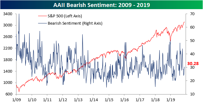
Neutral sentiment saw a roughly equivalent move to bullish sentiment falling 0.63 percentage points. For most of 2019, neutral sentiment has been consistently elevated relative to the past few years with the move this week leaving the reading in the middle of its recent range. As we discussed last week, neutral sentiment has been above its historical average for a pretty long time, and this week’s reading was the 16th straight making it the longest streak of above-average readings since 2017. While above its historical average, as with bullish and bearish sentiment, it is still within a normal range (within one standard deviation of the average).

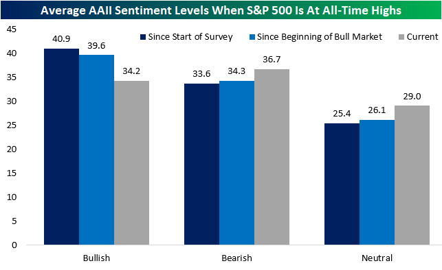
Unlike the S&P 500 and other major equity indices that have ripped higher this November, sentiment has remained rather subdued. As shown in the chart below, typically when the S&P 500 has reached record highs sentiment across the board has leaned more bullish than it currently is. Since the AAII survey began in 1987, bullish sentiment has averaged 40.9% when the S&P 500 closed at a record high. That is a 6.7 percentage point difference from where things currently stand. Even in regards to the current bull market beginning in 2009, all-time highs have typically seen bullish sentiment more elevated. Likewise, bearish and neutral sentiment is higher than the average for other all-time highs both since 1987 and in the current bull market. Despite this, there have been plenty of other record highs where sentiment has been even more subdued. Out of all the record S&P 500 highs since the survey began, the current reading on bullish sentiment is only in the 20th percentile. So while it is low, it could also be much lower.
While AAII’s survey did not see any major changes this week, another investor sentiment survey from Investors Intelligence was perhaps more notable. That survey’s reading on bullish sentiment has been consistently grinding higher over the past quarter with increases in all but two weeks. Rising again this week to 58.1%, bullish sentiment by this measure is the highest since October of last year when it was 61.8%.

The Investors Intelligence survey also gauges investor expectations for a correction. That reading fell again this week marking the tenth decline out of the past twelve weeks. While not a new low, this indicator is also sitting around levels that have not been observed since October of last year. Start a two-week free trial to Bespoke Institutional to access our interactive economic indicators monitor and much more.

Latin American Equities Go Their Own Way (Lower)
The rally in equities over the last several days hasn’t just been confined to the US. As shown in the snapshot below of regional global ETFs from our Trend Analyzer, with the exception of the Latin America 40 ETF (ILF), every ETF has had a positive return over the last five trading days, and most are up over 1%. It’s definitely nice to see equities trade broadly higher, but with those gains, they are pretty much all trading at (or close to) overbought levels. The only one that isn’t is also the only one that is down over the last week (ILF).
ILF is also the only ETF that is below its 50-day moving average and the only one up less than 5% YTD. In looking at the performance of the ETF’s components, it hasn’t just been a handful of names dragging LatAm down. YTD, nearly half of the ETF’s stocks are in the red, including its two largest components (Itau and Vale) which both have 9% weightings and are down close to 10%. Sign up for Bespoke’s “2020” special and get our upcoming Bespoke Report 2020 Market Outlook and Investor Toolkit.

Bespoke’s Morning Lineup – 11/29/19 – (Almost) Everybody Rallies
See what’s driving market performance around the world in today’s Morning Lineup. Bespoke’s Morning Lineup is the best way to start your trading day. Read it now by starting a two-week free trial to Bespoke Premium. CLICK HERE to learn more and start your free trial.

The Closer – Data Feast Week, Take 2 – 11/27/19
Log-in here if you’re a member with access to the Closer.
Looking for deeper insight on markets? In tonight’s Closer sent to Bespoke Institutional clients, we go through the day’s releases beginning with a recap of GDP. Next, we delve into manufacturing data with the release of durable goods and the Chicago PMI. We recap personal income and spending figures before finishing with an updated look at our Beige Book Index and weekly EIA data..

See today’s post-market Closer and everything else Bespoke publishes by starting a 14-day free trial to Bespoke Institutional today!
Stocks To Be The Most Thankful For
Below is a list of the 25 best performing stocks in the S&P 500 so far in 2019. Advanced Micro Devices (AMD) tops the list with a gain of more than 100%. While no other S&P 500 stocks have yet to double this year, another semi name, Lam Research (LRCX) has come close with a gain of 99%. Xerox (XRX), MarketAxess (MKTX), and Target (TGT) have also all risen more than 90%.
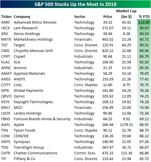
Apple (AAPL) is the 19th best performing stock in the list above. But because of its trillion+ dollar market cap, Apple’s (AAPL) 69% gain has a much bigger impact on the overall stock market than all of the other stocks that have seen a bigger price move this year. In fact, of the S&P 500’s 25% price gain this year, Apple has accounted for 2.24 of those percentage points (or roughly 9%).
Instead of looking at simple year-to-date price change, below is a list of the stocks that investors should be most thankful for this year because of their contribution to the S&P’s gains. Right behind Apple (AAPL) in first is the other trillion+ dollar company — Microsoft (MSFT) — which has accounted for 1.7 percentage points of the S&P’s 25% gain. After AAPL and MSFT are Facebook (FB), Alphabet (GOOGL), and Amazon (AMZN). Together these five mega-caps account for 25% of the S&P’s move higher this year. While this group of companies has been vilified in 2019 for a number of things, they’re certainly still delivering for the stock market in a big way. See Bespoke’s most actionable investment ideas with a two-week free trial to Bespoke Premium.

S&P 500 Industry Group Breadth Running Strong
The S&P 500 may be hitting record highs at a pace of more than once every other day, but would you believe that there are still Industry Groups trading below their 50-day moving averages? The chart below shows the rolling percentage of Industry Groups trading above their 50-DMAs over the last several years, and the current reading stands at 91.7%. Over the last five years there have been numerous periods where a higher percentage (and even 100%) of Industry Groups traded above their 50-DMAs, and the most recent was back in July.

So which are the two outlier groups that are still below their 50-DMAs? Well, when everyone seems to be taking an offensive posture in the market, it’s only natural that defensive sectors would be lagging, and two of the most defensive-oriented sectors in this yield-hungry world we live in are Utilities and Real Estate. Even these two groups, though, are only about 1% below their 50-DMAs, so all it will take is one or two good days for these groups to get them back over the hump. On the upside, Health Care Equipment & Services is the furthest above its 50-DMA at 7.72%.
The S&P 500 as a whole is currently just over 4% above its 50-DMA. What’s interesting to note here, though, is that just 9 of the 24 Industry Groups are further above their 50-DMAs while 15 are not above their 50-DMAs by as much as the S&P 500. In terms of YTD returns, the S&P 500 is currently sitting on a gain of more than 25% YTD. Leading the way higher this year, Tech Hardware (Apple) has rallied just under 48%, while Semis are up just over 40%. Behind these two leaders, four other Industry Groups are up over 30% YTD. While there is no downside on a YTD basis, Energy has been the biggest laggard and is just barely hanging on to a YTD gain. If Energy can’t hang onto a YTD gain in a year where the S&P 500 gains more than 25%, Energy investors may need to wear paper bags over their heads. Sign up for Bespoke’s “2020” special and get our upcoming Bespoke Report 2020 Market Outlook and Investor Toolkit.

Fixed Income Weekly – 11/27/19
Searching for ways to better understand the fixed income space or looking for actionable ideas in this asset class? Bespoke’s Fixed Income Weekly provides an update on rates and credit every Wednesday. We start off with a fresh piece of analysis driven by what’s in the headlines or driving the market in a given week. We then provide charts of how US Treasury futures and rates are trading, before moving on to a summary of recent fixed income ETF performance, short-term interest rates including money market funds, and a trade idea. We summarize changes and recent developments for a variety of yield curves (UST, bund, Eurodollar, US breakeven inflation and Bespoke’s Global Yield Curve) before finishing with a review of recent UST yield curve changes, spread changes for major credit products and international bonds, and 1 year return profiles for a cross section of the fixed income world.
In this week’s report we review the seasonality of bond yields.

Our Fixed Income Weekly helps investors stay on top of fixed income markets and gain new perspective on the developments in interest rates. You can sign up for a Bespoke research trial below to see this week’s report and everything else Bespoke publishes free for the next two weeks!
Click here and start a 14-day free trial to Bespoke Institutional to see our newest Fixed Income Weekly now!
Bespoke Matrix of Economic Indicators – 11/27/19
Our Matrix of Economic Indicators is the perfect summary analysis of the US economy. We combine trends across the dozens and dozens of economic indicators in various categories like manufacturing, employment, housing, the consumer, and inflation to provide a directional overview of the economy.
To access our newest Matrix of Economic Indicators, start a two-week free trial to either Bespoke Premium or Bespoke Institutional now!

Claims Breathe a Sigh of Relief
The past couple of weeks’ releases for jobless claims have been a bit concerning. Last week and the week before, initial jobless claims ran up to 227K. That was not only the highest level since June 21st’s 229K, but it also marked a distinct breakout above the past several months’ range. Released a day earlier than usual due to the Thanksgiving holiday tomorrow, this week’s claims gave reason to be thankful as they came in at a much healthier level falling to 213K compared to forecasts of a decline to 221K. That 15K decline was the largest since May 10th’s 16K drop. This has also led the indicator to fall back into the middle of the range that it had broken out of in the prior two weeks.

Given this week’s decline, the four-week moving average has also fallen. The moving average, which helps to smooth out the week to week fluctuations, is now at 219.75K, and it is the first time the moving average has dropped in three weeks. This is another welcome sign as recent readings have been at the upper end of its downtrend channel.

On a non-seasonally adjusted (NSA) basis, claims data was not quite as rosy. NSA claims rose this week by 24.5K up to 252.4K. While week-over-week upticks could be expected this time of year due to seasonal factors, the 33.7K increase versus last year’s reading was more of a surprise. Not only was the NSA data higher than it was one year ago, but it is higher than the current week of the year in 2017 as well. Additionally, this was the largest YoY increase for any week since December 6th, 2013 when it rose 34.2K.
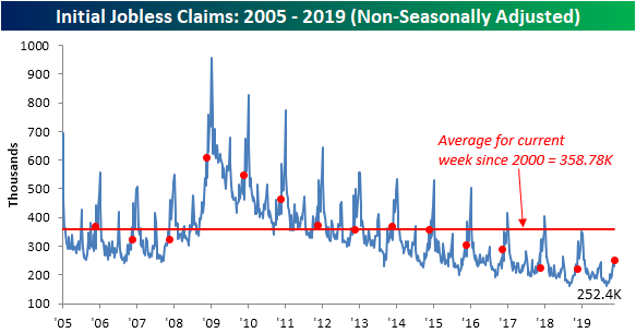
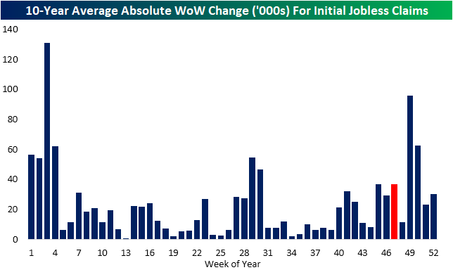
While those increases are notable, it should still be taken with a grain of salt as one week does not make a trend and it could come down to seasonal factors including the timing of Thanksgiving. This time of year has historically been volatile for claims, meaning comparisons of the same week number between different years is not an exact science. To highlight the volatility of this year, in the past decade November through January typically sees some of the largest week-over-week changes (in absolute terms) of the year. This week of the year (light blue bar) is no exception as it too has typically seen a larger than average move than the average for all weeks of the year (red line). Perhaps a better read on how things stack up versus one year ago will come several weeks down the line once claims have put in their seasonal peak.
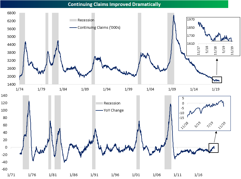
Additionally, that concerning uptick in the NSA data is idiosyncratic with other labor data released today. Continuing jobless claims experienced a substantial improvement this week as they fell to 1640K compared to forecasts of 1691K and last week’s revised 1697K. That 57K decline was the largest since a 62K decline in April of this year; around the time of multidecade lows for claims. This week’s print not only broke to new lows of the past couple of years (inlaid chart below), but it was also the lowest reading on continuing claims since early August of 1973. As shown in the second chart, Continuing claims are down 55K relative to last year, which is the largest YoY decline since July. It also provides a nice break from the increases that have been observed over the past few weeks for the first time this cycle (which we discussed last week). Start a two-week free trial to Bespoke Institutional to access our interactive economic indicators monitor and much more.
Bespoke’s Global Macro Dashboard — 11/27/19
Bespoke’s Global Macro Dashboard is a high-level summary of 22 major economies from around the world. For each country, we provide charts of local equity market prices, relative performance versus global equities, price to earnings ratios, dividend yields, economic growth, unemployment, retail sales and industrial production growth, inflation, money supply, spot FX performance versus the dollar, policy rate, and ten year local government bond yield interest rates. The report is intended as a tool for both reference and idea generation. It’s clients’ first stop for basic background info on how a given economy is performing, and what issues are driving the narrative for that economy. The dashboard helps you get up to speed on and keep track of the basics for the most important economies around the world, informing starting points for further research and risk management. It’s published weekly every Wednesday at the Bespoke Institutional membership level.
You can access our Global Macro Dashboard by starting a 14-day free trial to Bespoke Institutional now!
