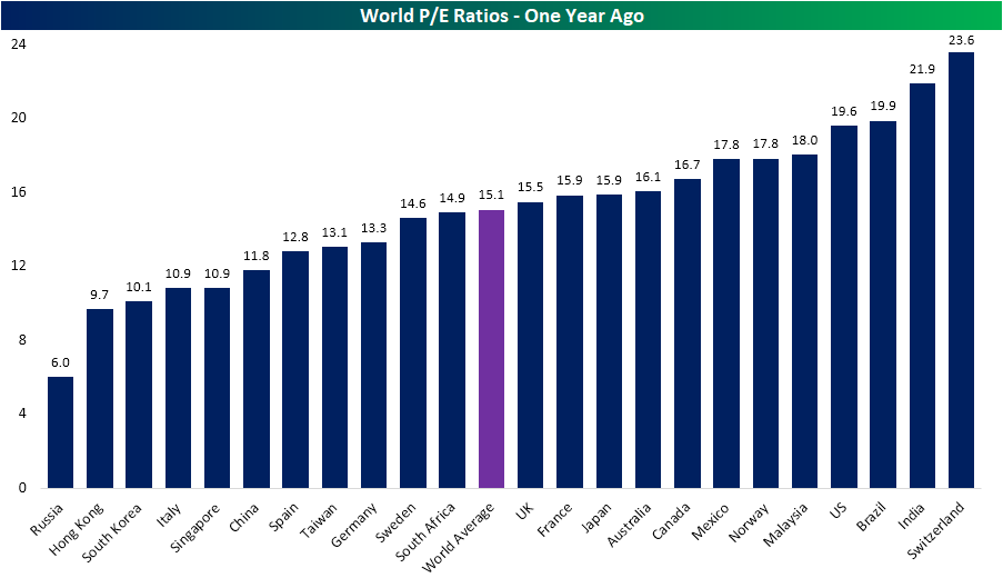
Price-to-Earnings Around the Globe
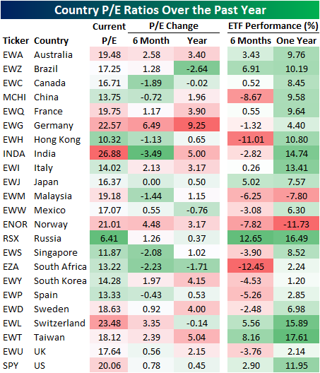
Every Wednesday, we release our Global Macro Dashboard, which tracks major data economic and market data points from 23 of the largest global economies. One stat we include is each country’s P/E ratio for their respective equity markets. India continues to have the highest valuation with a P/E of 26.9. That compares to the US which is now valued at 20.1x earnings and the fifth-highest of the countries tracked. This is also higher than the average P/E for all of these countries which is 17.02. Other countries with notably high valuations include Norway, Germany, and Switzerland. Russia, on the other hand, has by far the lowest valuation of just 6.41, the only country with a P/E in the single digits.

Compared to where things stood six months and one year ago, valuations around the globe have collectively risen. The world average now stands at 17.0 versus 16.4 at the end of April and 15.1 last October. While the average multiple has increased, only 60% of the countries tracked have seen valuations increase over the last 6 months while 74% have risen over the past year. Germany’s P/E has actually risen the most of these having jumped to the third-highest P/E of all countries (22.6). Six months and one year ago, Germany (EWG) actually had a below-average P/E. Multiple expansion can come in the form of higher prices and/or lower earnings, and in the case of Germany, the culprit has been weaker earnings.
Even though it currently continues to hold the number one spot on the list, multiples in India (INDA) have actually fallen over the past six months from 30.4 down to the current level of 26.9. Given INDA has fallen over 2.5%, this lower valuation makes better sense than the jump in Germany. Similarly, in regards to the US, the ratio rising to over 20 from 19.28 comes is a result of the S&P 500’s 3% gain as earnings have been pretty flat.
Compared to one year ago, it is a similar story. As is the case now, Russia and Hong Kong have had the lowest valuations over the past six months and one year, although they have risen in that time. The valuation for most countries have risen over the past year.

Summarizing in the table below, there is a bit of a mixed picture in regards to how P/E ratios have changed with performance over the past half-year and year. One would expect the ratio to increase as equities rise, but that has not necessarily been the universal case. For countries like Norway (ENOR) and Germany (EWG), valuations have risen the most in spite of equity markets that have experienced declines over the past six months (Norway’s declines being the fourth-worst of the 23 countries) and only modest gains in the past year. On the other hand, Russia (RSX) has the lowest valuation of all countries despite having outperformed dramatically over the last six to twelve months. RSX has also not seen any major surge in valuation in that time as earnings have kept up with prices. Meanwhile, other countries like India (INDA), Switzerland (EWL), Taiwan (EWT) and the US (SPY) have seen this dynamic react more in line with what could be expected. Start a two-week free trial to Bespoke Institutional to access our Global Macro Dashboard and much more.
Fixed Income Weekly – 10/30/19
Searching for ways to better understand the fixed income space or looking for actionable ideas in this asset class? Bespoke’s Fixed Income Weekly provides an update on rates and credit every Wednesday. We start off with a fresh piece of analysis driven by what’s in the headlines or driving the market in a given week. We then provide charts of how US Treasury futures and rates are trading, before moving on to a summary of recent fixed income ETF performance, short-term interest rates including money market funds, and a trade idea. We summarize changes and recent developments for a variety of yield curves (UST, bund, Eurodollar, US breakeven inflation and Bespoke’s Global Yield Curve) before finishing with a review of recent UST yield curve changes, spread changes for major credit products and international bonds, and 1 year return profiles for a cross section of the fixed income world.
In this week’s report we look at the recent shifts in interest rate volatility, and what’s been recent driving movements.

Our Fixed Income Weekly helps investors stay on top of fixed income markets and gain new perspective on the developments in interest rates. You can sign up for a Bespoke research trial below to see this week’s report and everything else Bespoke publishes free for the next two weeks!
Click here and start a 14-day free trial to Bespoke Institutional to see our newest Fixed Income Weekly now!
Guidance Trends Lower
Our good friend (and a former boss) Laszlo Birinyi used to hammer home that “it’s all about the guidance!” when it comes to earnings reports for specific companies. That is indeed very true as investors discount stocks based on forward projections more than what they’ve done in the past. On the subject of guidance, this season we’ve been seeing a lot more companies lower guidance than raise guidance, which has resulted in a pretty big tick lower in our guidance spread reading on our Earnings Explorer page (available to Bespoke Institutional members).
Our guidance spread reading shows the difference between the percentage of companies that have raised guidance and lowered guidance over the last three months on a rolling basis. A positive reading means more companies have raised guidance than lowered guidance over the last three months and vice versa for a negative reading. As you can see, the reading is currently at -6.48 percentage points, which is well below the historical average of -2.97. (It’s notable that historically the average guidance spread has been negative, which tells us that in general companies like to under-promise and over-deliver.) The guidance spread completely tanked in the first quarter of 2019 before stabilizing and rallying back during the summer. While it hasn’t been in positive territory all year, the spread did briefly get above its historical average during the Q2 reporting period in July.
A negative guidance reading means companies are less optimistic about the future than they could be, but it’s not necessarily a bearish sign for the stock market. If anything, it gives companies an easier chance at beating estimates going forward as long as the economy doesn’t completely fall off a cliff. As you can see in the second chart below that extends our guidance spread reading all the way back to 2003, the current reading is hardly a negative outlier to be concerned about. The only time the spread really collapsed was in mid to late 2008 in the midst of the Financial Crisis. Want to see Bespoke’s best analysis? Start a two-week free trial to one of our premium plans today.


Bespoke’s Global Macro Dashboard — 10/30/19
Bespoke’s Global Macro Dashboard is a high-level summary of 22 major economies from around the world. For each country, we provide charts of local equity market prices, relative performance versus global equities, price to earnings ratios, dividend yields, economic growth, unemployment, retail sales and industrial production growth, inflation, money supply, spot FX performance versus the dollar, policy rate, and ten year local government bond yield interest rates. The report is intended as a tool for both reference and idea generation. It’s clients’ first stop for basic background info on how a given economy is performing, and what issues are driving the narrative for that economy. The dashboard helps you get up to speed on and keep track of the basics for the most important economies around the world, informing starting points for further research and risk management. It’s published weekly every Wednesday at the Bespoke Institutional membership level.
You can access our Global Macro Dashboard by starting a 14-day free trial to Bespoke Institutional now!

Bespoke Morning Lineup – 10/30/19
See what’s driving market performance around the world in today’s Morning Lineup. Bespoke’s Morning Lineup is the best way to start your trading day. Read it now by starting a two-week free trial to Bespoke Premium. CLICK HERE to learn more and start your free trial.

The Closer – Small Cap Run, Auto Merger, Health Care, Home Prices, Dems – 10/29/19
Log-in here if you’re a member with access to the Closer.
Looking for deeper insight on markets? In tonight’s Closer sent to Bespoke Institutional clients, we take a look at the outperformance of more cyclical stocks including small caps before going over the news of a potential Fiat-Chrysler and Peugeot merger. We then review Health Care’s outperformance before recapping today’s housing data. We finish with a brief update on the Democratic primary.

See today’s post-market Closer and everything else Bespoke publishes by starting a 14-day free trial to Bespoke Institutional today!
BYND A Bad Reaction to Earnings
Earlier this morning on the blog, we made note of today’s earnings triple plays (EPS and sales beat alongside raised guidance) including the terrible stock price reaction pre-market for Beyond Meat (BYND) in spite of these solid quarterly results. To provide an update, BYND gapped down 21.3% at the open today although it has seen a small rally since then; currently down only around 18% from yesterday’s close. Using a screen in our Earnings Explorer database, shown in the tables below, we looked at every earnings triple play since our data begins in 2001. Across the more than eight thousand triple plays, stock price reactions have held a very positive bias. These stocks have gapped up 86% of the time, averaging a 5.12% gain. These stocks have also averaged a full-day and open-to-close gain as well. So any decline let alone one as large as Beyond Meat’s is not common, but also not totally without precedent.
BYND is tied with Anadigics’s (ANAD) response to earnings in October of 2007 (ANAD is no longer actively traded as it was acquired by II-VI in 2016) for the third-worst opening gap down of any triple play. The only two reactions that were worse were the quarterly reports from Twitter (TWTR) in February of 2014 and ReachLocal (RLOC) in May of 2016 which fell 23.28% and 27.75%, respectively. For TWTR, that quarter also saw the single worst full-day decline for any triple play since 2001. Like ANAD, RLOC is no longer actively traded due to an acquisition by Gannet (GCI) just a few months after that quarter. RLOC, in particular, is interesting as the stock rallied 39.2% intraday to more than erase the losses from the opening gap. Granted, it is unlikely that BYND shareholders could see that kind of turnaround today, especially since RLOC was trading for under $2 at that time. Especially since some of these declines are also a factor of IPO investors exiting their positions. Today is the official lockup expiration date for BYND. Given the IPO price of $25, those investors are still notching a ~250% profit. Start a two-week free trial to Bespoke Institutional to access our interactive Earnings Explorer, 100 Most Recent Triple Plays, and much more.

B.I.G. Tips – Fed Days October 2019
We’ve just published our regular pre-Fed report ahead of another expected rate cut from Chair Powell tomorrow. If you’d like to see our analysis of Fed expectations for tomorrow and beyond, and how the stock market typically reacts to rate cuts, start a two-week free trial to Bespoke Premium. You won’t be disappointed!
One thing for sure is that the stock market has not taken kindly to Chair Powell on Fed Days during his tenure. Below is an intraday composite chart of the S&P 500 on all Fed Days under Powell’s helm. Do we get another day like this tomorrow or will it be more of the same? Read more in our just-published report. You can sign up for access here.


Confidence Softens
With the impeachment inquiry heating up, Consumer Confidence on the part of US consumers unexpectedly softened in October. While economists were expecting the headline index from the Conference Board to rebound from 126.3 up to 128.0, the actual reading declined slightly, falling to 125.9. While overall confidence levels remain high by historical standards, it has now been a full-year since the current cycle’s peak of 137.9 last October.

Breaking down confidence levels by sentiment towards present conditions and expectations, consumers are a lot more comfortable with their present situation than they are with the future. While sentiment towards the ‘Present Situation’ rose slightly in October, ‘Expectations’ actually declined for the third straight month. With the 2020 election, the US-China trade war, and now a possible impeachment dominating the headlines, you can’t really fault consumers for having less optimism.

In looking at the spread between Present Situation and Expectations, after October’s report, we are getting back up near the highest levels of the current cycle. Looking at the spread over time, in all but one period where this spread topped 50, a recession wasn’t far behind. The only exception was the late 1990s when the spread remained elevated over 50 for well over a year. Interestingly enough, that’s also the last time that consumers had to deal with a possible impeachment of the President.

The elevated spread above is most certainly a potential negative to monitor. Another key indicator to track is sentiment towards the job market and at this point, consumers are still relatively confident. In this month’s report, the percentage of consumers who consider jobs to be plentiful rose to 46.9% from 44.5% last month. We’ve seen a bit of volatility in this indicator over the last few months, but as long as it doesn’t take a meaningful turn lower, it helps to offset the concern of the chart above. Once confidence towards the jobs market starts to impact expectations, though, that’s when it becomes a problem. Want to see Bespoke’s best analysis? Start a two-week free trial to one of our premium plans today.

Leading and Lagging Groups Since the July High
With the S&P 500 finally taking out its July high on Monday, there has been a lot of movement below the surface in terms of leading and lagging groups. In fact, 18 groups within the S&P 500 are up over 5% since the last high back in July while 13 are down over 5%. In the table below, we list the best and worst-performing groups since the 7/26 closing high. To make the list, each group had to either be up or down 2%.
On the upside, leadership has been spread across a variety of sectors. Leading the way higher, Tech Hardware (think Apple) has rallied over 17% and with an overall weight in the index of nearly 4%, this group has been a key leader of the market. The only other group up over 15% is Household Durables (homebuilders), which has a much smaller weight in the S&P 500. Behind these two groups, another five – Multiline Retail, Construction Materials, Construction & Engineering, Biotech, and Trading Companies – have seen double-digit gains since the late July high. The fact that the seven groups with the strongest gains come from five different sectors suggests that the rally isn’t especially narrow, even if the percentage of stocks hitting new highs has been lacking.
On the downside, Leisure Equipment and Products has been the worst performing group in the S&P 500 with a decline of 21.9%. The weakness in this group, though, is 100% attributable to Hasbro (HAS), which is the only stock in the group (hence its 0.1% weight in the S&P 500). Behind Leisure, Communications Equipment has dropped more than 14% driven by weakness in Cisco (CSCO). Finally, what would a list of losers be without a group from the Energy sector?
What’s most interesting about this list is that even as the market has been essentially flat over the last three months, there’s been a lot of dispersion in performance – not just within the market, but also within sectors. Take the Consumer Discretionary sector, for example. While five of the sector’s groups are on the list of best performers since the 7/26 high, there are also five on the list of biggest losers. Start a two-week free trial to Bespoke Institutional for full access to some of the most sought after research on the street, including our Trend Analyzer tool.
