Sep 7, 2022
Building upon yesterday’s Chart of the Day, we took a look into Apple’s (AAPL) intraday performance on iPhone announcement days. Today is one of those days, and although we couldn’t locate the exact announcement time for each day going back to 2008, the ones that we did find occurred at 1 PM Eastern, which is highlighted in red below.
As you can see, the stock has tended to sell off during the first hour of the day before slowly trudging higher until 1 PM Eastern. However, once the event begins, the stock has tended to decline in a sell-the-news reaction. That weakness has tended to last most of the afternoon until the final 40 minutes of trading when the stock has tended to bounce back a bit. For the entire day. AAPL’s stock has, on average, declined 78 basis points on the day of prior iPhone announcements since 2008. Click here to learn more about Bespoke’s premium stock market research service.

Aug 31, 2022
Earlier today, we sent out our Chart of the Day highlighting seasonal trends for the month of September. Breaking this down further, below we break down some seasonal trends for the first trading day of September relative to all other months over the last 50 years (since 1972). During this span, the first trading day of September has been weaker than the first trading day of any other month with the S&P 500 averaging a decline of 0.11%. However, the positivity rate is above 50% and the median performance is a gain of 0.05%, and much of the negativity comes after the index posts a gain in August.
Over the last 50 years, September has averaged a loss of 0.32% (median: -0.07%) on the first trading day of September following gains in August, trading lower 54% of the time. On an average basis, September has been the worst first trading day of the month following gains in the prior month, but when it comes to both median and positivity rates, August is worse. On the other hand, when August resulted in losses for the S&P 500, September has averaged a gain of 0.16% on the first trading day of September, posting gains 59% of the time. Click here to learn more about Bespoke’s premium stock market research service.

The chart below is included to help you visualize the comparative performance of the first trading day in September relative to other months. Perhaps one of the more surprising aspects of this chart is that fact that despite being known as a positive month, positivity rates on the first trading day of December have been weak. Along with August, it is the only month where the first trading day of the month has been down more often than it has been up regardless of whether the prior month was up or down.

Aug 18, 2022
As we mentioned in today’s Chart of the Day, there can be a wide spread between total returns and price change based on dividend yield. Although it doesn’t always make financial sense for a company to pay dividends, they can certainly magnify returns all else equal. Click here to start a two-week trial to Bespoke Premium and receive our paid content in real-time.
The table below outlines twenty S&P 500 stocks that have seen a high percentage of their returns over the last twenty years come from dividends. The average stock on this list has seen over 80% of their gains over the last two decades come from dividends alone. Although the average stock on this list has only seen a price gain of 61.1% since August of 2002, their average total return when factoring in dividends re-invested has been 278%.

To show you what we mean, below is a chart of price change versus total return over the last 20 years for Altria Group (MO). As you can see, the dividend in this case turns a below average stock into an outperformer. Click here to start a two-week trial to Bespoke Premium and receive our paid content in real-time.

Aug 17, 2022
In an earlier tweet, we pointed out the elevated readings across 10-day advance decline lines in our Sector Snapshot. Not only is the 10-Day A/D line for the S&P 500 approaching one-year highs (as of yesterday’s close), but it has been “overbought” for the last 15 trading days.

Going back to the start of our data in 1990, there have only been eight other times in which the S&P 500’s 10-day A/D line has been overbought for 15 days in a row or more. The last time such a steak was observed was at the start of 2019 which ended at 22 days. That tied for the March 2016 streak for the longest on record back to 1990. We would also note that other than one streak in the first couple of months of 1991, nearly all of these long streaks with an overbought 10-day A/D line occurred since 2010. In other words, consistently impressive breadth by this measure has largely been a recent phenomenon.
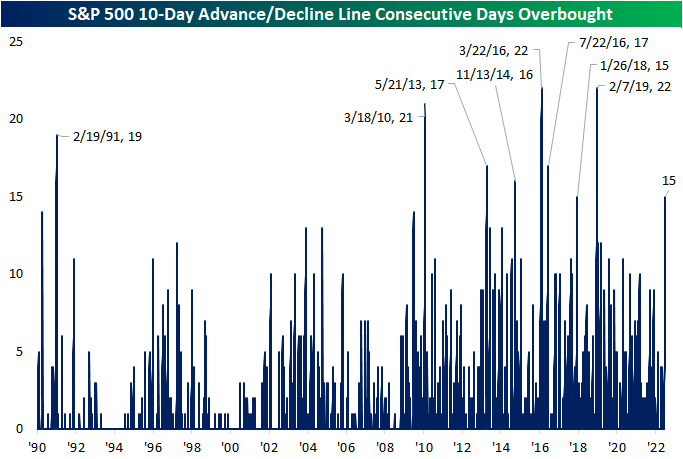
This is not the only impressive breadth signal we have covered of late. For example, in yesterday’s Chart of the Day we highlighted that more than 90% of S&P 500 stocks were above their 50-DMAs. Prior times when we’ve seen that reading spike above 90% have been followed by strong returns in the months and year ahead. Looking at the past times in which the 10-day advance decline line has been overbought for 15 days in a row, forward performance of the S&P 500 has not been considerably stronger than the norm. From that 15th day, the S&P has risen half the time one week out. One and three month returns are more consistently positive but weaker than the norm on a median basis. In the year after the long overbought A/D streaks listed below, though, the S&P was higher 7 of 8 times for an average gain of 11.1%.

Below is a chart of the S&P 500 since its 2009 Financial Crisis low. As shown, most of these overbought A/D line streaks have occurred as the index was recovering from some sort of sell off. Only one of them (in early 2018) came about at the time of a notable peak in the index. Click here to learn more about Bespoke’s premium stock market research service.
