The Bespoke 50 Top Growth Stocks — 10/31/19
Every Thursday, Bespoke publishes its “Bespoke 50” list of top growth stocks in the Russell 3,000. Our “Bespoke 50” portfolio is made up of the 50 stocks that fit a proprietary growth screen that we created a number of years ago. Since inception in early 2012, the “Bespoke 50” has beaten the S&P 500 by 111.8 percentage points. Through today, the “Bespoke 50” is up 231.4% since inception versus the S&P 500’s gain of 119.6%. Always remember, though, that past performance is no guarantee of future returns. To view our “Bespoke 50” list of top growth stocks, please start a two-week free trial to either Bespoke Premium or Bespoke Institutional.

Long List of Today’s Triple Plays
Today is one of the busiest days of earnings season, and with these reports, we have also gotten a massive number of earnings triple plays over the past 24 hours. Since last night’s close, 22 companies have reported better than expected sales and EPS while also raising guidance. For reference, heading into today there were a total of only 35 triple plays this entire earnings season!
Charles River Associates (CRAI), a consulting firm, is up the most since last night’s close having risen more than 20%. Other stocks that have risen double-digits include Universal Display (OLED), ManTech (MANT), Ultra Clean Holdings (UCTT), and Teledoc (TDOC). Of all these triple plays, Inovalon (INOV) saw the largest gap up at the open, rising 13.94%. Despite that gap up, INOV has fallen since the open. On the other hand, only three companies, Generac (GNRC), YETI (YETI), and ACADIA Pharma (ACAD) gapped down today. While overall performance so far for this group of stocks has been strong with an average gain of over 4.7%, intraday performance has been somewhat weak. Just under half of them have sold off since the open. The worst of these is recent IPO Lyft (LYFT) which, as of this writing, has fallen almost 7% since the open, erasing all of its gap higher. Cigna (CI), Masimo (MASI) and FormFactor (FORM) have also more than erased this morning’s gap higher.
Using data from our Earnings Explorer, other stocks that have reported triple plays this earnings season have risen an average of 0.83% from open to close and have averaged a full-day gain of 4.86%. Looking at all triple plays throughout history since our data begins in 2001, those averages are 0.26% and 5.4%, respectively. In other words, this season’s triple plays including today have been doing better than average on an intraday basis, but have been slightly weaker in regards to the full-day stock price reaction. Start a two-week free trial to Bespoke Institutional to access our interactive Earnings Explorer and much more.

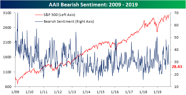
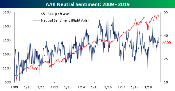
Sentiment Little Changed
Last week, we noted the sharp rebound in sentiment over the past few weeks. In the wake of those large moves, the AAII survey of investor sentiment took a breather this week despite the market’s successful efforts to reach new highs. The S&P 500’s new all-time highs have done little to garner optimism, though, as bullish sentiment declined 1.6 percentage points to just a hair under 34%. While lower than last week, it is still at the higher end of where sentiment has been over the past few months and in the middle of the past couple of years’ range.

Bearish sentiment took some of that loss from the bullish camp as it rose 0.16 percentage points. That is the smallest one week change in bearish sentiment since the last week of June when it fell 0.08 percentage points. Additionally, this was only the 20th time in the past decade that bearish sentiment changed less than 0.2 percentage points.
Neutral sentiment took the larger share of the losses from bulls as it rose to 37.59% and is now at the highest level since the beginning of the month when it reached 39.19%. Neutral sentiment is also still the predominant sentiment reading for the third week in a row, outweighing bearish, and to a lesser extent, bullish sentiment readings. In other words, investors do not seem to have fully bought into the new highs for the S&P 500, but are at least slightly more optimistic than pessimistic. Start a two-week free trial to Bespoke Institutional to access our interactive economic indicators monitor and much more.
October Employment Report Preview
While rate hikes anytime soon aren’t likely, at yesterday’s post-decision press conference, Fed Chair Powell pretty much ruled out more rate cuts any time soon either. That guidance hasn’t been unwarranted either as recession fears have started to ebb in recent weeks. Thursday’s much weaker than expected Chicago PMI report, however, serves as a reminder that the clouds haven’t quite cleared yet. This will put added significance on tomorrow’s October employment report. While expectations are already low due to the impact of the GM strike, any downside surprise is unlikely to be greeted well by the market.
Heading into Friday’s Non-Farm Payrolls report, economists are expecting an increase in payrolls of just 85K, which would be a big decline from September’s slightly weaker than expected growth of 136K. In the private sector, economists are expecting an increase of 80K from September’s reading of 114K. Job growth in the Manufacturing sector is expected to decline 55K. For the Manufacturing sector, we haven’t seen that large a decline in payrolls since the middle of 2009, but keep in mind that the impact of the now-ended GM strike is expected to pressure job growth. Because of the strike, the unemployment rate is expected to rise to 3.6% from September’s ridiculously low reading of 3.5%, and average weekly hours are expected to remain unchanged at 34.4.

Ahead of the report, we just published our eleven-page preview of the October jobs report. This report contains a ton of analysis related to how the equity market has historically reacted to the monthly jobs report, as well as how secondary employment-related indicators we track looked in October. We also include a breakdown of how the initial reading for October typically comes in relative to expectations and how that ranks versus other months.
For anyone with more than a passing interest in how equities are impacted by economic data, this October employment report preview is a must-read. To see the report, sign up for a monthly Bespoke Premium membership now!
Chart of the Day: Chicago Miss, ISM To Fall
B.I.G. Tips – November 2019 and Rest of Year Seasonality
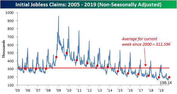
Claims Drift Higher
After falling to 213K last week (revised up from 212K), initial jobless claims returned right back to where they stood the week before at 218K. While that was a bigger increase than expected—up 5K from last week compared to expectations for claims to rise to 215K—claims have not made any significant new high or low. Instead, the data remains right in the range it has been in for the last six months. Claims trending sideways, if not slightly lower over the past year, has not necessarily been a bad thing though as they have held at very healthy levels and continued the record streaks at or below 250K and 300K. Those streaks have grown to 108 and 243 consecutive weeks, respectively. Overall, this week’s report was nothing too exciting and only reaffirmed the recent trend of no improvements but also no deterioration in the data.
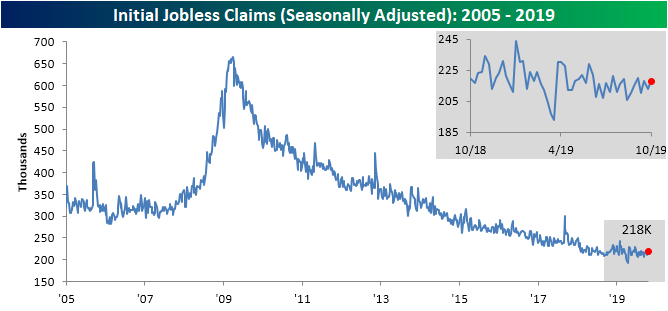
The four-week moving average reiterates this trend as well as it fell to 214.75K from 215.25K. This was the second straight week with a decline of 0.5K week-over-week. The moving average is also slightly lower year-over-year dropping just 1.25K.

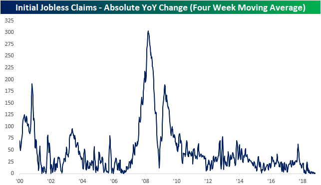
While those are improvements, they are much smaller than earlier in the cycle. As shown in the chart below, the sideways trend in jobless claims has shown up in the fact that y/y readings in the four-week moving average have flatlined.
As with the moving average, non-seasonally adjusted jobless claims fell WoW and YoY. Now at 198.1K, NSA claims are just 0.4K below where they stood one year ago. Looking forward through the end of the year, seasonal patterns will likely lead NSA claims to grind higher week-over-week until the annual peak around the end of December/early January. Start a two-week free trial to Bespoke Institutional to access our interactive economic indicators monitor and much more.
Bespoke’s Morning Lineup – 10/31/19
See what’s driving market performance around the world in today’s Morning Lineup. Bespoke’s Morning Lineup is the best way to start your trading day. Read it now by starting a two-week free trial to Bespoke Premium. CLICK HERE to learn more and start your free trial.

The Closer – Last Fed Cut, Earnings Madness, IPO Sadness, GDP Solid – 10/30/19
Log-in here if you’re a member with access to the Closer.
Looking for deeper insight on markets? In tonight’s Closer sent to Bespoke Institutional clients, we recap today’s FOMC decision and the subsequent response in the markets. Given the over 150 earnings reports that came out after the close, we then glance at some of the more notable reports that came out tonight. Given Beyond Meat’s (BYND) massive decline on earnings yesterday, next, we take a look at its performance relative to other IPOs over the past few years. We finish tonight by reviewing today’s economic data including an in-depth analysis of what drove GDP in the third quarter and an update on EIA petroleum data.

See today’s post-market Closer and everything else Bespoke publishes by starting a 14-day free trial to Bespoke Institutional today!
Health Care’s Dramatic Recovery
After trading in a rather tight range over the last few months, the Health Care sector’s chart has taken some dramatic turns in the last few weeks. Just earlier this month, as Elizabeth Warren’s poll numbers were surging, Health Care appeared to be on the verge of breaking down as its price broke below both the 50 and 200-day moving average as well as the summer lows. Just as the sector looked to be on its deathbed, though, it has seen a dramatic recovery to the point where it is now testing its 2019 highs! It should come as no surprise that the recent rally has coincided with what has recently been a decline in Warren’s poll numbers, but positive earnings results from high profile names in the sector have also helped.

The chart below shows the daily overbought/oversold readings for the S&P 500 Health Care sector over the last year. The chart measures where the sector is trading relative to its 50-day moving average (measured in standard deviations). When the line is in the red zones, it indicates that the sector is overbought while readings in the green zone indicate that the sector is oversold.
Recent readings for the sector reflect the major shift that the sector has seen in the last four weeks. As recently as October 2nd, the Health Care sector was in extreme oversold territory, trading more than two standard deviations below its 50-day moving average. In the span of fewer than four weeks, the sector has gone from extreme oversold to extreme overbought, which is the type of reversal you don’t see very often. In fact, going back to 1980, it has only happened in eight prior periods with the most recent occurring all the way back in July 2016 just after the original Brexit vote.
When a sector reaches extreme overbought levels, it usually indicates that it is due for a pause to work off the overbought condition. In order to work off the overbought condition, the sector could either experience a pullback in price or a period of sideways trading so that the sector’s moving averages can catch up to the current price. These pauses and pullbacks don’t always start exactly when the sector reaches overbought levels, though. In fact, back in July 2016 when the sector last saw a similar reversal, Health Care kept rallying after its sharp positive reversal gaining 1.2% over the following week and 3.1% over the next month. Start a two-week free trial to Bespoke Institutional to access our interactive tools, including the Trend Analyzer and Earnings Explorer.
