Here’s One Place Where Corona is Showing Up in the Economic Data
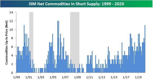
This morning’s ISM Non-Manufacturing report for the month of February was impressive at the headline level despite growing concerns over the impact of the Covid-19 virus. One aspect of the report where the outbreak is starting to show up is in the survey where companies are asked what commodities are in short supply. In this month’s survey, ISM noted that 11 commodities were in short supply among companies in the Non-Manufacturing sector. The chart below shows the number of commodities in short supply on a monthly basis with recessions highlighted in gray. Going back to 1999, there have only been two other months where a larger number of commodities were in short supply and that was in the months immediately following Hurricane Katrina.
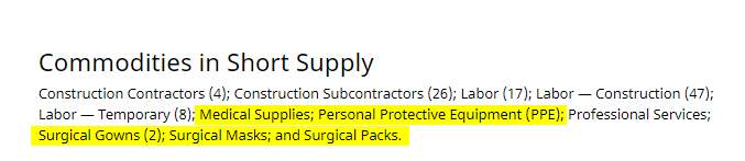
Looking at the commodities that were flagged as being in short supply in February, five can be directly related to Covid-19. As shown below, Medical Supplies, Personal Protective Equipment, Surgical Gowns, Surgical Masks, and Surgical Packs are all flying off the shelves. Start a two-week free trial to Bespoke Institutional for full access to all of our economic research and tools.
Bespoke’s Morning Lineup – 3/4/20 – Super Wednesday
Due to unscheduled maintenance issues with our email provider, subscribers may not receive the email of today’s Morning Lineup in a timely manner. We apologize for any inconvenience but we just wanted to let you know that if you did not receive this morning’s copy, it is not related to any changes in your email settings.
See what’s driving market performance around the world in today’s Morning Lineup. Bespoke’s Morning Lineup is the best way to start your trading day. Read it now by starting a two-week free trial to Bespoke Premium. CLICK HERE to learn more and start your free trial.
After positive results for Joe Biden in the Super Tuesday Democratic primaries, the former VP has established himself as the current front-runner to challenge President Trump in November. Over at electionodds.com, Biden now has a 75.5% chance of winning the nomination, which is almost a full 60 percentage points ahead of Bernie Sanders. Those numbers are certainly comforting for Biden, but we would remind people that as recently as 2/24, the roles were completely reversed with Biden at 5.5% and Sanders over 50%!
The biggest story of the night, though, was that the Democratic primaries have become a two-person race. With poor showings from both Bloomberg and Warren, they are out of the running now as even Hillary Clinton is ahead of them in the betting markets.

Read today’s Bespoke Morning Lineup for a discussion of Biden’s impressive performance in Super Tuesday voting, news on coronavirus, global PMI data from the Services sector, and the latest stock-specific news of note.

The Closer – Super Lose – 3/3/20
Log-in here if you’re a member with access to the Closer.
Looking for deeper insight on markets? In tonight’s Closer sent to Bespoke Institutional clients, we take a look at the market reaction to today’s rate cuts and where equities stand relative to short term rates. We then take a look at the record low yields in the US and abroad. Next, we show just how much bonds have outperformed equities before reviewing credit markets. We finish by looking through derivative markets.

See today’s post-market Closer and everything else Bespoke publishes by starting a 14-day free trial to Bespoke Institutional today!
Daily Sector Snapshot — 3/3/20
S&P 500 Dividend Yield Now 100+ Basis Points Higher Than 10-Year Treasury Yield
The yield on the 10-Year Treasury tipped below 1% today for the first time ever as the Fed cut rates by 50 bps. That is a record low yield for the 10 Year. Meanwhile, the past few days have seen the S&P 500’s dividend yield rise to some of its highest levels in over a year. This leaves the S&P’s dividend yield at 2.1% today. That means holding the various levels of risk and other factors constant, stocks are yielding over 1% more than the 10-Year yield. That sharp divergence in yields is shown in the chart below.

Since the mid-2000s, the spread between the S&P’s dividend yield and the 10-year yield has only moved above one on one other occasion, and that was near the depths of the Financial Crisis in December 2008. Start a two-week free trial to Bespoke Institutional to access our interactive tools and full library of research.

Covid-19 Cases and Mortality Rates By Country
One of the factors that makes it so hard for investors to grapple with the Covid-19 coronavirus is that there really aren’t very good numbers related to the mortality rate, and if you look at the mortality rates by individual countries, they vary widely. Reasons for the variance range from lack of available testing infrastructure to a general distrust of statistics being reported by certain governments. With those two caveats in mind, a look at current infection and mortality rates shows a disconcerting picture from a US perspective. The table below shows the number of cases and deaths due to the coronavirus broken down by country. These figures were pulled from the incredibly useful Johns Hopkins Coronavirus monitor, and we only included countries that have reported more than ten cases of Covid-19.
The table below is sorted by mortality rate from highest to lowest, and here is one case where the US doesn’t want to be winning. With a current rate of 5.6%, the mortality rate from confirmed Covid-19 cases in the US is higher than any other country in the world including Iran which comes in at 3.3%. Obviously, the lack of available testing in the US from a shortage of test kits has resulted in fewer tests than other countries, so the number of confirmed cases in the US is likely a lot lower than the number currently flowing around undetected. However, the fact that the US even finds itself here in the first place isn’t the most comforting thing for Americans already worried about the spread of the virus! Receive full access to all of our analysis, including the latest coronavirus news and how it’s impacting the markets, by signing up for a free two-week free trial to Bespoke Institutional today.

The chart below shows the ten countries/regions with the highest mortality rates from the Covid-19 outbreak. The US is nearly a full two percentage points above China (3.7%) and a full three percentage points above every other country besides Iran. Again, as testing expands in the US, the number of cases will undoubtedly rise as milder cases are detected, but even in that case, testing procedures capacity in the US should have been a lot faster to ramp up.

Homebuilders Appear Attractive As Rates Move Lower
Earlier today we updated our weekly Stock Scores, which ranks each of the stocks in the S&P 1500 based on various fundamental, technical, and sentiment factors. Coincidentally on the same day that the Federal Reserve surprised with a 50 bps rate cut, one group of stocks poised to benefit from lower rates, the homebuilders, came in with very strong scores. As shown in the chart below, breaking down the S&P 1500 by the GICS Level 4 Sub-Industries, the average stock in the homebuilder sub-industry had a score of 65.9 (out of 100). That is higher than any other group with the next highest-ranked sub-industry being Heavy Electrical Equipment. Another interesting group to note is Airlines, which despite having been crushed in the coronavirus fallout, surprisingly find themselves in the top ten.
The strength in Airlines is due in large part to high fundamental ratings for stocks in the group. Those high scores don’t fully take into account the weaker earnings that the market is pricing in, but unlike prior periods over time, airlines as a whole are in a lot better financial shape than they were in the past.

Looking at just the homebuilder stocks, Taylor Morrison Home (TMHC) boasts the highest total score this week at 81.1 thanks to strong fundamental, technical, and sentiment scores. TMHC has such a strong score this week that it also places second out of all S&P 1500 stocks. Several others have similarly strong fundamental scores, but only DR Horton (DHI) has a flawless technical score.

While equities more generally have traded violently in the last two weeks, they have moved decidedly lower this afternoon, even after the FOMC cut rates. The homebuilders, however, have been the exception . Following steep declines last week, the Homebuilders ETF (ITB) fell back down to the 200-DMA for the first time in nearly a year. That level acted as support, though, as ITB bounced off that level over the past couple of sessions. This bounce has been helped further today by low rates providing a stimulus to the industry. This is as already low mortgage rates have led to housing being a bright spot for the economy. Looking ahead, the next resistance to watch for ITB would be the 50-DMA. If you’d like full access to our weekly Stock Scores ratings, start a two-week free trial to Bespoke Institutional today.

Bespoke Stock Scores — 3/3/20
Chart of the Day: Intermeeting Rate Cuts
Bespoke’s Morning Lineup – 3/3/20 – Two for Tuesday?
See what’s driving market performance around the world in today’s Morning Lineup. Bespoke’s Morning Lineup is the best way to start your trading day. Read it now by starting a two-week free trial to Bespoke Premium. CLICK HERE to learn more and start your free trial.
The market was hoping for more than a statement from the G7 this morning, but that’s all it got for now. As a result, positive action in the futures market quickly headed south. Things have bounced back quite a bit from the initial reaction as current indications suggest a modestly weaker open…for now.
Read today’s Bespoke Morning Lineup for the latest on Biden’s surge in the political polls ahead of Super Tuesday, news on coronavirus, and the latest stock-specific events.
The S&P 500 is already up over 4% MTD, and if yesterday’s gains don’t hold it would mark a truly momentous milestone for the S&P 500. That’s because we have already seen two straight months where the S&P 500 was up over 3% MTD but finished down in a given month. In the entire history of the S&P 500, there have only been four periods of back to back months where we have seen similar reversals with the most recent occurrence back in January and February of 2009. In case you were curious, there were only three other months in between these two periods where we saw a similar reversal in a single month (October 2009, January 2010, and November 2010).
Looking at the prior back to back monthly negative reversals, the S&P 500 was higher six months later three out of four times. The only negative period was in May and June of 1973 when the S&P 500 fell 6.4% over the next six months and 17.5% over the next year.
