Chart of the Day: Stre-Tech-ed
Dividend Stock Spotlight: Waste Management (WM)
Of all the stocks in the S&P 500, only one has had a positive return every day in 2020: Waste Management (WM). Isn’t it fitting that a company involved in garbage hauling is doing so well in a year where it seems like many of this year’s best-performing stocks came from the trash heap of last year’s worst performers?
WM currently yields around 1.8%, and while that’s not high, it is right in line with the yield of the S&P 500. WM has also continuously increased its payout over the past 20 years, and with a payout rato of just 44% it has the ability to not only continue to pay shareholders but also grow the dividend.
Up until the final weeks of 2019, WM had been in a downtrend since the late summer when investors rotated from momentum to value names. But in mid-December, it broke out of this downtrend before going on the current run of 15 consecutive up days (including today); the longest such streak in the stock’s history (second chart below). As a result of this winning streak, the stock looks to be on the verge of a breakout with the stock making its first 52-week high since early September.

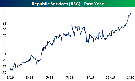
As Waste Management is just beginning to break out, it has seemingly been working at a lag to what is the company’s largest competitor, Republic Services (RSG). Similar to WM, back in August RSG had consolidated around record highs without moving above those levels until the final week in December. Since then, RSG has taken out those prior highs and rallied an additional 5%. While there is obviously no guarantee that WM will follow in the footsteps of RSG’s breakout, especially as WM currently trades at extremely overbought levels, RSG has set a promising path. Additionally, because RSG has run up more than WM, its dividend yield is lower and its P/E is higher. Start a two-week free trial to Bespoke Institutional to access our Chart Scanner, Trend Analyzer, and the rest of our interactive tools and research.
Bespoke’s Morning Lineup – 1/22/20 – On the Mend?
See what’s driving market performance around the world in today’s Morning Lineup. Bespoke’s Morning Lineup is the best way to start your trading day. Read it now by starting a two-week free trial to Bespoke Premium. CLICK HERE to learn more and start your free trial.

The Closer – Sick Day for EM – 1/21/20
Log-in here if you’re a member with access to the Closer.
Looking for deeper insight on markets? In tonight’s Closer sent to Bespoke Institutional clients, we take a look at the effects the new virus out of China has had across assets before reviewing some of the major earnings reports out tonight and this week. Next, we review some market internals including the number of new highs and the percentage of stocks showing an overbought RSI reading. We also look at the price action in natural gas before finishing with a recap of the Mexican unemployment rate.

See today’s post-market Closer and everything else Bespoke publishes by starting a 14-day free trial to Bespoke Institutional today!
Chart of the Day: Big Week for Earnings
Bespoke Stock Scores — 1/21/20
Higher Priced Stocks Outperforming
As the US equity market has rallied over the last decade, share prices have risen dramatically. When the S&P 500 hit is Financial Crisis low on March 9th, 2009, there were just six stocks in the S&P 500 trading above $100/share. At the same time, there were 119 stocks in the index (24%) trading with a single-digit share price of less than $10. Fast forward to today and there are now 235 stocks (47%) in the S&P 500 trading above $100/share, while there is just one — ONE — stock in the index trading below $10/share. The one stock trading with a single-digit share price is also a single-letter ticker — Ford (F).
We are constantly running our decile analysis on the S&P 500 to see which stock characteristics are driving performance within the index. To do this, we break the index into deciles (10 groups of 50 stocks each) based on things like P/E ratio, market cap, dividend yield, analyst ratings, etc., and then we calculate the average performance of the stocks in each decile over a given time period.
Share price is a very basic stock characteristic that most people don’t (nor should they) use as an investment factor. But when we ran our decile analysis recently, we still found it notable that the highest priced stocks in the S&P are outperforming the lowest priced stocks by quite a bit. As shown below, the 50 stocks in the S&P with the highest share prices at the start of the year are up an average of 3.67% year-to-date. The next 50 stocks with the highest share prices are up an average of 4.03% YTD. On the other end of the spectrum, the 50 stocks with the lowest share prices at the start of the year are up just 1.4% YTD, while the next 50 lowest-priced stocks are up just 0.77%.

In case you’re interested, below is a snapshot of our full decile matrix so you can see the other stock characteristics we like to analyze. This analysis is very helpful for finding underlying trends that are driving market performance. To unlock the full matrix, start a two-week free trial to Bespoke Premium then view our recent B.I.G. Tips report at this link.

Bespoke’s Morning Lineup – 1/21/20 – Davos Downer
See what’s driving market performance around the world in today’s Morning Lineup. Bespoke’s Morning Lineup is the best way to start your trading day. Read it now by starting a two-week free trial to Bespoke Premium. CLICK HERE to learn more and start your free trial.
It took a while but last week we finally saw a breakout in the number of stocks trading at overbought levels. At a level of 63.4%, the percentage of S&P 500 stocks trading more than one standard deviation above their 50-day moving averages is now at its highest level since last February. At the same time, just 6% of S&P 500 stocks are oversold, and that’s actually a relatively high number given how many stocks are at overbought levels. Last February, the last time there were this many overbought stocks, the percentage of oversold stocks was under 4%. That suggests that there is a bit more dispersion in the market than there was this time last year.

Dividend Stock Spotlight: Telecoms Looking Cheap
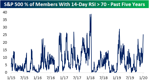
While equities have continued to rally in the new year, conditions have gotten a bit extended as every one of the major US index ETFs was more than two standard deviations above their 50-DMAs at the end of last week. Taking another look at just how overbought conditions have gotten, of the S&P 500 stocks, over 25% currently have a 14-day RSI reading above 70. That is the highest reading by this measure since late February of last year.
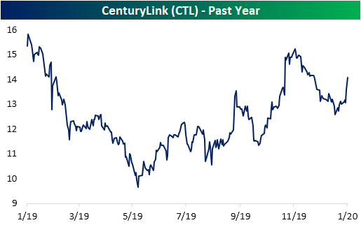
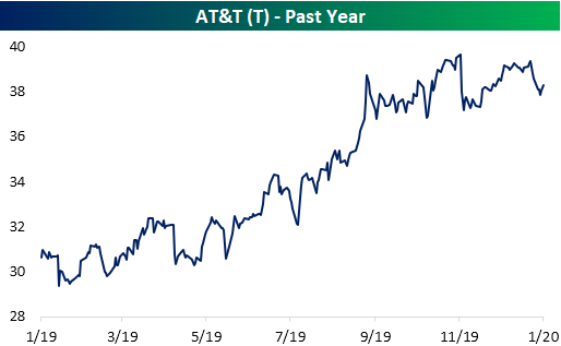
Although stocks are generally overbought, there are still some to be found that are not running as hot. One such group is the Telecommunication Services group. Of the S&P 500 stocks in this group—Verizon (VZ), CenturyLink (CTL), and AT&T (T)—each one has pulled back within its respective trading range recently and have begun to bounce from the bottom of their uptrends as shown in the charts below. Today, each one of these stocks has also crossed back above their 50-DMAs. Given this, these three stocks have also earned a good timing score in our Trend Analyzer tool.
In addition to being attractive from a technical standpoint, the valuations are also relatively cheap. Stocks in the Telecom Services group reside in the broader S&P 500 Communication Services sector, which has a price-to-earnings ratio of 23.5. But for VZ, CTL, and T, the P/E ratios are 16.3, 11.6, and 10, respectively. Not only are those lower than the sector’s P/E ratio , but for CTL and VZ, that is in the 13th and 11th percentile of the past decade’s readings, respectively. Although the P/E is still fairly low, the valuation for T is not quite as significantly low as its current P/E ratio is in the 75th percentile of the past ten year’s range.
Additionally, this is a group of high yielders paying a dividend at least twice the size of the 1.88% dividend yield of the S&P 500. In fact, currently yielding 7.37%, CenturyLink (CTL) has the third-highest dividend yield of all S&P 500 stocks. The payout ratio for CTL is a bit high at 88.8%, but it could also be worse. AT&T has the 14th highest dividend yield of 5.47% but has an elevated payout ratio of over 100% meaning further ability to pay its dividend as well as grow it would come more into question for this stock holding the earnings picture constant. On the other hand, while not one of the largest dividends, VZ’s yield is still generous at 4.13% while the payout ratio is the most palatable of the bunch at just 49%. Start a two-week free trial to Bespoke Institutional to access all of our research and interactive tools.

Snap Out of It
Snapchat parent company Snap Inc. (SNAP) made a new 52-week high last Friday in a beautiful breakout pattern. As shown below, the stock traded in a very nice uptrend over the first seven months of 2019, but then it began a multi-month consolidation phase. During this consolidation phase, the stock rounded out a bottom (a cup formation) all while holding above support at its 200-day moving average. The end result was Friday’s break to new highs.

Below are charts of SNAP and a handful of other related companies in the online/social media space. You can very easily build custom portfolios like this on our website with a Bespoke Premium or Bespoke Institutional membership. Being able to easily monitor the stocks and ETFs you’re most interested in with our Custom Portfolios tool is extremely helpful. Start using our Custom Portfolios tool and everything else on our website with a two-week free trial to Bespoke Institutional.
