Fed Day Follow Up
In last night’s Closer, we recapped the market reaction to the FOMC’s 50 bps rate hike noting that equities really took off once Fed Chair Powell ruled out the possibility of 75 bps hikes on the horizon. By the close, the S&P 500 rallied 2.55% from right before the decision (1:59 PM). As shown below, that marked the third-best S&P 500 reaction to a Fed day since 1994 when the FOMC began to announce its decision on the same day as the meeting.

Given today’s massive declines, the S&P has already erased its 2%+ post-FOMC gain. Below we show the S&P’s intraday performance the day after each Fed day when the index rallied over 2% post-meeting (1:59 to the close). For each day, the date shown represents the day of the FOMC meeting. On average, the S&P 500 has tended to gap down the following day and continue to trade lower throughout the first post-FOMC session as we are seeing today.
Today’s performance is certainly on the weaker end of these occurrences, though. In fact, like the other two largest post-FOMC rallies that saw over 3% gains in the afternoon of Fed days, December 2008 and August 2011, today saw a significant gap lower with continued losses through mid-morning. The continued selling today is setting up to more closely resemble the August 2011 occurrence. Following the December 2008 instance, on the other hand, the S&P 500 found a low in the late morning and even briefly went positive the day after the big post-FOMC gain.
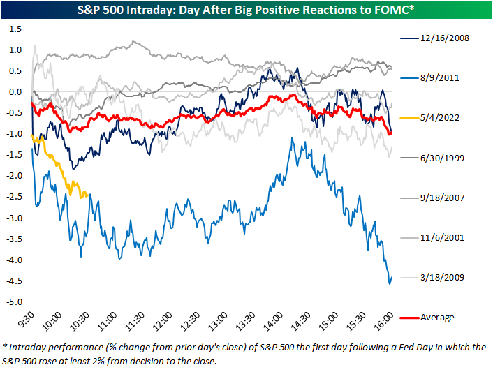
While today is shaping up to look like another time the market rallied hard in response to the FOMC, taking a step back to look at all Fed day afternoon performance (1:59 to the close) versus next-day performance (full day), there is not much of a strong trend. As shown below, the S&P 500’s performance from 1:59 to the close on a Fed day is a statistically poor explainer of next-day performance. That being said, today does stand out as one of the worst Fed day follow-ups on record. Click here to learn more about Bespoke’s premium stock market research service.

Claims Come Off the Lows
Initial jobless claims have come off of multi-decade lows in the past few weeks with the most recent print released this morning marking the most significant increase in some time. Claims are back up to 200K for the first time since the week of February 11th. Additionally, the 19K week over week increase was the largest one-week uptick since last July when they rose 33K and the level of claims was more than double what it is now.

Non-seasonally adjusted claims are also still at historically strong levels albeit having come off the lows. The only comparable week of the year that has seen a lower reading on claims was in 2018 when they were roughly 7K below current levels.
In terms of seasonal trends, claims will likely continue to fall modestly in the coming weeks before running into some seasonal headwinds in the late spring and early summer.
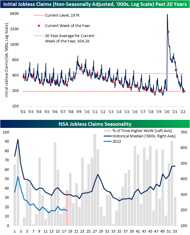
Continuing claims are delayed an additional week to initial jobless claims and this reading set a new low in the most recent print. Claims fell below 1.4 million for the first time since February 1970 reiterating the point that there are a historically small number of people filing continued unemployment claims. Click here to learn more about Bespoke’s premium stock market research service.

The Bespoke 50 Growth Stocks — 5/5/22
The “Bespoke 50” is a basket of noteworthy growth stocks in the Russell 3,000. To make the list, a stock must have strong earnings growth prospects along with an attractive price chart based on Bespoke’s analysis. The Bespoke 50 is updated weekly on Thursday unless otherwise noted. There were four changes to the list this week.
The Bespoke 50 is available with a Bespoke Premium subscription or a Bespoke Institutional subscription. You can learn more about our subscription offerings at our Membership Options page, or simply start a two-week trial at our sign-up page.

The Bespoke 50 performance chart shown does not represent actual investment results. The Bespoke 50 is updated weekly on Thursday. Performance is based on equally weighting each of the 50 stocks (2% each) and is calculated using each stock’s opening price as of Friday morning each week. Entry prices and exit prices used for stocks that are added or removed from the Bespoke 50 are based on Friday’s opening price. Any potential commissions, brokerage fees, or dividends are not included in the Bespoke 50 performance calculation, but the performance shown is net of a hypothetical annual advisory fee of 0.85%. Performance tracking for the Bespoke 50 and the Russell 3,000 total return index begins on March 5th, 2012 when the Bespoke 50 was first published. Past performance is not a guarantee of future results. The Bespoke 50 is meant to be an idea generator for investors and not a recommendation to buy or sell any specific securities. It is not personalized advice because it in no way takes into account an investor’s individual needs. As always, investors should conduct their own research when buying or selling individual securities. Click here to read our full disclosure on hypothetical performance tracking. Bespoke representatives or wealth management clients may have positions in securities discussed or mentioned in its published content.
Chart of the Day: Earnings Season Summary
Bespoke’s Morning Lineup – 5/5/22 – Back to Reality
See what’s driving market performance around the world in today’s Morning Lineup. Bespoke’s Morning Lineup is the best way to start your trading day. Read it now by starting a two-week trial to Bespoke Premium. CLICK HERE to learn more and start your trial.
“Democracy is the destiny of humanity; freedom its indestructible arm” – Benito Juárez

Below is a snippet of content from today’s Morning Lineup for Bespoke Premium members. Start a two-week trial to Bespoke Premium now to access the full report.
Futures are moderately lower this morning following yesterday’s major post-Fed surge. After taking the declines into account, though, the S&P 500 is still higher than it was heading into the last hour of yesterday’s trading. Economic data this morning was mixed to negative. Non-Farm Productivity and Initial Jobless Claims were weaker than expected, Unit Labor Costs were higher than expected, and Continuing Jobless Claims were the only data point that was stronger than economist forecasts.
In today’s Morning Lineup, we recap overnight events in Asia and Europe (pg 4), the BoE’s latest policy decision (pg 5), other Asian and European economic data (pg 6), and a lot more.
With the market rallying 2% on a Fed day for the second time in a row and the S&P 500 rallying more than 1% in the final hour of trading for the second time this week, you can’t fault investors for feeling a sense of deja vu. As noted on Twitter, yesterday was the first time since April 2009 that the S&P 500 rallied more than 2% on back-to-back Fed days.
Shifting the focus to last-hour rallies, 1%+ gains in the final hour of trading aren’t nearly as uncommon. Since the mid-1980s, it has happened 168 times and looking at the chart, they have occurred in all types of market environments – uptrends, downtrends, near peaks, and near bottoms, so it’s hard to read too much into their significance.

Start a two-week trial to Bespoke Premium to read today’s full Morning Lineup.
Daily Sector Snapshot — 5/4/22
The Quitter Market
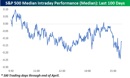
If it seems to you like the market simply can’t hold on to gains this year, you aren’t mistaken. The chart below shows an intraday composite of the S&P 500 on a median basis over the last 100 trading days through the end of April. The general pattern during this period has been for the market to open modestly higher, but then sell off for the remainder of the morning. It has then regained its footing shortly after mid-day but then sells off into the close.
How does the last five months or so compare to history? The charts below really put the recent trend of intraday weakness into perspective.
The first chart shows the number of days over a rolling 100-trading day period that the S&P 500 tracking ETF (SPY) traded in positive territory on an intraday basis but finished the day down. The reading currently stands at 38 and was as high as 40 (red line) in the last week of April. As shown in the chart below, there hasn’t been another period that the S&P 500 has had so much trouble holding onto intraday gains in more than a decade (October 2010)!

For the Nasdaq 100 (QQQ), it has been a similar story. As recently as April 22nd, the trailing number of times in the last 100-trading days that QQQ traded in positive territory on an intraday basis but finished the day lower reached 42 and currently stands at 40. Like SPY, the recent reading of 42 was the highest number of occurrences in a 100-trading day span since October 2010.
For both indices, the currently elevated frequency of giving up intraday gains has been extremely uncommon for the post-financial crisis period. Interestingly enough, though, in the ten years before the financial crisis, these types of periods were a lot more common, especially for the Nasdaq. Could it have anything to do with the fact that the last 12 years have also been one of the more accommodative monetary environments investors have ever experienced? Click here to learn more about Bespoke’s premium financial markets research.
