ETF Trends: Fixed Income, Currencies, and Commodities – 6/8/16
Volatile gold stocks have jumped the entire spectrum from some of the worst performers to some of the best in a few short days. Coffee and other commodity exposures have also ripped while banks lead the list of losers along with the USD and preferred shares.

Bespoke provides Bespoke Premium and Bespoke Institutional members with a daily ETF Trends report that highlights proprietary trend and timing scores for more than 200 widely followed ETFs across all asset classes. If you’re an ETF investor, this daily report is perfect. Sign up below to access today’s ETF Trends report.
See Bespoke’s full daily ETF Trends report by starting a no-obligation free trial to our premium research. Click here to sign up with just your name and email address.
47 New 52-Week Highs in S&P 500 Today
Nearly 10% of stocks in the S&P 500 made new 52-week highs today, and we provide a table of them all (47 to be exact) below. The table is sorted by sector and then YTD performance. While the Consumer Discretionary sector is one of the larger sectors in the S&P, it only had two stocks make new 52-week highs today. The Industrials sector had the most with eleven, followed by Health Care with nine.
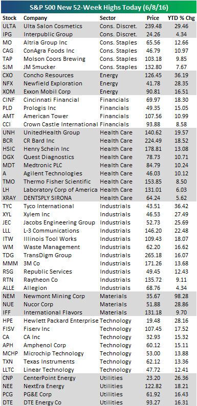
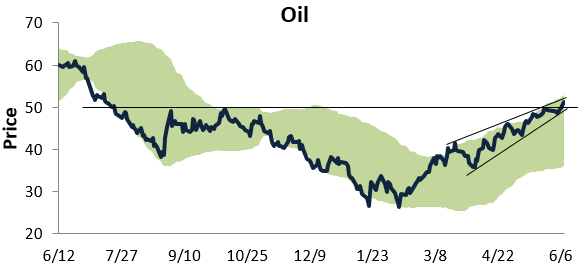
Chart of the Day: Oil Bull Markets
Below is a one-year price chart of oil, with the light green shading representing between two standard deviations above and below its 50-day moving average. As you can see in the chart, oil recently moved above resistance that had formed from its highs last September and October, and it continues to trade in a tight uptrend.
In today’s Chart of the Day sent to paid subscribers, we take a look at the huge run oil has had during its current bull market and how it compares to past oil bulls. To view the report, please start a 14-day free trial below.
B.I.G. Tips – Quality Issues
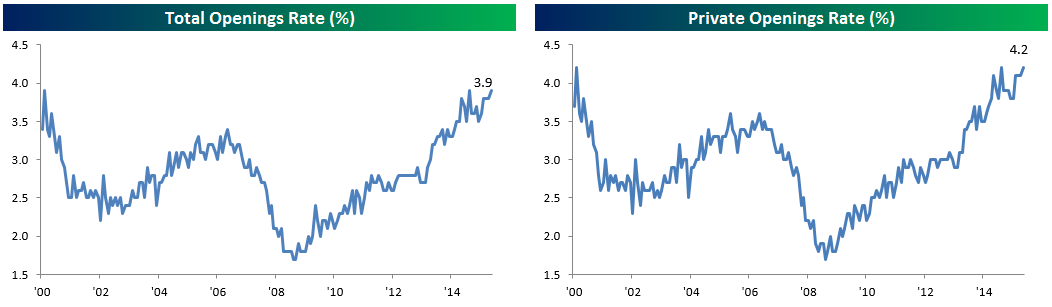
Job Openings Back up to New Highs
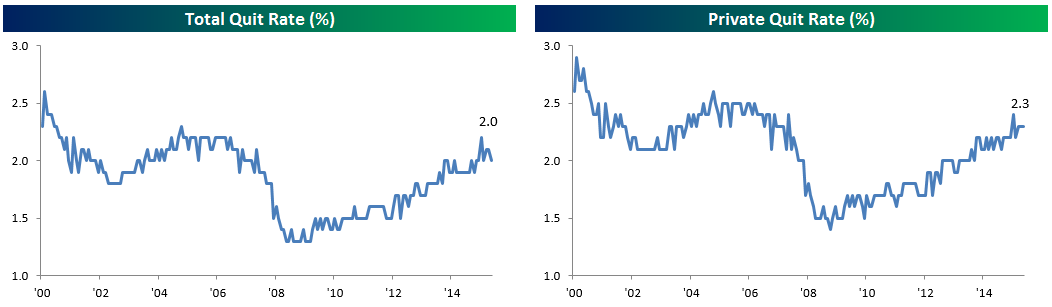
Total job openings returned to their highest level of the ever in the month of April, with businesses reporting that they were looking to fill 5.788 million positions. The separations rate (all quits, firings, retirements, etc) remains relatively stagnant, moving sideways month-over-month.

The openings rate, which adjusts for the changing size of the labor force over time, returned to an all-time high that it posted at the peak of the expansion in 2000 and July of 2015. The private openings rate had a similar performance, sitting at highs previously achieved in those same months.
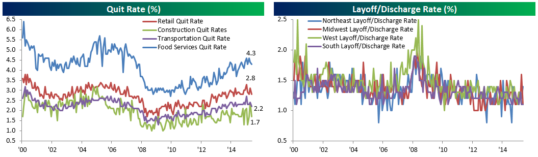
If there was one clear negative reading on the JOLTS’ internals, it was the total quit rate, which hasn’t made a new high since December of 2015 when it hit 2.2%. That level was consistent with what we saw in the peak of the last expansion, while the 2% rate and sideways trend over the last few months is not. FOMC hawks will want to see this number move up. However, it’s worth observing that the private quit rate which does not include government workers was flat MoM at 2.3%. To be sure, that number isn’t as strong as previous expansions, but it does suggest that the stumble in the overall quit rate should prove temporary.
The really good news we saw in today’s report was the layoff and discharge rate. Employees losing their jobs returned to the lowest ever share, at 1.1% for all workers and 1.2% for private only. This combined with the return to all-time highs for the number of openings is indicative of much stronger labor market demand than the figures we’ve seen in recent nonfarm payrolls job creation figures.
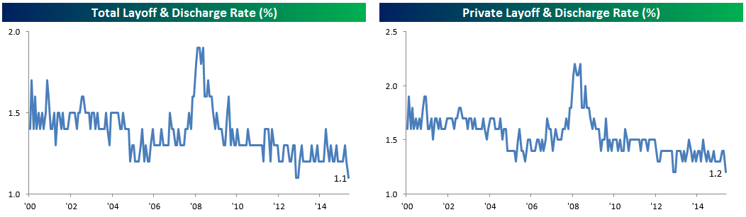
Slightly less impressive in terms of internals were industry-level quits data (which declined) and layoffs data (very little to be worried about in terms of overall trend). The Northeast saw a spike in layoffs, but they’re still below recent highs. Other regions were solid. In terms of quits, the share of employees leaving low-prerequisite industries has been moving basically sideways for the last two years. Food Services is still broadly trending higher, but Retail and Transportation aren’t, while Construction is quite volatile. We need to see these kinds of industries see a spike in quits to gain confidence about the ongoing wage growth story.
Dynamic Upgrades/Downgrades: 6/8/16
Crude Oil: A Buck From a Double
Crude oil is up for a third straight day this morning, which has taken the price of WTI above $50 per barrel to $51.10. At this level, crude oil has now taken out its highs from last October and is trading at its best levels since 7/15/15. It has certainly been an amazing rally for oil prices over the last four months, with prices rising 96% off their lows in February. If the price rises another dollar, it will be a clean double. Going forward, it will be interesting to see if there is a point where financial markets become concerned that prices have risen too high. That point is probably a way off, but while we may be dating ourselves here, there was a time when $50 crude was considered a bad thing.

S&P 500 Sector Trading Range Charts
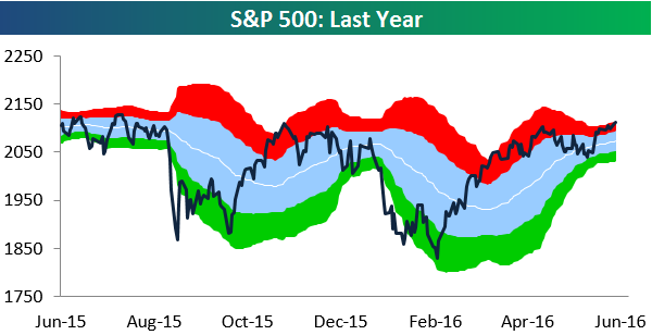
The S&P 500 got within 16 points of its all-time intraday high yesterday, but the index couldn’t hold the rally into the close like it had been doing in recent trading days. Buyers appeared to take the afternoon off. As we head into another day of trading, below is a look at our S&P 500 sector trading range charts, so you can see where different areas of the market currently stand. In the charts, the white line represents each sector’s 50-day moving average (DMA), while the light blue shading represents its “normal” trading range — one standard deviation above and below the 50-DMA. Moves into or above the red zone are considered overbought, while moves into or below the green zone are considered oversold.
For the S&P 500 as a whole, the index remains in overbought territory, but its range continues to tighten dramatically as volatility has dropped and sideways action has taken hold. Whenever trading ranges tighten like this, conventional wisdom suggests that a big move in either direction is on the horizon. Bulls are certainly hoping that move is to the upside, but a wise investor once said, “Hope is not a winning investment strategy.”
Looking at the ten sectors, Consumer Discretionary’s chart looks somewhat similar to the S&P 500’s in that it is trading sideways and its range is tightening. However, the sector hasn’t yet made a new 2016 high while the S&P 500 as a whole has. While Consumer Discretionary trades sideways, Consumer Staples remains in an uptrend. It too, though, has yet to take out its prior 2016 highs.
While Energy’s multi-year chart still doesn’t look great, its action over the last 3-4 months has been extremely positive. From its lows in late January/early February, Energy has been trading in a tight uptrend channel — bouncing off of support at the bottom of this channel every time it gets there. The Financial sector’s long-term chart doesn’t look great either, but it too has seen better days more recently. Gains over the last two months have allowed the Financial sector to move slightly above the top of its long-term downtrend channel.
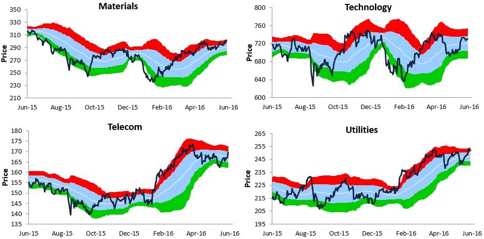
Looking at Health Care, the sector recently broke above its April highs, but the move has left it quite extended into overbought territory. Both Industrials and Materials have two of the better-looking charts out of the ten sectors at the moment, while Technology is as range-bound as it gets. Finally, the two main defensive sectors — Telecom and Utilities — continue to consolidate after experiencing sharp moves higher from February through April.

The Closer 6/7/16 – “Not All Costs Are Equal”
Looking for deeper insight on global markets and economics? In tonight’s Closer sent to Bespoke clients, we summarize today’s update to Q1 Productivity and Costs from the Bureau of Labor Statistics. We also investigate consumer credit, which had updated stats as of April today from the Federal Reserve.

The Closer is one of our most popular reports, and you can sign up for a trial below to see it and everything else Bespoke publishes free for the next two weeks!
Click here to start your no-obligation free Bespoke research trial now!
Buyers Take the Afternoon Off
Last Friday we played Spot the Pattern, but today the question is, “Can you find the outlier?” The first four trading days of June were characterized by solid and steady buying in the afternoon hours (on Monday there was a brief sell-off shortly after noon ahead of Fed Chair Janet Yellen’s speech), but on Tuesday, buyers took the day off. What was a nice gain near the highs of the year around 1:30 PM ET turned into a small gain of just about 0.10% by the close. Didn’t you like it the other way around?
