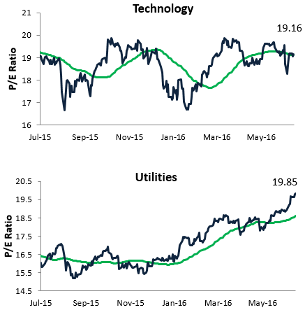
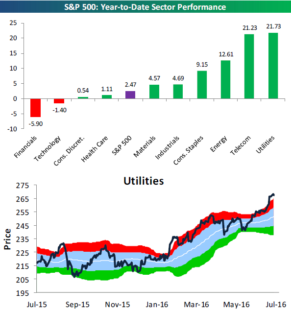
Utilities P/E Ratio Now Higher than Technology
The recent run for the Utilities sector has been nothing short of spectacular. With risk-free rates at historically low levels, investors can’t get enough of high-dividend paying stocks like Utilities names. But when investors rush in and earnings don’t grow, valuations get elevated. At this point, it’s worth highlighting that the S&P 500 Utilities sector has a higher trailing 12-month P/E ratio than the Technology sector! For actionable market analysis, start a 14-day free trial to Bespoke’s premium research today!
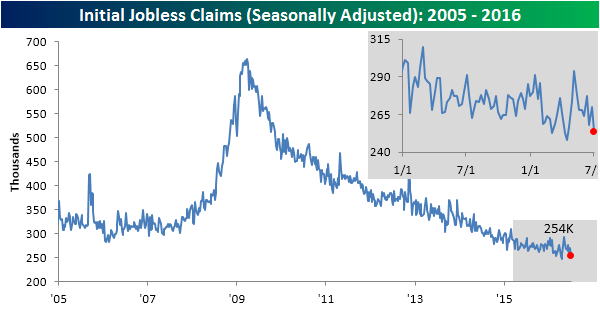
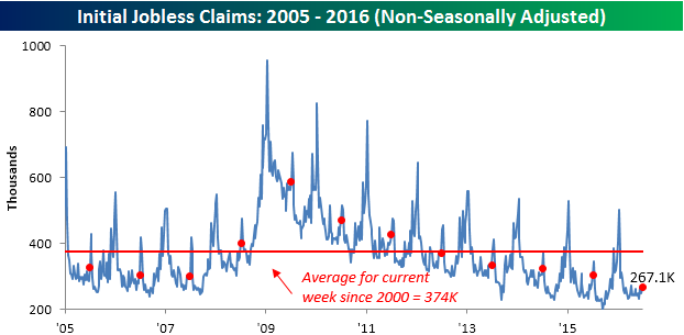
Jobless Claims Back Below 260K
Jobless claims continued their amazing run this week with the 70th straight week of sub 300K readings. While economists were forecasting claims to come in at a level of 269K, the actual reading was 254K. That’s the lowest weekly reading since April and the fourth lowest weekly reading of the entire recovery. The fact that claims continue to stay so low underlies the consistency of the current state of the employment sector.
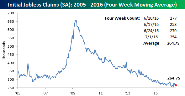
The four-week moving average of claims also declined this week, falling from 267.25K down to 264.75K. For this measure, claims are also down to their lowest level since late April and less than 9K below the cycle low of 256K 11 weeks ago in April.
On a non-seasonally adjusted (NSA) basis, claims increased by less than 4K to 267.1K. For the current week of the year, this is more than 100K below the average of 374K since 2000. In fact, to find a week where NSA claims were lower at this time of year, you have to go all the way back to 1973.
the Bespoke 50 — 7/7/16
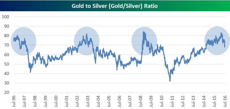
Gold/Silver Ratio on the Downswing
Gold and silver have both been on fire over the last six months, which you can clearly see in our trading range charts of the two precious metals below:
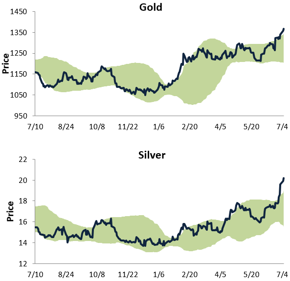
While both metals have surged, silver has been the best performer of the two. Year-to-date, silver is up 47% versus a gain of 30% for gold. With silver outperforming gold during the current bull market for metals, below is a chart of the gold/silver price ratio. When the line is rising, gold is outperforming silver. When the line is falling, silver is outperforming gold. Notably, the ratio peaked out just when it crossed above the 80 mark earlier this year. As we’ve highlighted in the chart, over the last twenty years, any time the ratio has gotten above 80, it hasn’t remained there very long. For actionable market analysis, start a 14-day free trial to Bespoke’s premium research today!
The Closer — 7/6/16 — Utilities Up 20%!, Netflix Downgraded, and a Rising Tide Lifts All Boats
Looking for deeper insight on global markets and economics? In tonight’s Closer sent to Bespoke clients, we take a look at the massive run higher experienced by the Utilities sector lately. We also try and identify the stock characteristics leading the post-Brexit market bounce, and we focus in on a key downgrade of Netflix this morning.
The Closer is one of our most popular reports, and you can see today’s by starting a free trial below!
Click here to start your no-obligation free Bespoke research trial now!
ETF Trends – US Sectors and Groups 7/6/16
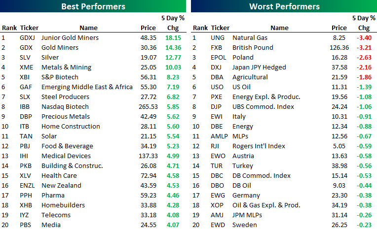
Below is our daily list of the twenty best and worst performing ETFs over the last five trading days. Metals continued to rise as gold, silver, steel, and other precious metal exposures all featured prominently atop the list of best performers. A number of construction and home building stocks have also outperformed. Energy, including natural gas and oil stocks, as well as commodities, turned in a dismal performance. Japan JPY Hedged also continued to lose ground, as 20-year interest rates turned negative in Japan while investors poured money into the yen. The British Pound remains one of the worst performers as the currency continues its slide. A number of European exposures also slipped.
Bespoke provides Bespoke Premium and Bespoke Institutional members with a daily ETF Trends report that highlights proprietary trend and timing scores for more than 200 widely followed ETFs across all asset classes. If you’re an ETF investor, this daily report is perfect. Sign up below to access today’s ETF Trends report.
See Bespoke’s full daily ETF Trends report by starting a no-obligation free trial to our premium research. Click here to sign up with just your name and email address.
Chart of the Day – Raytheon (RTN) Launches to Another High
ISM Commodities Survey Near a Two-Year High
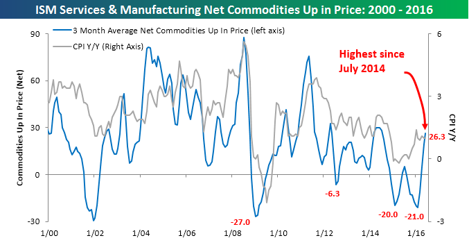
In each month’s ISM reports on the Manufacturing and Non-Manufacturing sectors, respondents are asked whether prices for commodities they deal with are up or down. Over time, we have found that trends in the number of commodities rising in price has tended to coincide with, or even lead, trends in inflation. In this month’s ISM Manufacturing report, respondents noted price increases in thirteen commodities and declines in two for a net of eleven. In the Non-Manufacturing sector, respondents noted increases in sixteen commodities and declines in three. On a combined basis, a total of 29 commodities were up in price, while just five were down, for a net of +24. Compared to last month’s net combined reading of +27, that represents a slight decline.
In order to smooth out month to month volatility in the ISM Commodities survey, we like to track these readings using a three-month moving average, which we have charted below along with the y/y change in CPI. Following this month’s data, the three-month moving average of the ISM Commodities survey increased from 19.3 up to 26.3, which is the highest reading since July 2014 and up sharply from levels seen just four months ago. What does this suggest about inflation? While the y/y reading in CPI has been stable right around 1.0 for the last five months, the surge in the commodities index would suggest some upside pressure for inflation readings in the coming months.
New High for the Year in ISM Services
After some weak data to start out the week, today’s ISM Non-Manufacturing report for June provided a welcome surprise. While economists were forecasting the headline index to post a modest increase to 53.3 from last month’s level of 52.9, the actual reading came in at a much better than expected 56.5. That was the best reading for the index in 2016 and the biggest beat relative to expectations since the release of the July report last August. This month’s increase was also the largest m/m jump in the ISM Services Index since February 2008. On a combined basis and accounting for each sector’s weight in the overall economy, the combined ISM for June rose to 56.1 from 52.7. That was the largest m/m increase in the combined reading since April 2009.
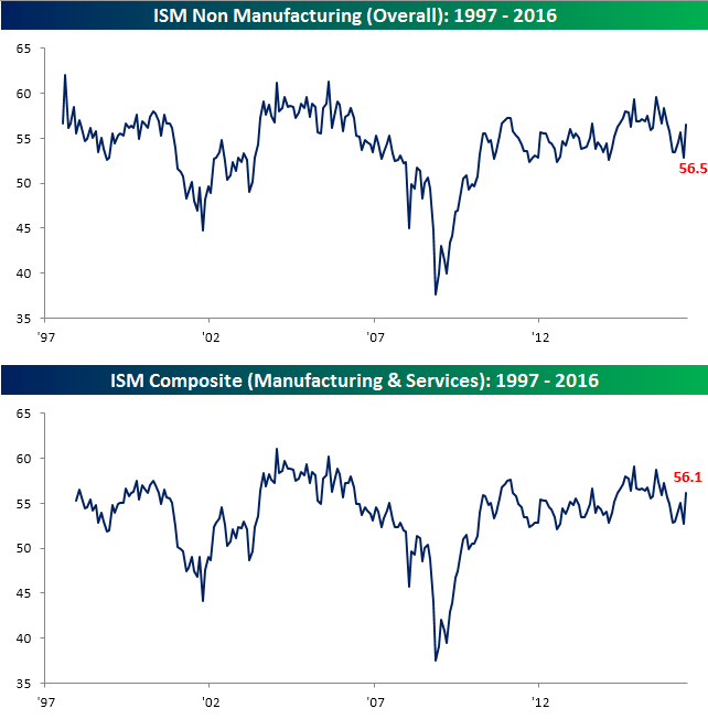
The table below breaks down the ISM Services report by each of its ten sub-components. In this month’s report, every component except Backlog Orders was above 50 and all but two (Backlog Orders and Prices) saw m/m increases. The biggest increases this month came in New Orders and Business Activity, which are both now inching closer to 60. These kind of trends are hardly indicative of a recession. On a y/y basis, gains were more muted with six components increasing and four declining. The biggest gainer was Import Prices, while the biggest loser was Backlog Orders. Finally, with the July Employment report coming up Friday, we would note that the Employment component of today’s report moved back above 50 to 52.7. Historically speaking, when the Employment component has been within a point above or below 52.7, the NFP reading for that month has been an average of 186K. For reference, the consensus estimate for this Friday’s report is 180K.

10-Year Yield Continues to Plummet
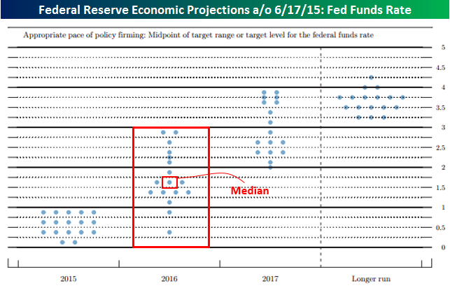
Yields on long-term sovereign debt continue to plummet around the globe this morning. Earlier today, the yield on the 10-year US Treasury dropped down to a 50+ year low of 1.31%, but it has since recovered a bit to 1.34%.

Besides the fact that the yield on the 10-year currently sits at historical lows, what makes current levels so amazing is that they are either right around or even below the level of interest rates that FOMC committee members were forecasting for the Fed Funds rate one year ago. The chart below is from the Fed’s Economic Projections package following its June 2015 meeting. As shown, all but three of the seventeen committee members were forecasting the Fed Funds rate to rise to between 1.25% and 1.50% in 2016, while the median forecast was above 1.5%. Had those projections actually been reached, we would be dealing with an inverted yield curve right about now.