Chart of the Day: Two Software Standouts
In today’s Chart of the Day sent to paid subscribers, we identified attractive chart formations for two software stocks that are both members of our Bespoke 50 list of top growth stocks in the Russell 3,000. To see the two stocks, please start a 14-day free trial below.
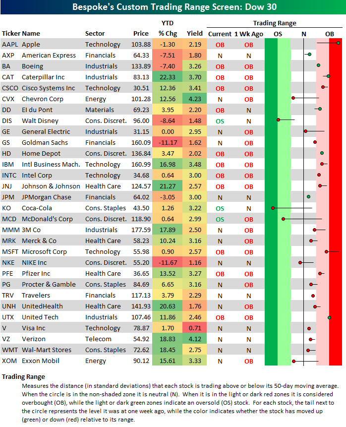
Bespoke’s Dow 30 Trading Range Screen
Below is an updated look at our Dow 30 trading range screen, which is a quick and easy way to gauge momentum and overbought/oversold levels for the Dow’s 30 index members. For each stock, we also include its year-to-date percentage change and its current dividend yield.
In the trading range portion of the table below, the dot represents where the stock is currently trading in relation to its 50-day moving average, which is the black vertical “N” line. Moves into the red zone are considered overbought, while moves into the green zone are considered oversold. The reason we updated this screen today is because Apple (AAPL) has finally taken its place as the most overbought stock in the Dow again. It’s been a long time since that has been the case!
The large majority of stocks in the Dow remain above their 50-day moving averages, and 12 of 30 are still overbought. But that’s down from the 20 stocks that were overbought last week at this time. There are six stocks in the Dow currently below their 50-days, and all of them have seen big moves lower within their trading ranges over the last week. The biggest negative reversals have come from Coca-Cola (KO) and McDonald’s (MCD). Coca-Cola (KO) moved from above its 50-day to extreme oversold territory over the last week, while McDonald’s (MCD) moved from overbought to oversold.
Looking at year-to-date performance, Nike (NKE) is currently the biggest loser in the Dow with a drop of 11.67%. Goldman Sachs (GS) isn’t far behind, though, at -11.17%. Both of these names are relatively recent additions to the now 120-year old index. On the positive side, Caterpillar (CAT) is up the most year-to-date with a gain of 22.33%, followed closely by Johnson & Johnson (JNJ) and UnitedHealth (UNH).
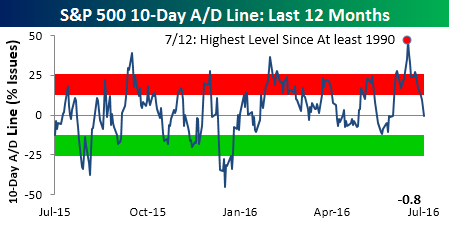
10-Day A/D Line Back Down to Earth
After rocketing up to its highest level on record (at least 1990) on July 12th, the S&P 500’s 10-Day A/D line has quickly come back down to earth and is actually now slightly negative through midday Thursday. For those unfamiliar with this indicator, the 10-Day A/D line measures the rolling net number (or percentage) of stocks in the S&P 500 that trade up on a given day (advancing stocks minus declining stocks). Earlier this month, we published a B.I.G. Tips report (Premium and Institutional clients only) which highlighted how the S&P 500 has typically performed following prior extremely positive readings in the 10-Day A/D line. In that report, we noted that over the very short term, the market’s returns were generally flat, which is exactly what we have seen over the last two weeks of consolidation. Longer term, the report noted some pretty notable and consistent trends for the S&P 500. To see those trends, check out the report. Click here to start your no-obligation free Bespoke research trial now!
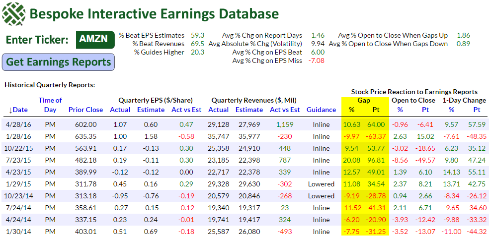
Amazon (AMZN) Earnings After the Close
Our Interactive Earnings Report Database contains historical quarterly earnings data for more than 5,000 stocks and 140,000 earnings reports going back to 2001. It’s available to subscribers of our highest level of service — Bespoke Institutional — for those of you that would like to use it.
With Amazon.com (AMZN) reporting earnings after the close today, we pulled a snapshot of AMZN’s quarterly reports over the last few years from our Earnings Database to see how it has been reacting recently in terms of price movements. The table below shows AMZN’s quarterly reports going back to January 2014. The right side of the table shows how the stock has gapped at the open the following morning after its evening reports, and how it has traded from the open to the close after its initial post-earnings gap. We’ve highlighted its recent opening gaps following earnings because they’ve been rather extreme. For four consecutive quarters from January 2014 through October 2014, AMZN gapped down more than 6%! That was certainly a rough stretch of earnings reports for Amazon.com. Since the start of 2015, however, AMZN earnings have been hitting it out of the park. In fact, the stock has gapped higher by more than 9% on the morning after earnings five of the last six quarters. The one time it didn’t gap higher, though, was this past January when it gapped down nearly 10% and fell $48.35 for the full day. AMZN did recover nicely last quarter with a gap higher of 10.63%.
You’ll notice a few additional stats at the top of the table. One thing for sure is that AMZN is likely to experience a huge move in one direction or the other. Historically, the stock has averaged a change of +/-9.94% on its earnings reaction days. When the stock has beaten earnings expectations, it has averaged a gain of 6% on its earnings reaction days, and when it has missed earnings expectations, it has averaged a decline of 7.08%.
Holding AMZN into earnings is certainly not for the meek of heart!
Remember, if you’re not yet a Bespoke Institutional member, sign up now to use our Interactive Earnings Report Database.
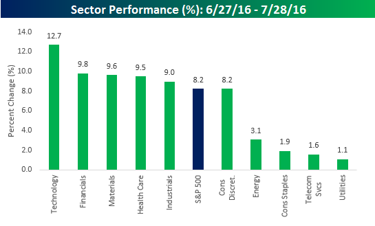
Sector and Industry Performance Post Brexit
It has now been a month since US equities bottomed from their two-day sell-off following the 6/23 UK referendum to leave the EU. With that, we wanted to recap which sectors and industries within the S&P 500 have led and lagged the market since then. We’ll start with sectors. The chart below shows the performance of each S&P 500 sector since the close on 6/27. While the S&P 500 is up 8.2%, five sectors have outperformed and five have underperformed. Leading the way higher, Technology (+12.7%) has been a big outperformer, boosted by semiconductors, Apple (AAPL) and Facebook (FB) among others. On the downside, with the exception of Consumer Discretionary which has just barely underperformed, the four other sectors that have underperformed off the Brexit lows are all lagging by a wide margin. Not surprisingly, the three sectors that are up the least during this monster rally are all defensives.
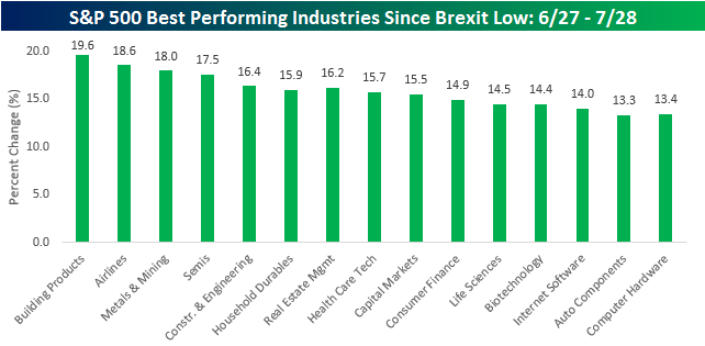
Digging a little deeper into industry returns post-Brexit, there are 60 different industries within the S&P 500 classification. Of those 60 industries, 59 are up and just one is down. In terms of the winners, semiconductors have been the topic of conversation recently, but three other industries are actually doing better. As shown, Building Products (+19.6%), Airlines (+18.6%), and Metals and Mining (18.0%) have all outpaced the 17.5% gain in the semis. Overall, the list of top performing industries is an interesting mix between technology, cyclicals, and even the brokers (Capital Markets).
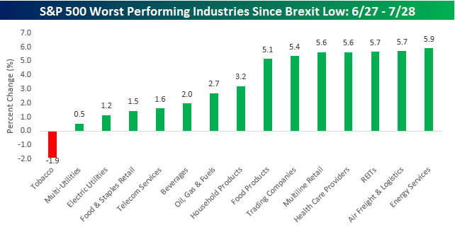
As mentioned above, there’s just one industry in the S&P 500 where investors have been burned since the Brexit lows, and that industry is Tobacco (-1.9%). As a testament to just how strong the rally has been, besides Tobacco, just seven other industries are up less than 5%. While a lot of the laggards are from defensive industries, Energy related ones also showed up on the list on the recent weakness in crude oil.
the Bespoke 50 — 7/28/16
Dynamic Upgrades/Downgrades: 7/28/16
Bullish Sentiment Declines
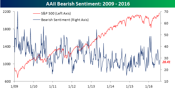
It may be hard to imagine, but while it may seem as though stocks have been doing nothing but going up, the S&P 500 is currently at the same level now that it was at two weeks ago. Granted, the two weeks or so prior to that saw a strong rally, but with stocks just hanging around right near record levels, individual investors have become increasingly antsy. According to the weekly survey from AAII, bullish sentiment declined from 35.43% down to 31.25%, marking the 39th straight week of below average bullish sentiment. If the July rally couldn’t boost sentiment above 40%, we certainly shouldn’t have expected a sideways market to do the trick!

While bullish sentiment declined by over four points, bearish sentiment increased by a more modest amount, rising from 26.72% up to 28.41%. The majority of investors who left the bullish camp moved into the neutral camp as that category increased from 37.85% back up above 40.34%.
Jobless Claims Rise More Than Expected
Jobless claims for the latest week rose more than expected, hitting a level of 266K versus economists’ expectations of 262K. While this morning’s report was the highest weekly reading for the month of July, it is still low by historical standards and represents the 73 straight week that first-time claims were below 300K. That’s the longest streak of weekly readings with a ‘2’ handle since 1973.
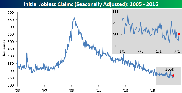
While claims were up this week, the four-week moving average declined to 256.5K, which is less than 1K from its post-recession low of 256K 14 weeks ago in April. In order to get a new low in this reading, though, next week we will need to see claims drop below 252K; it’s possible but not likely.
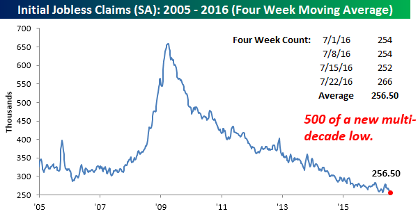
On a non-seasonally adjusted (NSA) basis, claims fell to 231.3K. That’s more than 100K below the average of 339K for the current week of the year since 2000. While this week’s NSA reading was low, it was actually slightly lower for the same week last year (230.3K), but that was the lowest weekly reading for the current week of the year since 1969.

The Closer 7/27/16 – Meh-ff OMC
Looking for deeper insight on global markets and economics? In tonight’s Closer sent to Bespoke clients, we review today’s FOMC decision, including a full breakdown of cross-asset price reaction and commentary. We also summarize releases today from the National Association of Realtors and the Advance Manufacturers’ Sales, Inventories, and New Orders report commonly referred to as Durable Goods.

The Closer is one of our most popular reports, and you can sign up for a trial below to see it and everything else Bespoke publishes free for the next two weeks!
Click here to start your no-obligation free Bespoke research trial now!