The Closer 1/9/17 – Credit Cards Back In Vogue
Log-in here if you’re a member with access to the Closer.
Looking for deeper insight on global markets and economics? In tonight’s Closer sent to Bespoke Institutional clients, we take a look at today’s consumer credit release from the Federal Reserve.

The Closer is one of our most popular reports, and you can see it and everything else Bespoke publishes by starting a no-obligation 14-day free trial to our research!
Chart of the Day – Consumer Pulse Sentiment Check
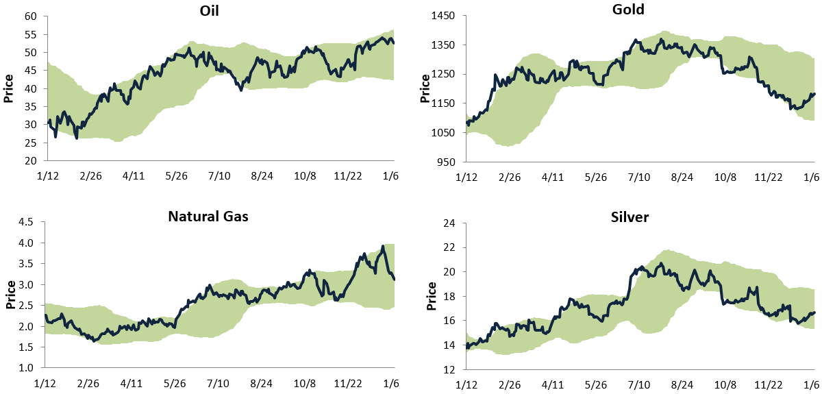
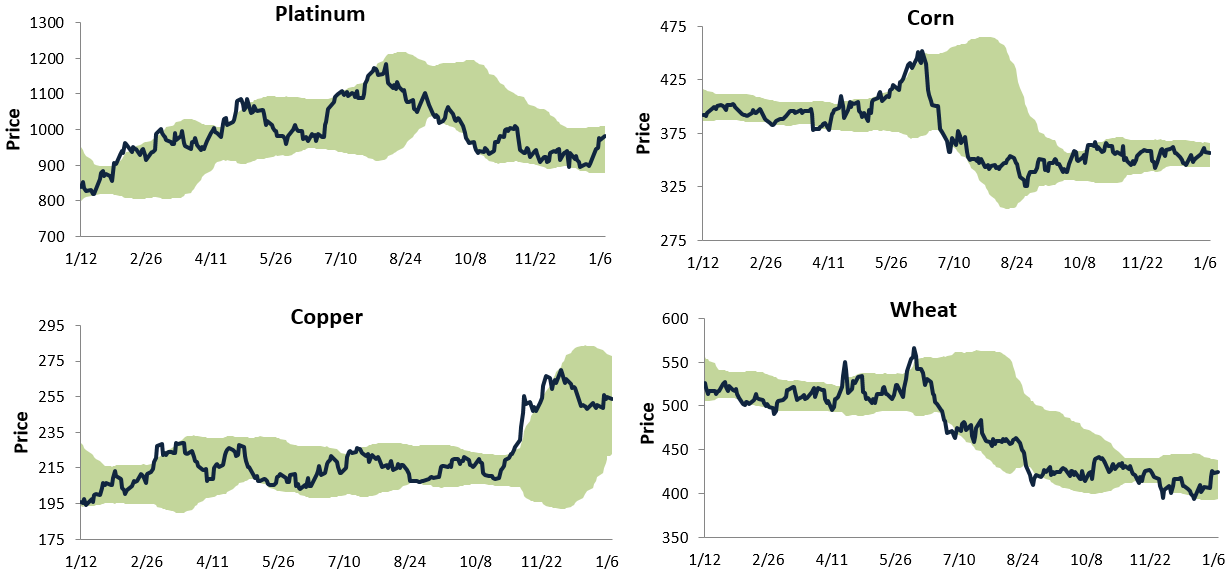
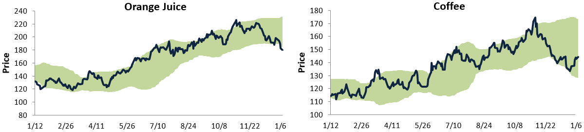
Bespoke’s Commodity Trading Range Screen
Get Bespoke’s 2017 Outlook Report with a 30-day free trial to Bespoke’s premium research! Click here to learn more.
Below is a look at our trading range charts for ten major commodities. Each chart goes back one year, and the light green shading represents between two standard deviations above and below each commodity’s 50-day moving average. You’ll notice that rarely do prices move above or below this range, and pullbacks or bounces typically occur when prices reach the top or bottom of the range.
Oil remains in a nice long-term uptrend, but it appears to be dipping back towards the middle of its range after reaching the top of its range at the start of 2017. Natural gas also remains in a long-term uptrend, and it recently experienced a significant pullback after hitting the top of its range. While energy commodities are in uptrends, the two major precious metals — silver and gold — are in downtrends. Both recently experienced bounces off the bottom of their ranges, but they are still a long way away from overbought territory.
While gold and silver remain in downtrends, platinum is looking better recently. Copper is in a consolidation phase after a big spike after the November election, while corn and wheat have been in tight, sideways ranges for the last five months. Interestingly, both orange juice and coffee broke their long-term uptrends back in November, and while coffee recently ticked up off the bottom of its range, orange juice has yet to find a bottom.
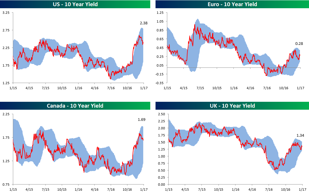
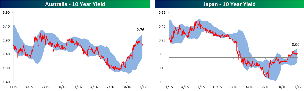
Global 10-Year Trading Range Charts
Get Bespoke’s 2017 Outlook Report with a 30-day free trial to Bespoke’s premium research! Click here to learn more.
Below is an updated look at our trading range charts for various 10-year sovereign debt yields around the world. When we last posted these charts in mid-2016, the yield on the 10-Year US Treasury Note was under 1.5%. As shown in the top left chart below, the yield currently sits at 2.38% after getting as high as 2.5% a few weeks ago. After trading at the top of or above its normal range (blue shading) for pretty much all of November and December, the US 10-year yield currently sits in the middle of its range.
While the US saw its 10-year yield dip down to 1.5% at its lows, and Canada and the UK both dipped below 1%, the major news of 2016 was negative 10-year yields for the Euro area and Japan. Both areas saw their 10-years dip below -0.10% at last year’s lows. But all is well in the world now as yields have moved back into positive territory. The Euro area 10-year is back to yielding 0.28%, while Japan’s 10-year now pays a hefty interest rate of 0.06%.
Stock Seasonality Report: 1/9/17
ETF Trends: Hedge – 1/9/17
Gold miners have surged over the last few days with the shiny metal’s recovery in recent sessions. Biotechs have also made a bit of a comeback while metals and mining, east Asian equity indices, and oil services have also done well. Over the past week natural gas has gotten positively demolished, down over 16%. Turkey is down almost 6% as USDTRY continues to skyrocket higher amidst further purges of academics and the media by Erdogan. Oil has also undperformed, dropping on the order of 2%. Most equity indices haven’t dropped that much with the worst US-focused equity ETF we track (DES) dropping only 1.1%.

Bespoke provides Bespoke Premium and Bespoke Institutional members with a daily ETF Trends report that highlights proprietary trend and timing scores for more than 200 widely followed ETFs across all asset classes. If you’re an ETF investor, this daily report is perfect. Sign up below to access today’s ETF Trends report.
See Bespoke’s full daily ETF Trends report by starting a no-obligation free trial to our premium research. Click here to sign up with just your name and email address.
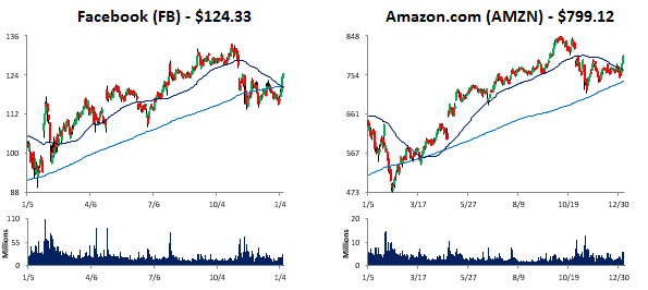
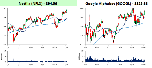
Bulls Sinking Their Teeth Back into FANG
Get Bespoke’s 2017 Outlook Report with a 30-day free trial to Bespoke’s premium research! Click here to learn more.
Largely written off after the election when shares underperformed, the FANG trade of Facebook (FB), Amazon.com (AMZN), Netflix (NFLX), and Google Alphabet (GOOGL) has kicked off 2017 with a bang. Through early Monday morning, GOOGL is the worst performing of the four but is still up over 4%. Overall, the average return of the four stocks that make up FANG is a gain of 6.04%, and Netflix is trading right near all-time highs. That’s already two full percentage points more than the average strategist S&P 500 forecast for the entire year!
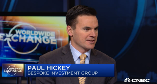
Bespoke CNBC Appearance (1/9/17)
Bespoke co-founder Paul Hickey appeared on CNBC’s Worldwide Exchange on Monday morning to discuss market performance leading up the inauguration. To view the segment, click on the image below.
Bespoke Brunch Reads: 1/8/17
Welcome to Bespoke Brunch Reads — a linkfest of the favorite things we read over the past week. The links are mostly market related, but there are some other interesting subjects covered as well. We hope you enjoy the food for thought as a supplement to the research we provide you during the week.
CRISPR
A simple guide to CRISPR, one of the biggest science stories of 2016 by Brad Plumer and Javier Zarracina (Vox)
Some background on Clustered Regularly Interspaced Short Palindromic Repeats (CRISPR), an unproven technology that has the potential to open incredible new doors for genetic engineering. [Link]
Rewriting The Code of Life by Michael Specter (New Yorker)
Hopeful potential for CRISPR, which has the potential to help species adapt and end diseases. [Link]
Food
There’s A Massive Restaurant Industry Bubble, And It’s About To Burst by Kevin Alexander (Thrillist)
More than half of American spending on food takes place at restaurants but the explosion in eating out has what can only be described as shaky underpinnings. [Link]
Americans Eat 554 Million Jack in the Box Tacos a Year, and No One Knows Why by Russell Adams (WSJ)
A fascinating dive into the world of America’s worst – and one of the most frequently consumed – tacos: the “gooey, deep-fried beef envelope” which sold over half a billion units in the US last year. [Link; paywall]
Investing
When do you average down? by John Hempton (Bronte Capital)
A thoughtful consideration of when and how to add to a loser from Australia’s most frequently blogging hedge fund manager. [Link]
How Merrill Tamed Its Herd, Pushing Brokers to Pitch Bank Products by Michael Wursthorn (WSJ)
The massive army of brokers who used to earn commissions relative to the number of stock sales they make has been reoriented to pitching accounts which come with an annual fee. [Link; paywall]
Byron Wien Announces Ten Surprises for 2017 (Blackstone)
While we wouldn’t classify all of these as surprises, they make interesting reading and are part of what’s frankly become a Wall Street tradition. Wien’s long experience and deep insight makes his opinions worthy of consideration, if not automatic acceptance. [Link]
Pitfalls
No One Questioned This Hedge Fund’s Madoff-Like Returns by Zeke Faux (Bloomberg)
A review of the fraud at Platinum Partners, which totaled more than $1 billion per the charges leveled by the government. [Link]
One Winner, One Loser in Brothers’ Lottery Worth Billions by Devon Pendleton and Yaacov Benmeleh (Bloomberg)
Despite every effort to make the distribution of their fathers’ assets equitable, the brothers Ofer have seen twists of fortune that deliver remarkably different fates. [Link]
Retail
How Credit-Card Data Might Be Distorting Retail Stocks by Miriam Gottfried (WSJ)
Investors place a lot of faith in the first looks on store revenues they get from research providers, and in many cases it’s too much, generating wild performance swings…and reversals. [Link; paywall]
The Brutal Truth Is That America Still Has Way Too Many Places to Shop by Brian Sozzi (The Street)
In purely quantitative terms, there are too many stores in the United States, with square footage running well above other countries with similar economies. [Link]
Millennial Myths
Millennials are entitled, narcissistic and lazy – but it’s not their fault: Expert claims ‘every child wins a prize’ and social media has left Gen Y unable to deal with the real world by Belinda Cleary (Daily Mail)
Is it really the fault of current twenty-somethings that their Baby Boomer parents demanded that their children get treated to trophies at every turn? [Link]
The Media’s Favorite ‘Millennial’ Is 55 Years Old by Ben Collins (The Daily Beast)
AP, Vocativ, Forbes, and Cosmopolitan are just a few of the outlets that have presented a man in his 50s as being a Millennial. [Link]
Driving
States Wire Up Roads as Cars Get Smarter by Paul Page (WSJ)
Speed limits that adjust for weather, driverless cars talking to asphalt, and the need to run wires under millions of miles of roadways. [Link; paywall]
Humanitarians
‘James Bond of Philanthropy’ Gives Away the Last of His Fortune by Jim Dwyer (NYT)
Giving away $8 billion isn’t as easy as it sounds, but Charles F. Feeney has managed to do it…becoming one of the greatest philanthropists in history in the process. [Link; soft paywall]
Farmer on Trial Defends Smuggling Migrants: ‘I Am a Frenchman.’ by Adam Nossiter (NYT)
“Liberté, égalité, fraternité” can be a bit difficult to square with national borders, as a unique case featuring an underground railroad for migrants shows. [Link; soft paywall]
Reviews
tom wolfe’s reflections on language by E.J. Spode (3am Magazine)
While we enjoyed The Electric Kool-Aid Acid Test, The Right Stuff, Bonfire of the Vanities, and I Am Charlotte Simmons as much as the next person, this frankly gutting review of Wolfe’s most recent effort at non-fiction gives us serious pause. [Link]
Media Matters
Megyn Kelly’s Jump to NBC From Fox News Will Test Her, and the Networks by Jim Rutenberg (NYT)
The cable TV star is hoping her sharp, plain-spoken brand of questioning and presentation will work on a larger scale. [Link; soft paywall]
Miscellaneous
Good Luck, Morons by Sara Estes (Bitter Southerner)
The hardest ultramarathon in the world is found in Eastern Tennessee, but the story of the man that dreamed it up is one that’s harder to believe than the fact that human beings run scores of miles for fun! [Link]
Carrie Fisher, Script Doctor: Her Unknown Legacy Examined by Peter Sciretta (Slashfilm)
The story behind Carrie Fischer’s under-appreciated work on major scripts that salvaged dialogue, plots, and the films themselves. [Link]
The Bespoke Report — Dow 19,999.63
If you’re not yet a Bespoke subscriber, you can still get Bespoke’s 2017 Outlook Report with a 30-day free trial to Bespoke’s premium research! Click here to learn more.
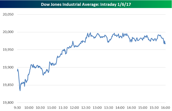
The chart below is included on page one of this week’s Bespoke Report newsletter, which was just sent to Bespoke Premium subscribers. Don’t tell traders that Dow 20,000 is just a meaningless number. While many like to mock the focus on big round numbers in the financial media, Friday’s action for the index shows that someone out there is using 20,000 as something more than just an arbitrary level. The chart highlights the intraday minute-by-minute action of the Dow Jones Industrial Average today. The closest the index had gotten to 20,000 prior to today was 19,987, but by mid-day Friday, it looked as if a cross of the 20,000 level was a shoe-in. It never happened, though.
All afternoon, the index got close to 20,000 — as close as 19,999.63 in fact — but every time it got near 20,000, sellers stepped in with force to not let it happen. It appears as if there are a large number of sell orders right at Dow 20,000. We’ll have to wait until Monday now to see if all of those sells are still in place.
Even though NYSE floor traders couldn’t wear their Dow 20,000 hats home for the weekend, it is important to note that all three major indices (Dow, S&P 500, Nasdaq) still hit new intraday highs today, which is quite a healthy sign for the market.
If you’d like to see the rest of this week’s Bespoke Report newsletter, take advantage of our one-month Bespoke Premium free trial offer that includes our 2017 Outlook Report. Sign up now at this page.
Have a great weekend!