Bespoke Stock Scores: 1/24/17
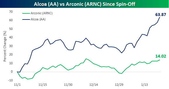
Poor Old Alcoa (AA)
Even though the company lost a lot of its relevance as a bell weather years ago and was even booted from the DJIA way back in 2013, we always considered the release of Alcoa’s (AA) earnings report to mark the unofficial start of earnings season. Late last year, though, Alcoa split up into two separately traded companies, and neither of the two remaining companies releases its report until late January, so the company’s distinction as kicking off earnings season is no longer applicable. Tonight, after the close, AA, which consists of the former company’s legacy raw aluminum operations, reports earnings, while Arconic (ARNC), which represents the company’s higher-growth business of manufactured goods for the aerospace and automotive industries, reports a week from today on 1/31.
With both companies now trading on their own for close to three months, we wanted to take a look at how they have performed as their own independent entities. For a little background, when the split was first announced in late 2015, the purpose was meant as a way to free Arconic from the shadows of the old line slow growth Aluminum company. The thinking was that this would help the market to fully recognize the value of this high growth business and for just about everyone involved, Arconic was the company with better prospects going forward. The fact that CEO Klaus Kleinfeld said he would take over as the CEO of Arconic showed which business he thought had the best potential, and he was quoted as saying, “You have to look at where you can create more value.”
So while everyone seemed to get all excited for the prospects of Arconic and left Alcoa for dead, which stock do you think has done better on its own? The chart below shows the performance of both stocks since they started trading on a separate basis. In the nearly three months that Arconic has been on its own, the stock has rallied a pretty impressive 14%, or nearly twice the gain of the S&P 500. That’s all well and good, but over that same time period, poor old Alcoa has rallied more than 60%! For any stock, that’s a major move in three months, but for a stock that did essentially nothing for several years and sat out the bull market, it’s monstrous, and it all came from the legacy slow-growth business that Arconic and executives at the combined company were trying to get away from. It’s still early, but as of now Alcoa’s performance still casts quite a shadow over Arconic!
The Closer 1/23/17 – Market Updates
Log-in here if you’re a member with access to the Closer.
Looking for deeper insight on global markets and economics? In tonight’s Closer sent to Bespoke Institutional clients, we update our valuation model for the Bloomberg USD Index (a proxy for the broad dollar), present tables of the most volatile and highest implied volatility stocks in the Russell 1000, and take a look at the characteristics of volatility for major US equity index ETFs and S&P 500 sector ETFs.

The Closer is one of our most popular reports, and you can see it and everything else Bespoke publishes by starting a no-obligation 14-day free trial to our research!
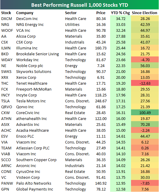
Best Performing Russell 1,000 Stocks YTD and Since Election
Get Bespoke’s 2017 Outlook Report with a 30-day free trial to Bespoke’s premium research! Click here to learn more.
The average stock in the Russell 1,000 is up 1.55% so far in 2017. Below is a look at the 30 stocks that are currently up the most year-to-date. As shown, DexCom (DXCM) ranks first with a gain of 34.72%, followed by NRG Energy (NRG) and VCA Inc. (WOOF). Alcoa (AA) ranks fourth with a gain of 27.88%, and CSX Corp (CSX) rounds out the top five with a gain of 25.58%.
Tesla (TSLA) is the most high-profile name on the list of winners with a YTD gain of 17.31%. After a lackluster 2016, Elon Musk has started 2017 on a positive note.
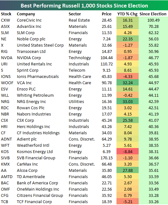
Since the close on election day (11/8/16), the average stock in the Russell 1,000 is up 8.09%. Below is a list of the 30 best performing stocks in the index since election day. As shown, CoreCivic (CXW) is up the most with a gain of 100.49%. AdvanSix (ASIX) ranks second with a gain of 70.28%, followed by SLM with a gain of 62.32%. Other notables on the list include US Steel (X), NVIDIA (NVDA), Sprint (S), Transocean (RIG), and Bank of America (BAC).
Bespoke Stock Seasonality Report: 1/23/17
Chart of the Day: 2017 Decile Analysis
ETF Trends: US Indices & Styles – 1/23/17
Gold continues to rally, benefiting Miners over the past week. While natural gas inventories have tightened a fair bit relative to recent history, warm weather is keeping gas longs unhappy. Biotech continue to labor under headline risk while the period of bank outperformance following the election continues to unwind. Lat Am, the antipodeans, and GBP have all been good perfomers in the past week.

Bespoke provides Bespoke Premium and Bespoke Institutional members with a daily ETF Trends report that highlights proprietary trend and timing scores for more than 200 widely followed ETFs across all asset classes. If you’re an ETF investor, this daily report is perfect. Sign up below to access today’s ETF Trends report.
See Bespoke’s full daily ETF Trends report by starting a no-obligation free trial to our premium research. Click here to sign up with just your name and email address.
Bespoke’s “Industry Insights” Report — Restaurants — 1/23/17
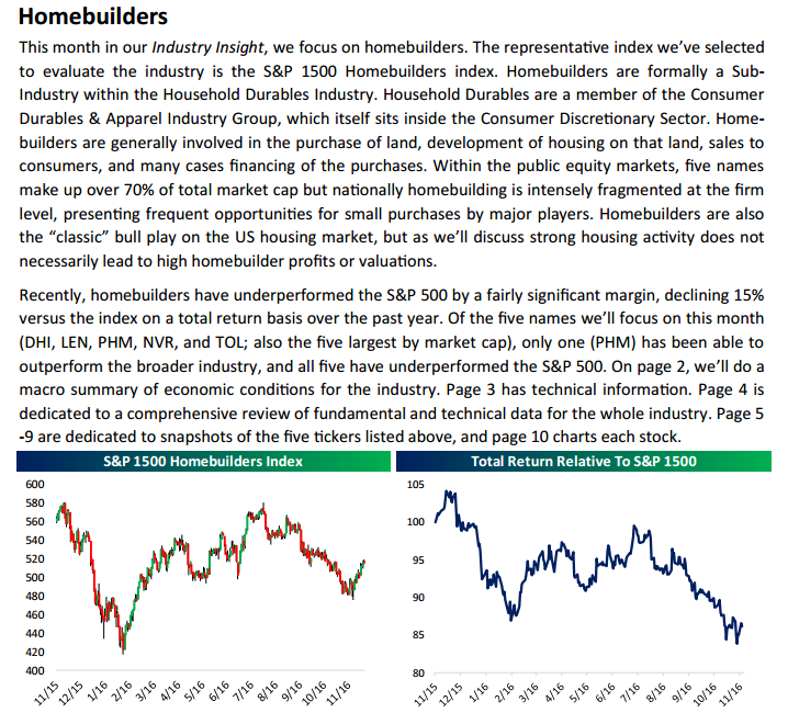
Today we’ve published the second edition of our new “Industry Insights” report that’s available to Bespoke Institutional subscribers. Our “Industry Insights” report provides more in-depth industry/sector/group coverage than we’ve previously offered. In our first edition, we took a look at Homebuilders. This month, we did a dive into Restaurants. Over the next few months, we’ll be publishing reports on more industries until we build a pretty extensive coverage list. Keep in mind that this is only the second version, and we plan on tweaking and improving the report over time.
Below is a snapshot of the first page from this month’s report. To access the full 11-page PDF, sign up for a two-week free Bespoke research trial today. In addition to this report, you’ll also receive everything else we publish on a daily basis, starting with our Morning Lineup and finishing with The Closer each night.
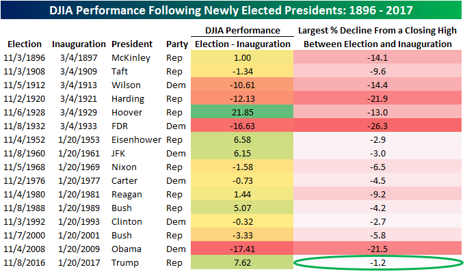
The Smoothest Transition Ever
By most accounts, the first weekend of the Trump Administration wasn’t good. Characterized as rocky, erratic, terrible, and full of false claims, the ‘not ready for prime time’ transition team is now the ‘not ready for prime-time administration.’ However you want to characterize it, there were certainly some missteps in the Trump administration’s transition from the election to the Inauguration as well as during its first weekend. There will also no doubt be additional missteps along the way over the next four (or eight) years. That said, a lot of this is to be expected. Anytime you have a complete changeover in Washington (even right down to the drapes in the Oval Office), there are going to be issues that come up.
By at least one measure, though, the Trump Administration’s transition has been pretty smooth. The table below was from this week’s Bespoke Report newsletter and shows how the DJIA performed from Election Day through Inauguration Day for each newly elected President since 1896. Along with the DJIA’s performance during each transition, we also show the maximum percentage decline the index saw from a closing high during each period. With a gain of 7.62% during Trump’s transition, the DJIA had its second best transition performance since 1896. More importantly, with a maximum decline of 1.2% from a closing high, no other newly elected President has ever seen a less volatile transition period! Call it whatever you want, but from the stock market’s perspective at least, the Trump transition was the smoothest ever.
Bespoke Brunch Reads: 1/22/17
Welcome to Bespoke Brunch Reads — a linkfest of the favorite things we read over the past week. The links are mostly market related, but there are some other interesting subjects covered as well. We hope you enjoy the food for thought as a supplement to the research we provide you during the week.
Brexit
Britain’s Pound Depreciation Isn’t Working (WSJ)
Despite looking cheaper to overseas purchasers due to the lower pound sterling, UK exports aren’t ticking up despite a surge in imports thanks to higher prices. [Link; paywall]
Goldman May Cut London Staff by 50% on Brexit, Handelsblatt Says by Dakin Campbell (Bloomberg)
While this report is unconfirmed and couldn’t get anyone on the record, the framing is stark; nobody pre-Brexit would have planned for half of London’s 3,000 Goldman employees to no longer be working in the UK. [Link]
Trumponomics
Trump team shifts further from strong dollar policy (FT)
Trump advisor Anthony Scaramucci noted this week that the administration wouldn’t necessarily support a strong dollar policy, a stance which would strike a strong contrast to Congressional plans which rely on a 20% appreciation of the dollar. [Link; paywall]
PB 17-3 Border Tax Adjustments: Assessing Risks and Rewards by Gary Clyde Hufbauer and Zhiyao (Lucy) Lu (PIIE Policy Briefs)
More background on the impact of the proposed border tax adjustment being discussed in Congress. [Link; 12 page PDF]
Trump
Reality bites: Trump’s wake-up call by Mike Allen and Jim VandeHei (Axios)
A quick summary of the gradual transition from bluster of campaign to grim reality of executing the work of governance. [Link]
How the Attacks on Trump Reinforce His Strategy by Roger Martin (HBR)
The creation of an entirely new category of political candidates, or the inevitable outcome of many forces? [Link; soft paywall]
Strange Food
Thousands of Skittles end up on an icy road. But that’s not the surprising part by Doug Criss (CNN)
It turns out that cows enjoy tasting the rainbow just as much as humans do. [Link]
Ranking America’s Fast-Food Chicken Nuggets by Ryan Sutton (Eater)
A definitive – and well-constructed – ranking of the best fast food chicken nuggets available. [Link]
Hoops
Barack Obama’s 9 most disrespectful basketball moments, RANKED by Tyler Tynes (SBNation)
Trash talk, high pressure jumpers, swatting his personal assistant, cleaning out Don Cheadle, and outright disrespectful dad wear: a playful list of some memorable shade thrown on the court by the outgoing POTUS. [Link]
Alphabet
Google Uses Its Search Engine to Hawk Its Products by Jack Nicas (WSJ)
Is the silent manipulation of algorithms the next big step for antitrust law? [Link; paywall]
Google’s “moonshot” projects are crashing to earth by Jonathan Berr (CBS)
Solar-powered drones, fiber internet, robotics, and smart thermostats are all lines of business that have either been restructured or significantly changed up in the past couple of years within Alphabet’s massive non-profitable business portfolio. [Link; auto-playing video]
Clean Energy And Other Pursuits
A Big Test for Big Batteries by Diane Cardwell and Clifford Krauss (NYT)
Generation costs for solar and wind power are now competitive (on an unsubsidized basis) with even the cheapest, dirtiest forms of fossil fuel. The only problem? That electricity doesn’t always sync up with when it’s needed. Enter the utility scale battery…hopefully. [Link; soft paywall]
Gotta Love Capitalism
Full Marx! (Bonhams)
A first edition of Das Kapital has sold at roughly twice the price it was expected to fetch, going for over a quarter of a million dollars. [Link]
Is Elon Musk Researching A.I. by Watching Old Sci-Fi Movies? by Ryan Britt (Inverse)
Some members of the Bespoke team are avid science fiction readers so we aren’t entirely disappointed with Musks’ decision to consult prior investigations around the ethics of AI. That said, we’re not sure we’d have gone the direction Musk did. [Link]
China
China’s WTO Entry, 15 Years On by Brad Setser (Council On Foreign Relations)
A fantastic investigation of the consequences – as well as possible remedies – for allowing China into the WTO. [Link]
Behind China’s Bond Selloff, a Risky Twist on the Repo Trade by Shen Hong (WSJ)
Leverage has a funny way of sneaking into quiet markets and that’s exactly what happened up until recently in China, where non-binding repo trades supported speculation. [Link; paywall]
Economic Reading
Class Notes by J. W. Mason
A massive compendium of notes CUNY professor Mason uses to teach his class. Worthwhile as reference material or as an introduction to the field. [Link; 139 page PDF]
Location, Location, Location
J.C. Penney Sets Trend in Reviving Suburban Corporate Campuses by Peter Grant (WSJ)
The revitalization of urban areas around the country is drawing corporate locations into denser areas that cater to workers who want access to amenities not offered out in the suburbs. [Link; paywall]
VR tech startup Avenue Planet launches its first ‘v-commerce’ location: Lincoln Road by Nancy Dahlberg (Miami Herald)
A South Florida start up is rolling out virtual editions of real-world locales which consumers can use to buy goods via a VR headset. [Link]
GameStop Shares Could Be A Game Winner by Jack Willoughby (Barron’s)
Markets are pricing game over, but small changes in assumptions make GameStop appear cheap, per Barron’s. [Link; paywall]
Poverty
In the Shopping Cart of a Food Stamp Household: Not What the New York Times Reported by Rebecca Vallas and Katherine Gallagher Robbins (Talk Poverty)
Do people who use SNAP (commonly referred to as “food stamps” or “EBT”) eat less healthy diets than the rest of the country? Not so much…though of course we could all probably do with more fresh vegetables and less soda. Also a good lesson in how poverty is often presented, contrary to fact-based evaluations. [Link]
Legal Beagles
With Competition Fierce, Even Elite Law Firms Resort to the Unusual by Elizabeth Olson (NYT)
In order to pick off star talent, law firms are starting to behave much more like banks in their recruiting practices. [Link; soft paywall]
Investing
What I’ve learnt from trading by Saeed Amen (Cuemacro)
An honest evaluation of lessons learned from years of taking risk and managing it. [Link]
Pulling Retirement Cash, but Not by Choice by Vipal Monga and Sarah Krouse (WSJ)
One way or another, even tax-deferred savings will eventually have to pony up, a process which millions of Baby Boomers are starting to become familiar with. [Link; paywall]
Oh Canada
Shark Tank’s Kevin O’Leary to run for Conservative leadership in Canada (CNBC/AP)
Fractured right-wing field, brash candidate, no political experience…stop us if you’ve heard this one before. [Link]