A Confidence Boost For the Forgotten Man
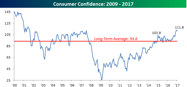
Consumer Confidence for the month of January was released earlier today, and after hitting the highest level in over a decade last month (August 2001), sentiment saw a slightly larger than expected pullback. While economists were forecasting the headline reading to come in at 112.8, the actual reading printed at 111.8. As shown in the chart below, though, this month’s decline barely registers relative to the move we have seen in the past few months, and sentiment remains comfortably above its historical average of 93.6 dating back to 2000.
What really stood out in this month’s report is how confidence varied by income level. As shown in the chart, for all three income levels, sentiment surged post-election. However, the only income level where sentiment hit a new high was in the middle-income level of consumers with incomes of $35K to $50K. Among many political scientists, this is the heart of President Trump’s base and consists of the “Forgotten Man” among the US population. The term “Forgotten Man” was first coined in an essay by William Graham Sumner. In a nutshell, when the rich see an injustice from which the poor are suffering, it is often the people in the middle who bare the burden of the remedying of the situation. Trump took this theme and campaigned on the idea that while traditional Republicans were the party of the rich and Democrats were increasingly focused on catering to lower income Americans, no one was fighting for the middle class. Given the results of the election, it only makes sense that confidence among this group has seen the biggest improvement since Trump. Whether their confidence continues remains to be seen, but for now, the “Forgotten Man” is still with Trump.
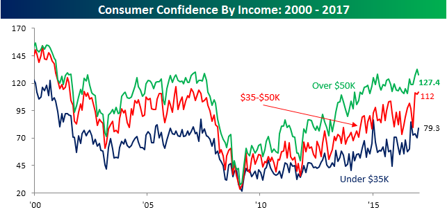
Chart of the Day: February Sector Performance
Bespoke Stock Scores: 1/31/17
ETF Trends: Hedge – 1/31/17
4 emerging markets top the list of the best performing ETFs over the past week with the USD making new lows intraday today. Russia and Hong Kong are also high on the list of best performers along with semis, MLPs, and financials. Poor performers include Italy, South Africa, Energy companies, Metals, and REITs.

Bespoke provides Bespoke Premium and Bespoke Institutional members with a daily ETF Trends report that highlights proprietary trend and timing scores for more than 200 widely followed ETFs across all asset classes. If you’re an ETF investor, this daily report is perfect. Sign up below to access today’s ETF Trends report.
See Bespoke’s full daily ETF Trends report by starting a no-obligation free trial to our premium research. Click here to sign up with just your name and email address.
High Yield Spreads Still Holding Up
The S&P 500 is on pace for its fourth straight day of losses which would mark the longest losing streak for the index since the election (leading up to the election, through 11/4, the index was down for nine straight days). While the four-day decline has been relatively modest, whenever equities slump we like to see how things in the high yield market are playing out in order to see if there are any warning signs in this area of the fixed income market. Historically speaking, spreads (yield premium over treasuries) on high yield debt have been inversely correlated to the equity market. In other words, when spreads on high yield debt increase, equities usually decline, and vice versa.
Taking a look at the chart below, spreads on high yield debt have narrowed significantly over the last year. After hitting a peak of 887 bps back in February of last year, spreads contracted by more than half through their recent lows which occurred last Friday at 393 bps. In yesterday’s trading, spreads widened a bit, which is understandable given the increased risk aversion in the market. However, with an increase of just 3 bps, like the equity market, high yield debt markets aren’t showing a high degree of concern at this point.

The Headlines Have Spoken
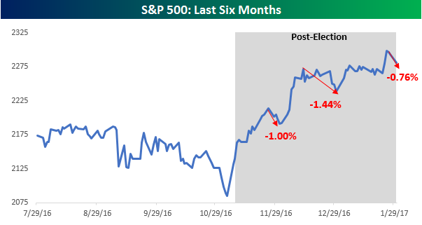
The S&P 500 fell 60 bps Monday and is now down a whopping 0.76% from its most recent closing high last Wednesday. At this point, the current “sell-off” ranks as the third largest peak to trough decline from a closing high since the Election. As shown in the chart below, another couple of days like the last two and the current pullback could end up being the largest post-election decline since Trump became the President-Elect and subsequently President.
So is the rally over? Who knows. However, a look at the headlines from a lot of major media outlets that cover the market suggests that the answer is obvious — Yes.
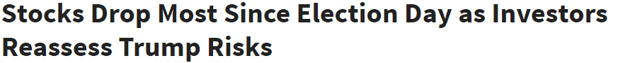
The normally bullish Investors Business Daily (IBD) still isn’t sure and posed its headline in question form:
![]()
Same goes for CNN:

While IBD didn’t take a stand in either direction, other outlets were a lot more definitive in their headlines.
Fox Business reports that investors are having second thoughts on Trump:
Both Marketwatch and Reuters are calling an end to the honeymoon:

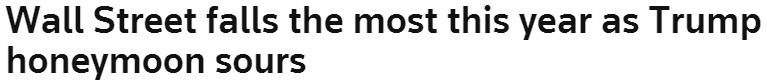
Not only is the honeymoon over, but based on the Wall Street Journal’s headline, the market and Trump may be heading straight for divorce.
![]()
Finally, if Bloomberg’s account of today’s sell-off is any indication, the divorce may be messy as today’s 0.6% drop only emboldened “Trump’s Haters.” We can only imagine how messy things would be if the S&P 500 actually fell a full percent!

The Closer 1/30/17 – Consumption & Correlation
Log-in here if you’re a member with access to the Closer.
Looking for deeper insight on global markets and economics? In tonight’s Closer sent to Bespoke Institutional clients, we break down today’s personal income and spending report from the BEA before moving on to investigating what a positioning-driven selloff looks in terms of sector correlation. Finally, we take a look at implied correlation and implied volatility.

The Closer is one of our most popular reports, and you can see it and everything else Bespoke publishes by starting a no-obligation 14-day free trial to our research!
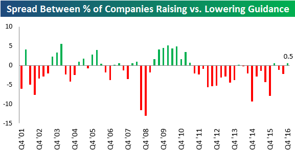
Is a Positive Guidance Spread in the Cards?
Roughly 500 companies have reported earnings so far this season (which began on January 9th), and believe it or not, more companies have raised guidance this earnings season than lowered.
While you might think that a positive guidance spread isn’t a big deal, it is when you look at the data over the last six years. Below is a chart showing the quarterly guidance spread (% of companies raising guidance minus % of companies lowering guidance) for each earnings season going back to 2001. As you can see, just two out of the last twenty-one earnings seasons have finished with a positive guidance spread.
This season, the guidance spread is positive not so much because companies are raising guidance at a higher clip, but more because less companies are lowering guidance. Even still, the spread is currently just barely positive. There’s still a long way to go before this earnings season ends.
Given the big jump in economic and stock market sentiment measures following the election, we’ve been curious to see how corporate America would respond as well. Guidance that’s released along with quarterly earnings numbers is one way to track this. Should this season’s spread finish in positive territory, it could be a sign that companies are finally coming out of a six-year funk.
Want to see more research like this? Click here to start a no-obligation two-week free trial.