Crude Oil Inventories Surge
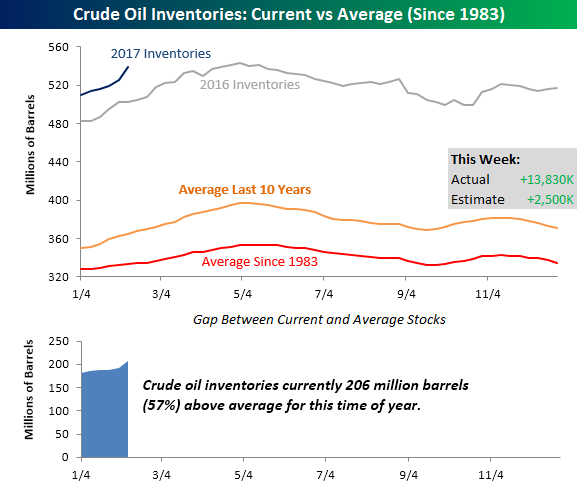
Crude oil inventories saw a much larger than expected increase in the latest week, surging by 13.83 million barrels compared to the consensus forecast of a 2.5 million barrel build in stockpiles. This week’s increase represents the second largest weekly build in stockpiles going all the way back to 1983. The only week in the last 34 years that saw a larger weekly increase in inventories was last October when stockpiles increased by 14.42 million barrels. The key difference between last October and this week’s build in stockpiles is that back in October, the weekly build followed several drawdowns in the prior week, including the second-largest single week decline on record whereas this week’s build followed four prior weeks where inventories also increased.
The chart below compares weekly crude oil inventories in 2017 to weekly levels in 2016, as well as the ten-year average and the average going back to 1983. Needless to say, inventory levels are way above average. In fact, this week’s level of just under 540 million barrels is the fifth highest weekly reading since at least 1983, and that puts total stockpiles 206 million (57%) above their historical average for this time of year.
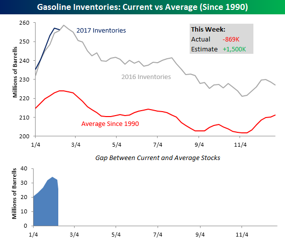
While crude oil inventories spiked this week, gasoline stockpiles saw an unexpected decline after five straight weeks of large builds. While traders were expecting a build in inventories of 1.5 million barrels, stockpiles actually declined by 839K. Like crude oil, as shown in the chart below, gasoline stockpiles are well above their historical average, but not to nearly the same degree. Additionally, at this point inventory trends seem to be following last year’s trends pretty closely.
Interesting Trends in Gas Prices
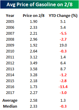 Summer driving season is still a long ways off, but we are seeing some really interesting trends unfold in terms of gas prices. According to AAA, the national average price of a gallon of gas currently stands at $2.27, which is down about 3% from where prices were at the end of 2016. As shown in the table to the right, this year’s decline is much weaker than the average YTD change of +1.3% at this time of year, and going back to 2005, there have only been two other years (2007 and 2016) where the national average price saw a larger YTD decline at this time of year.
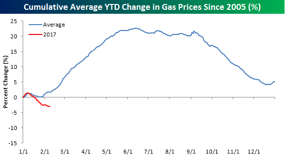
The chart below compares this year’s move lower in gas prices to a composite of the average YTD change going back to 2005. It’s not uncommon for prices to start the year off on a weak note in January. Once February begins we see a steady move higher until the start of the Summer driving season around Memorial Day when they typically reach their peak for the year. If history is any guide, prices should start to rebound in the weeks and months ahead. It’s certainly not guaranteed, but it is the ‘typical’ pattern.
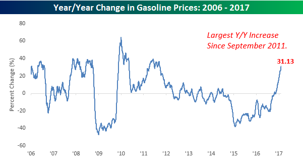
Rather than focusing on absolute price levels, when thinking about gas prices, it is often helpful to compare current levels to where they were a year ago. When prices are down significantly versus the same time last year, consumers may feel more flush, whereas higher prices may force the consumer to reign in spending elsewhere. On this front, even though gas prices are down on the year, because energy prices, and by extension gas prices, were so depressed at this time last year, the y/y change in gas prices has recently surged. As shown in the chart below, prices at the pump are currently more than 30% higher than they were at this time last year. To find a larger y/y increase in prices at the pump you have to go back more than five years to September 2011.
Bespoke CNBC Appearance (2/8/17)
Bespoke co-founder Paul Hickey appeared on CNBC’s Power Lunch yesterday to discuss markets and the rally in the tech sector. To view the segment, please click on the image below.
The Closer 2/7/17 – Trade, Openings, Credit
Log-in here if you’re a member with access to the Closer.
Looking for deeper insight on global markets and economics? In tonight’s Closer sent to Bespoke Institutional clients, we recap US trade data reported today along with the Job Openings and Labor Turnover Survey and consumer credit reported by the Federal Reserve.

The Closer is one of our most popular reports, and you can see it and everything else Bespoke publishes by starting a no-obligation 14-day free trial to our research!
Chart of the Day: Apple (AAPL) Approaching New All-Time Highs
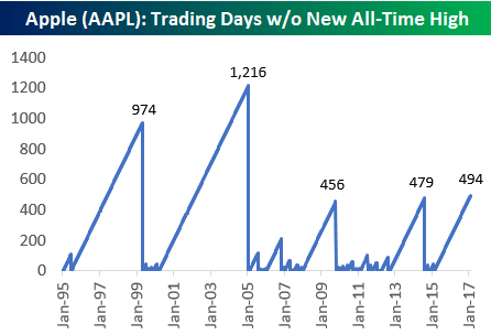
Apple (AAPL) is now less than $2 away from making a new all-time closing high. The stock last made a new all-time high on February 23rd, 2015 when it closed at $133/share. The chart below shows prior streaks of trading days without a new all-time high for the stock going back to 1995. As shown, the current streak of 494 trading days is the longest of the iPhone-era.
To read our thoughts and see more analysis of Apple’s (AAPL) historical trading pattern, start a 14-day free trial below and check out today’s Bespoke Chart of the Day.
Bespokecast — Episode 6 — Rob Bartenstein
 In our newest conversation on Bespokecast, we speak with investment advisory industry veteran Rob Bartenstein. Rob is the CEO of Kestra Private Wealth, and he’s also a regular guest on financial networks like CNBC and Fox Business. Kestra is a platform for registered investment advisors. In our conversation, we discuss the current state of the investment advisory industry including the pending Department of Labor fiduciary rule. Rob also discusses his views on the market and the outlook for the economy. We learned a lot talking to Rob and think you will too!
To access episode 6 immediately, please start a 14-day free trial to Bespoke’s research product. If you’ve already signed up for a Bespoke free trial in the past, you can gain access by choosing a membership option at our products page. Here’s a look at past guests if you’re interested.

B.I.G. Tips – 80 Days and Counting
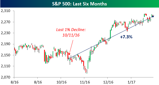 While equities finished the day down on Monday and have now traded down on a daily basis more in the last three weeks than they have traded up, amazingly, we have yet to see a day since the November election where the S&P 500 dropped 1% or more. In fact, you have to go back nearly a month before the election to find the last time the S&P 500 dropped 1% in a single day. The lack of a 1% decline through Monday is notable for the fact that it has now been 80 trading days since the S&P 500 last saw a one-day decline of 1%+. During that span, the index is up 7.3%.
The chart below shows historical streaks of trading days since 1928 that the S&P 500 went without a decline of 1%+. Looking at the chart, these types of streaks were pretty common in the 1950s and 1960s, but from 1970 through the present, their frequency has become increasingly sporadic. While there were eleven streaks in the twenty-year stretch spanning the 1950s and 1960s, in the more than four decades since there have only been eight. In fact, the current streak represents the first 80+ trading day streak without a 1% decline since 2006, and before that, you have to go back to 1995 to find the next one.
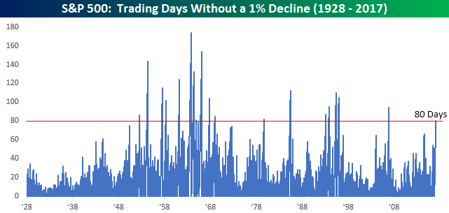
Earlier today, we sent Bespoke Premium and Bespoke Institutional members a report highlighting the S&P 500’s performance during, and more importantly after, each of the prior 18 streaks. To see this report, sign up for a monthly Bespoke Premium membership.
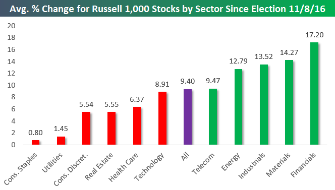
Post-Trump Performance Check-Up
Below is a look at the average performance of Russell 1,000 stocks by sector since the close on election day (11/8/16). As shown, the average stock in the entire index is now up 9.4% since election day. Five sectors have seen outperformance while six have seen underperformance.
The Financial sector is averaging the biggest gains at +17.20%, followed by Materials (+14.27%), Industrials (+13.52%), and Energy (+12.79%). While Technology has been outperforming recently since the election the average Tech stock is up 8.91%, which is actually less than the overall average. The real laggards have been Consumer Staples and Utilities. Both sectors have seen their stocks average very minute gains.
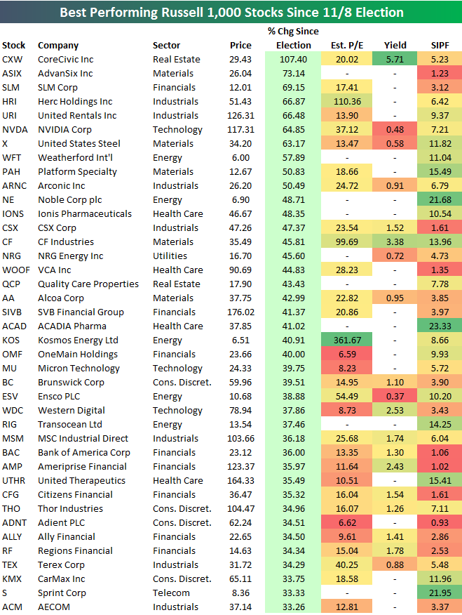
Below is a list of the 40 Russell 1,000 stocks that are up the most since election day (through the close on 2/6). As shown, CoreCivic (CXW) — a REIT — is up the most with a gain of 107.4%, followed by AdvanSix (ASIX), SLM, and Herc Holdings (HRI). United Rentals (URI), NVIDIA (NVDA), and US Steel (X) rank 5th through 7th. Other notables on the list of big winners include Alcoa (AA), Micron (MU), Western Digital (WDC), Bank of America (BAC), and Sprint (S). For each name, we also include its estimate P/E ratio, its dividend yield, and its short interest as a percentage of float (SIPF).
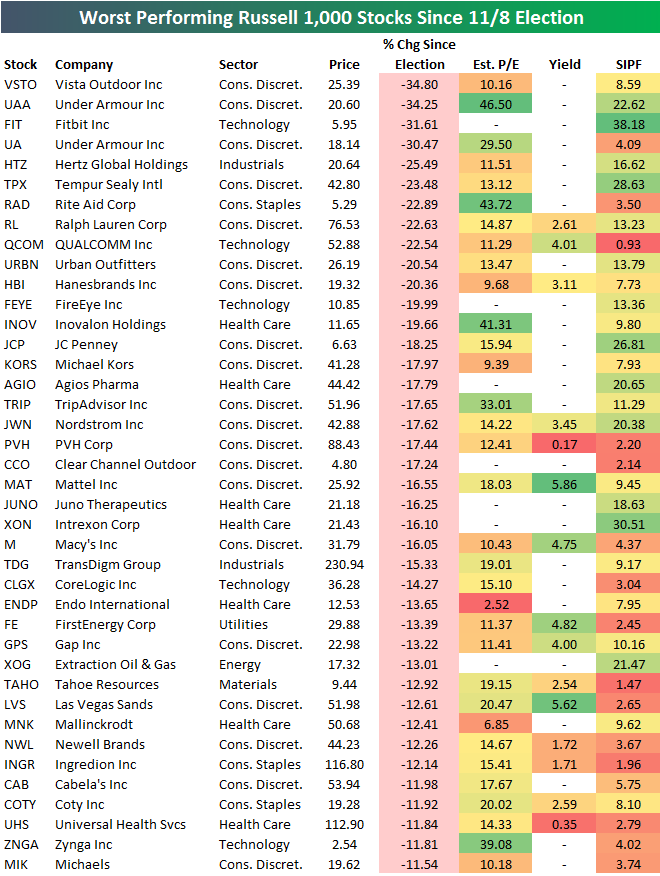
The list of biggest losers since election day is led by Vista Outdoor (VSTO) and Under Armour (UAA), which have both declined more than 34%. Fitbit (FIT) ranks third worst with a decline of 31.61%. Other notables on the list of losers include Ralph Lauren (RL), QUALCOMM (QCOM), FireEye (FEYE), JC Penney (JCP), Nordstrom (JWN), Macy’s (M), and Las Vegas Sands (LVS). The list is riddled with retailers and other consumer stocks that are suffering “Death by Amazon.”
ETF Trends: Hedge – 2/7/17
Gold and gold miners continue to rally with the best performance over the last five trading days. A number of US equity industries have performed well over the last couple of weeks, with mortgage real estate, MLPs, financial services, and semiconductors all performing well. On the losing side of the slate, a number of currencies are major underperformers over the last week: pound sterling, Swedish krona, and the Canadian dollar are all down sharply while French and Spanish equities have been the biggest country ETF decliners.

Bespoke provides Bespoke Premium and Bespoke Institutional members with a daily ETF Trends report that highlights proprietary trend and timing scores for more than 200 widely followed ETFs across all asset classes. If you’re an ETF investor, this daily report is perfect. Sign up below to access today’s ETF Trends report.
See Bespoke’s full daily ETF Trends report by starting a no-obligation free trial to our premium research. Click here to sign up with just your name and email address.