B.I.G. Tips – Retail Sales Are Great Again
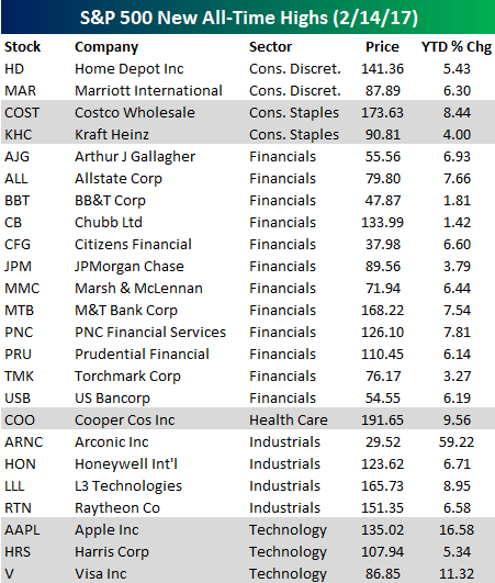
Apple (AAPL) Leads List of 24 New All-Time Highs
After 36 new all-time highs in the S&P 500 on Monday, the number dipped a bit down to 24 in Tuesday trading. Below is a list of these 24 new all-time highs for 2/14/17. It was a lovely Valentine’s Day for shareholders of these companies.
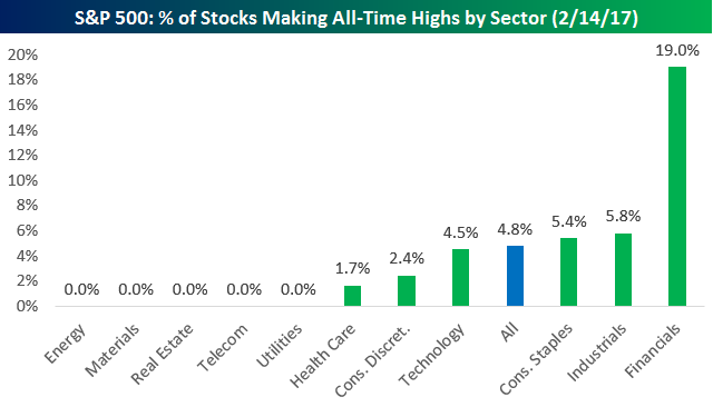
Financial stocks dominated the list of all-time highs yesterday. Within the S&P 500 Financial sector, 12 stocks hit new all-time highs, which represents 19% of the sector. On Monday it was the Industrials sector with the most new all-time highs, but only 4 Industrials stocks made new ATHs yesterday.
The most noteworthy stock on Tuesday’s all-time high list was Apple (AAPL). It had been nearly two years since the stock last made an all-time high in mid-2015.
The Closer — EMFX-nicals, Senate Stopover — 2/14/17
Log-in here if you’re a member with access to the Closer.
Looking for deeper insight on global markets and economics? In tonight’s Closer sent to Bespoke Institutional clients, we chart up some interesting opportunities in emerging market foreign exchange. We also break down today’s testimony at the Senate from Fed Chair Yellen and the January PPI report.

The Closer is one of our most popular reports, and you can see it and everything else Bespoke publishes by starting a no-obligation 14-day free trial to our research!
Six for Six
![]()
Before the open this morning when we saw the above headline, our natural inclination was to think that equity futures were showing a rather sizable decline. So we were surprised when we looked at the market and S&P futures were down just one point, even as fair value was down three points. In other words, despite the negative headline, futures were indicating a flat to positive open! This morning’s episode is just one more in the long list of examples where investors, pundits, and headline writers have been chomping at the bit to put the nail in this rally. It seems like every day, there’s a negative headline saying what’s wrong with the market, but by the time the closing bell rings, stocks finish in the green.
Today’s rally has made it six straight days of gains for the S&P 500. Since the bull market began in March 2009, this is the 18th streak of at least six straight daily gains for the S&P 500. In the table below, we highlight each of these streaks. In each row, the date represents day six of the winning streak, and with each streak, we also show how long the streak lasted, how much the S&P 500 gained in the first six trading days, as well as how it traded the following day. As shown in the list, in the early years of this bull market, the S&P 500 had a hard time making it to lucky number seven as the first ten streaks ended at six trading days. Since then, though, the S&P 500’s record on day seven has been more evenly split with four gains and three losses. Overall, just four of the streaks during this bull market have lasted more than six days, and the longest streak was eight days. Finally, while the current rally has been fun for the bulls, the 1.8% gain is on the weak side. Overall, the average six trading day gain during prior streaks has been over 3%. Let’s not get greedy, though!
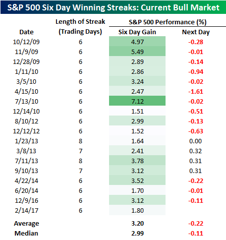
Chart of the Day: Nasdaq YoY Return Hits 30%
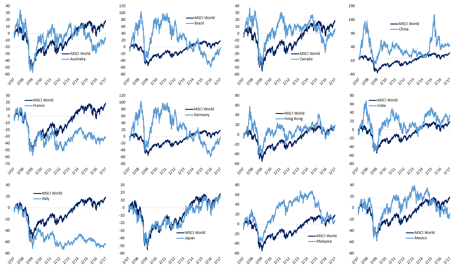
Global Equity Markets: A Ten Year View
Over the last ten years, capital markets have seen a lot happen! The global financial crisis, a downgrade from AAA of the United States, Eurozone political risk emerging, a commodity boom and crash, EM outperformance and underperformance, Chinese stock bubbles and burstings…the list goes on. Below, we chart the percentage price change in 22 major global equity indices relative to the MSCI World index, starting from Valentine’s Day 2007. Each index is priced in USD, so currency effects can change outcomes significantly. For each country, we’ve chosen broad benchmark indices which for the most part are representative of large cap stocks in that country. The charts might seem pretty small, so if you need to zoom in you can just click the picture for a bigger view.
You’ll notice when looking through the charts that the MSCI World index has outperformed most countries over the last ten years. The US has clearly been the main driver of performance since it makes up roughly 35% of world market cap and has tripled the performance of the MSCI World. China, Taiwan, and India are the only other countries that have outperformed the MSCI World by a meaningful amount.
ETF Trends: Hedge – 2/14/17
Steel producers, solar stocks, retail, and a number of EM countries lead the pack in terms of recent ETF performance over the last 5 days. China, banks, and biotechs have also performed well. Laggards include gold miners, natural gas, long-term Treasuries, and FX ETFs owning currencies like euros, Swiss francs, and the Swedish krona.

Bespoke provides Bespoke Premium and Bespoke Institutional members with a daily ETF Trends report that highlights proprietary trend and timing scores for more than 200 widely followed ETFs across all asset classes. If you’re an ETF investor, this daily report is perfect. Sign up below to access today’s ETF Trends report.
See Bespoke’s full daily ETF Trends report by starting a no-obligation free trial to our premium research. Click here to sign up with just your name and email address.
Bespoke Stock Scores: 2/14/17
A Look At Bank and Broker Credit Default Swap (CDS) Prices
With new all-time highs for some of the largest US banks (JPM, WFC) and some investment banks (GS), we wanted to see if credit markets are saying the same thing as equity markets.
First, in the chart below, we compare the spread on US bank CDS (5-Year CDS) for some of the largest US banks by market cap: Wells Fargo, JP Morgan, Bank of America, Citi, Morgan Stanley, and Goldman Sachs. The higher the CDS spread, the more expensive it becomes to insure bank debt against a default. While it can be challenging to directly imply a probability of default from CDS prices (because they’re also sensitive to recovery value), higher CDS spreads are indicative of the market pricing in stress for a given credit issuer.
Want to see more of our market research? Start a 14-day free trial today.
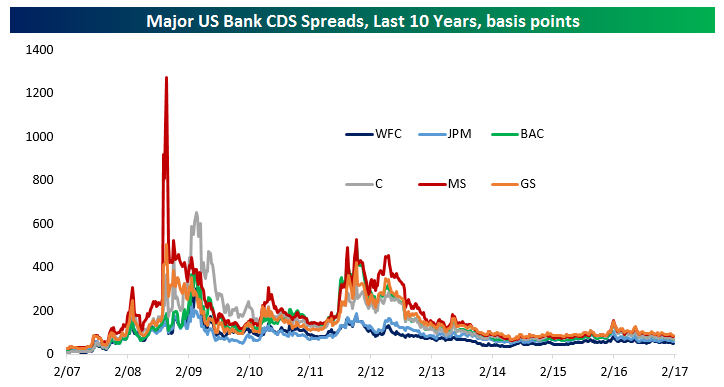
As shown in the chart above, the highest spreads in recent history came in two waves: during the global financial crisis (2008-2009) and the Eurozone/US debt ceiling stress of 2011-2012. Since then, while CDS spreads have moved somewhat, there’s been very little change in credit spreads. The same can’t be true for equity prices, as we show in the chart below.
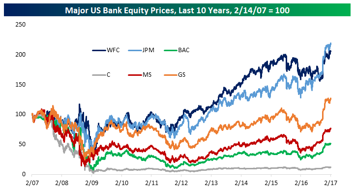
Wells Fargo, JPM, and Goldman are all at all-time highs. Others like MS, BAC, and Citi have rallied significantly off recent lows but are still well below the prices seen in 2007. In aggregate, the six stocks above have a combined market cap of $1,197 billion, versus a pre-crisis high water mark of $995 billion and a post-crisis low of $179 billion.
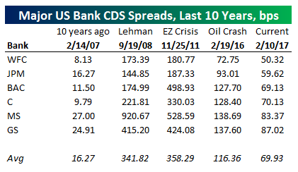
The last thing we wanted to show is the CDS spread of these major banks at various points in time. While the current CDS spread levels are dramatically lower than late 2008 (in the week Lehman went bankrupt) or the peak of the Eurozone crisis and US ratings downgrade, they’re higher than they were during the broad credit market excesses of the pre-crisis period. Even during the peak of oil market concerns and the broad financial market selloff in Q1 of last year, CDS spreads didn’t widen by very much.
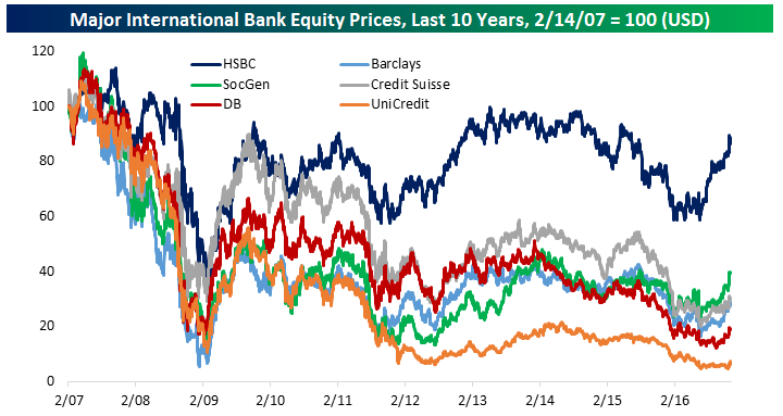
International banks aren’t necessarily in the same position. Below, we recreate the same CDS chart as above, but for six major international banks. Similar to US banks, spreads were extremely low in the pre-crisis period, and climbed steadily into the 2008-2009 period. We should note, however, that unlike the US, most of these banks saw spreads peak well after the crisis. Because five of the six we chose are primarily European (HSBC being the exception; headquartered in London its focus is more global), they were much more adversely impacted by the Eurozone crisis relative to the global financial crisis. Also, unlike US bank CDS, these credit indicators are still showing some stress after widening last spring. Lower profitability, lower capital levels, lower asset quality, and exposure to political shocks are all factors keeping these banks’ CDS spreads wider than their American peers.
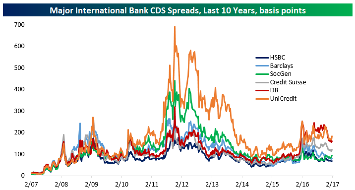
We should also point out that none of the six banks we’ve picked have seen their share prices make new all-time highs when priced in USD. Indeed, UniCredit (the largest Italian bank by assets) still has an equity price over 90% lower than it did pre-crisis. While HSBC has held up okay (from the perspective of a US investor), it’s well off post-crisis highs and remains dramatically lower than it traded in 2007. Again, concerns over profitability, capital, asset quality, and European politics are all risk factors that the European banks have to contend with which don’t have as large of an impact on US banks.
Want to see more of our market research? Start a 14-day free trial today.
Remarkably the average CDS spread for European banks we’ve highlighted is almost as high as it was the week Lehman Brothers failed! It was higher during the peak of global market concerns in Q1 of 2016, though bank CDS remain well below the spreads seen during the peak of the EZ crisis.
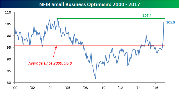
Small Business Optimism Maintains Post-Election Spike
This morning’s release of the NFIB’s monthly report on small business optimism came in higher than expected, rising to 105.9 from last month’s reading of 105.8 and above the consensus expectation of 105. While the index didn’t rise, it did hold on to the post-election surge, which is impressive on its own. At current levels, small business optimism is at the highest level since December 2004 and not far below the post-2000 high of 107.4. Going forward, the improved sentiment on the part of businesses should translate into better economic data. The key word here is should. Any signs that this improved sentiment is not translating into better data will be greeted harshly.
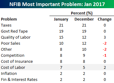 As we do each month, the table to the right summarizes the issues that small businesses consider to be the biggest problems they face in operating their businesses. As is always the case, the two issues topping the list this month are Taxes (21%) and Government Red Tape (19%), which account for a combined 40% of all responses. Next on the list is Quality of Labor, which was cited by 15% of respondents, up from 12% last month. Along with lower labor quality, business owners are also increasingly having problems with labor costs, as that was the only other problem to register a m/m increase. It’s just one month, but that is something to watch going forward. A continued increase could lead to upward pressure on wages.