Ackman Ends the Valeant Nightmare
Learn more about Bespoke’s research and wealth management services.
While everyone has had their share of losing trades during their career, the most high profile losing trade over the last year or so has been Pershing Square’s long position in Valeant Pharmaceuticals (VRX). After establishing a position in the stock back in Q1 of 2015, VRX was initially a profitable trade for Pershing — briefly trading above $250 before coming crashing down in the second half of 2015, into 2016, and then into this year. All along the way, the big question everyone was asking was, “Will Ackman sell now?” For well over a year, the answer to that question was no, but just today after the close, news hit the tape that Pershing has liquidated its position in VRX at a price of $11, which is more than 9% below Monday’s closing price. With Ackman and Pershing Square now out of the nightmare position in VRX, we’ve heard a number of people ask whether this may mark some sort of short term bottom as a former large holder finally cries uncle.
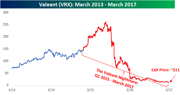
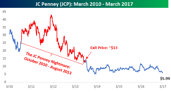
For some guidance on how VRX may react, it might help to look how another big, high profile losing trade for Pershing Square played out a few years back. That trade concerned JC Penney (JCP). In the case of JCP, Pershing first started acquiring a position in the stock back in October 2010. Like the VRX trade, JCP initially worked out well, but beginning in early 2012, it quickly began to sour as CEO Ron Johnson’s vision for the company wasn’t boosting sales, but in fact hurting them.
In August 2013, Pershing Square decided to cut its losses in JCP at a price of around $13. Just like now, back then a lot of people wondered if the fund’s sale would mark a low for the stock. As shown in the chart below, though, while JCP was a big loser for Pershing, it could have been worse…a lot worse. Within two months of Pershing’s sale, JCP lost another 50% of its value, falling to $6.42. Now three years later, JCP is even lower still, closing at $5.99 on Monday. Over this period, the S&P 500 is up 45%. If you are thinking about jumping into VRX now that Ackman is out, hopefully you can come up with a better reason.
To see Bespoke’s full line of macro and micro research, sign up for one of our premium membership options today! You won’t be disappointed.
B.I.G. Tips – S&P 500 Decile Analysis
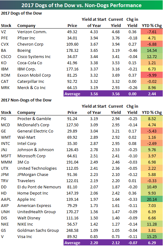
2017 Dogs of the Dow
Learn more about Bespoke’s research and wealth management services.
The “Dogs of the Dow” crushed it in 2016, but they’ve gotten off to a slow start in 2017. Below is a table of 2017’s Dogs, which are the 10 highest yielding stocks in the Dow 30 at the start of the year. (Read more about the Dogs of the Dow strategy here.) We also include a list of the 20 non-Dogs along with their YTD performance.
As shown, this year’s Dogs are up an average of 2.44% year-to-date. That compares to an average YTD gain of 6.29% for the 20 non-Dogs. Four of the ten Dogs are in the red so far this year, with Exxon Mobil (XOM) down the most at -9.99%. Just three of the twenty non-Dogs are in the red, with General Electric (GE) down the most at -5.43%.
We’ll provide another update on the “Dogs” strategy in a couple of months, so be sure to check back if you’re interested.
To see Bespoke’s full line of macro and micro research, sign up for one of our premium membership options today! You won’t be disappointed.
Microsoft IPO – 31 Years and a Lot of Big Winners Later
Learn more about Bespoke’s research and wealth management services.
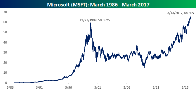
Today marks the 31st anniversary of Microsoft’s (MSFT) IPO back on 3/13/1986. You don’t need us to tell you what a great run it has been for MSFT shareholders, but just to remind you, if you invested $10,000 into MSFT at the IPO, that investment would be worth $6,646,604.94 today, and that doesn’t even include dividends! Not a bad investment even for a 31-year time frame. What’s even more interesting about MSFT over the last 31 years, though, is how the company has been able to reinvent itself from a PC-centric company to more of a cloud-based company. It’s hard enough for a small company to reinvent itself, but for a company that was once the largest in the world to lose a lot of its relevance and then shift focus and move back into a leadership role is nearly unheard of. Apple (AAPL) is a name that quickly comes to mind, but other examples of such a reinvention are few and far between.
The chart below does a good job of showing the rise, fall, and rise again of Microsoft over the last 30 years. As shown, it’s been anything but a straight line. As far back as December 1999, the stock was less than $5 from its current level before its share price dropped 75%. Whereas a $10K investment in MSFT at the IPO is worth $6.7 million today, a $10k investment back in December 1999 would only leave you with $10,900 excluding dividends.
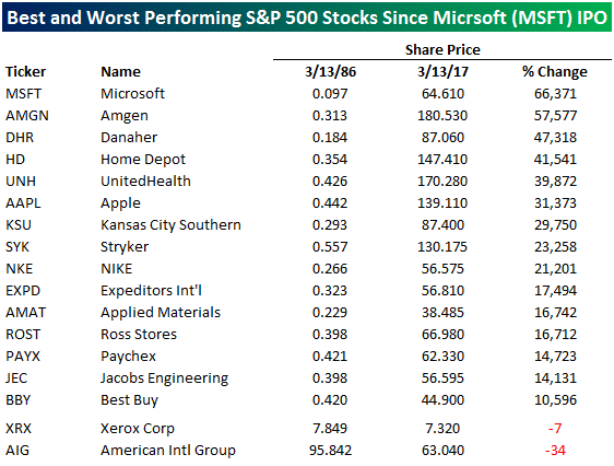
Since the MSFT IPO 31 years ago, no other current member of the S&P 500 has had a better run than Mr. Softee. The table below lists the fifteen current members of the S&P 500 that were around at the time of the MSFT IPO who have seen their share price increase by more than 10,000%. We also show the two stocks — American International Group (AIG) and Xerox (XRX) — that have actually seen their share price decline during the same time period. Remember, this is a list of current S&P 500 stocks that were public back in 1987. Obviously there are a lot of companies that were around in 1986 that have declined, gone out of business, and/or are no longer public.
As far as the two losers cited, if a company has seen its share price decline over a 31-year stretch, there isn’t much you can say. As far as the winners are concerned, there are a lot of household names. A name like Amgen (AMGN) has rallied 57,577% since March 1986, while Home Depot (HD) has gained over 40,000%. Surprisingly, Apple ranks just sixth on the list with a gain of 31,373%. Finally, while these days it seems like just about every retailer besides Amazon.com (AMZN) has fallen on hard times, there are actually two retailers — Best Buy (BBY) and Ross Stores (ROST) — that made the list. The way things have been going for the sector, though, we wonder if they will be able to hold on to these gains a year from now.
To see Bespoke’s full line of macro and micro research, sign up for one of our premium membership options today! You won’t be disappointed.
Stock Seasonality Report – 3/13/17
Chart of the Day – NXPI Chart of the Day Update
S&P 500 Sector Weights — A Lot Has Changed in Eight Years
Learn more about Bespoke’s research and wealth management services.
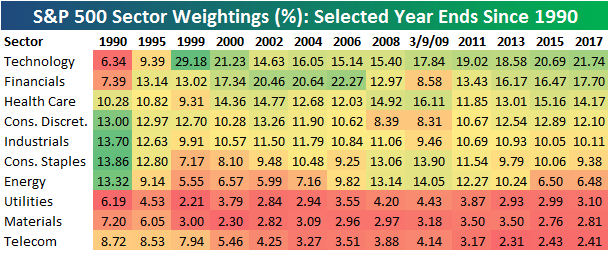
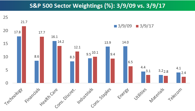
March 9th marked the 8-year anniversary since the 2009 Financial Crisis lows, and one of the topics we wanted to write about surrounding the 8-year mark was S&P 500 sector weightings. Below is a table highlighting the percentage weighting of each sector as of the end of each year shown. We’ve included weightings as of the close on 3/9/09 (the “low”) as well.
Back in 1990, there were four sectors at the top of the food chain — Consumer Discretionary, Consumer Staples, Industrials, and Energy. The Technology sector had the second smallest weighting at just 6.34%, while the Financial sector was the fourth smallest. As the 1990s progressed, the US continued a huge shift from primarily a manufacturing economy to a services economy. Once the Dot Com bubble took hold, the Technology sector’s weighting shot up, and the Financial sector trailed it higher. By the end of the 90s, the Technology sector’s weighting had ballooned to 29.18%, which was more than 16 percentage points larger than the next closest sector. That was clearly not sustainable, and within 3 years the Tech sector’s weighting was more than cut in half.
From 2002 through 2006, the Financial sector had the largest weighting in the economy. At the end of 2006, the Financials made up 22.27% of the S&P 500, which was more than 7 percentage points above the next closest sector. The Financial sector exists to service the economy, and that fact alone should tell you that something isn’t right when the Financial sector is by far the largest sector of the market. Cue the Financial Crisis…
From the end of 2006 through the low on March 9th, 2009, the Financial sector’s weighting in the S&P dropped from 22.27% to 8.58%. At the lows, the Financial sector had dropped from the largest sector to the fifth smallest.
Over the last 8 years, we’ve seen the Technology sector remain on top the whole time, and as of March 2017, it’s weighting stands at 21.74%. That’s not nearly as elevated as it was in 1999, but it is starting to creep up to levels that make you squeamish.
We mentioned early on that back in 1990, the four largest sectors were Consumer Discretionary, Consumer Staples, Industrials, and Energy. Fast forward 27 years to today, and those four sectors are now the 4th through 7th largest. Technology, Financials, and Health Care currently hold the top three spots — making up nearly 54% of the market. The bottom three sectors make up less than 9% of the market today, while the bottom three made up 20% back in 1990. Along with the shift from manufacturing to services, the economy today is much more top heavy.
(One thing to note is that in 2016, S&P added the “Real Estate” sector in order to remove REITs from the Financial sector. In order to make an apples to apples comparison from a historical perspective, we’ve added the Real Estate sector’s current weighting back into the Financial sector.)
To see Bespoke’s full line of macro and micro research, sign up for one of our premium membership options today! You won’t be disappointed.
ETF Trends: Fixed Income, Currencies, and Commodities – 3/13/17
Oil ETFs are up a bit intraday to day but have fallen out of bed versus where they were a week ago. Oil-related stocks have also declined, while silver, REITs, and Russia have also underperformed sharply. Natural gas has risen steadily over the last week or so, along with junior gold miners, Israeli stocks, and homebuilders.

Bespoke provides Bespoke Premium and Bespoke Institutional members with a daily ETF Trends report that highlights proprietary trend and timing scores for more than 200 widely followed ETFs across all asset classes. If you’re an ETF investor, this daily report is perfect. Sign up below to access today’s ETF Trends report.
See Bespoke’s full daily ETF Trends report by starting a no-obligation free trial to our premium research. Click here to sign up with just your name and email address.
Bespoke’s Financial Conditions Index Hits New High
Each month, Bespoke runs a survey of 1,500 US consumers balanced to census. In the survey, we cover everything you can think of regarding the economy, personal finances, and consumer spending habits. We’ve now been running the monthly survey for more than two years, so we have historical trend data that is extremely valuable, and it only gets more valuable as time passes. All of this data gets packaged into our monthly Bespoke Consumer Pulse Report, which is included as part of our Pulse subscription package that is available for either $39/month or $365/year. We highly recommend trying out the service, as it includes access to model portfolios and additional consumer reports as well. If you’re not yet a Pulse member, click here to start a 30-day free trial now!
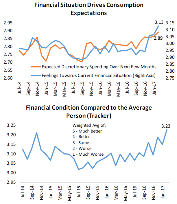
The first chart below highlights the monthly results of two questions that we ask survey takers. The first asks them about their expected discretionary spending over the next few months, while the second asks them for their feelings towards their current financial situation. In our most recent monthly survey, we saw a continuation of the positive sentiment that respondents have felt about their financial situations. This is a key driver for expected discretionary spending over the next few months, which has also been increasingly positive in our survey. Over the next few months, we should see this trickle through to higher activity across all spending categories. While the fundamentals of consumer strength have also looked solid, we believe perceived financial condition is far more important, as the first chart below demonstrates.
Not only have respondents felt much better about their own financial condition recently, but they feel that they are in better financial condition relative to other consumers. The second chart below shows that perceived financial conditions relative to the average person has hit a new high in our survey series. While this may not seem significant, it indicates that “animal spirits” are really accelerating for the US consumer.
To track additional consumer sentiment trends, click here to start a 30-day free trial to our Pulse service now!
Bespoke Brunch Reads: 3/12/17
Welcome to Bespoke Brunch Reads — a linkfest of the favorite things we read over the past week. The links are mostly market related, but there are some other interesting subjects covered as well. We hope you enjoy the food for thought as a supplement to the research we provide you during the week.
Social Science
Is It Better to Be Poor in Bangladesh or the Mississippi Delta? by Annie Lowery (The Atlantic)
An interview with the most recent Nobel laureate in economics, Angus Deaton, dives into some of the complications, contradictions, and tragedies of policy outcomes in the US. [Link]
Quarterly Review, March 2017 (Bank for International Settlements)
A huge compendium of new research from the BIS staff with investigations of risk appetite, global financial flows, consumption, credit loss provisioning, payments, and the use of swaps at the long end of the yield curve. [Link]
A Public-Health Crisis That We Can Fix by David Leonhardt (NYT)
US traffic deaths are surging higher after years of steep declines, thanks to the incessant use of cell phones by drivers who should be watching the road. [Link; soft paywall]
Risk Factors
Cyxtera adds protection against looming U.S. tax changes by Jonathan Schwarzberg and Lynn Adler (Reuters)
Buyers of leveraged loans have a new risk factor to consider when scrutinizing bond documents. Data center operator Cyxtera added language to a new issue that would allow it to call loans in the three-tranche deal in the event legislation removing the tax-deductible status of interest payments is enacted; such language is under consideration for the Republican tax reform package. [Link]
Architecture
Google’s New Circus Tent Campus Approved, Construction To Begin In April by Jay Barman (SFist)
The newest addition to Google’s Mountain View campus evokes the circus visits of childhood, with expected completion two years from now. [Link]
Transportation Trouble
Waymo Asks Court to Block Uber’s Self-Driving Car Project by Daisuke Wakabayashi (NYT)
In an odd turn of events, a former Google subsidiary is suing a Google Ventures portfolio company over technology allegedly stolen by a former employee. [Link; soft paywall]
Repairing My Tesla Model S Has Been an Utter Nightmare — and It’s Mostly Tesla’s Fault by Evan Niue (The Motley Fool)
Tesla performs repairs on its vehicles, and that’s a problem for this owner who has had a frankly unbearable struggle trying to get his repaired after being rear-ended. [Link]
CIA ‘mission’ on cars shows concern about next-generation vehicles by Alexandria Sage (Yahoo!/Reuters)
One part of the new Wikileaks release of CIA documents shows that the CIA considered a “mission” against connected car technology, prompting concern from manufacturers and watchdogs. [Link]
Update On Asia
Trump Inherits a Secret Cyberwar Against North Korean Missiles by David E. Sanger and William J. Broad (NYT)
A painstakingly researched story about the secret digital tools deployed against North Korea by the Obama Administration, and what that means for the current flare-up in regional tensions. [Link; soft paywall]
Capital controls the talk of China parliamentarians by Emily Feng and Tom Mitchell (FT)
At last week’s annual meeting of China’s National People’s Congress, concerns and frustration over the ratcheting up of capital controls was a hot topic. [Link; paywall]
Millennial Movers Breathe New Life Into Japanese Mountain Towns by Keik Ujikane and Masahiro Hidaka (Bloomberg)
Rejecting urban intensity as industrial strategy: rural areas in Japan faced with challenging demographics (a rapidly aging population) are trying to draw young white color workers and businesses requiring low-intensity manual labor into the hollowing out interior of some Japanese islands. [Link]
Sustainability
A Single Bitcoin Transaction Takes Thousands of Times More Energy Than a Credit Card Swipe by Christopher Malmo (Motherboard)
Even at the current scale (relatively small), Bitcoin devours energy at a breathtaking pace; the computational needs of the blockchain require enormous amounts of electricity to function properly. [Link]
UK carbon emissions fall to late-19th century levels by Pilita Clark (FT)
Thanks in part to plunging coal consumption, UK CO2 emissions are collapsing on an outright basis, currently at the lowest level since the Great Depression and in about the same place they were in the late 1890s. [Link; paywall]
Investing
The Golden Age of Hedge Funds by Ben Carlson (CFA Institute)
Alpha is always scarce, but when thousands of new funds and billions of new AUM start competing for it, its life expectancy goes to almost zero. So it is in the world of hedge funds. [Link]
Individual Investors Wade In as Stocks Soar by Aaron Kuriloff and Daisy Maxey (WSJ)
In the aftermath of the financial crisis, smaller investors were very hesitant to buy into the rising stock market for fear of another crash. Now, with stock valuations elevated and the economic cycle much longer in the tooth, they’re piling in. [Link; paywall]
Regulatory Revision
Gutting Dodd-Frank Is Hard, So Republicans Focus Elsewhere by Elizabeth Dexheimer (Bloomberg)
Banks have seen valuations basically double over the past year as the market bids up prospects of higher net income thanks to deregulation from the new Administration. The reality on the ground, on the other hand, is much different. [Link; auto-playing video]
Clarifying the Choices in Housing Finance Reform by Jim Parrott (Urban Institute)
A fine effort at clarifying competing ideas for how housing finance ought to work, with three different approaches laid out and compared. [Link]
Turnarounds
Kony 2017: From Guerrilla Marketing to Guerrilla Warfare by David Gauvey Herbert (Foreign Policy)
After achieving a global viral moment in 2012, nonprofit Invisible Children was widely criticized. Since, its taken a radically different approach to its mission with radically different results. [Link]
Struggling shopping malls let high schools, doctors move in where Penney’s used to be by Tonya Garcia (MarketWatch)
While occupancy rates remain extremely high, mall landlords are being forced to turn to nontraditional renters to keep their square footage filled. [Link]
Sports
Men’s & Women’s College Basketball: ESPN Blankets Networks with 24-Hour Tournament Challenge Marathon on March 13-14 by Rachel Margolis Siegal (ESPN MediaZone)
Save a thought for the brutal basketball binge that Rece Davis, Jay Bilas, Seth Greenberg, and Jay Williams will be forced to consume in a 24-hour straight lineup of appearances. [Link]
Writing
What writers really do when they write by George Saunders (The Guardian)
Adding context adds humanity and room for understanding; the more specific we are about what we are communicating, the more likely we are for other people to understand the nuance of our words. [Link]
Easy Money
Blank book about Democrats is No. 1 bestseller on Amazon by Yaron Steinuch (NYPost)
A joke book – with all blank pages – purporting to argue good reasons to vote for Democrats is currently the best-selling book online. [Link]
Have a great Sunday!