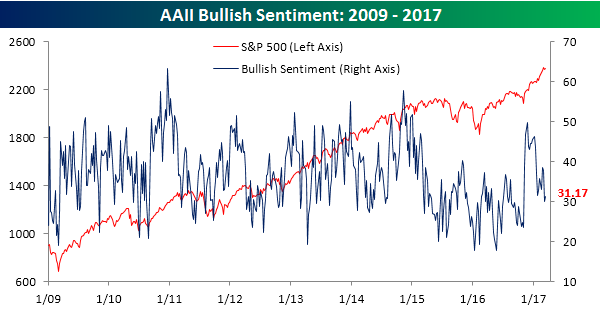
Little Increase in the Bullish Camp
The latest sentiment figures from AAII were released earlier this morning, and as has been the case for years (yes, years!), bulls are still far from a majority. Heck, at current levels they aren’t even at a third of the total! After falling to a post-election low of 30% last week, bullish sentiment increased a measly 1.17 percentage points to 31.17%. This marks a record 115 weeks where bulls have been out of the majority. We’ll be the first to agree that overall market sentiment hasn’t been as positive as it has during prior bull markets, but this continued lack of bullish sentiment in the AAII survey seems like an outlier.
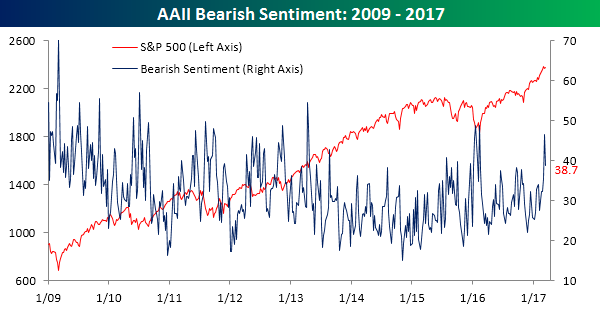
While bullish sentiment saw little in the way of a bounce, bearish sentiment saw a sharp decline, falling from 46.5% to 38.7%, which was actually the largest weekly decline since early October.
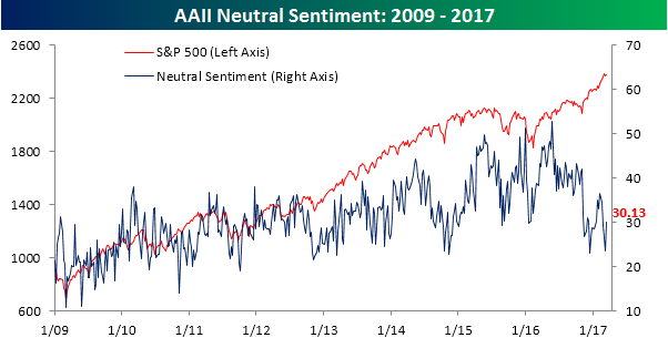
With all of those investors leaving the bearish camp but not ready to commit to the bullish side, ‘neutrals’ ballooned up to 30.13%. With that increase, all three camps are once again bunched up in the 30% decile. Individual investors just need to make up their minds already!
ETF Trends: US Sectors & Groups – 3/16/17
In the wake of the Fed’s dovish hike yesterday we’ve seen a “rally in everything”. Indeed, only 15 of the more than 200 ETFs we track were down over the past week. Gold miners and EM were some of the biggest winners while Energy and Oil are down over the past week thanks to big moves lower in WTI up until yesterday.

Bespoke provides Bespoke Premium and Bespoke Institutional members with a daily ETF Trends report that highlights proprietary trend and timing scores for more than 200 widely followed ETFs across all asset classes. If you’re an ETF investor, this daily report is perfect. Sign up below to access today’s ETF Trends report.
See Bespoke’s full daily ETF Trends report by starting a no-obligation free trial to our premium research. Click here to sign up with just your name and email address.
B.I.G. Tips – Death by Amazon – 3/16/17
Chart of the Day: Lithium Love
the Bespoke 50 — 3/16/17
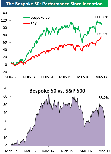
Every Thursday, Bespoke publishes its “Bespoke 50” list of top growth stocks in the Russell 3,000. Our “Bespoke 50” portfolio is made up of the 50 stocks that fit a proprietary growth screen that we created a number of years ago. Since inception in early 2012, the “Bespoke 50” has beaten the S&P 500 by 38 percentage points. Through today, the “Bespoke 50” is up 113.8% since inception versus the S&P 500’s gain of 75.6%.
To view our “Bespoke 50” list of top growth stocks, sign up for Bespoke Premium ($99/month) at this checkout page and get your first month free. This is a great deal!
The Closer — Fed Steals Third — 3/15/17
Log-in here if you’re a member with access to the Closer.
Looking for deeper insight on global markets and economics? In tonight’s Closer sent to Bespoke Institutional clients, we recap the Fed’s decision to raise rates for the third time this cycle. Included is analysis of the statement and Chair Yellen’s press conference as well as 6 pages of charts to fully recap intraday asset price moves in response to the decision. We also update our coverage of inflation with analysis of the CPI report from today.

The Closer is one of our most popular reports, and you can sign up for a free trial below to see it!
The Closer is one of our most popular reports, and you can see it and everything else Bespoke publishes by starting a no-obligation 14-day free trial to our research!
Global Equities Back to Overbought
US equities posted nice gains following the Fed’s rate hike this afternoon. The same was true for country ETFs outside of the US. Both the Russian stock market (RSX) and the Mexican stock market (EWW) posted gains of 3%+ today.
Below is an updated look at our trading range screen for the 30 largest country ETFs traded on US exchanges. For each country, the dot represents where it’s currently trading, while the tail end represents where it was trading one week ago. The black, vertical “N” line represents each country’s 50-day moving average, and moves into the red or green zones are considered “overbought” or “oversold.”
A week ago, only 7 of 30 country ETFs in our screen were trading in overbought territory, but after today’s move, that number is back up to 23 of 30. Pretty much all regions of the world are extended well above their 50-day moving averages again. South Africa (EZA), Spain (EWP), France (EWQ), and South Korea (EWY) are four of the most extended.
Just 5 country ETFs are currently below their 50-days — Canada (EWC), Colombia (GXG), Russia (RSX), Thailand (THD), and Vietnam (VNM) — and just 2 of those 5 are oversold (Colombia and Russia). And even though Russia is still oversold, it has seen a huge jump higher within its range over the last week, just like pretty much every other country.
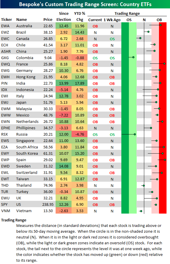
Chart of the Day: Beware the Ides of March?
Fixed Income Weekly – 3/15/17
Searching for ways to better understand the fixed income space or looking for actionable ideals in this asset class? Bespoke’s Fixed Income Weekly provides an update on rates and credit every Wednesday. We start off with a fresh piece of analysis driven by what’s in the headlines or driving the market in a given week. We then provide charts of how US Treasury futures and rates are trading, before moving on to a summary of recent fixed income ETF performance, short-term interest rates including money market funds, and a trade idea. We summarize changes and recent developments for a variety of yield curves (UST, bund, Eurodollar, US breakeven inflation and Bespoke’s Global Yield Curve) before finishing with a review of recent UST yield curve changes, spread changes for major credit products and international bonds, and 1 year return profiles for a cross section of the fixed income world.
In this week’s note, we examine the return of carry and roll in the front end of global interest rate markets.
Our Fixed Income Weekly helps investors stay on top of fixed income markets and gain new perspective on the developments in interest rates. You can sign up for a Bespoke research trial below to see this week’s report and everything else Bespoke publishes free for the next two weeks!
Click here to start your no-obligation free Bespoke research trial now!
ETF Trends: Hedge – 3/15/17
Emerging markets are common at the top of our best performers list, with South Korea, India, and South Africa all featuring prominently. European equities continue to outperform, while metals and steel producers have recovered somewhat. Oil prices have risen in the last 24 hours but are still down significantly WoW, with Transports, MLPs, and precious metals also underperforming.
Bespoke provides Bespoke Premium and Bespoke Institutional members with a daily ETF Trends report that highlights proprietary trend and timing scores for more than 200 widely followed ETFs across all asset classes. If you’re an ETF investor, this daily report is perfect. Sign up below to access today’s ETF Trends report.
See Bespoke’s full daily ETF Trends report by starting a no-obligation free trial to our premium research. Click here to sign up with just your name and email address.