Bespoke’s Sector Snapshot — 3/30/17
We’ve just released our weekly Sector Snapshot report (see a sample here) for Bespoke Premium and Bespoke Institutional members. Please log-in here to view the report if you’re already a member. If you’re not yet a subscriber and would like to see the report, please start a 14-day trial to Bespoke Premium now.
Below is one of the many charts included in this week’s Sector Snapshot, which highlights our trading range screen for the S&P 500 and ten sectors. The black vertical “N” line represents each sector’s 50-day moving average, and as shown, three sectors — Energy, Financials, and Telecom — are currently below their 50-days. Only two sectors — Consumer Discretionary and Technology — remain overbought. (The red zone is considered overbought territory, while the green zone is considered oversold territory.)
To see our full Sector Snapshot with additional commentary plus six pages of charts that include analysis of valuations, breadth, technicals, and relative strength, start a 14-day free trial to our Bespoke Premium package now. Here’s a breakdown of the products you’ll receive.
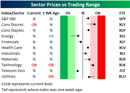
Chart of the Day: Rupee Ripping
the Bespoke 50 — 3/30/17
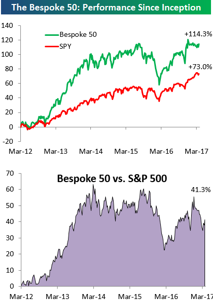
Every Thursday, Bespoke publishes its “Bespoke 50” list of top growth stocks in the Russell 3,000. Our “Bespoke 50” portfolio is made up of the 50 stocks that fit a proprietary growth screen that we created a number of years ago. Since inception in early 2012, the “Bespoke 50” has beaten the S&P 500 by 41 percentage points. Through today, the “Bespoke 50” is up 114.3% since inception versus the S&P 500’s gain of 73.0%. Always remember, though, that past performance is no guarantee of future returns.
To view our “Bespoke 50” list of top growth stocks, sign up for Bespoke Premium ($99/month) at this checkout page and get your first month free. This is a great deal!
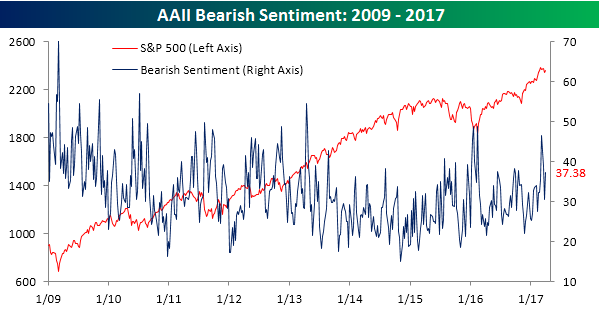
Individual Investors Turn Sour Again
After two straight weeks where individual investor sentiment saw some improvement, this week’s survey from AAII showed that individual investors returned to their bearish ways. In last week’s survey, bullish sentiment reached as high as 35.28% (which is still low by historical norms), but this week nearly all of the last two weeks of improved sentiment was erased as bullish sentiment barely held on to 30%, falling just over five percentage points to 30.22%. For those keeping score at home, it has now been 117 weeks since more than half of individual investors were in the bullish camp.
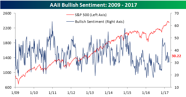
On the other side of the ledger, bearish sentiment ticked higher this week, rising from 30.5% up to 37.4%. In the last two weeks, we had seen some moderating in the bearish tone of individual investors, but it looks like they are getting right back to their bearish ways.
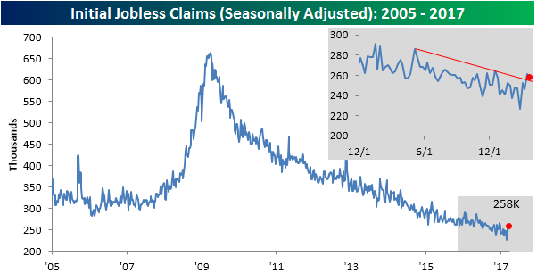
Another Disappointing Jobless Claims Report
When it comes to economic indicators, it used to be that weekly jobless claims were one of the most reliable to deliver a positive report. In recent weeks, though, that hasn’t been the case as claims have come in higher than expected in each of the last four weeks. In this week’s report, economists were expecting the headline reading to come in at a level of 247K from last week’s reading of 261K, but the actual decline was smaller at just 3K to 258K. The last time jobless claims have been higher than expected four weeks in a row was back in January of last year, and to find the last time claims exceeded forecasts for five straight weeks, you have to go all the way back to November 2013. Despite the weaker than expected readings, however, we would still note that claims remain very low, coming in below 300K for the last 108 weeks.
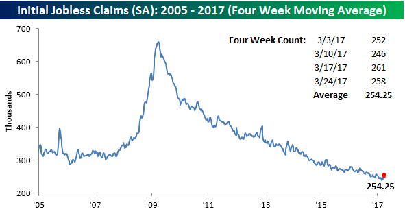
The four-week moving average also saw quite an increase this week, rising from 246.5K up to 254.25K. That 7.75K increase is the largest one-week jump in the four-week moving average since February 2015.
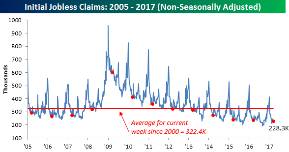
On a non-seasonally adjusted basis, jobless claims still remain encouraging. This week’s print came in at 228.3K, which was the lowest level for the current week of the year since 1973 and 94K below the average level of 322.4K for the current week of the year dating back to 2000.
The Closer — Negative NIIP — 3/29/17
Log-in here if you’re a member with access to the Closer.
Looking for deeper insight on global markets and economics? In tonight’s Closer sent to Bespoke Institutional clients, we dive into the quarterly net international investment position data from the BEA. We also take a look at oil inventory data and S&P 500 Energy valuation.

The Closer is one of our most popular reports, and you can sign up for a free trial below to see it!
The Closer is one of our most popular reports, and you can see it and everything else Bespoke publishes by starting a no-obligation 14-day free trial to our research!
Chart of the Day: Smart Money Checkup
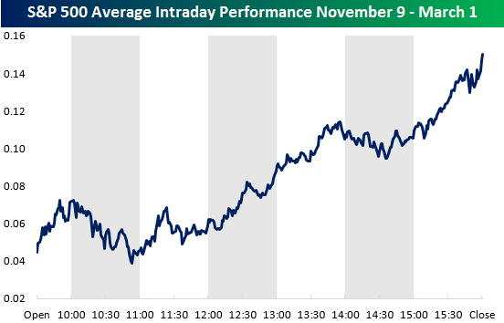
The “Smart Money Indicator” suggests that the “smart money” trades at the end of the trading day once all of the day’s events have shaken out, while the “dumb money” trades at or near the open in reaction to the day’s news. We like to track the intraday action of the market over time. While we’re not totally on board with the “Smart Money” theory, we do like to see the market finishing the trading day strong. Buying in the final hour or two of the trading day means investors are comfortable owning shares overnight. A market that opens up strong and then drifts lower throughout the trading day is one we’d prefer to avoid.
Below is a chart showing the average intraday pattern that the S&P 500 took from the close on Election Day 2016 (11/8/16) through the index’s last all-time closing high made on March 1st. This was a period where the market experienced a major move higher, and aside from slight pullbacks from 10 AM to 11 AM ET and 2PM to 2:30 PM, investors were buying, buying, buying all day long. The buying was especially strong in the final hour of trading, which suggests institutional investors were rushing to put money to work. The post-election move through the end of February was a massive buying event that brought quite a bit of new money into the market.
So how has the intraday pattern looked since the market peaked on March 1st? Have investors been selling into the close or stepping in to “buy-the-dip” late in the day? In today’s Chart of the Day (available to all paid clients), we answer these two questions and provide a chart of the S&P’s intraday pattern during the month of March. Start a no-obligation two-week free trial to Bespoke’s research platform to see the report now.
B.I.G. Tips – Economic Indicator Diffusion Index Near 52-Week Highs
Fixed Income Weekly – 3/29/17
Searching for ways to better understand the fixed income space or looking for actionable ideals in this asset class? Bespoke’s Fixed Income Weekly provides an update on rates and credit every Wednesday. We start off with a fresh piece of analysis driven by what’s in the headlines or driving the market in a given week. We then provide charts of how US Treasury futures and rates are trading, before moving on to a summary of recent fixed income ETF performance, short-term interest rates including money market funds, and a trade idea. We summarize changes and recent developments for a variety of yield curves (UST, bund, Eurodollar, US breakeven inflation and Bespoke’s Global Yield Curve) before finishing with a review of recent UST yield curve changes, spread changes for major credit products and international bonds, and 1 year return profiles for a cross section of the fixed income world.
In this week’s note, we take a look at the US Treasury term structure and what’s likely to drive curve moves going forward.
Our Fixed Income Weekly helps investors stay on top of fixed income markets and gain new perspective on the developments in interest rates. You can sign up for a Bespoke research trial below to see this week’s report and everything else Bespoke publishes free for the next two weeks!
Click here to start your no-obligation free Bespoke research trial now!
Gas Prices Sputtering Along
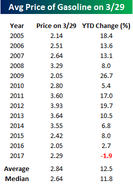 It’s been awhile since we last provided an update on national average gas prices, but recent trends are definitely worth highlighting. The table to the right shows the YTD change in gas prices based on AAA data this year and at the same point in each prior year dating back to 2005. With average prices at the pump down nearly 2% on the year, this is the first year where prices have actually been down YTD at this point in the year. This is a pretty big divergence from the overall average gain of 12.5% that is normal for this point in the year. Looking at the year by year returns, there has definitely been a trend in recent years where prices didn’t start off the year as strong as they have in the past, but this year’s decline is a bit extreme.
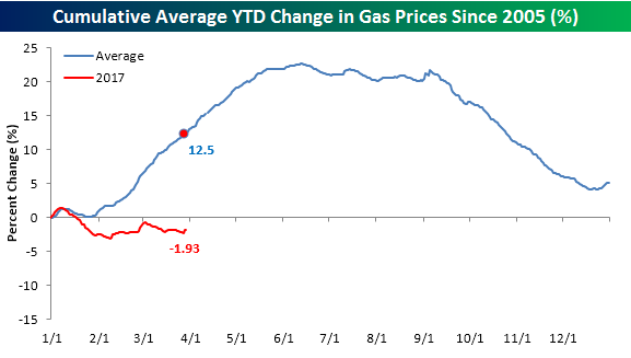
The chart below further illustrates this trend as it compares changes in prices YTD this year to a composite of the average YTD change for all prior years since 2005. By this point in the year, prices are typically already in rally mode leading up to the summer driving season. With oil prices weak this year, though, that seasonal lift has yet to materialize.
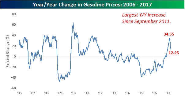
Finally, the chart below shows the year/year (y/y) change in gas prices going back to 2006. After prices bottomed in early 2016, the y/y change in prices began to recover and quickly accelerated to the upside the further away we moved from the lows. In late 2016, the y/y change in prices turned positive for the first time in over two years, and then quickly spiked to over 30% in February. As quickly as that y/y change increased, though, it has been declining even faster and is now just barely in double-digits at 12.25%, and if prices don’t start accelerating to the upside the y/y change will likely fall back to negative levels. The reason this is important is that it illustrates a trend we have seen throughout the commodity space in recent months, where base effects have had an exaggerated impact on y/y prices changes. Now that those low levels are falling further out than a year, though, the percentage changes are looking a lot less dramatic. This is also likely to start showing up in inflation statistics which have recently been lifting to multi-year highs on a y/y basis. Going forward, though, some of that upward pressure is likely to subside.