The Bespoke Report — 7/7/17
Bespoke Global Macro Dashboard — 7/7/17
Bespoke’s Global Macro Dashboard is a high-level summary of 22 major economies from around the world. For each country, we provide charts of local equity market prices, relative performance versus global equities, price to earnings ratios, dividend yields, economic growth, unemployment, retail sales and industrial production growth, inflation, money supply, spot FX performance versus the dollar, policy rate, and ten year local government bond yield interest rates. The report is intended as a tool for both reference and idea generation. It’s clients’ first stop for basic background info on how a given economy is performing, and what issues are driving the narrative for that economy. The dashboard helps you get up to speed on and keep track of the basics for the most important economies around the world, informing starting points for further research and risk management. It’s published weekly at the Bespoke Institutional membership level.
Click here to start a no-obligation two-week free trial to Bespoke Institutional!

S&P 500 Quickview Chart Book — 7/7/17
Facebook (FB) Age Problem
Each month, Bespoke runs a survey of 1,500 US consumers balanced to census. In the survey, we cover everything you can think of regarding the economy, personal finances, and consumer spending habits. We’ve now been running the monthly survey for more than three years, so we have historical trend data that is extremely valuable, and it only gets more valuable as time passes. All of this data gets packaged into our monthly Bespoke Consumer Pulse Report, which is included as part of our Pulse subscription package that is available for either $39/month or $365/year. We highly recommend trying out the service, as it includes access to model portfolios and additional consumer reports as well. If you’re not yet a Pulse member, click here to start a 30-day free trial now!
Along with valuable macro analysis, our Pulse survey also covers groups and sectors like smartphones, e-commerce, streaming media, and social media. Having long-term data on these sectors allows us to identify shifts in consumer activity and sentiment essentially in real time.
Yesterday we published a post featuring a couple of charts that are part of our broader smartphone coverage in our monthly Pulse report. Today we wanted to highlight a couple of interesting charts related to the social media space.
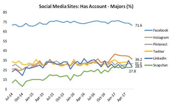
The first chart below shows the historical results from a question we ask consumers (balanced to US census numbers) regarding social media accounts. In our June 2017 survey, 71.6% of consumers reported having a Facebook account. That’s far and away the largest percentage of any social media platform. Instagram (owned by Facebook) ranks second at 36.2%, while Pinterest ranks third at 31.3%. Twitter, LinkedIn, and Snapchat are bunched up together just under the 30% mark.
What’s notable in this chart is the historical trend. Facebook appears to have peaked out at just over 75% and is now trending lower. And up until recently, Instagram had been moving steadily higher, but even Instagram has started to see a decline in those reporting an account on the platform.
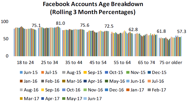
Another issue for Facebook is that younger age groups have started to see a dip in accounts lately. As shown below, the 18 to 24 demographic has been trending lower for the last year, while the 25 to 34 demo has dipped lower over the last few months. The only age groups that have seen a slight increase in accounts in recent months are the 65 to 74 demo and the 75 or older demo. That’s probably not a trend Facebook wants to see.
To see even more of our proprietary social media research, plus coverage of other sectors like streaming media and e-commerce, click here to start a 30-day free trial to our Pulse service now!
ETF Trends: US Indices & Styles – 7/7/17
Agriculture and Coffee continue their strong performance in this week’s best performing ETFs, up 3.5% and just under 2%, respectively. Semiconductors showed improvement as well, up 1% this week after poor performance last week. Oil ETFs were unable to continue the momentum they gained last week and made the transition to our list of worst performers. Other notable underperformers include Natural Gas, Silver, and Gold.

Bespoke provides Bespoke Premium and Bespoke Institutional members with a daily ETF Trends report that highlights proprietary trend and timing scores for more than 200 widely followed ETFs across all asset classes. If you’re an ETF investor, this daily report is perfect. Sign up below to access today’s ETF Trends report.
See Bespoke’s full daily ETF Trends report by starting a no-obligation free trial to our premium research. Click here to sign up with just your name and email address.
The Closer — Tradable Rebound — 7/6/17
Log-in here if you’re a member with access to the Closer.
Looking for deeper insight on global markets and economics? In tonight’s Closer sent to Bespoke Institutional clients, we break down trade data, including a look at which countries are driving US export growth. We also discuss some themes that are playing out in the market currently: outperformance of European equities and the 5th longest bond drawdown of the past 20 years.

The Closer is one of our most popular reports, and you can sign up for a free trial below to see it!
The Closer is one of our most popular reports, and you can see it and everything else Bespoke publishes by starting a no-obligation 14-day free trial to our research!
Bespoke’s Sector Snapshot — 7/6/17
We’ve just released our weekly Sector Snapshot report (see a sample here) for Bespoke Premium and Bespoke Institutional members. Please log-in here to view the report if you’re already a member. If you’re not yet a subscriber and would like to see the report, please start a 14-day trial to Bespoke Premium now.
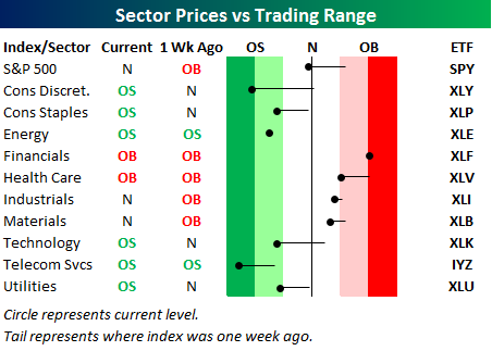
Below is one of the many charts included in this week’s Sector Snapshot, which highlights our trading range screen for the S&P 500 and ten sectors. For each sector, the dot represents where it’s currently trading, while the tail end represents where it was trading one week ago. The black vertical “N” line represents each sector’s 50-day moving average, and moves into the red or green zones are considered overbought or oversold.
As you can see, every sector except Energy and Financials has moved lower within its trading range over the last week. The Consumer Discretionary and Telecom sectors have moved into extreme oversold territory.
To see our full Sector Snapshot with additional commentary plus six pages of charts that include analysis of valuations, breadth, technicals, and relative strength, start a 14-day free trial to our Bespoke Premium package now. Here’s a breakdown of the products you’ll receive.
B.I.G. Tips – June Employment Report Preview
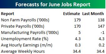
Heading into Friday’s Non Farm Payrolls (NFP) report for June, economists are expecting an increase in payrolls of 179K, which would be a 41K gain from last month’s much weaker than expected reading of 138K. In the private sector, economists are also expecting an increase of 170K, which would represent a modestly smaller gain than the headline number. The unemployment rate is forecasted to remain unchanged at 4.3%. Growth in average hourly earnings is expected to accelerate to 0.3%, while average weekly hours worked is also forecast to remain unchanged at 34.4.
Ahead of the report, we just published our eleven-page monthly preview for the April jobs report. This report contains a ton of analysis related to how the equity market has historically reacted to the monthly jobs report, as well as how secondary employment-related indicators we track looked in September. We also include a breakdown of how the initial reading for September typically comes in relative to expectations and how that ranks versus other months.
One topic we cover in each month’s report is the S&P 500 stocks that do best and worst from the open to close on the day of the employment report based on whether or not the report comes in stronger or weaker than expected. In other words, which stocks should you buy, and which should you avoid? The table below highlights the best-performing stocks in the S&P 500 from the open to close on days when the Non-Farm Payrolls report has been better than expected over the last two years. Of the 25 top performing stocks, seven sectors are represented, and Technology leads the way with seven. One of the top performing and consistently positive stocks on these days is Qorvo (QRVO) which as seen an average gain of 2.28% with positive returns 90% of the time.
For anyone with more than a passing interest in how equities are impacted by economic data, this report is a must read. To see the report, sign up for a monthly Bespoke Premium membership now!
Electric Cars On Sale
Over the last few days, Elon Musk’s Tesla (TSLA) has gotten hit, and hit hard. After an all-time high close of $383 on June 23rd, the stock has gone down almost every day and the last three have been particularly brutal with falls of 2.5%, 7.2%, and 4.5% (as of the time of this writing). In the course of that decline, the 14-Day RSI (a measure of momentum) has crept closer to deeply oversold territory around 30, and as of this writing, it stood at 31.5, the lowest since September of last year. Many technicians like to look at extreme RSI readings as a way to gauge mean-reversion: it’s hard for an oversold stock to stay oversold for long periods of time.
In the case of TSLA, though, buying the dip because it’s created an oversold condition might not work. In the table below, we show average 1y forward returns for all periods since TSLA’s IPO. When a period has an RSI of less than the period listed, it is included in the average return calculation. So for all days (0.2% of the total) when TSLA has had an RSI less than 20, it’s generated an average 1y forward return of 91.3%. As shown, the sweet spot for TSLA returns has been when RSI has been neutral, and that’s when most of the trading days have taken place. While the current reading on RSI (31.5) doesn’t necessarily mean there are more big declines to come, there’s also no reason to get fired up about a great entry point based on how the stock has traded in the past.
Another shocking aspect of the table below relates to how strong a stock TSLA has been since its IPO seven years ago. For all eight of the different RSI categories shown, the worst 12-month return is 37.5% (under 30), while every other category has seen an average gain of at least 57%!
Click here to start a no-obligation two-week free trial to our premium research platform.
ETF Trends: Fixed Income, Currencies, and Commodities – 7/6/17
Agriculture headlines our list of best performing ETFs this week, up nearly 5% on a 5 day rolling basis. Banks, Oil, and Steel also outperformed and continue to be fixtures on the left side of this chart. On the losing side, Natural Gas and Silver were the biggest losers along with other notable ETFs Pharma and Real Estate.

Bespoke provides Bespoke Premium and Bespoke Institutional members with a daily ETF Trends report that highlights proprietary trend and timing scores for more than 200 widely followed ETFs across all asset classes. If you’re an ETF investor, this daily report is perfect. Sign up below to access today’s ETF Trends report.
See Bespoke’s full daily ETF Trends report by starting a no-obligation free trial to our premium research. Click here to sign up with just your name and email address.