The Closer: End of Week Charts — 7/21/17
Looking for deeper insight on global markets and economics? In tonight’s Closer sent to Bespoke clients, we recap weekly price action in major asset classes, update economic surprise index data for major economies, chart the weekly Commitment of Traders report from the CFTC, and provide our normal nightly update on ETF performance, volume and price movers, and the Bespoke Market Timing Model. This week, we’ve added a section that helps break down momentum in developed market foreign exchange crosses.

The Closer is one of our most popular reports, and you can sign up for a free trial below to see it!
Click here to start your no-obligation two-week free Bespoke research trial now!
The Bespoke Report — 7/21/17
S&P 500 Quick View Chart Book – 7/21/17
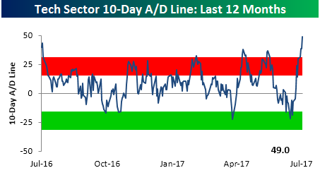
B.I.G. Tips – Tech Sector Breadth Explodes
The chart below appears in each week’s Sector Snapshots report and shows the 10-day advance decline line for the S&P 500 Technology sector over the last year. Throughout the month of June, we saw a steady decline in this reading as it drifted from extreme overbought to oversold levels. Since the beginning of July, however, the fireworks started to fly and breadth has come roaring back to levels not seen in at least a year.
Taking a longer term look at the Technology sector’s 10-day A/D line, would you believe that the reading through yesterday’s close was the fifth best single day reading on record? Also, the only other times we have ever seen a higher reading were also during the month of July. What is it about July and the Tech sector? In a B.I.G Tips report we just sent out to clients, we looked at prior extreme breadth readings for the Technology sector to see how it performed going forward. For anyone trying to decide whether to take profits or add exposure to the sector, the results are a must see!
If you are interested in obtaining this report, sign up for a monthly Bespoke Premium membership now!
ETF Trends: US Indices & Styles – 7/21/17
In this week’s edition of our ETF Trends report, Solar continues its strong performance among the world of ETFs that we cover, up just over 3% and topping our list of best performers for the second straight day. Silver, Media, and Biotech are also among the notable outperformers. Sweden, Transports, and Industrials are noteworthy underperformers, while the US Dollar makes its 3rd straight appearance on our worst performance list, down just over 1% on a 5 day basis.
 17-ETF-Trends.png” alt=”” width=”766″ height=”471″ />
Bespoke provides Bespoke Premium and Bespoke Institutional members with a daily ETF Trends report that highlights proprietary trend and timing scores for more than 200 widely followed ETFs across all asset classes. If you’re an ETF investor, this daily report is perfect. Sign up below to access today’s ETF Trends report.
See Bespoke’s full daily ETF Trends report by starting a no-obligation free trial to our premium research. Click here to sign up with just your name and email address.
The Closer — EUR Kiddin’ Me — 7/20/17
Log-in here if you’re a member with access to the Closer.
Looking for deeper insight on global markets and economics? In tonight’s Closer sent to Bespoke Institutional clients, we chart up monthly residential construction numbers. We also take a look at the strong performance of oil market data in the US of late, and an attractive technical setup.
The Closer is one of our most popular reports, and you can sign up for a free trial below to see it!
The Closer is one of our most popular reports, and you can see it and everything else Bespoke publishes by starting a no-obligation 14-day free trial to our research!
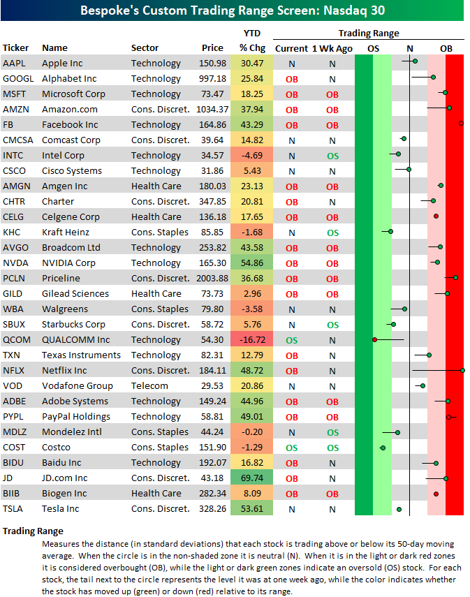
FANG+ Trading Range Screen
Below is our trading range screen for the 30 largest stocks in the Nasdaq 100 (sorted from largest to smallest). For each stock, the dot represents where it’s currently trading, while the tail end represents where it was trading one week ago. The black vertical “N” line represents each sector’s 50-day moving average, and moves into the red or green zones are considered “overbought” or “oversold.”
This screen allows you to quickly see how all of the “FAANG” stocks are trading in terms of upside or downside momentum. As you can see, the majority of stocks on the screen are currently in overbought territory, with Facebook (FB), Netflix (NFLX), Amazon.com (AMZN), and Priceline (PCLN) the farthest above their 50-day moving averages. Qualcomm (QCOM) is one of the only stocks that have headed lower within its trading range over the last week, and that’s due to extreme weakness in reaction to its earnings report today.
Year-to-date, you may be surprised to see JD.com (JD) up the most with a gain of 69%. NVIDIA (NVDA) and Tesla (TSLA) rank second and third.
Start a two-week free trial to Bespoke’s research platform to see our full offering.
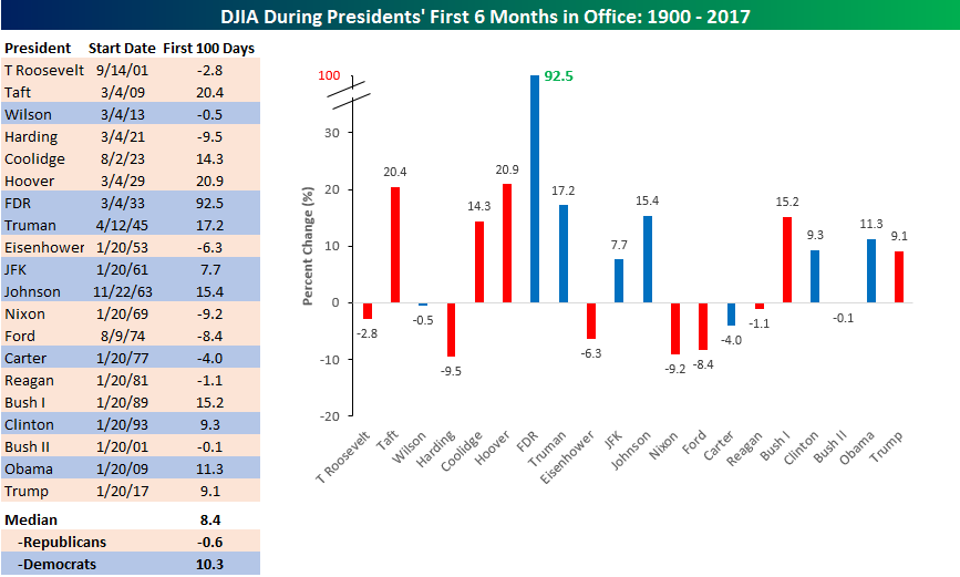
Trump’s First Six Months
It may be hard to believe, but depending on your perspective and/or political bent, it has already (or only) been six months since President Trump’s inauguration in January. With that in mind, we looked to see how the stock market’s return under Trump’s tenure stacks up relative to that of other US Presidents since the start of 1900. Have stock market returns really been as “yuge” as purported to be? The table and chart below help to answer that question, as it shows the historical returns of the DJIA during each President’s first six months in office.
There are a number of ways to interpret these results, but in the broadest sense, the 9.1% return of the DJIA during Trump’s first six months in office is really nothing to write home about. Of the 20 Presidents shown in the table and chart, Trump only outperforms the overall median (8.4) by less than one percentage point. Furthermore, plenty of other Presidents have seen much stronger returns during their first six months in office. The DJIA rose 92.5% during FDR’s first six months, while Taft and Hoover both saw the DJIA rally more than 20%. Even more recently, three of the last four US Presidents saw a stronger rally by the DJIA than Trump during their first six months in office. The only recent President to see a smaller gain in his first six months in office was the second President Bush.
While the DJIA’s performance under President Trump is right in line with the historical norm, it is much better than past Republicans. As shown at the bottom of the table, the median return of the DJIA for all Republican Presidents during their first six months in office was a decline of 0.6%, so Trump is outperforming here by a wide margin. Additionally, in the post-WWII period, the only Republican President that presided over a bigger gain in his first six months was the first President Bush. So far at least, the stock market’s performance during the President’s first six months in office compares more closely to the 10.3% median return that the DJIA has seen during the first six months of Democratic terms.
Finally, we would make note of two things. First, one could easily argue that the 9.1% gain so far under Trump is understated since the DJIA rallied “bigly” in the period from the election through the inauguration. That’s definitely true, but it’s hard to measure returns in this manner, since a number of Presidents listed weren’t actually elected. (i.e., Johnson, Ford, etc) Long story short, this is an imperfect way to measure returns, but it’s still standard across all Presidents. The second thing to note, of course, is that returns during a President’s first six months in office don’t always mean there are more gains to come! Take the first President Bush, for example. In his first six months in office, the DJIA rallied 15.2%; however, by the end of his term, the US economy was in a recession.
Click here to start a no-obligation two-week free trial to our premium research platform.
Bespoke’s Sector Snapshot — 7/20/17
We’ve just released our weekly Sector Snapshot report (see a sample here) for Bespoke Premium and Bespoke Institutional members. Please log-in here to view the report if you’re already a member. If you’re not yet a subscriber and would like to see the report, please start a 14-day trial to Bespoke Premium now.
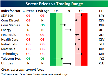
Below is one of the many charts included in this week’s Sector Snapshot, which highlights our trading range screen for the S&P 500 and ten sectors. For each sector, the dot represents where it’s currently trading, while the tail end represents where it was trading one week ago. The black vertical “N” line represents each sector’s 50-day moving average, and moves into the red or green zones are considered overbought or oversold.
The S&P 500 and six sectors are currently overbought, with Tech the most extended to the upside after a massive run higher over the last week. Even the beaten down Energy sector moved back above its 50-day moving average this week.
To see our full Sector Snapshot with additional commentary plus six pages of charts that include analysis of valuations, breadth, technicals, and relative strength, start a 14-day free trial to our Bespoke Premium package now. Here’s a breakdown of the products you’ll receive.
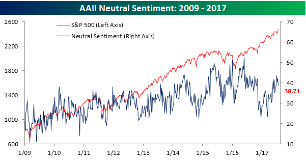
Investor Sentiment Starts to Thaw
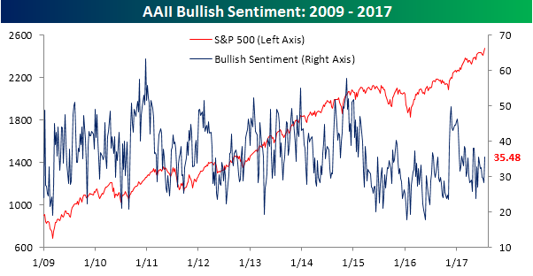
Based on the weekly bullish sentiment readings from AAII, investor sentiment has been downright miserable for the last couple of years. This week, however, sentiment saw a pretty nice bounce. According to the survey, bullish sentiment increased from 28.24% up to 35.48% – the highest since the first week of May. Granted, sentiment hasn’t topped 50% in more than two years, but you have to start somewhere.
Click here to start a no-obligation two-week free trial to our premium research platform.
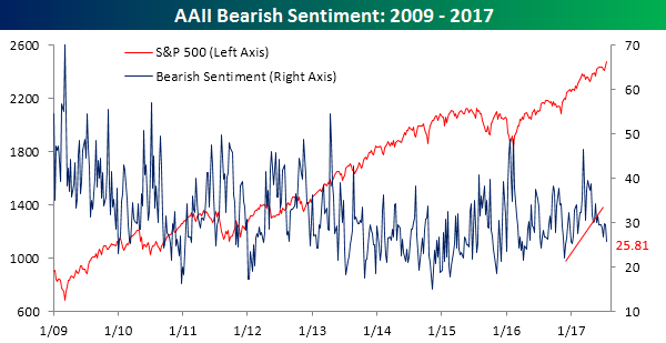
While bullish sentiment perked up, take a look at bearish sentiment breaking down. In this week’s survey, the percentage of investors calling themselves bearish dropped from 29.63% to 25.81%. This year, the only other time where bearish sentiment was lower was the first week of January.
Neutral sentiment dropped below 40% but still remains elevated at 38.71%.