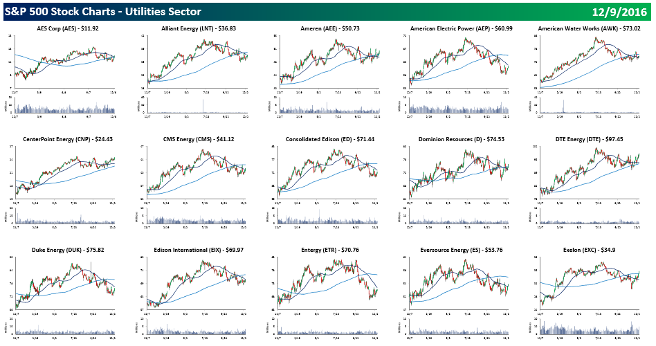
Every weekend, Bespoke Premium and Bespoke Institutional clients are emailed our S&P 500 Quick View Chart Book which contains one year price charts of every stock in the S&P 500. If you like following chart patterns, there simply isn’t a faster way to peruse all 500 components of the S&P 500. Looking at this week’s Chart Book, we couldn’t help but notice that the price charts for practically all the stocks in the S&P 500 Utilities sector look nearly the exact same; they ran up through July and has been trending lower ever since. Since the election, the pace of declines has only picked up steam. Take a look for yourself, by clicking the image below, which will take you to the section of our Chart Book containing the Utilities sector (open to everyone). Practically every single chart looks the same!
As mentioned above, there simply isn’t a faster way to scan the chart patterns for all 500 stocks in the S&P 500 than our weekly Quick View Chart Book. To get weekly access to this report, sign up for a monthly Bespoke Premium membership and get 10% off for life ($89/month).
