Bespoke’s Sector Snapshot — 7/27/17
We’ve just released our weekly Sector Snapshot report (see a sample here) for Bespoke Premium and Bespoke Institutional members. Please log-in here to view the report if you’re already a member. If you’re not yet a subscriber and would like to see the report, please start a 14-day trial to Bespoke Premium now.
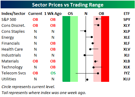
Below is one of the many charts included in this week’s Sector Snapshot, which highlights our trading range screen for the S&P 500 and ten sectors. For each sector, the dot represents where it’s currently trading, while the tail end represents where it was trading one week ago. The black vertical “N” line represents each sector’s 50-day moving average, and moves into the red or green zones are considered overbought or oversold.
The S&P 500 and three of ten sectors are currently overbought, but most sectors are now lower versus where they were a week ago due to today’s sell-off.
To see our full Sector Snapshot with additional commentary plus six pages of charts that include analysis of valuations, breadth, technicals, and relative strength, start a 14-day free trial to our Bespoke Premium package now. Here’s a breakdown of the products you’ll receive.
Facebook Joins the Half a Trillion Club
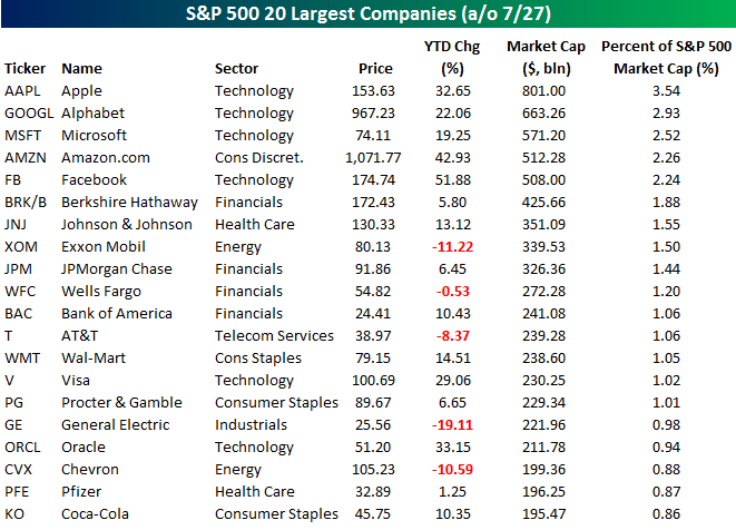
After an initially negative reaction to earnings after the close yesterday, shares of Facebook (FB) staged a sharp rebound overnight and into today and are currently up by over 5%. With that gain, Facebook’s market cap exceeded $500 billion for the first time, joining the narrow ranks of Apple (AAPL), Alphabet (GOOGL), Microsoft (MSFT), and Amazon.com (AMZN). At one point this morning, it looked as though FB would overtake AMZN for the number four spot, but AMZN’s rally today has been enough to hold FB at bay (for now). The table below lists the 20 largest companies in the S&P 500 based on market cap, and as you can plainly see, tech dominates the top of the list with the three largest companies and four of the top five. The only non-tech stock listed is AMZN, and one could easily make the case that it is just as “techy” as any of the other names.
What’s really fascinating about the market caps of these top companies is that the four largest stocks in the S&P 500 Technology sector now account for 48% of the sector’s total market cap and 11% of the entire S&P 500. Looking at it from the other side of the market cap spectrum, the 50 smallest companies in the S&P 500 account for less than 1.5% of the index’s total market cap while the smallest 200 companies account for less than 10% of the index’s market cap. Think about that for a second. If the smallest 200 companies in the S&P 500 were to drop to zero overnight, we still wouldn’t get a 10% correction in the S&P 500!
While there has been a lot of talk about the fact that the S&P 500 has become so top heavy and the risks it poses, by itself it isn’t a problem. As long as the rest of the index continues to hang in there, it is not a problem. The time to be concerned would be if we ran into a situation like 1999/2000 when the top stocks were rallying but the rest of the market was faltering. The best way to track that is by monitoring overall breadth levels, and looking at those, we are from that point.
ETF Trends: Fixed Income, Currencies, and Commodities – 7/27/17
US Oil leads the charge this week among the universe of ETFs we track daily, while Oil Services continues its struggles. Base Metals is up over 3%, while Silver, Telecoms, and Energy also have all seen solid gains over the past week. Natural Gas tops the list of worst performers for the 2nd straight day, down over 3%, and is joined by other notable underperformers Pharma and Transports.

Bespoke provides Bespoke Premium and Bespoke Institutional members with a daily ETF Trends report that highlights proprietary trend and timing scores for more than 200 widely followed ETFs across all asset classes. If you’re an ETF investor, this daily report is perfect. Sign up below to access today’s ETF Trends report.
See Bespoke’s full daily ETF Trends report by starting a no-obligation free trial to our premium research. Click here to sign up with just your name and email address.
Chart of the Day: Homeownership Is Back
the Bespoke 50 — 7/27/17
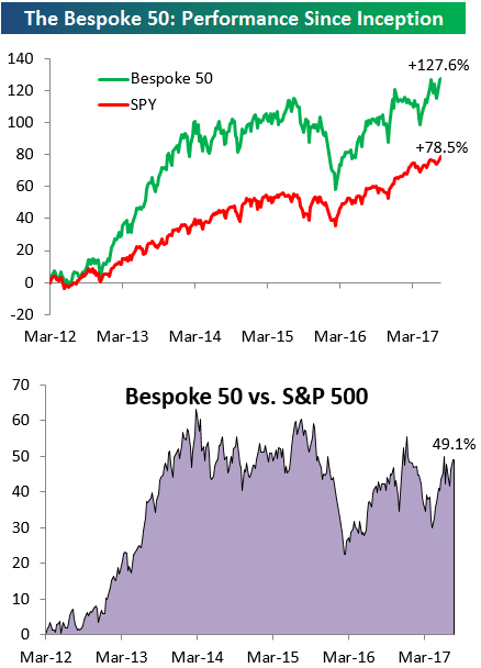
Every Thursday, Bespoke publishes its “Bespoke 50” list of top growth stocks in the Russell 3,000. Our “Bespoke 50” portfolio is made up of the 50 stocks that fit a proprietary growth screen that we created a number of years ago. Since inception in early 2012, the “Bespoke 50” has beaten the S&P 500 by 49.1 percentage points. Through today, the “Bespoke 50” is up 127.6% since inception versus the S&P 500’s gain of 78.5%. Always remember, though, that past performance is no guarantee of future returns.
To view our “Bespoke 50” list of top growth stocks, sign up for Bespoke Premium ($99/month) at this checkout page and get your first month free. This is a great deal!
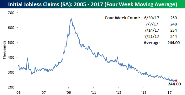
Jobless Claims Tick Higher
Jobless claims came in a bit higher than expected this week rising from 234K up to 244K compared to expectations for an increase to 240K. Even with the increase though, claims came in at or below 250K for the eighth straight week and below 300K for the 125th straight week. As shown in the chart below, the trend for claims remains lower with a series of lower highs.
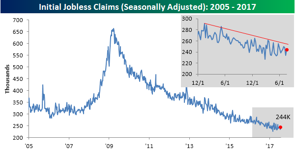
With this week’s increase, the four-week moving average remains unchanged at 244K as well. If claims are going to make a run for the record of 235.5K from back in May, we will need to see some low prints in the next two weeks as we will be dropping higher readings from the count.
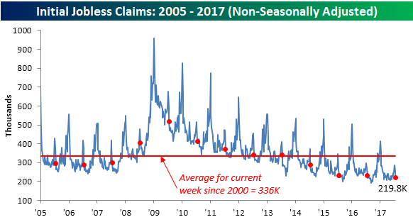
The most impressive aspect of the weekly claims report this week was the non-seasonally adjusted (NSA) reading. On an NSA basis, jobless claims came in at just 219.8K, which is once again more than 100K below the average for the current week of the year dating back to 2000. In fact, to find a year where the current week of July had a lower reading, you have to go all the way back to 1968.
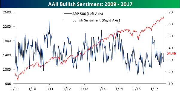
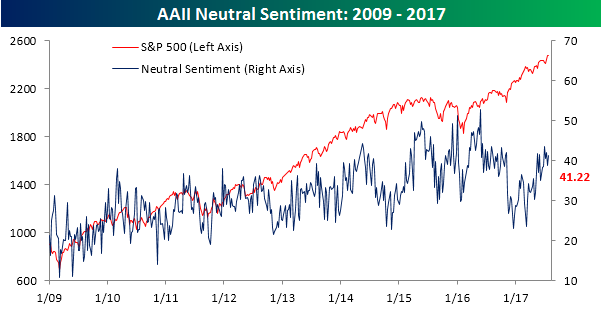
Bullish Sentiment Remains in the Dumps
With record after record in the major equity averages, you would think individual investors would eventually get excited, but not so again this week. According to the weekly sentiment survey from AAII, bullish sentiment declined from 35.48% down to 34.46%. That now makes it 134 straight weeks where bulls have been out of the majority.
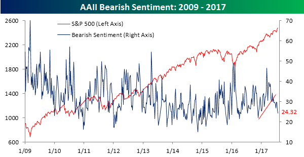
While individual investors aren’t bullish, they aren’t bearish either. In this week’s survey, bearish sentiment declined from 25.81% down to 24.32%. That’s the lowest weekly reading since right after the election last November, and it’s not far from two-year lows.
That leaves us with neutral sentiment, which rose back above 40% this week to 41.22%. For most of the current bull market, neutral sentiment was routinely in the mid 20% to high 30% range. Ever since the start of 2015, though, 40% readings have become much more of a ‘normal’ occurrence.
The Closer — New Homes, New Exports, Same Fed — 7/26/17
Log-in here if you’re a member with access to the Closer.
Looking for deeper insight on global markets and economics? In tonight’s Closer sent to Bespoke Institutional clients, we update tracking of new home sales and US petroleum markets. We also review the FOMC’s decision today and present several trade ideas to take advantage of the current policy outlook.

The Closer is one of our most popular reports, and you can sign up for a free trial below to see it!
The Closer is one of our most popular reports, and you can see it and everything else Bespoke publishes by starting a no-obligation 14-day free trial to our research!