The Bespoke Report — 8/4/17
S&P 500 Weekly Chart Book – 8/4/17
B.I.G. Tips – Economic Indicator Diffusion Index Hits a 19-Month Low
Average Stock Declines From 52-Week Highs
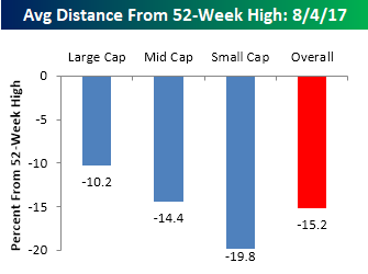
The Dow and other major US equity indices have been seemingly hitting new all-time highs on a daily basis, and although not many are likely to admit it on Twitter, if you look at your portfolio it is likely that at least some of your individual holdings are down from their most recent highs. It may sound strange, but in a well-diversified portfolio, you should have at least some stocks that are trading down from their 52-week highs. Otherwise, it is likely not very diversified! This is because not all stocks participate in the market to the same degree or at the same time. Currently, within the S&P 1500, which includes large cap, mid cap, and small cap stocks, that is exactly what we are seeing.
The first chart below shows the average percentage that stocks in the S&P 500 (large cap), S&P 400 (mid cap), and S&P 600 (small cap) are trading from their respective 52-week highs. In the S&P 500, the average stock is trading down 10.2% from its 52-week highs, while in the small cap S&P 600, the average stock is down 19.8%. Overall, stocks in the S&P 1500 are down an average of 15.2% from their one-year highs. It is common for small cap stocks to be trading further from their 52-week highs than large caps, but we would be the first to admit that an average decline of 19.8% is pretty high. That’s close to bear market territory for the average small cap stock! In fact, of the 600 stocks in the S&P 600 Small Cap Index, 37% (223) are down more than 20% from their 52-week highs. The average decline of 10.2% in the S&P 500, however, is actually pretty normal for an environment like the present.
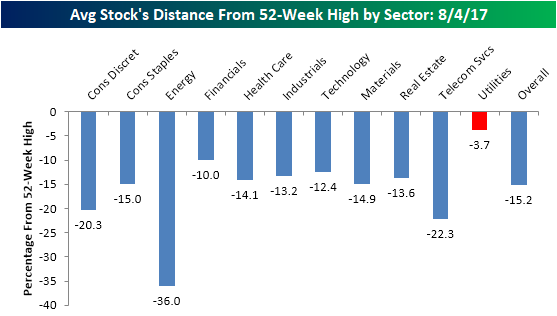
Looking at individual sectors, the main sector dragging down the averages is Energy, where the average stock in the sector is trading down 36% from its 52-week high. Behind Energy, Telecom Services is next at -22.3%, followed by Consumer Discretionary (-20.3%), where brick and mortar retail stocks are weighing on things significantly. Sectors where the average stock is down the least from their 52-week highs are Utilities (-3.7%) and Financials (-10.0%). That 3.7% reading in the Utilities sector is extremely strong, especially at a time when the market is in rally mode and defensive sectors like Utilities typically underperform on a relative basis.
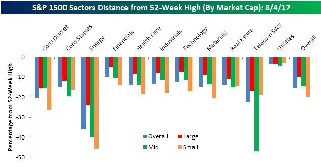
The final chart below breaks out the average decline from 52-week highs by sector and market cap. Here you can see how the weakness in the Energy sector is really confined to its mid and small cap stocks. While the average large cap Energy sector stock is down 24% from its 52-week high, mid cap stocks in the sector are down an average of 40.1%, and small cap stocks are down 46%! The only other segment where stocks are down more from their 52-week highs is Mid Cap Telecom Services (-47%), but that group only contains two stocks (Frontier-FTR and Telephone and Data Systems-TDS). In terms of segments holding up the best, all three market cap ranges of the Utility sector are currently within 5% of their respective 52-week highs. Outside of Utilities, the only other segment that is within 5% of a 52-week high is Financials.
B.I.G. Tips – July Employment Report Preview
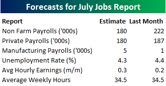
Heading into Friday’s Non-Farm Payrolls (NFP) report for July, economists are expecting an increase in payrolls of 180K, which would be a 42K decline from last month’s stronger than expected reading of 222K. In the private sector, economists are also expecting an increase of 180K, which would represent a smaller decline than the headline number. The unemployment rate is forecasted to decline back down to 4.3%. Growth in average hourly earnings is expected to accelerate to 0.3%, while average weekly hours worked is also forecast to remain unchanged at 34.5.
Ahead of the report, we just published our eleven-page monthly preview for the July jobs report. This report contains a ton of analysis related to how the equity market has historically reacted to the monthly jobs report, as well as how secondary employment-related indicators we track looked in July. We also include a breakdown of how the initial reading for July typically comes in relative to expectations and how that ranks versus other months.
One topic we cover in each month’s report is the S&P 500 stocks that do best and worst from the open to close on the day of the employment report based on whether or not the report comes in stronger or weaker than expected. In other words, which stocks should you buy, and which should you avoid? The table below highlights the best-performing stocks in the S&P 500 from the open to close on days when the Non-Farm Payrolls report has been better than expected over the last two years. Of the 25 top performing stocks, seven sectors are represented, and Technology leads the way with seven. One of the top performing and consistently positive stocks on these days is Qorvo (QRVO) which has seen an average gain of 2.28% with positive returns 90% of the time.
For anyone with more than a passing interest in how equities are impacted by economic data, this report is a must read. To see the report, sign up for a monthly Bespoke Premium membership now!

The Closer — Factories, Approvals, Contango — 8/3/17
Log-in here if you’re a member with access to the Closer.
Looking for deeper insight on global markets and economics? In tonight’s Closer sent to Bespoke Institutional clients, we chart factory sales, orders, and inventories, review Presidential approval ratings, and discuss the move towards backwardation in energy markets with an eye to the performance of Energy sector equities.

The Closer is one of our most popular reports, and you can sign up for a free trial below to see it!
See today’s post-market Closer and everything else Bespoke publishes by starting a no-obligation 14-day free trial to our research platform!
Bespoke’s Sector Snapshot — 8/3/17
We’ve just released our weekly Sector Snapshot report (see a sample here) for Bespoke Premium and Bespoke Institutional members. Please log-in here to view the report if you’re already a member. If you’re not yet a subscriber and would like to see the report, please start a 14-day trial to Bespoke Premium now.
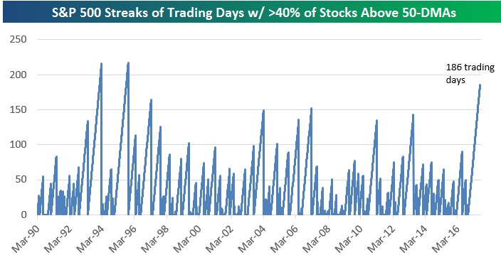
Below is one of the many charts included in this week’s Sector Snapshot, which shows the number of trading days it has been since the percentage of stocks trading above their 50-days in the S&P 500 has dipped below 40%. This basically shows that underlying breadth for the stock market has not dipped into oversold territory in a very long time.
To see our full Sector Snapshot with additional commentary plus six pages of charts that include analysis of valuations, breadth, technicals, and relative strength, start a 14-day free trial to our Bespoke Premium package now. Here’s a breakdown of the products you’ll receive.
Chart of the Day: Precious PMI
ETF Trends: Fixed Income, Currencies, and Commodities – 8/3/17
Long Duration Treasury leads the charge this week among the world of ETFs we track daily, up just over 3%. Also up just over 3% is Brazil, followed by consistent outperformers Coffee and Poland. Solar and Insurance also continue to trend upward. Oil and Natural Gas have been fixtures on our worst performers list, down over 5% and 4%, respectively. They are joined by other notable underperformers Biotech and Telecoms.

Bespoke provides Bespoke Premium and Bespoke Institutional members with a daily ETF Trends report that highlights proprietary trend and timing scores for more than 200 widely followed ETFs across all asset classes. If you’re an ETF investor, this daily report is perfect. Sign up below to access today’s ETF Trends report.
See Bespoke’s full daily ETF Trends report by starting a no-obligation free trial to our premium research. Click here to sign up with just your name and email address.
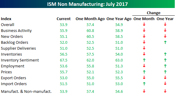
Big Disparity Between ISM Non Manufacturing and Manufacturing Reports
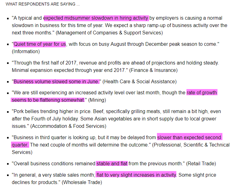
Earlier this week, we noted that despite the slightly weaker than expected reading in the ISM Manufacturing report, the commentary within the report was extremely strong. Today, we got the latest read from ISM regarding the non-manufacturing sector, and here, not only was the report much weaker than expected, but the commentary was a stark contrast to what we saw from respondents in the manufacturing sector. As shown below, most respondents noted a slowdown, quiet time, flattening growth, and a slower than expected second quarter. One caveat here is that many of the respondents also noted that the slower activity was expected and typical for this time of year, but the tone was decidedly different from what we saw in the manufacturing sector just two days earlier.
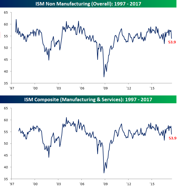
As far as the actual report is concerned, the July ISM Services report came in at a level of 53.9 versus estimates for a level of 56.9. That made the July report the weakest relative to expectations since the report from last August and the third weakest relative to expectations of the entire expansion. It was also the largest month/month drop since November 2008. That’s a big drop! On a combined basis and accounting for each sector’s share of the overall economy, the July ISM also dropped from 57.4 down to 53.9, which was also the steepest one month decline since November 2008.
Looking at the internals of the ISM Services report, things were also generally weak. Of the ten components, only three increased, including Prices Paid. On the downside, the largest declines came from New Orders and Business Activity. On a year/year basis, breadth was less weak but was still far from strong. As mentioned above, respondents noted that the weaker conditions this month were expected and considered to be temporary. That better be the case, or else we could be in for a shaky end of the year from the economy’s perspective.