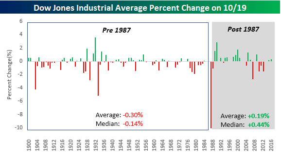
So Much For the Scars of 1987
Today marks the 30th anniversary of the 1987 Black Monday Crash, an event that had a major impact on investor psychology for a generation and beyond. While it would be completely irrational, given human nature, one would think that the 22% decline in the DJIA on 10/19/87 would cause investors to become a little more risk averse at this time of year. The increase in articles about the “Crash of ’87” every October has to make some investors uneasy.
Interestingly enough, looking at the historical performance of the DJIA on October 19th shows an interesting trend. In the years from 1900 through 1986, the DJIA averaged a one-day decline of 0.30% (median: -0.14%) on 10/19 with positive returns just 43% of the time. In the 30 years since the crash, however, the DJIA has averaged a gain of 0.19% (median: 0.44%) with positive returns two-thirds of the time. So much for the scars of 1987.
The Closer — Housing And Energy — 10/18/17
Log-in here if you’re a member with access to the Closer.
Looking for deeper insight on global markets and economics? In tonight’s Closer sent to Bespoke Institutional clients, we recap monthly housing starts numbers and this week’s petroleum market report from the EIA.

The Closer is one of our most popular reports, and you can sign up for a free trial below to see it!
See today’s post-market Closer and everything else Bespoke publishes by starting a no-obligation 14-day free trial to our research platform!
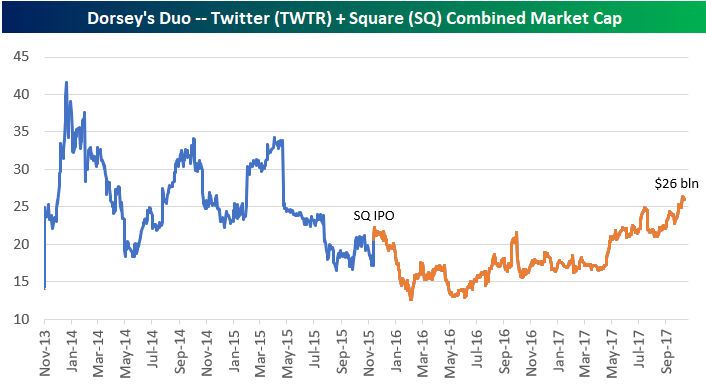
Dorsey’s Duo Not So Bad
Twitter (TWTR) CEO Jack Dorsey takes a lot of heat for the company’s weak performance, especially since he’s juggling the running of two multi-billion dollar companies at the same time. Along with running Twitter, Dorsey is the CEO of Square (SQ) as well. But you don’t hear people talk about how well Square (SQ) is doing nearly as much as you hear people talk about how poorly Twitter is doing. If you combine the performance of both companies, Dorsey is doing just fine. (Don’t tell that to Twitter shareholders!)
As shown below, while Twitter (TWTR) is down 30% from its IPO back in late 2013, Square (SQ) is now up 263% since its IPO in late 2015.
CLICK HERE to learn about Bespoke’s premium research options!

Below is a chart showing the combined market caps of both Twitter and Square. Note that both companies have market caps that are very similar at the moment, but Twitter still has a slight edge. Twitter is currently worth about $13.5 billion while Square is at $12.5 billion. But only Square has been adding value over the past couple of years.
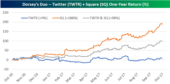
As shown below, over the last year, if you “invested in Dorsey” and owned an equal amount of Twitter and Square, you’d be up nearly 100%. There’s not much wrong with that kind of return!
Housing Starts and the Economic Cycle
Wednesday’s data on Housing Starts and Building Permits disappointed consensus expectations, and while some of the declines can be chalked up to the hurricanes in the South, we would note that Starts in both the Northeast and Midwest regions also showed declines. One silver lining to this month’s data was that in both the cases of Housing Starts and Building Permits, the majority of the weakness was in multi-family units, which tend to be more volatile.
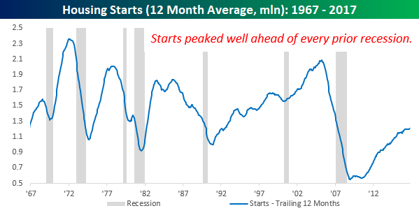
Residential construction is a big part of the US economy, so naturally, an uptick or slowdown in activity is going to have an impact on the business cycle. The chart below compares historical levels of Housing Starts on a 12-month average basis to expansions and recessions since 1967. It’s pretty easy to see in the chart that peaks in Housing Starts tend to occur late in the cycle, while troughs are formed right after the recession ends. What’s important to note, however, is that even after the peak level of Housing Starts for a given cycle, a recession doesn’t usually begin for at least another year.
So where do things stand right now with Housing Starts? Even after this month’s data, the 12-month moving average of Housing starts actually ticked higher in September, rising from 1.199 mln up to 1.204 mln. That’s the highest level since March 2008. While that’s definitely a positive data point, we would also note that barring a major improvement in the data over the coming months, we have likely seen a short-term peak in this reading as the 12-month average will be dropping average monthly readings of 1.243 mln for the next six months.
CLICK HERE to learn about Bespoke’s premium research options!
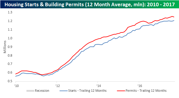
Taking a look at a shorter term window, the chart below shows the 12-month moving average of Housing Starts and Building Permits going back to 2010. Here it’s a little bit easier to see the most recent uptick in Housing Starts, but at the same time, the 12-month moving average of Building Permits has already started to tick lower. As is the case with Housing Starts, barring an imminent uptick in activity, this 12-month moving average will continue to decline in the months ahead.
CLICK HERE to learn about Bespoke’s premium research options!
Chart of the Day: Big Blue’s Big Move
Fixed Income Weekly – 10/18/17
Searching for ways to better understand the fixed income space or looking for actionable ideals in this asset class? Bespoke’s Fixed Income Weekly provides an update on rates and credit every Wednesday. We start off with a fresh piece of analysis driven by what’s in the headlines or driving the market in a given week. We then provide charts of how US Treasury futures and rates are trading, before moving on to a summary of recent fixed income ETF performance, short-term interest rates including money market funds, and a trade idea. We summarize changes and recent developments for a variety of yield curves (UST, bund, Eurodollar, US breakeven inflation and Bespoke’s Global Yield Curve) before finishing with a review of recent UST yield curve changes, spread changes for major credit products and international bonds, and 1 year return profiles for a cross section of the fixed income world.
In this week’s note, we demonstrate how significant the Fed’s tightening cycle is for the shape of the yield curve.
Our Fixed Income Weekly helps investors stay on top of fixed income markets and gain new perspective on the developments in interest rates. You can sign up for a Bespoke research trial below to see this week’s report and everything else Bespoke publishes free for the next two weeks!
Click here and start a 14-day free trial to Bespoke Institutional to see our newest Fixed Income Weekly now!
Bespoke’s Global Macro Dashboard — 10/18/17
Bespoke’s Global Macro Dashboard is a high-level summary of 22 major economies from around the world. For each country, we provide charts of local equity market prices, relative performance versus global equities, price to earnings ratios, dividend yields, economic growth, unemployment, retail sales and industrial production growth, inflation, money supply, spot FX performance versus the dollar, policy rate, and ten year local government bond yield interest rates. The report is intended as a tool for both reference and idea generation. It’s clients’ first stop for basic background info on how a given economy is performing, and what issues are driving the narrative for that economy. The dashboard helps you get up to speed on and keep track of the basics for the most important economies around the world, informing starting points for further research and risk management. It’s published weekly every Wednesday at the Bespoke Institutional membership level.
You can access our Global Macro Dashboard by starting a 14-day free trial to Bespoke Institutional now!

The Closer — Breadth, Industry, Capital Flows — 10/17/17
Log-in here if you’re a member with access to the Closer.
Looking for deeper insight on global markets and economics? In tonight’s Closer sent to Bespoke Institutional clients, we review breadth in below-the-headline US indices, update tracking of industrial production including the impact of Hurricane Harvey, and discuss August international capital flows data from the US Treasury.
The Closer is one of our most popular reports, and you can sign up for a free trial below to see it!
See today’s post-market Closer and everything else Bespoke publishes by starting a no-obligation 14-day free trial to our research platform!