The Most Volatile Stocks on Earnings
The start of the new quarter brings with it the start of another earnings season, and next week is when we’ll start to hear from companies reporting their Q3 2017 earnings. As we do prior to the start of each earnings season, in this post we update our list of the most volatile stocks on earnings.
Using our Interactive Earnings Report Database (which you can use for 30 days for just $1 by joining Bespoke Institutional here), we’re able to calculate the average move that stocks experience on their earnings reaction days. For a stock that reports in the morning before the open, its earnings reaction day is that same trading day. For a stock that reports after the close, we use the next trading day.
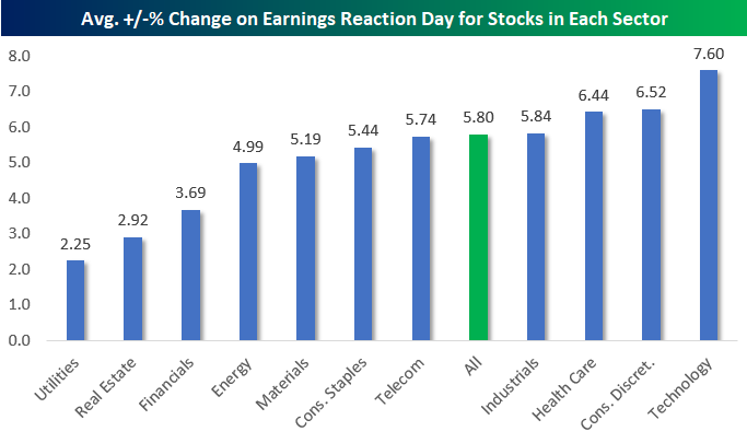
Below is a look at how volatile stocks are on earnings by sector. Since 2001, US stocks have experienced an average move of +/-5.80% on their earnings reaction day. This means that quarterly earnings reports typically result in a change in market cap of +/-5.8% for public companies. But some sectors are more volatile than others of course. As shown in the chart, Tech stocks that reports earnings typically move an average of +/-7.60% on their earnings reaction day. Conversely, the average stock in the Utilities sector only moves +/-2.25% on earnings. It’s not surprising that Tech stocks are 3x as volatile as Utilities stocks when it comes to earnings reactions, but these numbers help to quantify the differences.
Generally speaking, stocks in the Utilities, Real Estate, and Financial sectors move the least on earnings, while Technology, Consumer Discretionary, and Health Care stocks move the most.
Gain access to 1 month of any of Bespoke’s premium membership levels for $1!
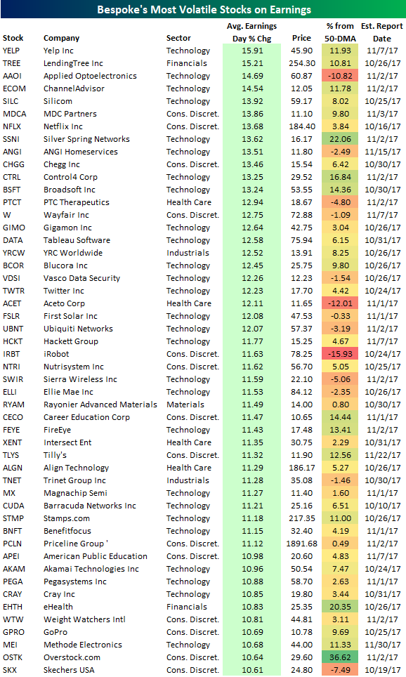
Using our Interactive Earnings Report Database, below is a list of the individual stocks set to report between now and the end of November that typically move the most on their earnings reaction days. To make the list, a stock must have at least 12 quarters (3 years) of earnings reports and trade for more than $10/share.
As shown, Yelp (YELP) is the most volatile stock on earnings with an average one-day change of +/-15.91%. LendingTree (TREE) ranks second and is the only other stock that typically moves more than +/-15%. Applied Opto (AAOI), ChannelAdvisor (ECOM), and Silicom (SILC) round out the top five.
Netflix (NFLX) is the most well-known stock in the top ten with an average one-day change of +/-13.68% on earnings. Other notable names on the list include Wayfair (W), Tableau Software (DATA), Twitter (TWTR), First Solar (FSLR), FireEye (FEYE), Priceline (PCLN), and GoPro (GPRO).
One final note. In the table below we’ve also included how far each stock is currently trading from its 50-day moving average. Heading into earnings season, there are a lot of stocks trading significantly above their 50-day moving averages (overbought). For stocks on the list with prices that are extended to the upside, expectations are going to be quite high for earnings. Failure to meet these lofty expectations will likely result in significant pain for investors. The reverse is true for stocks that are trading well below their 50-day moving averages.
Fixed Income Weekly – 10/4/17
Searching for ways to better understand the fixed income space or looking for actionable ideals in this asset class? Bespoke’s Fixed Income Weekly provides an update on rates and credit every Wednesday. We start off with a fresh piece of analysis driven by what’s in the headlines or driving the market in a given week. We then provide charts of how US Treasury futures and rates are trading, before moving on to a summary of recent fixed income ETF performance, short-term interest rates including money market funds, and a trade idea. We summarize changes and recent developments for a variety of yield curves (UST, bund, Eurodollar, US breakeven inflation and Bespoke’s Global Yield Curve) before finishing with a review of recent UST yield curve changes, spread changes for major credit products and international bonds, and 1 year return profiles for a cross section of the fixed income world.
In this week’s note, we build on last week’s note, identifying a number of interesting emerging markets FX trades based on the valuations we discussed previously.

Our Fixed Income Weekly helps investors stay on top of fixed income markets and gain new perspective on the developments in interest rates. You can sign up for a Bespoke research trial below to see this week’s report and everything else Bespoke publishes free for the next two weeks!
Click here to start your no-obligation free Bespoke research trial now!
Chart of the Day: Economic Indicator Diffusion Index Still Negative
Huge Beat in ISM Services
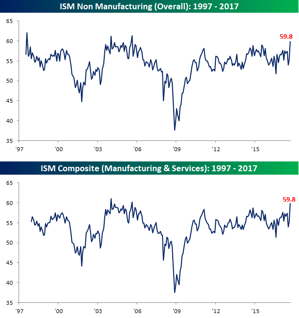
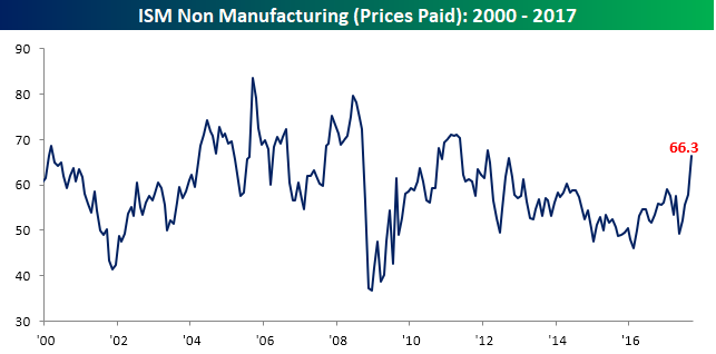
Following on the heels of a strong ISM Manufacturing report on Monday, today’s ISM report on the Non Manufacturing sector was also a good one. With economists expecting the headline index to come in at a level of 55.5 compared to August’s reading of 55.3, the actual reading came in at 59.8. This is the highest level for the index since August 2005. This month’s 4.5 point surge also represented the fourth largest one month increase in the history of the survey going back to 1997 and the biggest beat relative to expectations since May 2007. On a combined basis, the September ISM came in at 59.8, which was the highest reading since August 2005.
Gain access to 1 month of any of Bespoke’s premium membership levels for $1!
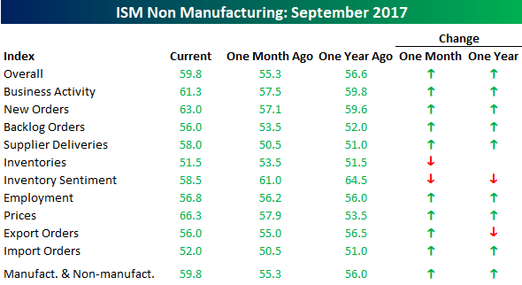
The table below breaks down this month’s report by each of its subcomponents. On a month/month basis, the only two categories that declined were Inventories and Inventory Sentiment. On the upside, Prices Paid (+8.4) showed the largest increase, followed by Supplier Deliveries (+7.5) and New Orders (5.9). The Employment component was also up this month but by an extremely small amount. In the case of Prices Paid, this month’s spike took the index to its highest level since February 2012 after what was its largest m/m increase since October 2010.
Gain access to 1 month of any of Bespoke’s premium membership levels for $1!
Bespoke’s Global Macro Dashboard — 10/4/17
Bespoke’s Global Macro Dashboard is a high-level summary of 22 major economies from around the world. For each country, we provide charts of local equity market prices, relative performance versus global equities, price to earnings ratios, dividend yields, economic growth, unemployment, retail sales and industrial production growth, inflation, money supply, spot FX performance versus the dollar, policy rate, and ten year local government bond yield interest rates. The report is intended as a tool for both reference and idea generation. It’s clients’ first stop for basic background info on how a given economy is performing, and what issues are driving the narrative for that economy. The dashboard helps you get up to speed on and keep track of the basics for the most important economies around the world, informing starting points for further research and risk management. It’s published weekly every Wednesday at the Bespoke Institutional membership level.
Click here for a special $1 introductory Bespoke Institutional membership rate.

The Closer — Auto Sales Surge, Brazilian Data Solid, IBEX Impact — 10/3/17
Log-in here if you’re a member with access to the Closer.
Looking for deeper insight on global markets and economics? In tonight’s Closer sent to Bespoke Institutional clients, we review the smashing success that was September auto sales in the US, update tracking of Brazilian economic data, and take a look at what companies have been driving the decline in Spain’s IBEX 35.
The Closer is one of our most popular reports, and you can sign up for a free trial below to see it!
See today’s post-market Closer and everything else Bespoke publishes by starting a no-obligation 14-day free trial to our research platform!
ETF Trends: US Sectors & Groups – 10/3/17
Bespoke Stock Scores: 10/3/17
NXP Semiconductors Better Alone?
It has been a year now since rumors first started circulating about QUALCOMM’s (QCOM) interest in NXP Semiconductors (NXPI), and more than eleven months since the $110 per share takeover was officially announced. Since that time, we have published a number of notes for clients (two examples are here and here) discussing how through a combination of the performance of the semiconductor stocks and the breakup fee agreed upon in the original merger agreement, that NXPI shareholders would likely be better off if the deal didn’t go through. For starters, if for some reason QCOM can’t close the deal because of regulatory or financial issues, the company would be required to pay NXPI a breakup fee of $2 billion. With 330 million shares outstanding, that breakup fee works out to about $6 per share or 5% of NXPI’s current market cap.
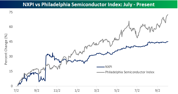
The second and bigger reason NXPI shareholders may be happy to see the deal fall apart is due to the performance of semiconductor stocks themselves since the deal was announced. The first chart below compares NXPI to the Philadelphia Semiconductor Index (SOX) since the start of July 2016. Leading up to the merger announcement, NXPI generally tracked the SOX index pretty closely. While the stock initially spiked and was outperforming its peer group immediately after the deal was announced, it started underperforming shortly thereafter and has continued to do so ever since. As of today, NXPI is up 45% since the start of July 2016, but the SOX index has gained 73%!
Gain access to 1 month of any of Bespoke’s premium membership levels for $1!
So how does that translate into stock prices? In the chart below we have plotted the price of NXPI along with where it would be trading had it simply matched the performance of the SOX index from 8/1/16 on. While NXPI has rallied 34.7% to $113.3 if it had performed inline with the SOX index, it would be trading at $134.6 today. Now obviously, that’s a counterfactual, but even before taking the potential $2 billion breakup fee into account, one could easily make the argument that with the original takeover price of $110 per share still in place and NXPI trading above $113, the biggest risk for NXPI shareholders now is that the previously agreed upon deal with QCOM actually does go through!
Gain access to 1 month of any of Bespoke’s premium membership levels for $1!
