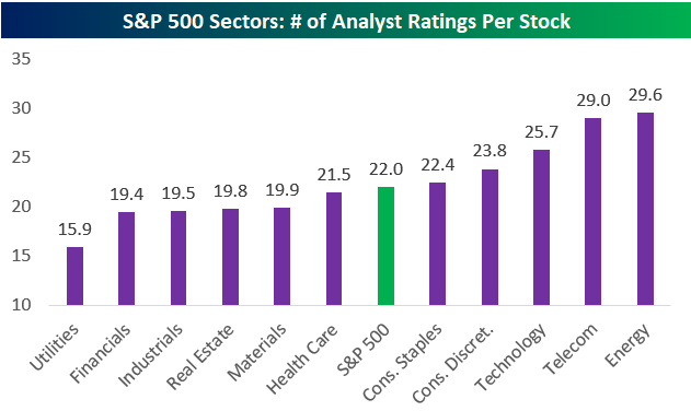
S&P 500 Stocks Have 22 Analyst Ratings on Average
We’ve just published a report for Bespoke Premium members titled “The Most Loved and Hated Sectors.” The report looks at the sectors that have the highest percentage of Buy and Sell ratings along with the sectors that have seen the biggest increases or decreases in Buy and Sell ratings over the last six months. If you’re not a subscriber, you can view the report by starting a two-week free trial to Bespoke Premium here.
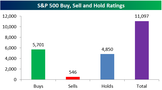
Without breaking down the percentage of Buy and Sell ratings by sector, below we highlight the total number of Buy, Sell, and Hold ratings for S&P 500 stocks. In total, there are 11,097 analyst ratings, which equates to 22 analyst ratings per stock. Think that’s a bit excessive?
Of the 11,097 ratings, 5,701 are Buys, 4,850 are Holds, and 546 are Sells. Clearly, analysts don’t like slapping a Sell rating on a stock!
Looking at sectors, you might think that Tech stocks are covered the most by analysts, but that’s not the case. The Energy sector actually has the highest number of analyst ratings per stock at 29.6. Tech ranks third at 25.7, followed by Consumer Discretionary at 23.8.
On the flip side, the Utilities sector — as much fun as it is — has the lowest number of analyst ratings per stock at 15.9.
B.I.G. Tips – The Most Loved and Hated Sectors
B.I.G. Tips – Retail Sales Horribilis
Chart of the Day: Bitcoin Passes a Key Test
Fixed Income Weekly – 2/14/18
Searching for ways to better understand the fixed income space or looking for actionable ideals in this asset class? Bespoke’s Fixed Income Weekly provides an update on rates and credit every Wednesday. We start off with a fresh piece of analysis driven by what’s in the headlines or driving the market in a given week. We then provide charts of how US Treasury futures and rates are trading, before moving on to a summary of recent fixed income ETF performance, short-term interest rates including money market funds, and a trade idea. We summarize changes and recent developments for a variety of yield curves (UST, bund, Eurodollar, US breakeven inflation and Bespoke’s Global Yield Curve) before finishing with a review of recent UST yield curve changes, spread changes for major credit products and international bonds, and 1 year return profiles for a cross section of the fixed income world.
In this week’s note, we update the relationship between the Fed’s estimate of longer-run interest rates, the market’s terminal rate estimate, and the ten year.

Our Fixed Income Weekly helps investors stay on top of fixed income markets and gain new perspective on the developments in interest rates. You can sign up for a Bespoke research trial below to see this week’s report and everything else Bespoke publishes free for the next two weeks!
Click here and start a 14-day free trial to Bespoke Institutional to see our newest Fixed Income Weekly now!
Bespoke’s Global Macro Dashboard — 2/14/18
Bespoke’s Global Macro Dashboard is a high-level summary of 22 major economies from around the world. For each country, we provide charts of local equity market prices, relative performance versus global equities, price to earnings ratios, dividend yields, economic growth, unemployment, retail sales and industrial production growth, inflation, money supply, spot FX performance versus the dollar, policy rate, and ten year local government bond yield interest rates. The report is intended as a tool for both reference and idea generation. It’s clients’ first stop for basic background info on how a given economy is performing, and what issues are driving the narrative for that economy. The dashboard helps you get up to speed on and keep track of the basics for the most important economies around the world, informing starting points for further research and risk management. It’s published weekly every Wednesday at the Bespoke Institutional membership level.
You can access our Global Macro Dashboard by starting a 14-day free trial to Bespoke Institutional now!

The Closer — ETF Flows & Consumer Credit — 2/13/18
Log-in here if you’re a member with access to the Closer.
Looking for deeper insight on markets? In tonight’s Closer sent to Bespoke Institutional clients, we catalog ETF flows and the quarterly consumer credit data from the New York Fed.

See today’s post-market Closer and everything else Bespoke publishes by starting a 14-day free trial to Bespoke Institutional today!
This Bird is on Fire! Twitter (TWTR) Back in the Black
Last October we published a post titled “Dorsey’s Duo Not So Bad.” At the time, Twitter CEO Jack Dorsey was taking heat due to the company’s poor stock performance, but we pointed out in the post that Dorsey’s other company — Square (SQ) — had been performing quite well. Due to Square’s huge share price gain, “investing in Dorsey” by owning both TWTR and SQ would have resulted in triple-digit percentage gains over the past year.
Fast forward five months to today…not only has Square continued to rally, but Twitter — the social media stock that Wall Street loves to hate on — has been on fire!
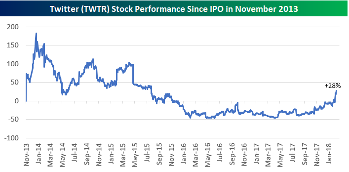
Don’t look now, but shares of Twitter are now “in the black” versus their IPO price of $26 on 11/6/13. As shown below, a surge since the start of 2018 capped by an 8% gain today has left TWTR shares up 28% versus their IPO price.
Along with TWTR’s 28% gain from its IPO, SQ is up 362% since going public in late 2015:
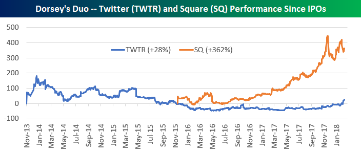
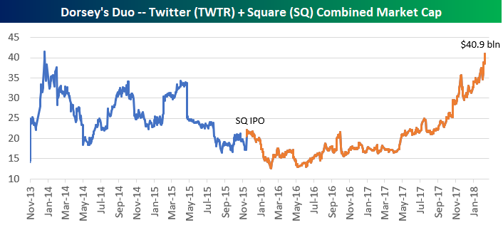
On a combined basis, Dorsey’s Duo of TWTR and SQ now have a market cap of $40.9 billion, which is up from less than $15 billion at the start of 2016.
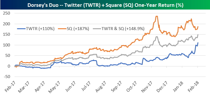
Twitter is now up 110% year-over-year, while Square is up 187%. Had you “invested in Dorsey” by buying the same amount of both companies, you’d be up 148.9%. Not bad!
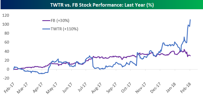
As Twitter (TWTR) has been rallying recently, its big brother in the social media space — Facebook (FB) — has stumbled a bit. While Twitter is up 39% in 2018, Facebook (FB) is down 1.9% on the year, and it’s down 10.3% over the last 8 trading days.
 Long-term Facebook (FB) shareholders still have a lot to be happy about of course. When comparing performance versus IPO prices, FB is still up more than 10x as much as TWTR. While the little blue bird is flying high right now, it still has a lot of catching up to do.
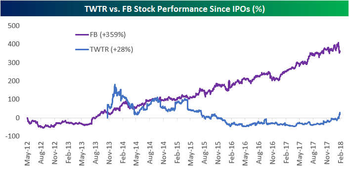
Chart of the Day: Corrections Come in All Shapes and Sizes
Bespoke’s Top Earnings Triple Plays — 2/13/18
Here at Bespoke, our job is to identify winners and losers, and one of the ways we try to find earnings-season winners is through our list of “triple plays.”
Long-term Bespoke subscribers know how much we like triple plays, but for those that haven’t heard of the term, we came up with it back in the mid-2000s for companies that beat analyst earnings estimates, beat analyst revenue estimates and also raise guidance. Investopedia.com is one of the best online resources for financial markets education, and they’ve actually given us credit for coining the “triple play” term on their website. We consider triple play stocks to be the cream of the crop of earnings season, and we are constantly finding new long-term buy opportunities from this basket of names each quarter.
Since earnings season began back in early January, there have been 99 total triple plays. That’s a high reading indicative of a healthy corporate environment, even though the S&P 500 is now in correction territory. Throughout earnings season, Bespoke Premium and Institutional members have access to our Earnings Triple Plays page, which keeps a running tally of the 100 most recent triple plays. We also publish our Top Triple Plays Report, which filters the list of most recent triple plays down to the ones with the most attractive chart patterns. We’ve just published our newest Top Triple Plays Report featuring 30 stocks with chart patterns that we like. Learn how to see the stocks below!
See our Top Earnings Season Triple Plays by signing up for a Bespoke Premium membership now. Click this link for a 14-day free trial and 30% off your first charge!